
Recommended
More Related Content
What's hot
What's hot (19)
Viewers also liked
Viewers also liked (6)
Similar to Muse
Similar to Muse (20)
Recently uploaded
Recently uploaded (20)
Muse
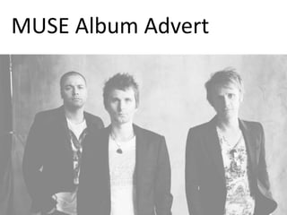
- 2. Muse – Alternative rock band from England. This advert featured in an issue of NME magazine in 2009. NME mainly focuses on rock, indie and alternative genres of music which perfectly fits with the style of the music produced by Muse. By targeting existing fans of the genre, they are much more likely to gain listeners rather than taking the risk of trying to target other audiences.
- 3. The logo is featured in the traditional and conventional top left hand corner. By placing it here people will immediately know that this is the band logo and not the album name and moreover as the band wasn’t yet fully established in 2009, it helped people to know the name of this particular band. Eventually, if the band were to become extremely well known and popular then the name may not need to be included in future publications. For example, the pop band One Direction can just put 1D an most people will know who they are.
- 4. The only text on the page is the name of the album, a website and a date. The very few words match the minimalistic style of the music and the lack of information causes the reader to do more independent research to find out more. This engages the viewers interest and creates a stronger interactive connection between the band and the target audience. However, more text would be completely unnecessary as there isn't any other relevant information to include and it would defeat the artistic style that the advert aims to portray. The font also matches the band logo to show consistency and link with the house style, and the typography is clear and easy to read making it very suitable for audiences.
- 5. The image on the advert juxtaposes the plain and simple background. The vague and complex artwork is extremely colourful in order to catch the eye of the reader and the difficulty deciphering the image will only further engage the readers interest as it is down to the audience’s own interpretation, perhaps causing controversy or discussion amongst fans – This is not necessarily a bad thing. Moreover, the clear theme is to do with time and space due to planet Earth being featured in the centre .The path leading towards it could connote that it is someone trying to decipher our planet, much like what we are trying to do to the album cover. The fact that the band is not shown through images on the advert could imply that they care more about the music, genre and theme as oppose to fame which is something rarely seen in the music industry now.
- 6. Overall, I believe that this advert is successful on multiple levels. Firstly, it is extremely aesthetically pleasing and voyeuristic to look at, aided by the simplicity of the advert. This is likely to be praised by fans of Muse. This advert contains just enough information to inform readers with relevant details, yet the lack of extra information requires readers to find out themselves. This audience interaction is a perfect method to engage their attention. The artistic design of the advert is a heavy indicator of the indie style of the music which will immediately give readers an idea about the genre of the band. The only criticism of this advert is that it is slightly too stylistic and different to perhaps encourage a different target audience to listen to their music. From this poster, I would say that currently listeners are around 17-25 as the genre is rock, it is not aimed at children and the niche style is likely to appeal a small group of them, however by not going down a more conventional road (such as including band photos or advertising in a more traditional way) it is unlikely to branch out from this.