2. 2
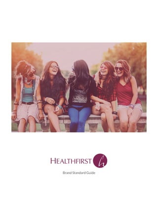
From examinations to conversations, the caring, confidential staff at Healthfirst offers young
women and men the resources and education they need to make smart choices about their health.
While we hope to target men and women, our core target is single women between the ages of 12-26.
We see men, Hmong, Hispanic and Black Wisconsinites as opportunities for future growth.
brand positioning statement
target
Brand Architecture
3. 3
Logo
Our logo is an expression of our personality and values. It is important it appears similarly across all mediums,
demonstrating our professionalism and commitment to consistency.
When possible, the logo should be used in four color, positive form with all elements included. Occasionally, a
design application will call for the negative form for readability. The black and white and grayscale forms should
be used only when color is not an option.
The “h” in the circle—the “mark”—can be used as a freestanding graphic element.
6. 6
Logo
do’s and don’ts
X 1X
To maintain our logo’s integrity, it should always be surrounded by at least the amount of open space indicated
in the diagram. (That space being equal to the entire width of the capital “H” in “Healthfirst.”) In general, avoid
crowding the logo with text or imagery to maintain its open, welcoming look.
Always the same spacing between
the word and the mark
7. 7
Logo
logo corporate use
The logo version that includes the word “Network” should be used for corporate applications only. For example,
use this logo for legal purposes. In general, this should be considered a non-client facing logo.
8. 8
Typeface
Futura Medium
The logo is built with Optima Regular (“Healthfirst”) and Futura Medium (“Network”). The thick and thin lines
in Optima—which mimic the thicks and thins created when we write by hand—balance perfectly with the more
machined, open Futura to give the impression of a very welcoming, but very professional place.
For print applications like brochures and letters, use Minion Pro for body copy. For specific applications, use
Minion Pro Regular italic, semi-bold and bold. While this is at the designer’s discretion, we strongly recommend
using Minion Pro Regular for all standard uses.
For headlines and subheads, use Lato bold or Lato black. Again, this is at the designer’s discretion, as long as a
clear hierarchy is established between headline, subhead and body copy.
Combining Lato and Minion Pro creates a contrast that is pleasing to the eye and very legible.
Optima Regular
Optima Regular
Body copy - Minon Pro
This is Minon Pro Regular being used as an example
This is Minon Pro semi-bold being used as an example
This is Minon Pro bold being used as an example
Headlines - Lato
This is Lato Light being used as an example
This is Lato Regular being used as an example
This is Lato Bold being used as an example
This is Lato Black being used as an example
9. 9
Colors
Gray
CMYK: 0, 0, 0, 75
RGB: 98, 99, 102
Hex: #71706e
PMS 683 c
CMYK: 44, 95, 42, 23
RGB: 127, 39, 84
Hex: #802754
One of the fastest ways people identify with a brand is through brand colors. Special care and attention should
be taken to ensure that our colors appear consistently and vibrantly.
Our logo is built with PMS 683 c (“Purple”) and 75% Black. Wherever the logo appears in color, use these
two colors.
10. 10
Photography
Our photography should always be aspirational, featuring uplifting lifestyle images focused on our target
demographics. Images should also reflect our culture of positivity and inclusiveness, promoting care for everyone
regardless of age, gender or race.
Barring situations where color is not possible, photography should appear in full color.
11. 11
Signage
Signage should reflect established brand standards for color and logo usage. Always ensure that the space behind
the mounted sign will not negatively affect the signs legibility.
exterior
interior
12. 12
Clothing
When placing the logo on clothing, follow all logo and brand guidelines for color, font, etc. Additionally, avoid
placing the logo on “busy” fabrics, or materials that will negatively affect legibility.
14. 14
Web fonts
Lato light
Lato regular
Lato bold
Lato black
For body copy and headlines, we recommend Lato.
A versatile sans-serif, Lato’s rounded edges are warm and welcoming, appealing to men and women alike. The
font’s structure is strong, staying legible in digital space in a variety of weights and sizes.
We recommend regular for body copy and bold for subheads and headlines.
Web colors
Primary
Hex: #802754
Secondary
Hex: #72829f
Bodycopy
Hex: #71706e
15. 15
Website graphic elements
Small concentric circles
Reversed circles
Slanted horizontal line
to separate elements
Use of tints, 80% of a color
(white will be 90%)
health services
Font treatment
Lato black for headlines
Lato regular for bodycopy
Website font
16. 16
Website Photography
Web photography should be treated the same way as print photography.
It should always be aspirational, featuring uplifting lifestyle images focused on our target demographics. Images
should also reflect our culture of positivity and inclusiveness, promoting care for everyone regardless of age,
gender or race.
Except very special applications, web photography should appear in color.
Below, you will see two styles of web photography. One has the background knocked out, featuring only people.
The other style is “situational,” and attempts to show our targets living their lives. This functions as “background”
photography.
17. 17
#802754
80% opacity
#72829f
80% opacity
#000000
90% opacity
Background photography should be screened with one of the three provided colors. Combined with the overlaid,
color photography, this provides a dynamic look to the overall layout.
Website Photography
tints
18. 18
This is a readin telling website
visitors about the relaunch and
rebranding of Healthwise … and what
that means for them. And it will be
about this many lines
of type that fit right hereyyyy.
ABOUT SERVICES WIC RESOURCES COMMUNITY CONTACT
SCHEDULE APPOINTMENT PATIENT LOGIN DONATE
Lorem ipsum dolor sit amet, consectetur adipiscing elit. Sed
viverra nisl odio, quis finibus mi fringilla ut. Curabitur faucibus
dui ut nibh consequat lobor s. Curabitur ullamcorper finibus
metus sed placerat. Integer sed ipsum vel quam tris que
tris que id non nulla. Duis dignissim sagi s lectus.
Nam hendrerit hendrerit sem, vitae por tor arcu ncidunt id.
Aliquam blandit felis non lorem venena s, id pre um neque
vulputate. E am non ex quis magna pharetra pharetra posuere
eu leo. Nulla vitae semper nibh. Sed consectetur convallis elit et
ullamcorper. Morbi quis moles e diam. Donec nisl nisi,
consectetur lacinia nisi et, facilisis bibendum leo. Aenean sodales
ligula a libero ncidunt egestas.
Lorem ipsum dolor sit amet, consectetur adipiscing elit. Sed viverra nisl odio, quis finibus mi
fringilla ut. Curabitur faucibus dui ut nibh consequat lobor s. Curabitur ullamcorper finibus metus
sed placerat. Integer sed ipsum vel quam tris que tris que id non nulla. Duis dignissim sagi s
lectus.
Nam hendrerit hendrerit sem, vitae por tor arcu ncidunt id. Aliquam blandit felis non lorem
venena s, id pre um neque vulputate. E am non ex quis magna pharetra pharetra posuere eu leo.
Nulla vitae semper nibh. Sed consectetur convallis elit et ullamcorper. Morbi quis moles e diam.
Donec nisl nisi, consectetur lacinia nisi et, facilisis bibendum leo. Aenean sodales ligula a libero
ncidunt egestas.
CALL TO ACTION HERE
(800) 246‐5743
health services
Health Services Header
what we do
Pregnancy support Educa on/Counseling Screenings & Tests Medical Exams
VIEW ALL SERVICES
Homepage graphic elements
Logo
Copy font and color
Imagery with no
backgrounds
Use of tints
Imagery in situation
Slanted horizontal line
to separate elements
Graphic elements
Imagery with no
backgrounds
The following is an example of page layout for the homepage.
19. 19
health services
reproduc ve health
preventa ve health
Lorem ipsum dolor sit amet, consectetur adipiscing elit. Sed viverra nisl odio,
quis finibus mi fringilla ut. Curabitur faucibus dui ut nibh consequat lobor s.
Curabitur ullamcorper finibus metus sed placerat. Integer sed ipsum vel quam
tris que tris que id non nulla. Duis dignissim sagi s lectus.
Nam hendrerit hendrerit sem, vitae por tor arcu ncidunt id. Aliquam blandit
felis non lorem venena s, id pre um neque vulputate. E am non ex quis magna
pharetra pharetra posuere eu leo. Nulla vitae semper nibh. Sed consectetur
convallis elit et ullamcorper. Morbi quis moles e diam. Donec nisl nisi,
consectetur lacinia nisi et, facilisis bibendum leo. Aenean sodales ligula a libero
Lorem ipsum dolor sit amet, consectetur adipiscing elit. Sed viverra nisl odio,
quis finibus mi fringilla ut. Curabitur faucibus dui ut nibh consequat lobor s.
Curabitur ullamcorper finibus metus sed placerat. Integer sed ipsum vel quam
Reproduc ve Health services header
Preventa ve Health services header
We are taking appointments at our clinics in nine Wisconsin coun es
VIEW SERVICE
VIEW LOCATIONS
SCHEDULE APPOINTMENT
SCHEDULE APPOINTMENT
Pregnancy Support
PH Service here
Screening & Tests
PH Service here
Educa on/Counseling
PH Service here
Medical Exams
ABOUT SERVICES WIC RESOURCES COMMUNITY CONTACT
SCHEDULE APPOINTMENT PATIENT LOGIN DONATE
(800) 246‐5743
Lorem ipsum dolor sit amet, consectetur adipiscing elit. Sed viverra nisl odio, quis finibus mi
fringilla ut. Curabitur faucibus dui ut nibh consequat lobor s. Curabitur ullamcorper finibus metus
sed placerat. Integer sed ipsum vel quam tris que tris que id non nulla. Duis dignissim sagi s
lectus.
Nam hendrerit hendrerit sem, vitae por tor arcu ncidunt id. Aliquam blandit felis non lorem
venena s, id pre um neque vulputate. E am non ex quis magna pharetra pharetra posuere eu leo.
Nulla vitae semper nibh. Sed consectetur convallis elit et ullamcorper. Morbi quis moles e diam.
Donec nisl nisi, consectetur lacinia nisi et, facilisis bibendum leo. Aenean sodales ligula a libero
ncidunt egestas.
header goes here
CALL TO ACTION/LINK HERE
CALL TO ACTION/LINK HERE
CALL TO ACTION/LINK HERE
Secondary page elements
Logo
Title treatments
Use of tints
Slanted horizontal line
to separate elements
The following is example of page layout for secondary pages.