
Recommended
More Related Content
What's hot
What's hot (16)
Similar to STYLE GUIDE 2015 - 2016 GRAPHIC STYLE GUIDE
Similar to STYLE GUIDE 2015 - 2016 GRAPHIC STYLE GUIDE (20)
STYLE GUIDE 2015 - 2016 GRAPHIC STYLE GUIDE
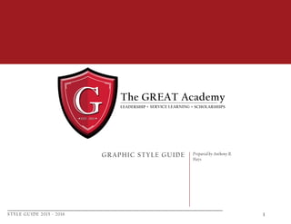
- 1. STYLE GUIDE 2015 - 2016 1 GRAPHIC STYLE GUIDE Prepared by Anthony R. Hays
- 2. STYLE GUIDE 2015 - 2016 2 Contents Introduction Sections 3 Why is this style guide important? 4 Identifying Components 5 School Shield 6 Singature Look 7 Typography 9 Questions to Consider 10 Strategic Planning
- 3. STYLE GUIDE 2015 - 2016 3 Why is this style guide important? A strong coherent visual identity is critical to The GREAT Academy (TGA) public image. The purpose of this manual is to provide guidelines that help you support a consistent and cohesive visual identity within TGA’s environment. The consistent use and thoughtful application of these guidelines on every form of official communication reinforces awareness of TGA, increases the Academy’s visibil- ity, promotes its premier academic reputation, and builds loyalty.
- 4. STYLE GUIDE 2015 - 2016 4 Identifying Componesnts TGA relies on the consistent use of a few simple components to identify itself. Here are the components: School Shield — The main identifying component is the school’s shield, The consis- tent use of the school shield (also referred to as the school logo) in the recommended colors will reinforce the identity of the University. TGA Signature — Another component is the use of The GREAT Academy Signa- ture and its consistent placement depending on the particular publication. GREAT is generally emphasized over the other elements with use of all capital letters. Typography — A third component is the use of the typeface — California FB type font. This classic and highly legible serif font is flexible enough to work across all media. The default numerals are roman, but it contains beautiful descending numer- als as well. CdeCalifornia FB The GREAT Academy
- 5. STYLE GUIDE 2015 - 2016 5 School Shield TGA Red: C: 22, M: 99, Y: 85, K: 14 Recommended colors: Use Pantone 187 C is crucial to allow the main part of the shield to read prominently. Use the one-color screen or line version for pieces that require a brighter color. The screen dot size should be 133 line or finer. Do not alter or obscure the shield in any way. Recommended sizing: Minimum size requirement is 3/4” or 4.5 picas in diameter ex- cept for Web use. The Web shield was created with less detail so it may be used smaller. Pantone 187 C Pantone Cool Gray 10C
- 6. STYLE GUIDE 2015 - 2016 6 Signature Look When used as a design signature, TGA is generally emphasized and set apart from the School Shield. This strengthens and main- tains the integrity of our identity. The GREAT Academy is gener- ally set in California FB. The exception to this would be if The GREAT Academy were used large on the same page, as the school Shield is, This would be all one size. Note: You can use the TGA signature with or without the School Shield. The signatures can be used in both horizontal and vertical configu- rations. The version you choose will depend on your layout. Other variations in size, color, font, placement, etc., can also be used to highlight TGA. Note: Our school seal is only to be used on offical documents such as: Diploma, Transcrip, and Official Letters. The GREAT Academy Offical School Seal
- 7. STYLE GUIDE 2015 - 2016 7 Typography Standardizing type family usage helps maintain a consistent look and feel across all campus media. The suggested fonts are the most authentic digital versions available. These classic type families include: California FB Arial Gill Sans MT Note: Our primary choice of font for general everyday use is Californida FB. California FB California FB Regular California FB Italic California FB Bold Arial Arial Regular Arial Narrow Arial Italic Arial Bold Arial Black Gill Sans MT Gill Sans MT Regular Gill Sans MT Italic Gill Sans MT Bold Serif Fonts San Serif Fonts PrimaryUse SecondaryUse
- 8. STYLE GUIDE 2015 - 2016 8 Typography There are several OpenType features in the fonts that give access to what was available in three different fonts, A single OT font can contain the regular faces as well as small caps in the roman forms, swash caps in the italic forms, and the inferior and superior numerals, ligatures, etc. All of the characters in an OT font can be seen in the Glyph Window, and if a character is double-clicked, it will be placed at a blinking cursor. These OT fonts can be used in the latest Adobe CS applications although their implementation across InDesign, Illustrator, and PhotoShop is not consistent. Not all of these features work with QuarkXpress 7, and none of the Open- Type features work in Microsoft Word. Fractions converts any sequence of numbers-slash-numbers into fractions. If you type the numbers 43/65, the fraction 43/65 will appear. Any fraction can be made as long as the slash separates the numerator and the denominator. Superiors/Superscript converts the numerals 0 –9 to their superior forms. In the Regular weight only, the period and comma also are changed to their superior forms. Inferiors/Subscript converts the numerals 0–9 to their inferior forms. Proportional Numbers is the default numeral style in all the fonts, which has a slightly tighter fit to appear well in text. Small Caps There are two variations of this in InDesign. Choosing Small Caps from the Character palette will convert the lowercase to small caps. The keyboard shortcut for Small Caps is Shift-Command-H. It is highly recommended that you not choose All Small Caps from the OpenType menu in the Character palette because both the upper- and lowercase letters will be converted to small caps but not necessarily the small caps that were designed to Goudy’s designs (they may, however, be the capitals reduced on the fly by an adjustable algo- rithm in InDesign. Ligatures will convert fi, fl, ff, ffi, ffl, ft, and tt to their ligated forms. Goudy’s superb serif-letter forms are im- proved when these are used all the time. Our current selection of fonts are available in OpenType.
- 9. STYLE GUIDE 2015 - 2016 9 1. For which component of The GREAT Academy is this piece being created? 2. Has the designer received project details and creative direction from the appropriate person? 3. How will the project be viewed (e.g. as a PDF, a brochure, a slide show)? 4. What is the expected shelf life of the piece (i.e., is it for reference, long-term, or short-term usage)? 5. Is it necessary to research imagery, arrange photo shoots, or obtain permission to reprint? 6. Who is the target audience (e.g. internal, external, donor, student, other)? 7. How “high-end” will the piece be? (Refer to next section on general look and feel to help determine this.) 8. Does it belong in a family of publications? 9. Which color palette is appropriate? 10. Will other logos/brands belonging to a corporate sponsor, affiliate organization, etc. appear on the piece? 11. What are the cost considerations? For example: — turn-around time/due date — limited budget — number of colors — quantities — cost of photographic imagery — royalty-free or stock — paper selection — customization/folders/die cuts Questions to Consider When embarking on a design project, it is important to consider the following:
- 10. STYLE GUIDE 2015 - 2016 10 [ [ [ [ Strategic Planning Categorizing your communications projects in terms of visibility, shelf life, audience, and other factors can help you make the most strategic use of your design resources and dollars. The descriptions at right suggest possible ways to prioritize your projects. You may rearrange the components of each to suit your needs. Determining the relationships between your school or unit’s materials help you eliminate redundancy and achieve the most impact through your communications. Using this approach will also help you determine the level of quality, time, and budget a piece requires. —Broad-based/ general information —Often has highest production values —Official documents —Prestigious audience —Ad campaigns = Long shelf life — Information about events, schools and col- leges, donor programs —Aimed at a specific target audience = Shorter shelf life —Direct mail/response materials —Ads —Temporary/high-impact materials —Based on a template = Very short-lived materials — Stationery —Training materials —Presentations —Mostly used internally = Can be ordered online 1 2 3 4