Download as PDF, PPTX


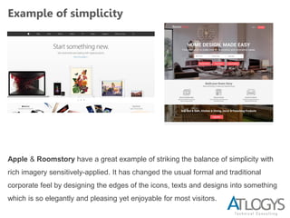
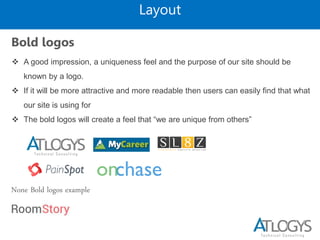
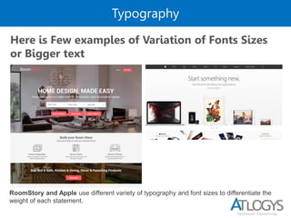
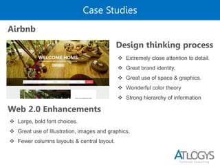

The document outlines principles of Web 2.0 design, emphasizing simplicity, centered layouts, strong typography, and effective navigation. Key recommendations include removing unnecessary elements, using bold colors and larger fonts for readability, and ensuring a clear hierarchy in navigation. Examples from sites like Apple and Roomstory illustrate the effective application of these design principles.