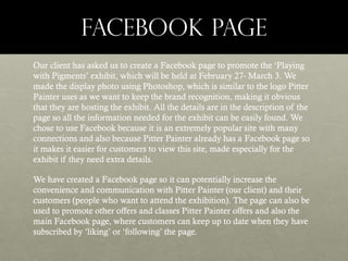
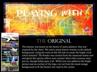
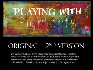
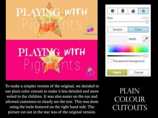
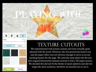
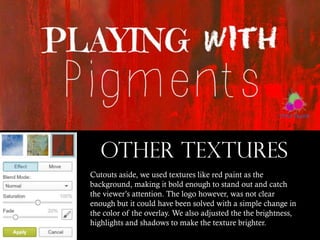
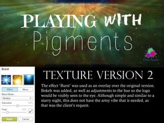
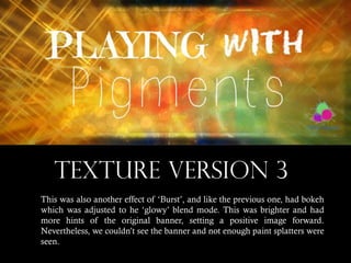
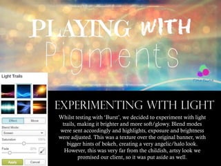
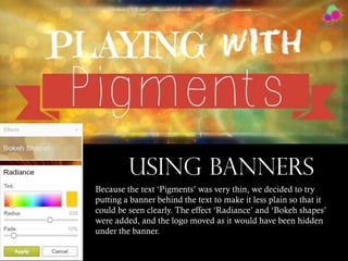
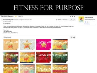
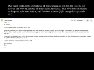
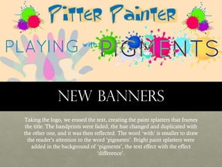
2. FACEBOOK PAGE
Our client has asked us to create a Facebook page to promote the ‘Playing
with Pigments’ exhibit, which will be held at February 27- March 3. We
made the display photo using Photoshop, which is similar to the logo Pitter
Painter uses as we want to keep the brand recognition, making it obvious
that they are hosting the exhibit. All the details are in the description of the
page so all the information needed for the exhibit can be easily found. We
chose to use Facebook because it is an extremely popular site with many
connections and also because Pitter Painter already has a Facebook page so
it makes it easier for customers to view this site, made especially for the
exhibit if they need extra details.
We have created a Facebook page so it can potentially increase the
convenience and communication with Pitter Painter (our client) and their
customers (people who want to attend the exhibition). The page can also be
used to promote other offers and classes Pitter Painter offers and also the
main Facebook page, where customers can keep up to date when they have
subscribed by ‘liking’ or ‘following’ the page.
4. INTRODUCTION
However, not only have we made a Facebook page for Pitter Painter,
we must make it eye catching and aesthetically pleasing to the
audience so the page can keep their interest. Banners are essential as
it gives readers the first impression of Pitter Painter.
The following slides include the many variations and processes the
banners and the client’s response to them.
5. ThE ORIGINAL
This banner was based on the theme of paint splatters, that was
required by the client. We used a paint texture overlay as the default
background, using the tools on the left side to create the bright vivid
colors featured. The border was created from the mueseum matte tool
and ghost like spectre effects were created when other textures were
put on, though faded quite a lot. White text was added to the bright
picture and an overlay of the logo, cut out from the usual orange
background to fit the banner was used in the corner.
6. ORIGINAL – 2nd VERSION
We overlayed a blue/green shade over the original banner to let the
white text stand out a bit more and also to make the whole effect a bit
darker. We used green textures to create this effect and the ‘difference’
in blend effect, fixed it a bit, and kept the text and the logo the same.
7. To make a simpler version of the original, we decided to
use plain color cutouts to make it less detailed and more
suited to the children. It was also easier on the eye and
allowed customers to clearly see the text. This was done
using the tools featured on the right hand side. The
picture cut out in the star was of the original version.
PLAIN
COLOUR
CUTOUTS
8. TEXTURE CUTOUTS
We experimented with texture cutouts and were actually quite
pleased with the result. However, the text proved too hard to see
and the paper effect was not obvious enough to serve as an eye
catching banner for the page. We used the same photo for the star
(the original banner) but instead covered it with a 3D paper texture.
We decided this did not fit the theme of paint splatters and did not
target the main audience, therefore we decided not to use it.
9. OTHER TEXTURES
Cutouts aside, we used textures like red paint as the
background, making it bold enough to stand out and catch
the viewer’s attention. The logo however, was not clear
enough but it could have been solved with a simple change in
the color of the overlay. We also adjusted the the brightness,
highlights and shadows to make the texture brighter.
10. TEXTURE VERSION 2
The effect ‘Burst’ was used as an overlay over the original version.
Bokeh was added, as well as adjustments to the hue so the logo
would be visibly seen to the eye. Although simple and similar to a
starry night, this does not have the artsy vibe that is needed, as
that was the client’s request.
11. TEXTURE VERSION 3
This was also another effect of ‘Burst’, and like the previous one, had bokeh
which was adjusted to he ‘glowy’ blend mode. This was brighter and had
more hints of the original banner, setting a positive image forward.
Nevertheless, we couldn’t see the banner and not enough paint splatters were
seen.
12. EXPERIMENTING WITH LIGHT
Whilst testing with ‘Burst’, we decided to experiment with light
trails, making it brighter and more soft/glowy. Blend modes
were sent accordingly and highlights, exposure and brightness
were adjusted. This was a texture over the original banner, with
bigger hints of bokeh, creating a very angelic/halo look.
However, this was very far from the childish, artsy look we
promised our client, so it was put aside as well.
13. USING BANNERS
Because the text ‘Pigments’ was very thin, we decided to try
putting a banner behind the text to make it less plain so that it
could be seen clearly. The effect ‘Radiance’ and ‘Bokeh shapes’
were added, and the logo moved as it would have been hidden
under the banner.
15. Our client explains the importance of brand image, so we decided to copy the
style of the website, instead of introducing new ideas. This would mean sticking
to the paint splattered theme, and the color scheme (light orange backgrounds,
etc.)
16. New banners
Taking the logo, we erased the text, creating the paint splatters that frames
the title. The handprints were faded, the hue changed and duplicated with
the other one, and it was then reflected. The word ‘with’ is smaller to draw
the reader’s attention to the word ‘pigments’. Bright paint splatters were
added in the background of ‘pigments’, the text effect with the effect
‘difference’.
17. FINAL IDEA
We decided to make it more simple and use the company’s official font –
Toontime. We also erased the border around the text to make it look more
professional. This had a bolder look and also features the color scheme (light
blue for text and light orange for the background). The client was pleased with
this banner and gave us permission to upload this onto the Facebook page.