Download to read offline

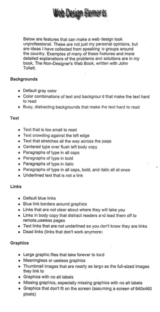
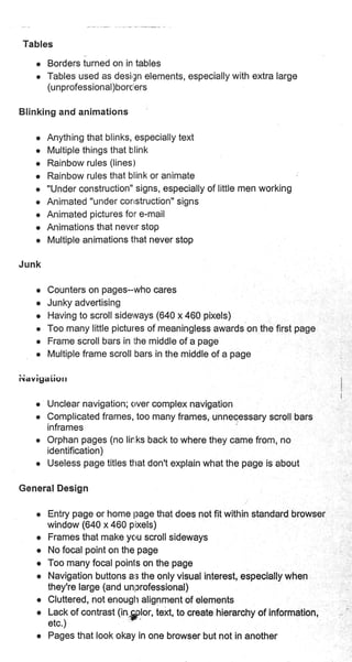
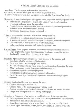
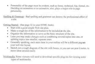

The document discusses key elements and concepts for effective web site design, including: - The importance of the home page grabbing attention and conveying the site's purpose. - Using alignment, colors, size/depth, proximity, and contrast to guide the eye and prioritize information. - Ensuring consistency across site pages in elements, style, and personality. - Addressing spelling, grammar, and planning before getting started on design and development. - Considering multimedia's need for specific plug-ins.


