1. The ‘peace’ sign which was originally an
idea for the front cover of the CD. After
anising and discussing what effective
about this and what not me and my
partner came with a overall decision
that this sign would be very effective if
we used it for the logo sign.
The font on this CD cover idea really
caught our eye and thought we
should use some parts of the front
into our final CD cover design.
This back CD cover wasn’t
really successful nothing
about it really stood out to us
so therefore we decided to
take no ideas from this.
The background is
black and white
making the artist
name and album
name stand out
more. This idea really
stood out to us and
thought we should
apply this when it
come to creating our
final idea.
2. One of the things which we liked
about this idea was the image of
the model walk on the road but
then we thought if the artist isn't
facing the audience they wouldn’t
really recognise what the artist is
so therefore wouldn’t be attracted
to the album.
This back DC cover design really
Grabbed our attention firstly, the image
Of the man walking but fading away as he
does Seemed very interesting to us. We took
the idea of the man fading away and added it
to our main CD cover design idea. Also, this
reflected the album name ‘Gone’ by fading
the image away conveys the idea of him
being gone. One of the things we thought
that wouldn’t really be effective if we added
it the the CD cover was the long camera shot
so we changed it into a medium close-up
shot.
The front of this CD
seemed to feminine for
our DC cover so therefore
didn’t use this type of
front.
3. This CD idea was very successful.
Firstly, the camera shot was
perfect, this shot was something
that me and my partner wanted to
include in our final CD cover. This
shot allows the audience to see
who the artist is which would
attack them to view the CD album
and buy it. The font was also
effective because it stand out
making it clear to the who the
artist is.
This back CD cover
idea gave us ideas of
what we could add
our advertisement
design. We liked the
whole idea of the long
shot of the artist
against the wall.
4. This CD cover design was
unsuccessful none of the
designs that was drawn
caught our eye so therefore
thought that we shouldn’t
add nothing in our final
outcome of the CD design.
5. The front of this CD cover
design was interesting to add to
our final CD cover because its in
bold and in capitals making it
eye catching.
The image of the artist
walking on the road
seemed interesting to
add it to our
advertisement.
6. This CD design was very colourful and
didn’t go with the gender we planed
on doing. We also thought by not
adding the main artist the audience
wouldn’t recognize what album it is
straight away.
The back CD cover also didn’t include any
images of the main artist so therefore this also
couldn't be used when it came to create our
final CD cover design.
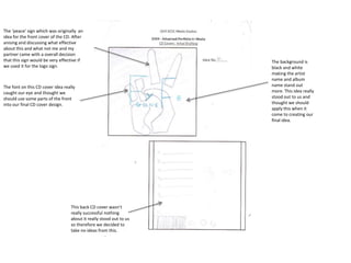
7. The bird reflects the idea
of something being free.
We liked the idea of
having the bird as being
part of the back CD cover
as it signifies that then
album is peaceful and can
make people feel ‘free’
from all their worries.
None of the design here
attacked our attention so
therefore chose not to
add anything in our final
CD design with this idea.