
Recommended
More Related Content
What's hot
What's hot (20)
Similar to Horror Poster plan
Similar to Horror Poster plan (20)
Recently uploaded
Recently uploaded (20)
Horror Poster plan
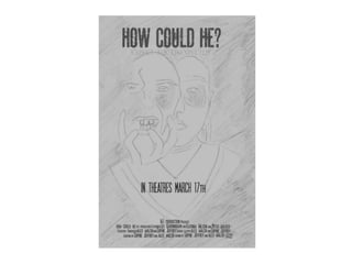
- 2. Title I decided to place the title of the film at the top of the page which is conventional for movie posters. It was important that I made sure that the title stood out of on the page as it is the most important aspect on the poster. To do this I used a bold font called Pahuenga Cass Font which I found on the website 1001 fonts. This font isn’t just bold it also helps indicate the film genre (horror) this is because the text has been slightly distorted to give the impression that it has been smudged and that something has been splattered on it, for example blood. Emphasising the horror the film in tales. the To make the font stand out even more I shall make it red, this colour is associated with blood and horror, therefore will successfully help highlight the horror genre of the film.
- 3. Tag line Underneath the title of the film is the tag line “Expected the unexpected” the purpose of this is to give the audience more UN answered questions. It emphasis that the film is full of plot twists and unexpected moments of horror which should increase the fear factor of the film as the viewers will be on edge the whole time as they are unsure of what will happen next. This text is slightly smaller than the title as it is less significant, therefore I didn’t use a font type which stands out as much as the title this font type is called Dark & Black Font which is found on the website 1001 fonts. I have decided to make it a murky grey colour as it will ensure it doesn’t stand out as much as the title.
- 4. Release Date Here is the release date of the film, it is conventional for all movie posters to contain this content as the main focus of this poster is to encourage people to go and watch the film, they require the release date to do this. This is important information so I will make it black to stand out. I used a font from 1001 fonts again called SF Movie Poster Font Family. I placed it near the middle of the page to help make it visible.
- 5. Credit block Here is the credit block which is conventional and essential to have on movie posters as they allow the audience to acknowledge what companies helped create the film and what actors play a part in it. The font will be white to ensure that it isn’t hidden in the black back ground and the font type will be SF Movie Poster Font Family from 1001 fonts.
- 6. Right Image The face to the right of the page only has its right side revealed; this will imply to the audience that she is hiding something and that she is with holding a secret. The reason I’m doing this is to let the audience begin to raise questions about the film making them more likely to go and pay to see it. The facial expression is dull and lifeless expressing a lack of emotion and empathy. By using makeup they will have a black eye emphasising that there have been moments of horror and that this character has been hurt by someone. Here neck will have lacerations around them implying that someone may of attempted to strangle her or had something around her neck, these injuries help to emphasis the genre of the film (horror.
- 7. Left Image The face on the left hand side is of the same person; however she is expressing a different emotion. She portrays that she is distressed and in pain. This image shows her screaming out and with her hands pulling on her face like she is fustrateted. The way this image has been distorted makes it look as if it is coming out from her face, implying that she has multiple personalities and a darker side to her. This helps to reflect the genre of the film horror. The left hand side of this face blurs out in to the black background highlighting that it is a darker side of the character, one that she may not show often. The left hand side is her true self whilst the right hand side is how she presents herself. This image will have the also have a black eye.