1. 1. In what ways does your media product use, develop or
challenge forms and conventions of real media products?
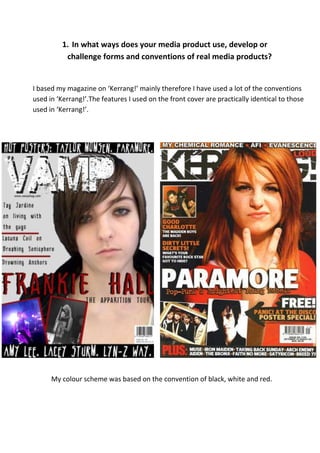
I based my magazine on ‘Kerrang!’ mainly therefore I have used a lot of the conventions
used in ‘Kerrang!’.The features I used on the front cover are practically identical to those
used in ‘Kerrang!’.
My colour scheme was based on the convention of black, white and red.
2. The word ‘Kerrang’ sounds like the kind of noise a guitar would make and it sums
up the genre of music in one word.
The font used fits with the rock genre because it portrays the music as harsh, loud
and ‘un-perfect’.
The white background makes the black text stand out. It’s also in bold and
capitalised.
The photo covers the title because it is a well-known magazine and it is noticeable
to the audience.
I chose to use the word ‘Vamp’ because it means a ‘seductive woman’ but also an
‘improvised accompaniment’ in music. It fit with the fact my music magazine was
mainly focused on female artists. My initial idea for the title was ‘Live It’ with the
idea that the audience I was targeting were the type to really live for music. After
some thought I changed it because I felt that ‘Live It’ sounded too much like a
lifestyle magazine.
I used conventions when choosing a font because it fits with the genre of music
because it is distressed.
I used a white font against a grey background but I used a black layer underneath it
to make it stand out more.
Because my magazine is new and unknown I made sure the title was still visible
above the photo.
3. High contrast is used for the ‘Kerrang!’ photo which makes her stand out.
I challenged the conventions because my photo is more subtle and natural
but I don’t think it stands out as well as a front cover image.
Like the photo of Hayley Williams I didn’t use the ‘male gaze’. I wanted my
artist to look edgy and rough to fit with the rock genre. ‘Kerrang!’ has
used a simple t-shirt for Hayley because it shows that she isn’t trying too
hard and shows a ‘tomboyish’ side to her. I also used a plain t-shirt but I
paired it with a leather jacket too. Make up is minimal on both people
too.
Both pictures are placed slightly to the left on the magazine; this allows
more space for cover lines and other smaller pictures. Both artists are
looking straight at the camera which grabs your attention. A straight angle
mid/close shot is used to give enough detail of the artist.
4. I have used the convention of using the same font for the two banners.
This links the top and the bottom of the page together so the whole front
cover looks right as one piece. ‘Kerrang!’ and ‘Vamp’ both use just the
name of the band or artist separated by dots.
I challenged conventions with the font I used for the main cover line
because is very different to the one ‘Kerrang!’ used, it isn’t as bold but I
think it fits with the genre.
I have used the convention of having a list of straplines on the left side of
the front cover though ‘Kerrang!’ have used bolder titles whereas I have
used lines to separate the text.
5. I challenged the conventions for the contents as I used a black and white theme;
though I don’t think this worked particularly well because nothing stands out that
well. ‘Kerrang!’ uses the rule of three colours, black and white and yellow for titles
mainly.
6. I used the same font for each title but I used a drop shadow and boxes behind the
smaller titles to make them stand out more. I think the ‘Contents’ title stands out
because its white on black but I probably should have used a different font.
In terms of font and size the lettering ‘Kerrang!’ have used is similar to what I used
though they have used more colour on theirs.
7. I think the big picture on my contents works well for my magazine and I think
that the fact it’s a live concert photo fits well with my genre though compared
to the photos used in ‘Kerrang!’ it is quite different.
‘Kerrang!’ uses more photos than I did and they used colour, I think my smaller
photos would look better in colour.
8. I developed the conventions on the contents because I used two columns and
I used white on black instead of the conventional black on white.
I also capitalised the bands and artists names to make them stand out to the
audience.
9. I used the black, red and white theme for my double page spread. ‘Kerrang!’ have used
pink, white and black, this gives a more feminine look to the page.
10. ‘Kerrang!’ used two different fonts for the article title but used one font in two
different sizes, I developed this idea because I used three different fonts but two
that were similar to each other.
Like ‘Kerrang!’ I used mainly two colours that were part of the theme and that fit
with the rest of the page.
I used the convention of using one colour for the question and another colour
for the answer, I also used the convention of a pull quote.
11. The photo I used is a straight angle mid shot, like in ‘Kerrang!’ and she is looking
straight at the camera.
The picture of Taylor Momsen in ‘Kerrang!’ seems to have used more shadow for
the edgy look; however I did use similar costume and make up.