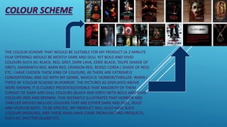
1. COLOUR SCHEME
THE COLOUR SCHEME THAT WOULD BE SUITABLE FOR MY PRODUCT (A 2 MINUTE
FILM OPENING) WOULD BE MOSTLY DARK AND DULL YET BOLD AND VIVID
COLOURS SUCH AS: BLACK, RED, GREY, DARK LAVA, EERIE BLACK, TAUPE (SHADE OF
GREY), AMARANTH RED, BARN RED, CRIMSON RED, ROSSO CORSA ( SHADE OF RED)
ETC. I HAVE CHOSEN THESE KIND OF COLOURS, AS THERE ARE EXTREMELY
CONVENTIONAL AND GO WITH MY GENRE, WHICH IS ‘HORROR/THRILLER. WHEN I
TYPED IN ‘COLOUR SCHEME IN HORROR’, THE PICTURES AS DISPLAYED ABOVE
WERE SHOWN, IT IS CLEARLY PRESENTED/VISIBLE THAT MAJORITY OF THEM
CONSIST OF DARK AND DULL COLOURS (BLACK AND GREY) WITH BOLD AND VIVID
COLOURS (RED AND BROWN). THIS INSTANTLY ILLUSTRATES THAT HORROR AND
THRILLER MOVIES INCLUDE COLOURS THAT ARE EITHER DARK AND DULL, BOLD
AND VIVID OR BOTH. TO BE SPECIFIC, MY PRODUCT WILL ALSO HAVE SUCH
COLOURS INVOLVED, AND THESE IDEAS HAVE COME FROM EXISTING PRODUCTS,
SUCH AS: SHUTTER ISLAND ETC.
2. The colours used in the poster are extremely
conventional, dominated by black, white and red.
There is also a hint of orange from the flame, that has
reference to the film’s storyline. The flame very
cleverly lights up the DiCaprio’s character’s face,
obviously revealing that he is the main character. The
cinematic shot of the island below gives a teaser of
the film stylistically, with the rain and crashing waves
adding to the effect of a psychological thriller/horror.
This particular poster has greatly inspired me, in terms
of giving me ideas on what shades of colours I should
use and include in my film opening. As this would
come in the ‘thriller’ genre, it clearly shows that dark
and dusky colours are used and therefore helps me in
designing my product. Whether it will consist of bold
and vivid colours like red, orange or brown etc., or
dark and dull colours like black, ash grey, misty dark
blue etc.
A Similar existing product that matches my genre of
horror/thriller