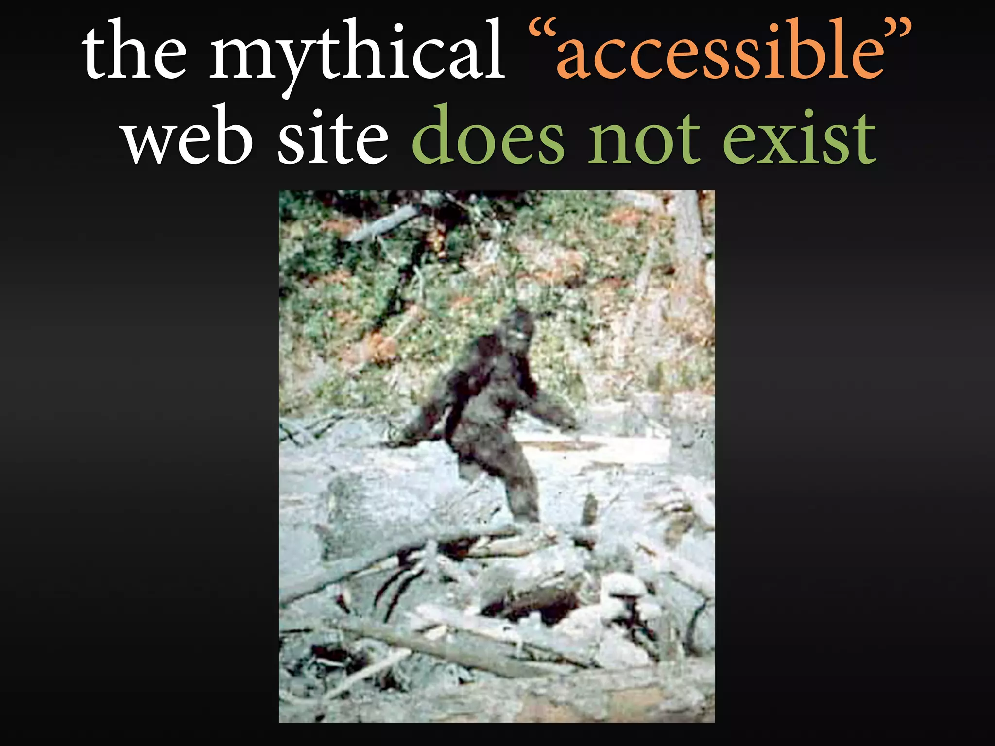
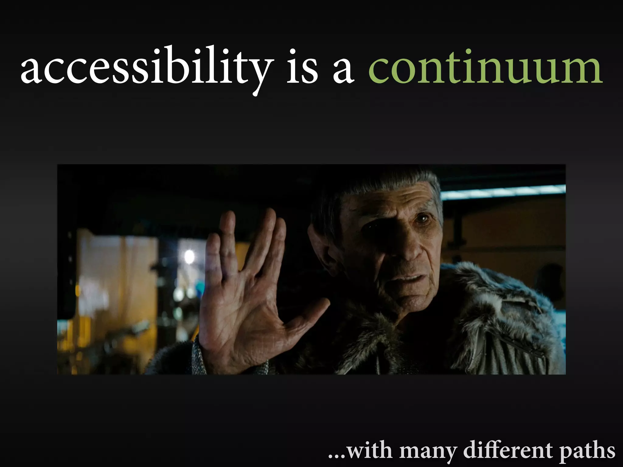
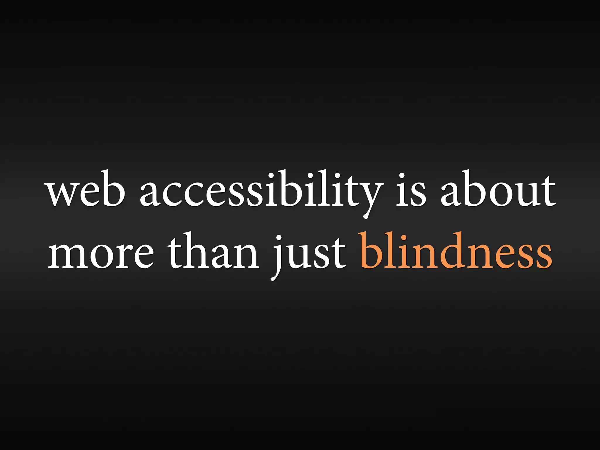
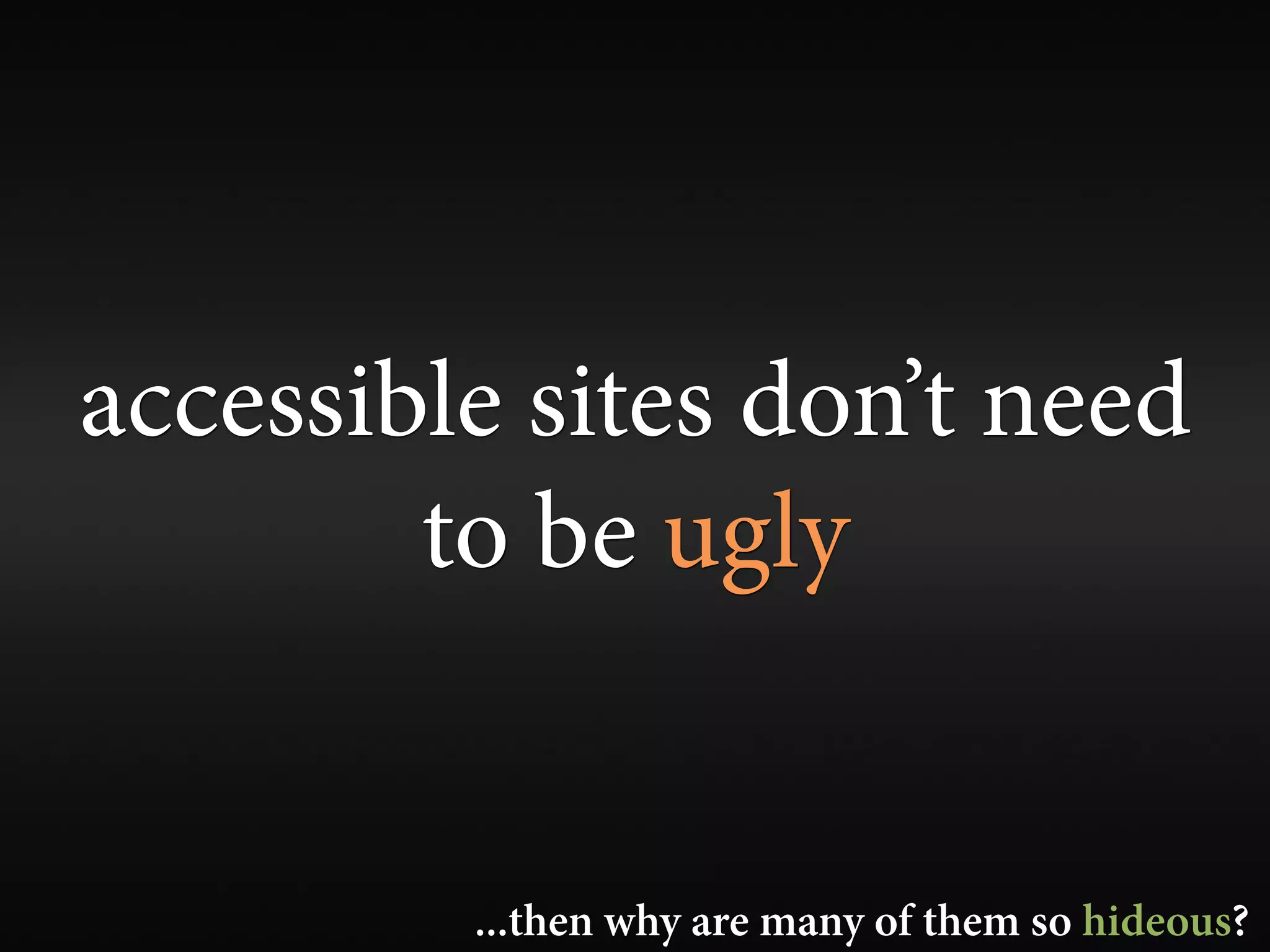
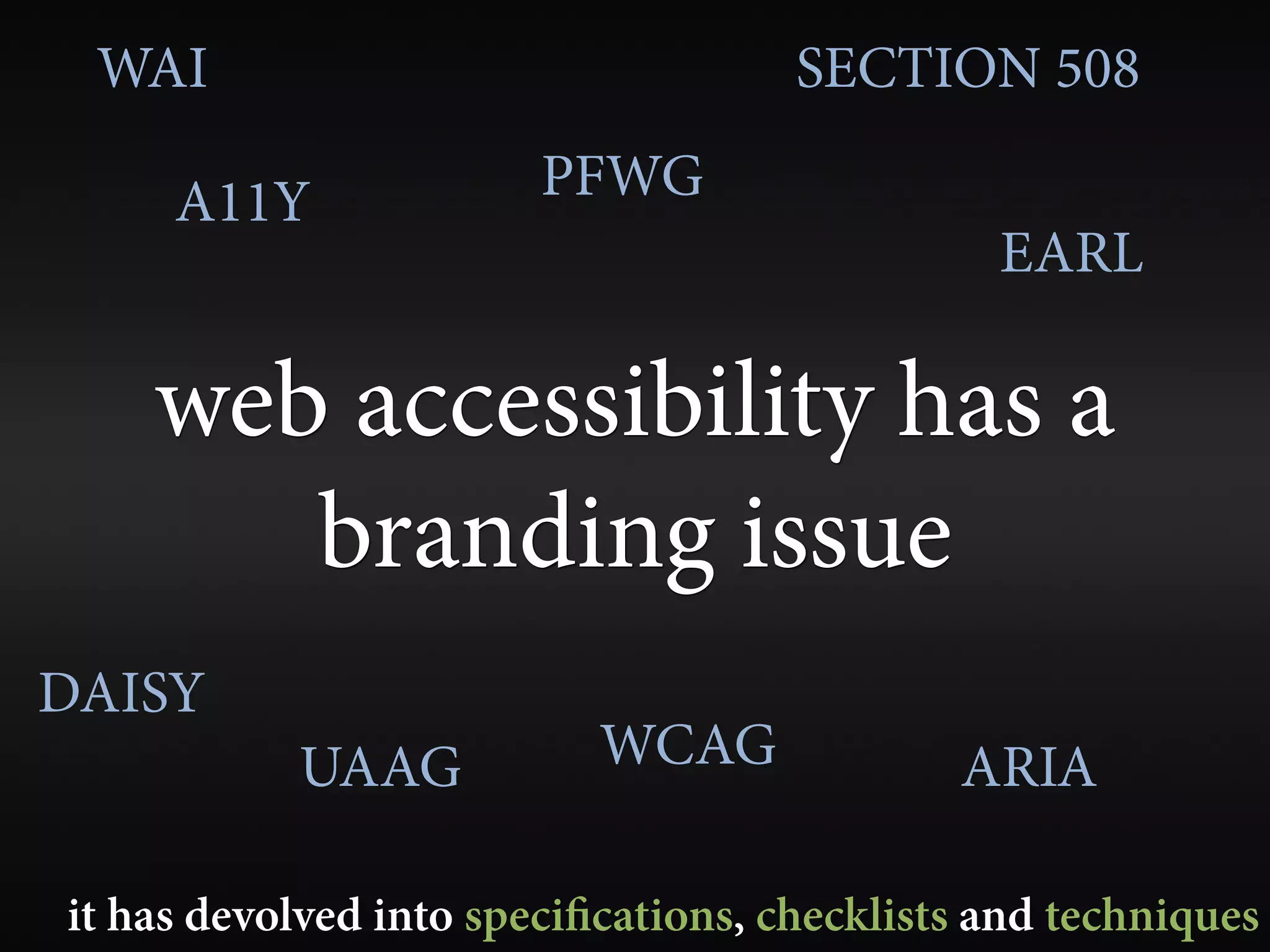
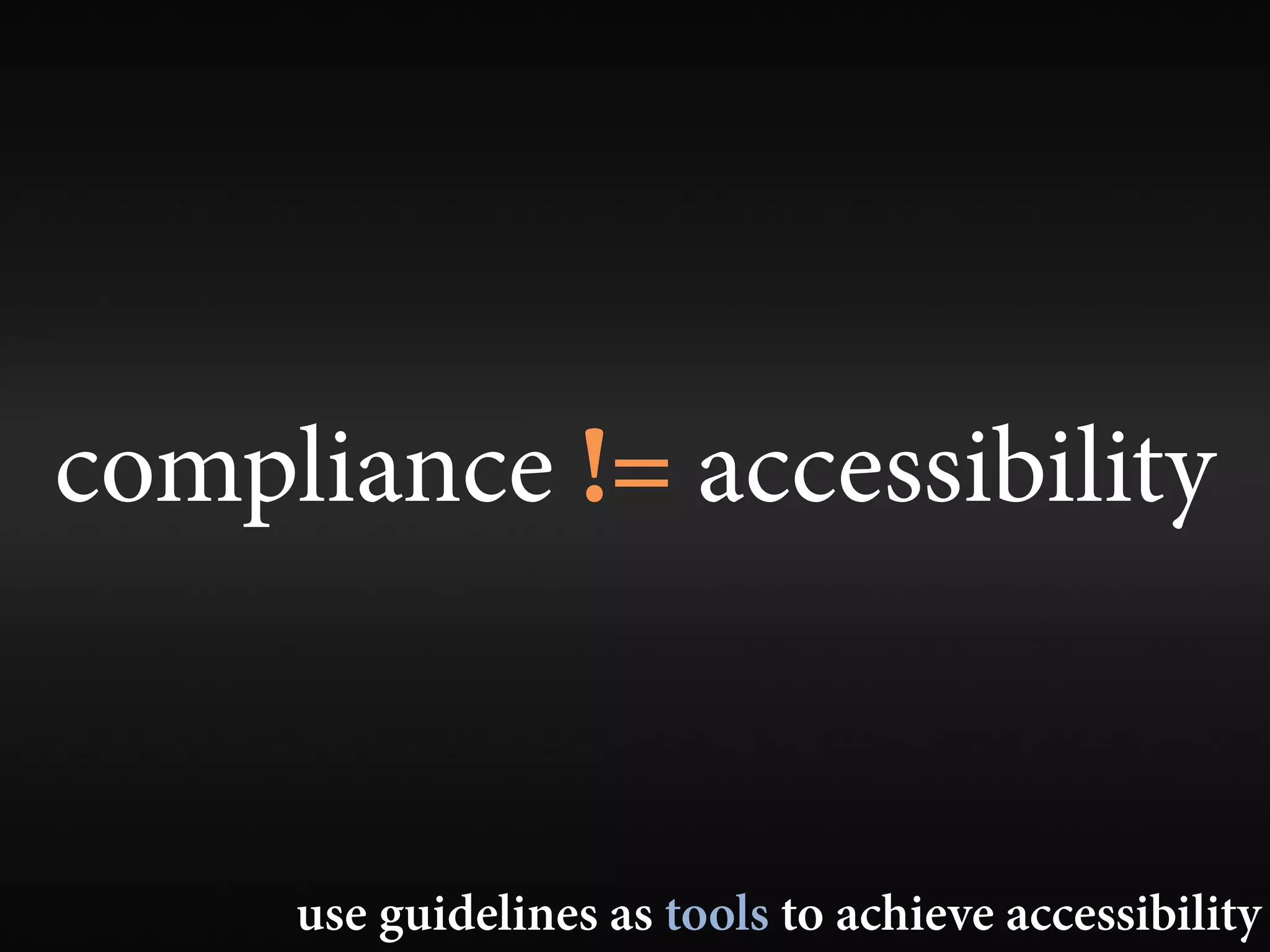
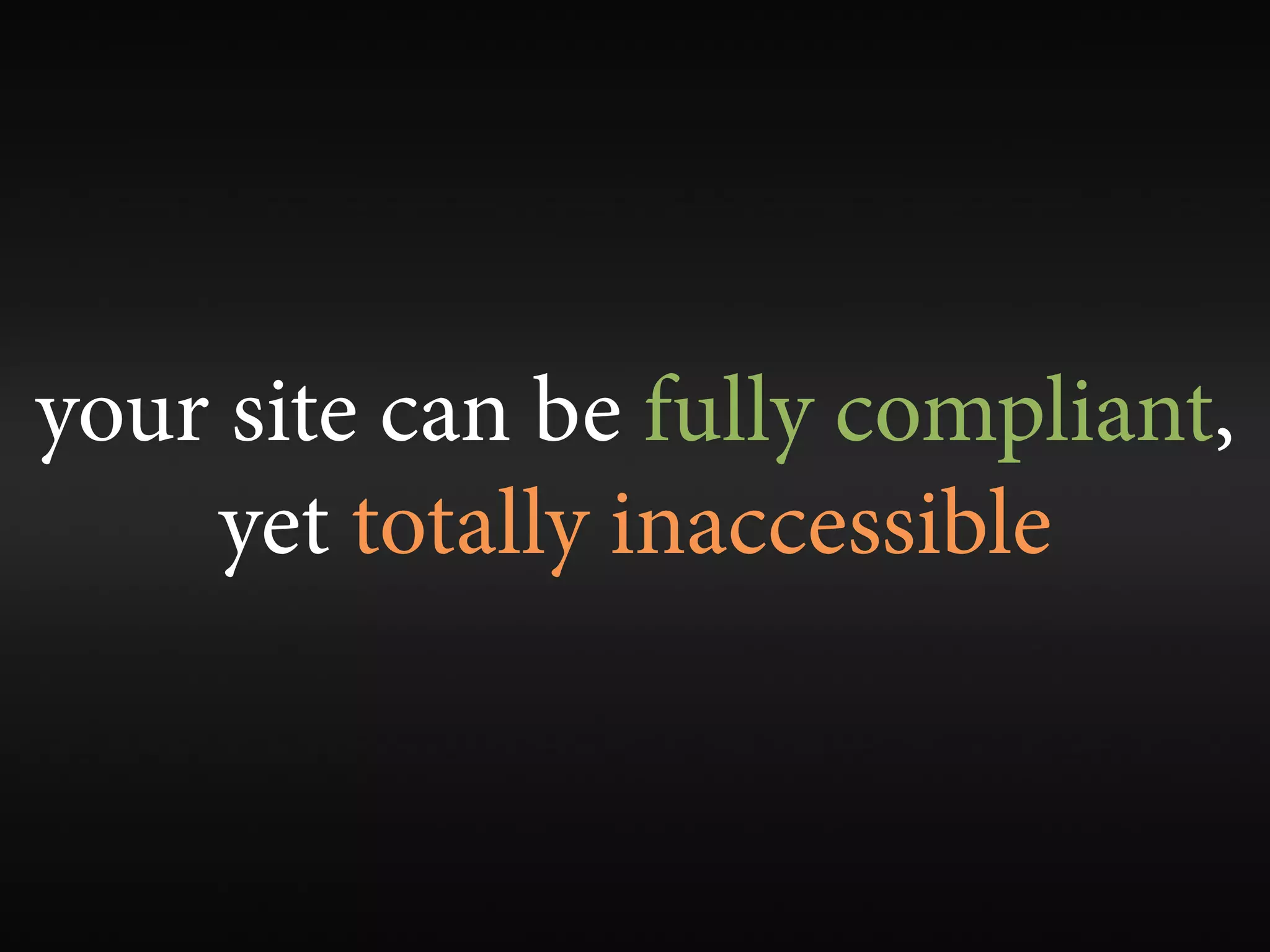
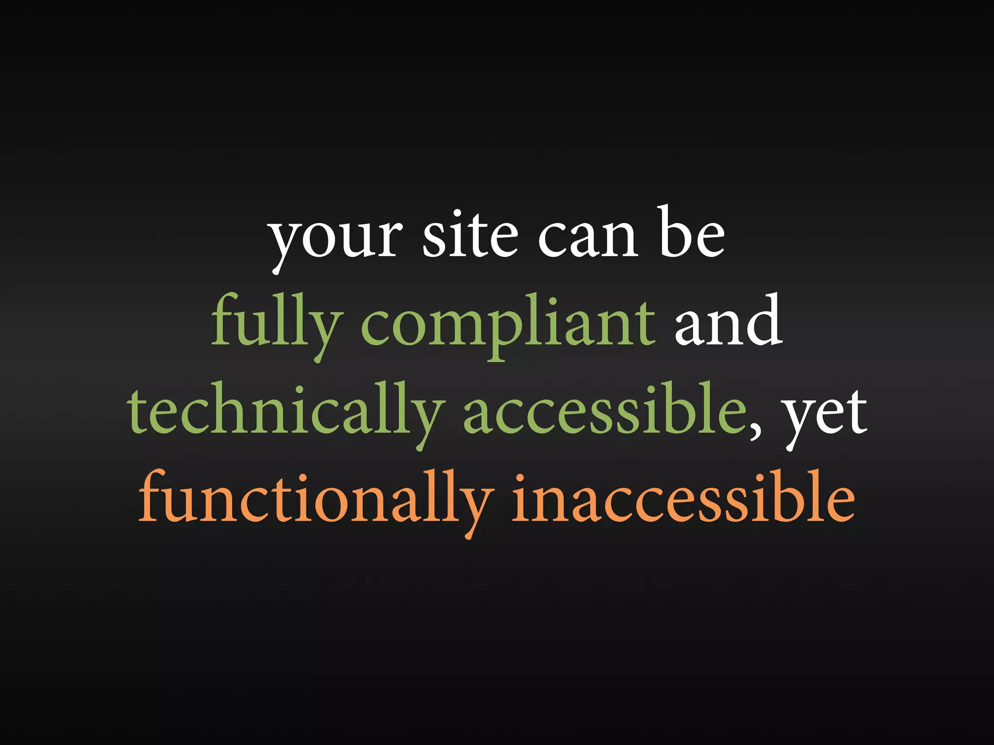
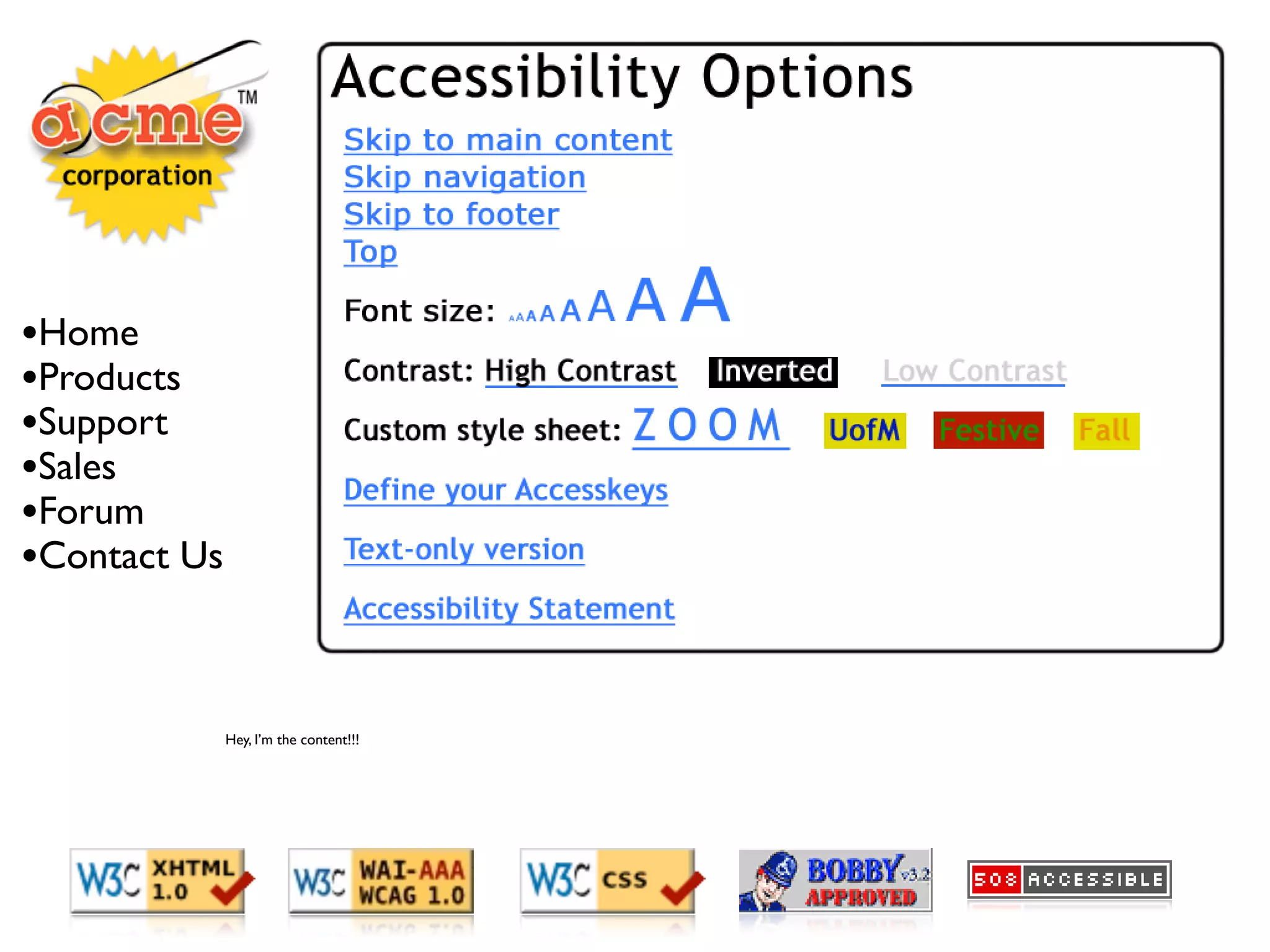
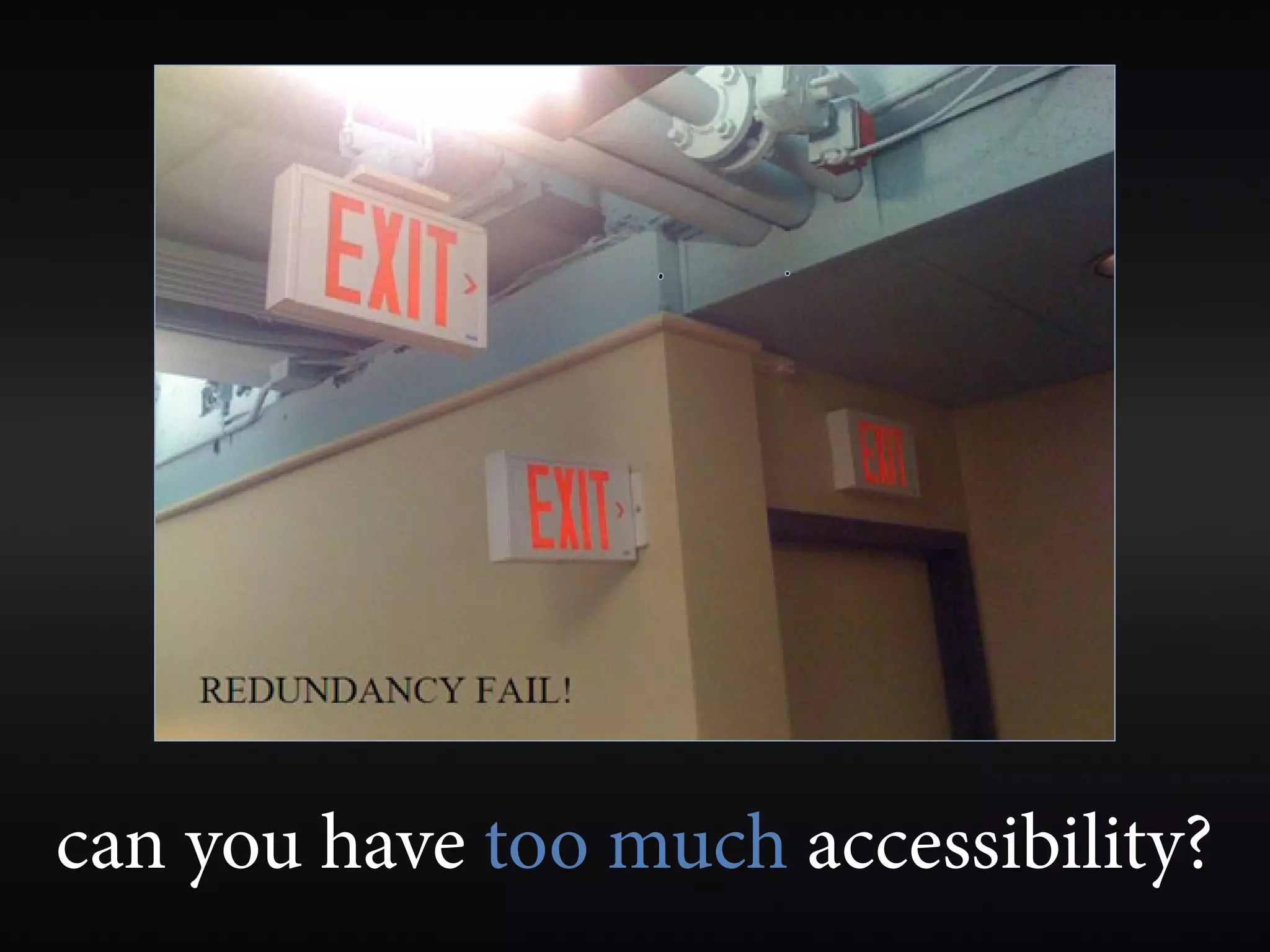
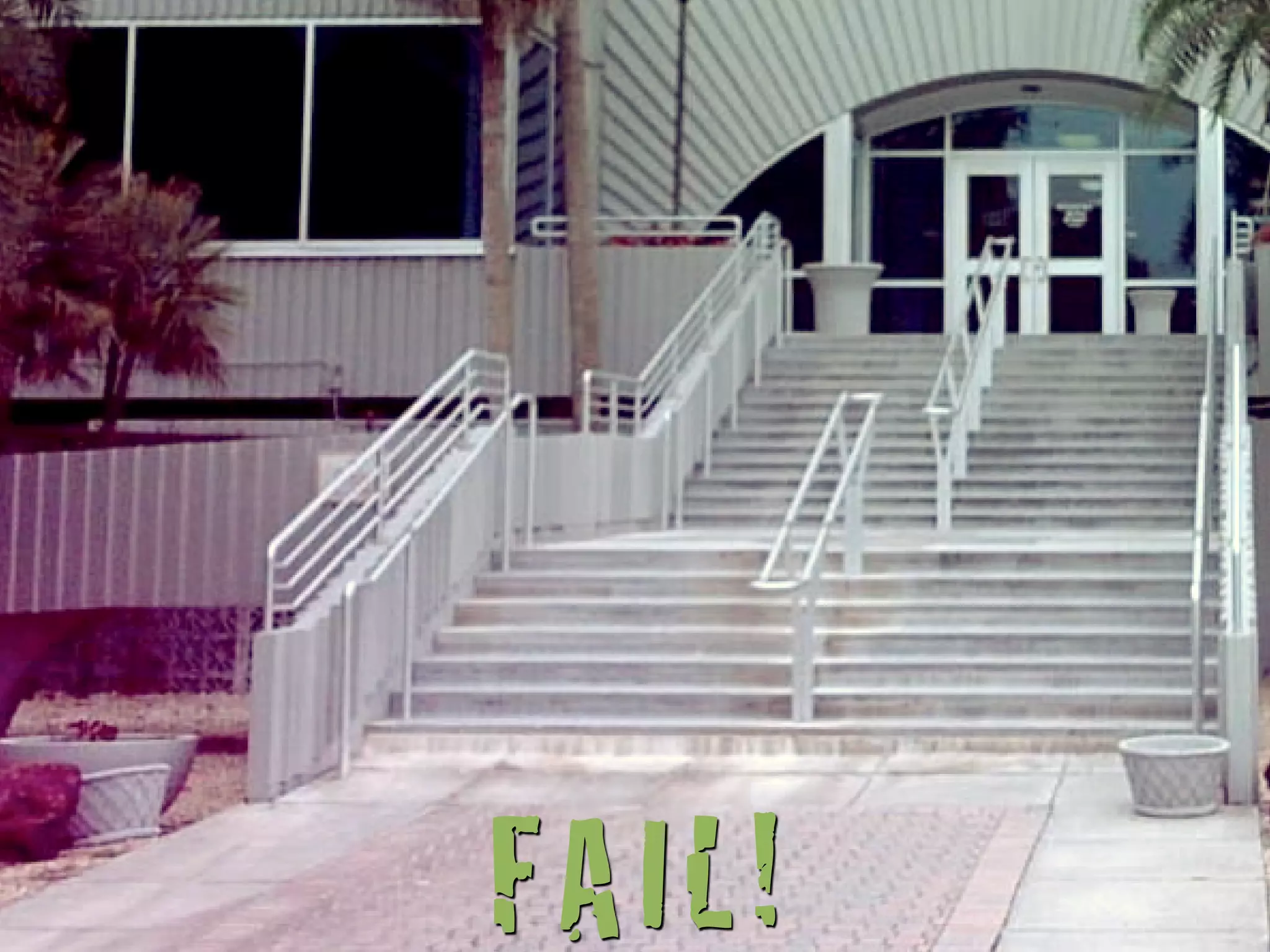
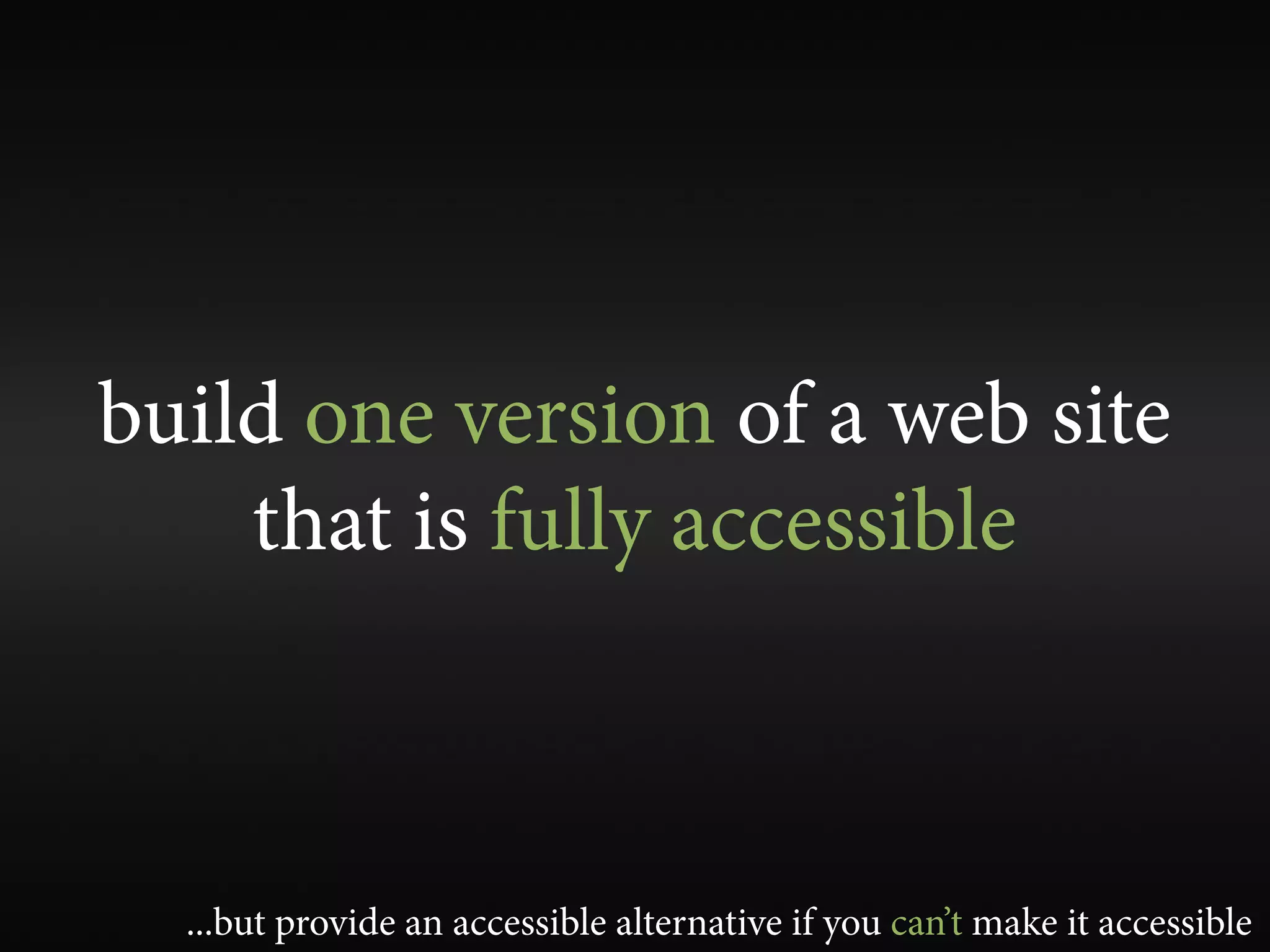
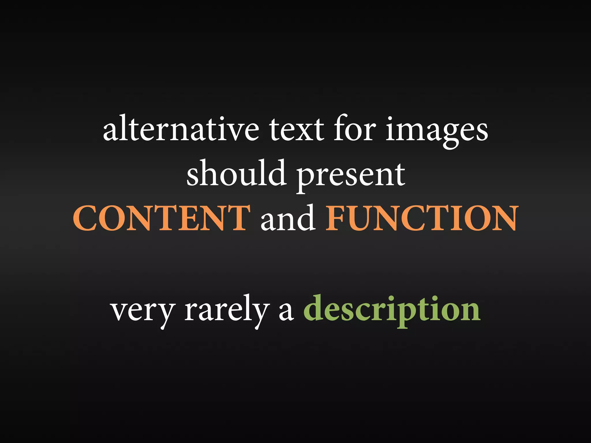
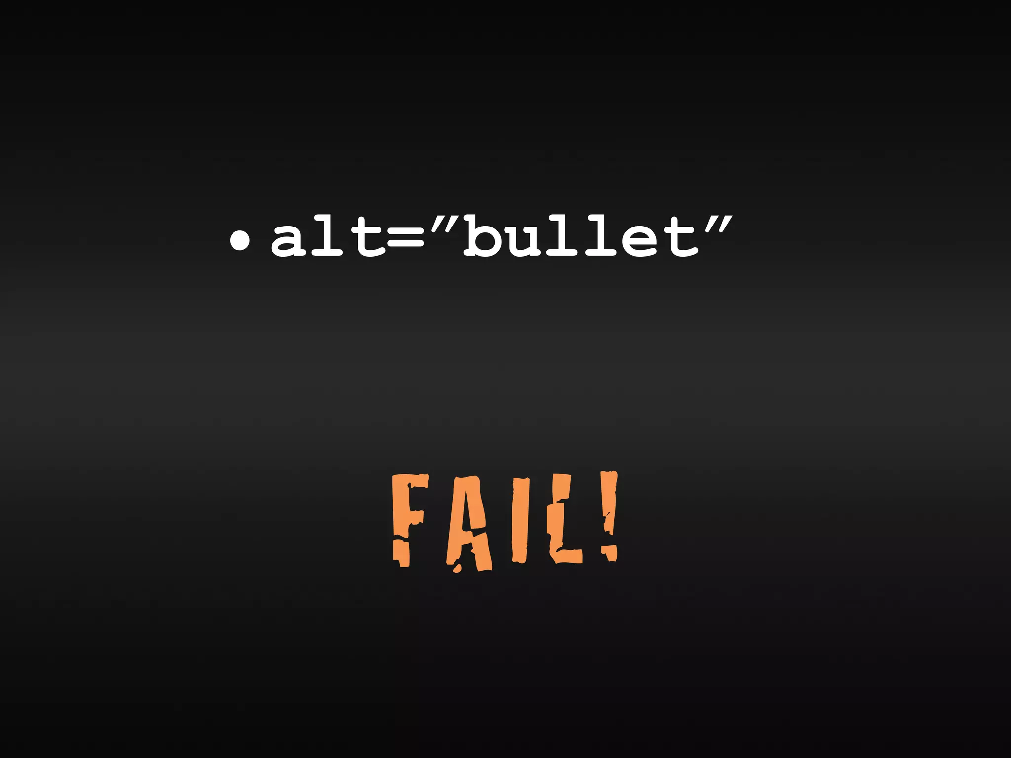
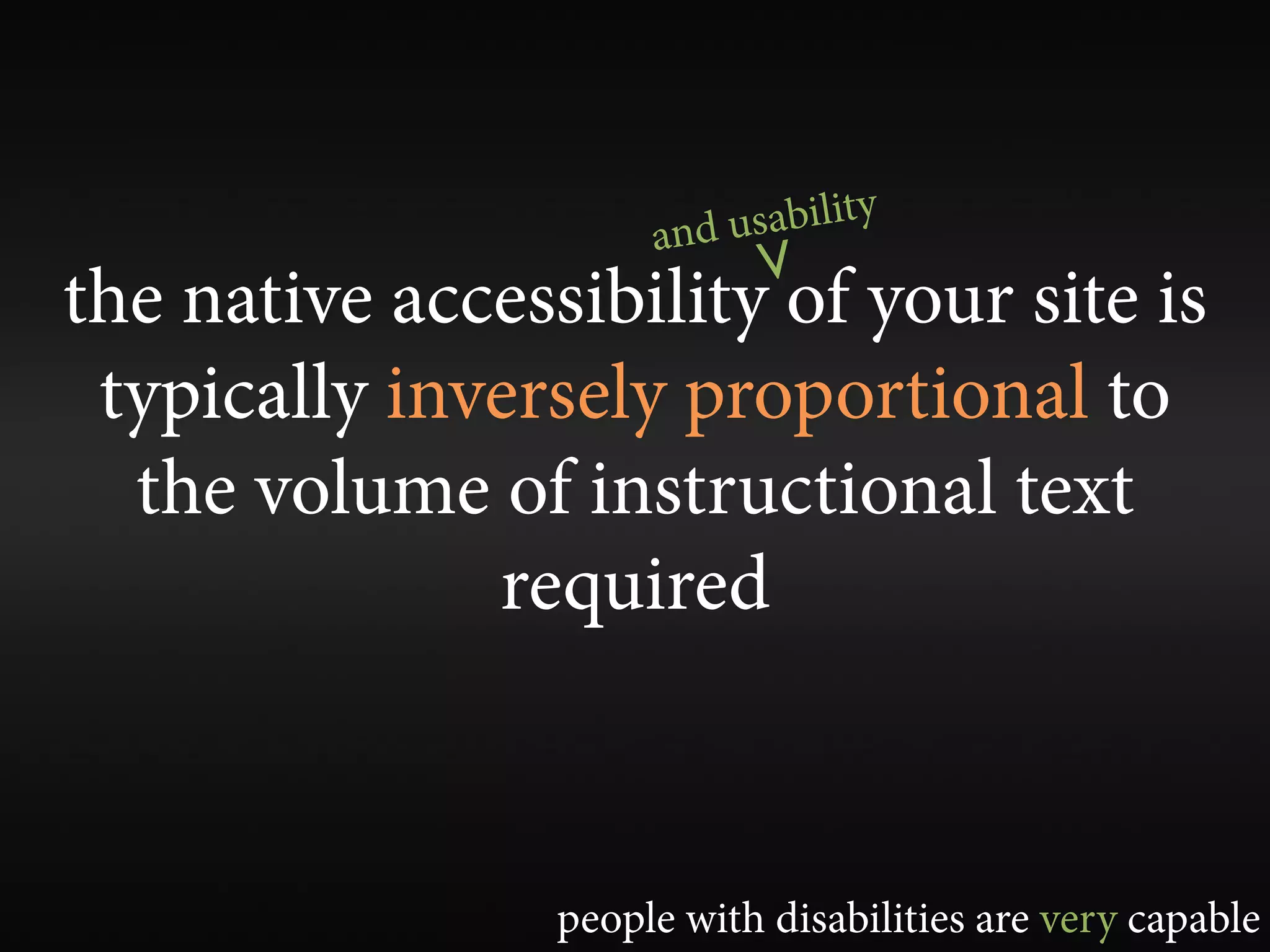
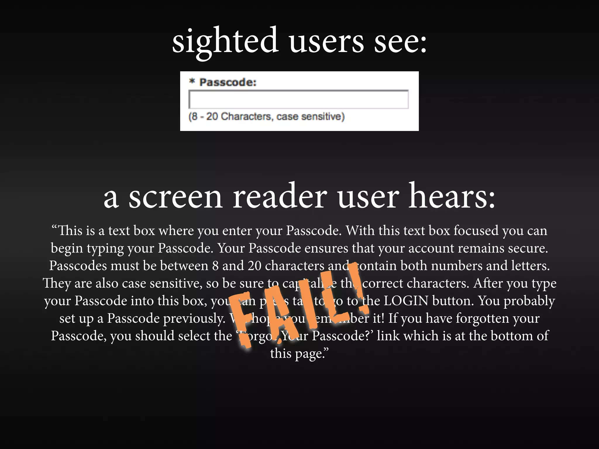
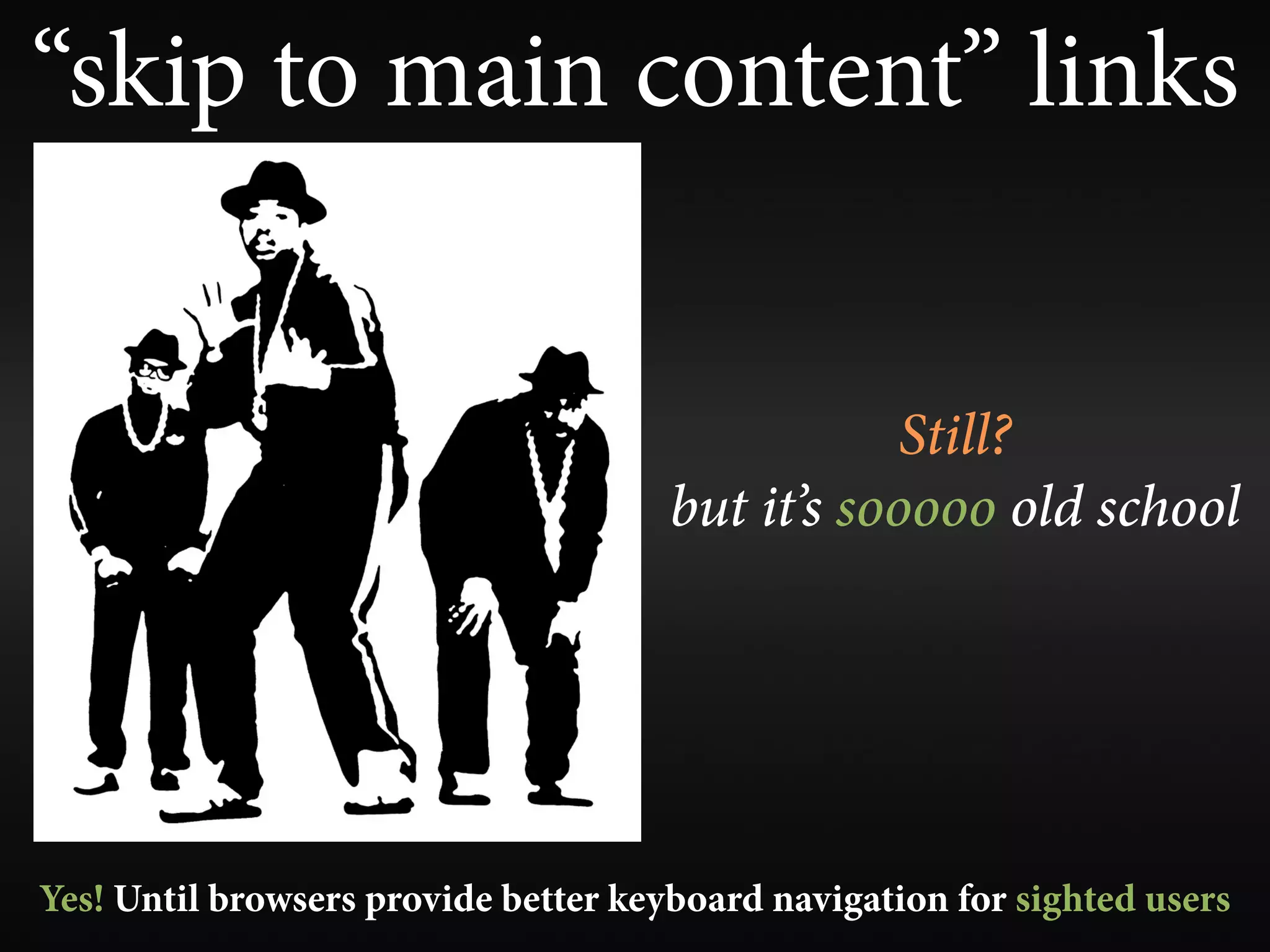
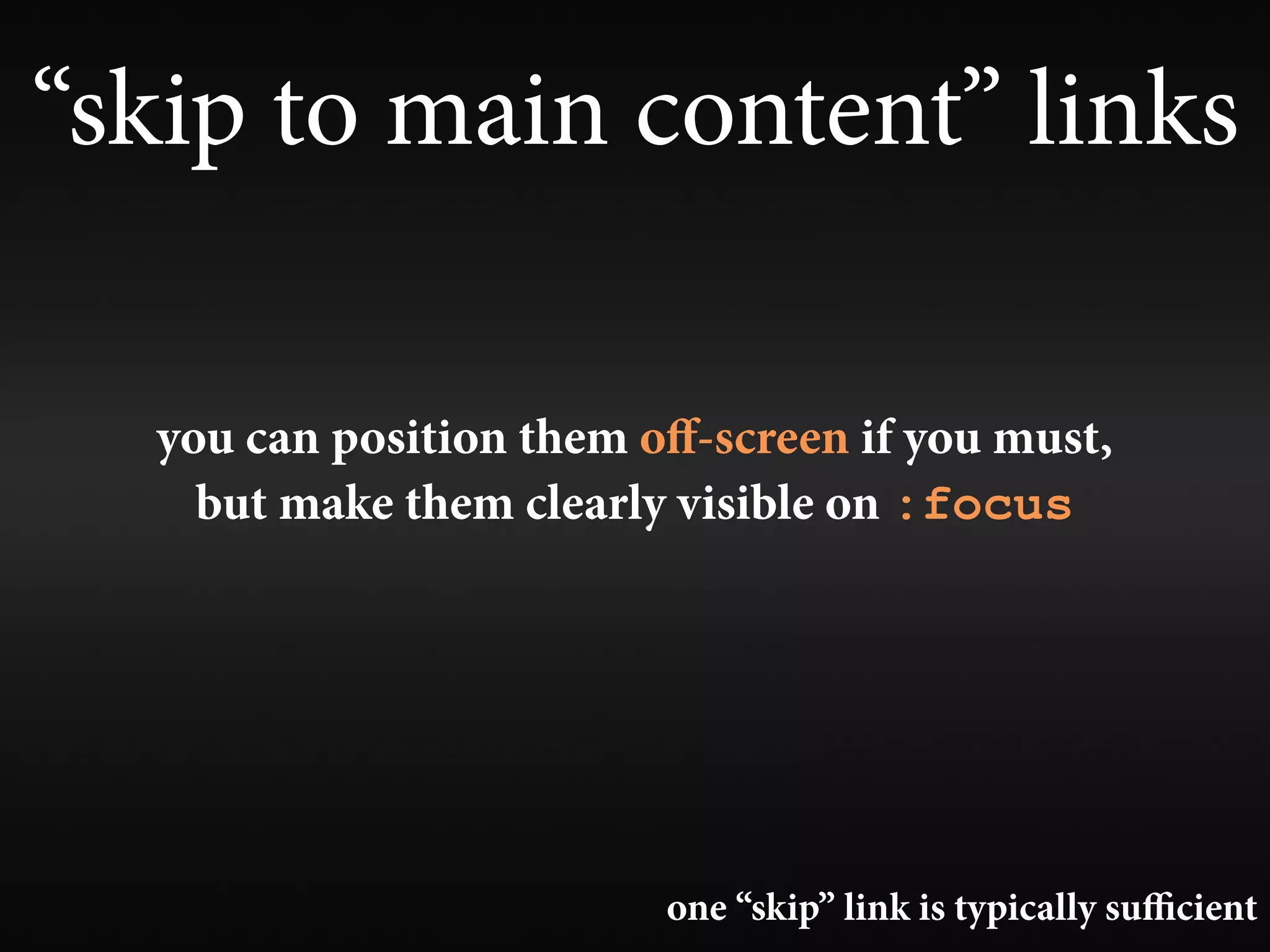
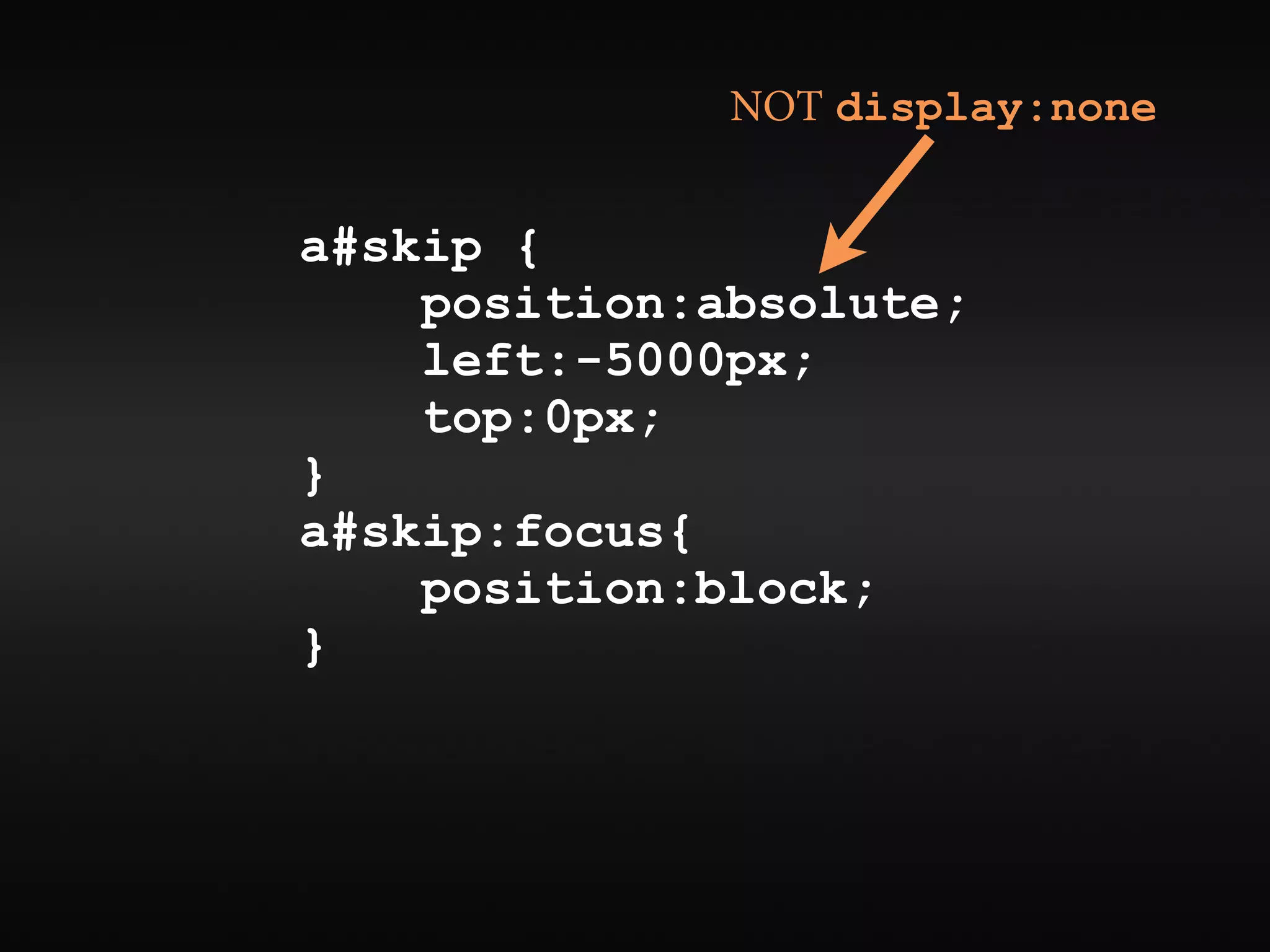
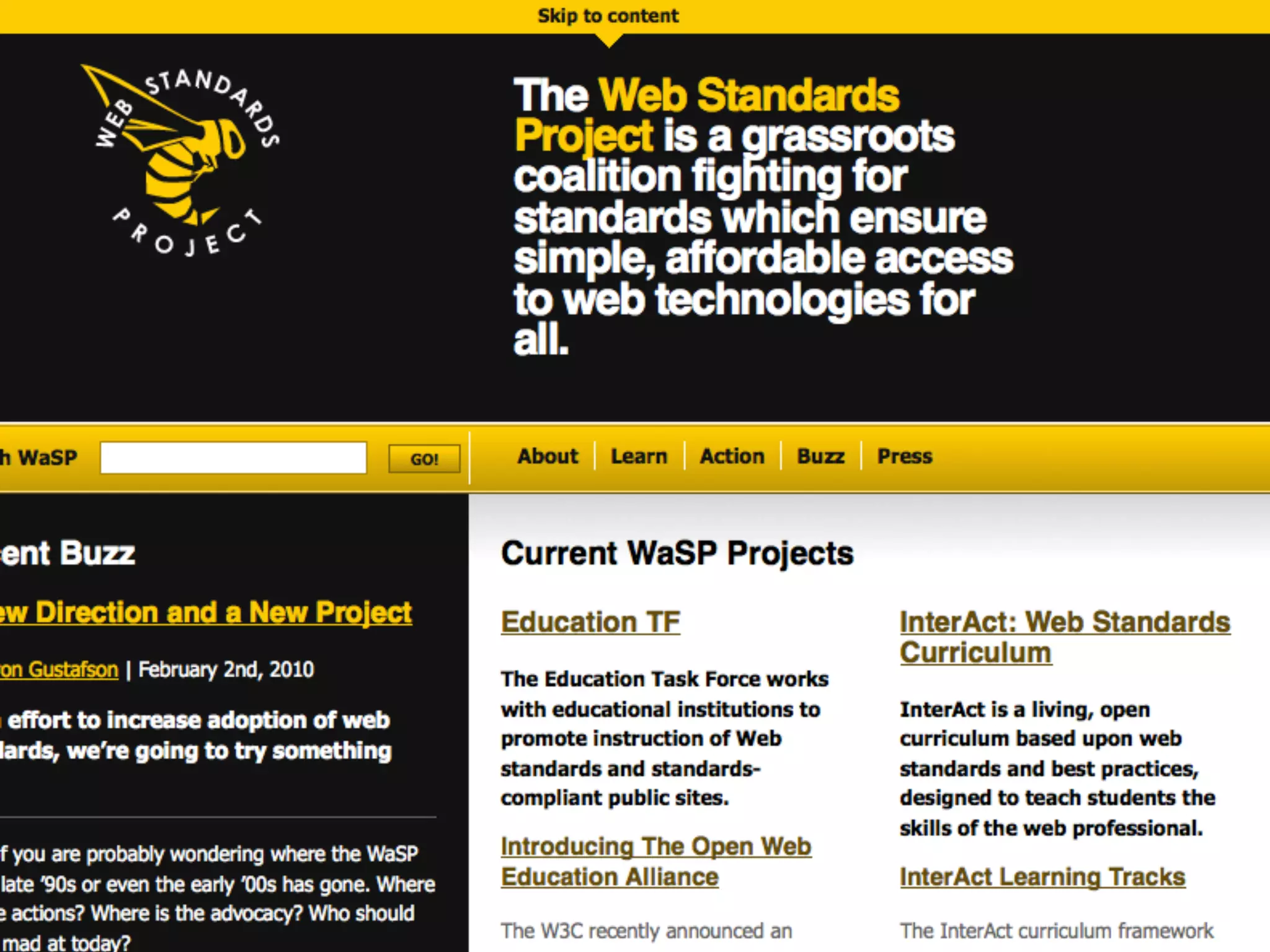
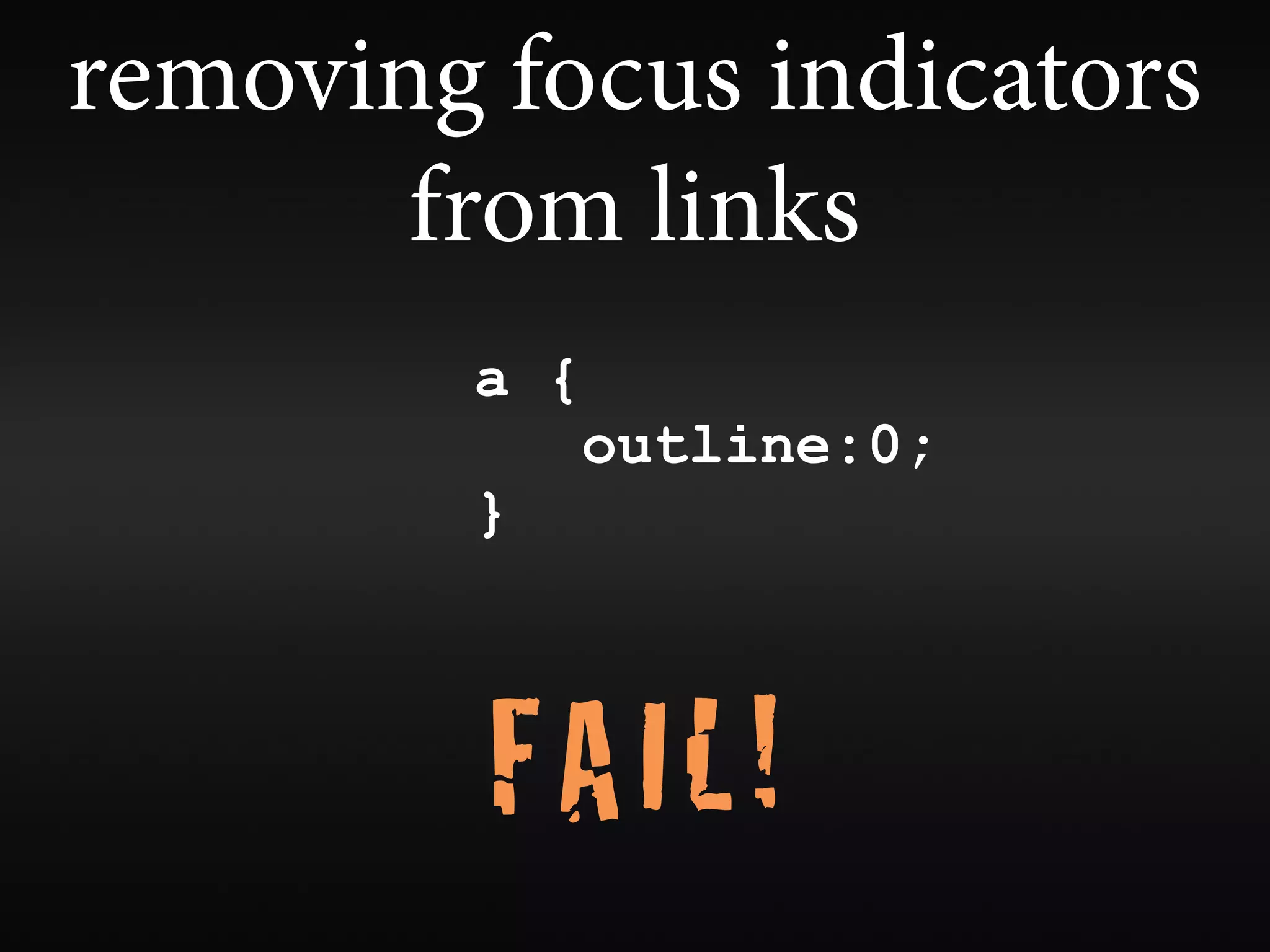
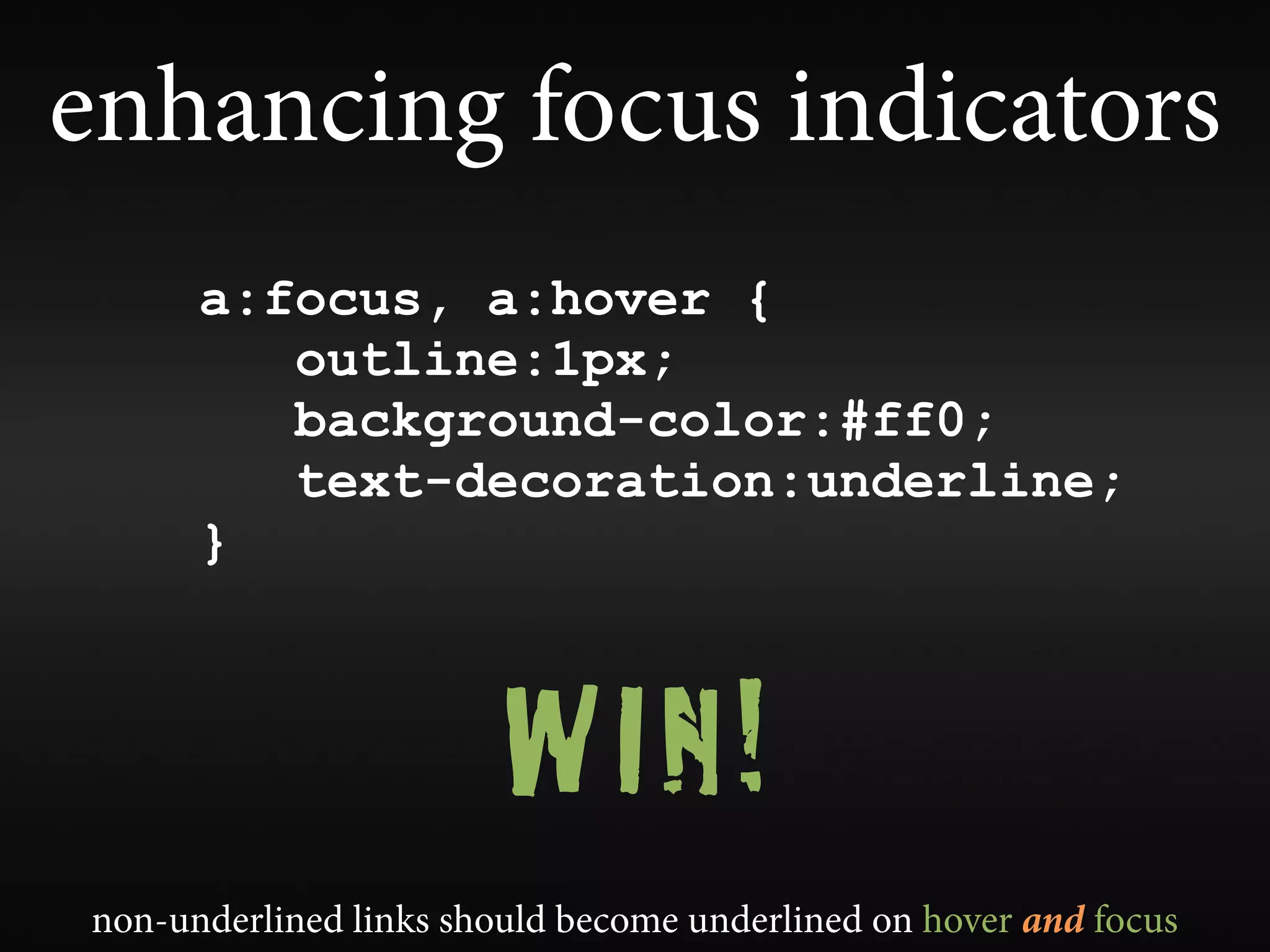
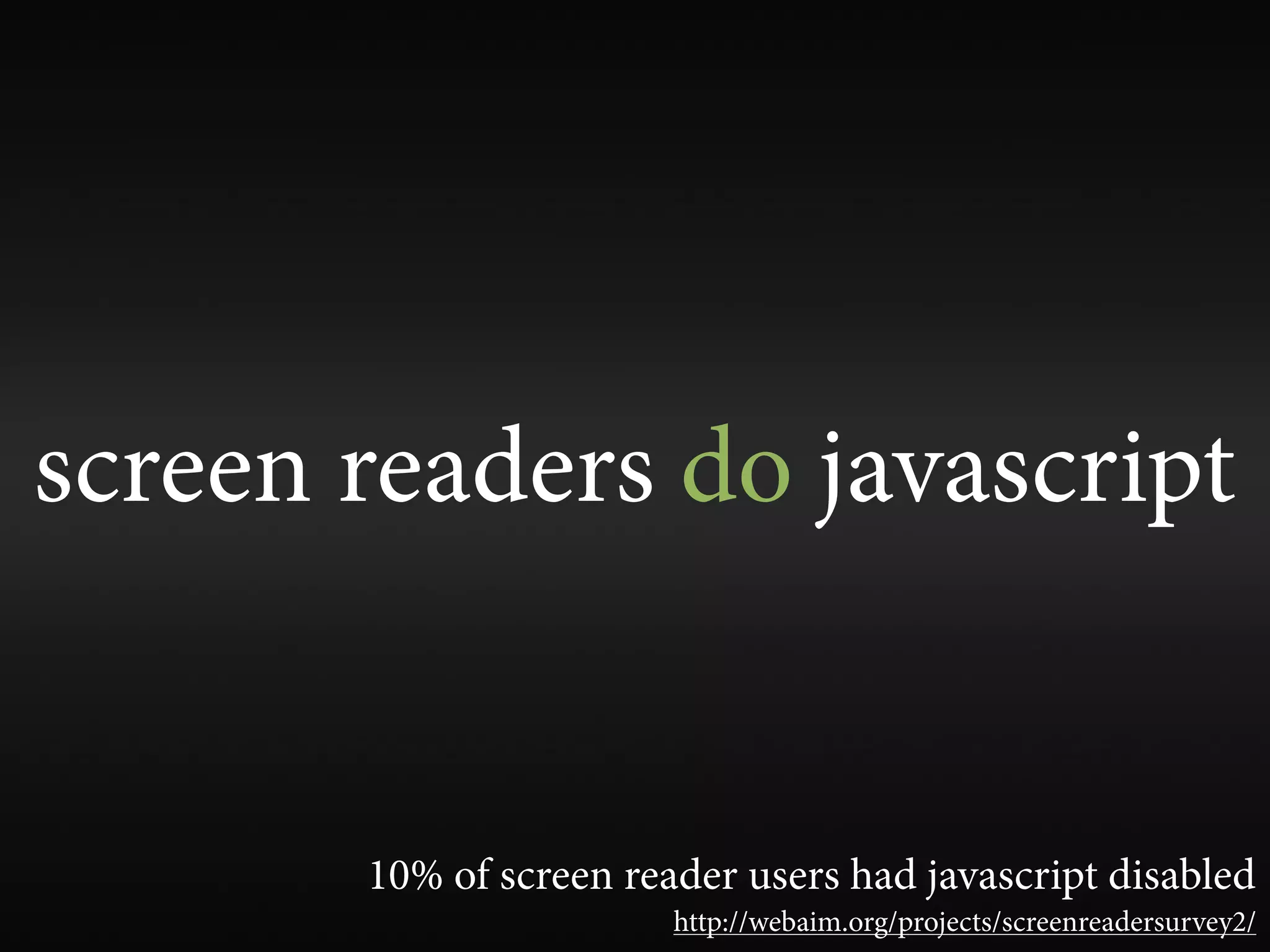
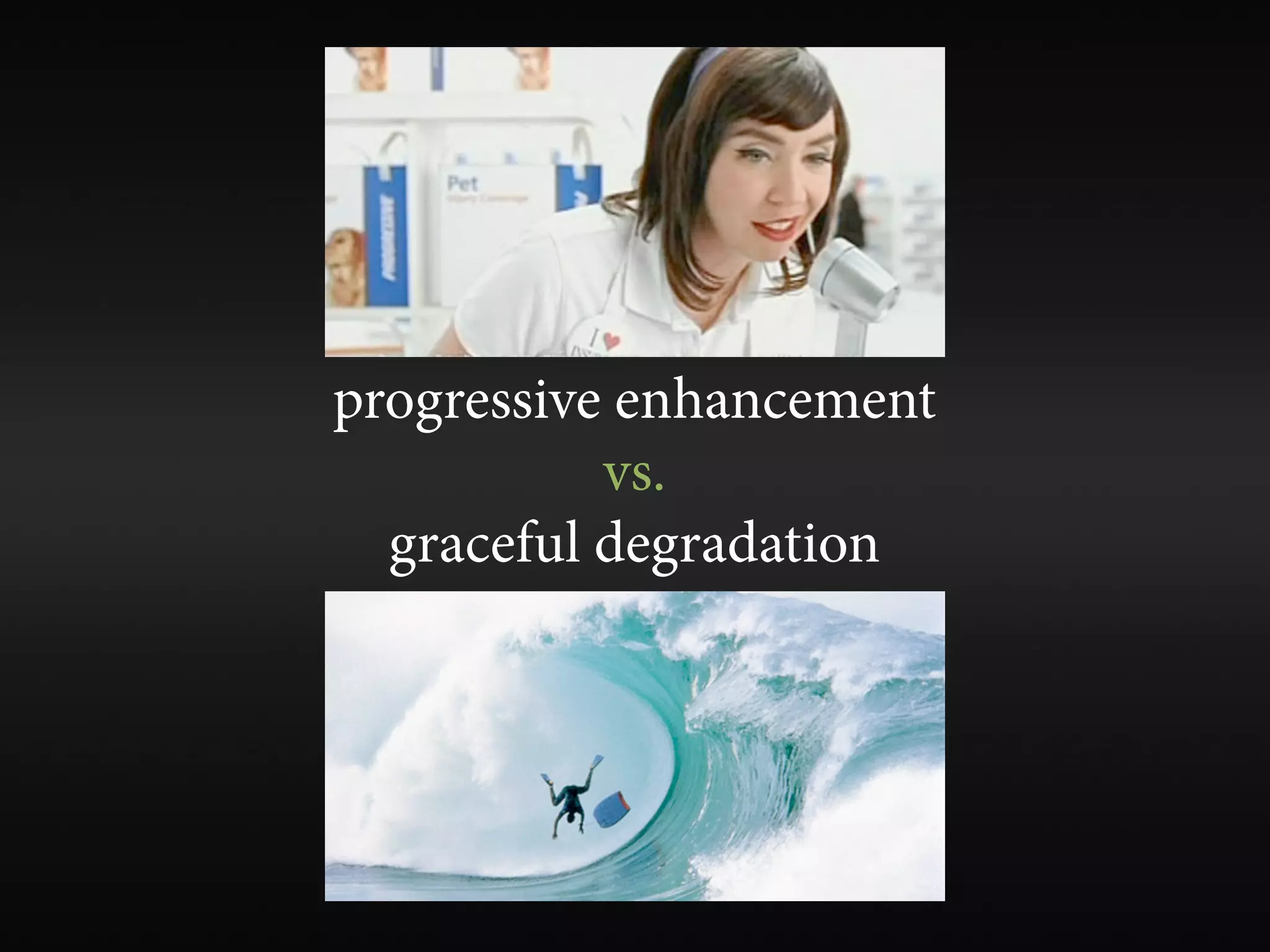
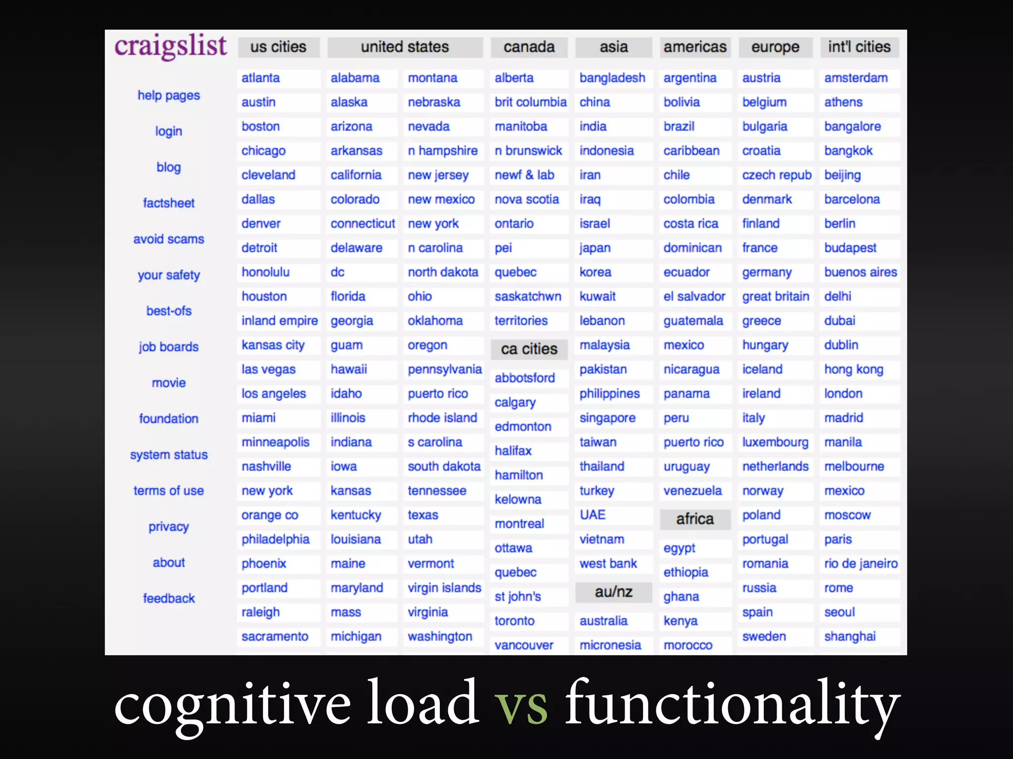
Web Accessibility
        Gone Wilde v e n M!O R E
                w                 No wilder

                       jared smith
                     @jared_w_smith
                       webaim.org


#webaccessgonewild                        SXSWi 2010
mistakes, misconceptions, over-
indulgences, minutia, and generally
    silly aspects of modern web
             accessibility

           ...or “how to FAIL at web accessibility”
the mythical “accessible”
 web site does not exist
accessibility is a continuum


              ...with many different paths
web accessibility is about
more than just blindness
accessible sites don’t need
        to be ugly


         ...then why are many of them so hideous?
WAI                                 SECTION 508

     A11Y               PFWG
                                               EARL

    web accessibility has a
       branding issue
DAISY
           UAAG            WCAG              ARIA

it has devolved into speci cations, checklists and techniques
compliance != accessibility


     use guidelines as tools to achieve accessibility
your site can be fully compliant,
    yet totally inaccessible
your site can be
   fully compliant and
technically accessible, yet
 functionally inaccessible
e most accessible site on
        Earth...
•Home
•Products
•Support
•Sales
•Forum
•Contact Us


              Hey, I’m the content!!!
can you have too much accessibility?
web accessibility preferences
      are for sissies?
web accessibility can and
should happen naturally
FAIL!
accessibility implemented
 partially or incorrectly can be
worse than no accessibility at all
which provides better accessibility?
don’t make the disability relevant
...but understand that the experiences of
  those with disabilities will be different
build one version of a web site
    that is fully accessible


  ...but provide an accessible alternative if you can’t make it accessible
alternative text
alternative text for images
       should present
CONTENT and FUNCTION

  very rarely a description
alt=”Jared Smith”

     WIN!
alt=”strong, handsome man...”???

            FAIL!
• alt=”bullet”


    FAIL!
alt=”bullet”


   WIN!
alt=”image of my cat”
adding “image of...”,
“graphic of...” to alt text


     FAIL???
browser visual rendering of alternative text


             FAIL!!!
            http://rebuildingtheweb.com/en/how-should-browsers-render-alt-text/
alt=”Photo of the
Austin Convention
     Center”
alt=”Photo of the
 Austin Convention
      Center”


                WIN!

...though “Photo of...” is not necessary for all photos
alt=”smiling lady”???
“I don’t want to miss out on any content”
                         vs.
“I’m listening to the page at 400 words per minute
  in a robotic computer voice - I don’t care about
          the mood and feel of the page.”


           focus on content and functionality
images that are the only thing within a link
            MUST have alt text


                          image buttons and hot spots too
avoid redundant text


    <a href=”http://sxsw.com/”>
<img src=”sxswlogo.png” alt=””><br>
             SXSW</a>


       alternative text doesn’t have to be in the alt attribute
captcha
captcha
Completely Automated Patience Test to Confuse
        the Hell out of your Audience


                             FAIL!
spam prevention


                 ...you’re doing it wrong.


   http://webaim.org/blog/spam_free_accessible_forms/
accesskey and tabindex

                   FAIL!
    ...unless you're sure you know what you're doing.

learn the power of tabindex=”0” and tabindex=”-1”
tabindex
tabindex=”1+”
Speci es exact tab order. Ensure tab order is
complete, logical, and intuitive. Rarely needed.
tabindex=”0”
Places element in the default tab order.
tabindex=”-1”
Do not place element in tab order, but allow the
element to programmatically receive focus.
tabindex, focus(), and aria
      to the rescue!
aria


accessible rich internet applications
ARIA paves the cow paths
aria
• gives or enhances semantics of non-semantic
  or other-semantic elements
• landmark roles - de ne major functional areas
  of your page (search, navigation, main, etc.)
• enhances keyboard accessibility for widgets
  and controls
• ensures accessibility of dynamically updated
  content
the tip of the aria iceberg
                                           more at http://webaim.org/presentations/2010/aria/


www.flickr.com/photos/natalielucier/4155261005/
visually hiding content
• display:none and
 visibility:hidden hide from
 everyone... and that’s a good thing.
• absolute position off-screen le with
 CSS for screen readers
• use judiciously
and usability
                            V
the native accessibility of your site is
 typically inversely proportional to
  the volume of instructional text
              required


                 people with disabilities are very capable
sighted users see:


          a screen reader user hears:
 “is is a text box where you enter your Passcode. With this text box focused you can
 begin typing your Passcode. Your Passcode ensures that your account remains secure.


                                        L!
 Passcodes must be between 8 and 20 characters and contain both numbers and letters.


                                    A I
ey are also case sensitive, so be sure to capitalize the correct characters. Aer you type


                                  F
your Passcode into this box, you can press tab to go to the LOGIN button. You probably
  set up a Passcode previously. We hope you remember it! If you have forgotten your
 Passcode, you should select the ‘Forgot Your Passcode?’ link which is at the bottom of
                                         this page.”
“skip to main content” links


                                                  Still?
                                      but it’s sooooo old school


Yes! Until browsers provide better keyboard navigation for sighted users
“skip to main content” links

  you can position them off-screen if you must,
    but make them clearly visible on :focus


                         one “skip” link is typically sufficient
NOT display:none


a#skip {
    position:absolute;
    left:-5000px;
    top:0px;
}
a#skip:focus{
    position:block;
}
removing focus indicators
       from links
        a {
              outline:0;
        }


         FAIL!
enhancing focus indicators
      a:focus, a:hover {
         outline:1px;
         background-color:#ff0;
         text-decoration:underline;
      }


                        WIN!
non-underlined links should become underlined on hover and focus
screen readers do javascript


       10% of screen reader users had javascript disabled
                        http://webaim.org/projects/screenreadersurvey2/
progressive enhancement
           vs.
  graceful degradation
bullet-proof web design

        WIN!
avoid “click here”


  it’s either ambiguous or indicative of poor visual design
headings


                   WIN!
properly structured, one <h1> for document title,
                and never empty

                             ... and other semantic structure
title attribute
• advisory information only
• ignored by screen readers, except...
   • form elements missing labels
   • <frame title=”navigation”>
   • <acronym>/<abbr> ...usually.
cognitive disabilities


     (not much happening here)
cognitive load vs functionality
odds and ends
• Test in a screen reader. NVDA is open-source and free!
• Provide accurate, descriptive, succinct page titles
• Don’t stress over screen reader pronunciation and
  quirks.
• Expand rst instance of acronyms and abbreviations.
  You don’t have to use <acronym>/<abbr> on all
  instances. Don’t use for well known terms.
• Use < eldset> and <legend> for groups of radio
  buttons and checkboxes
• Layout tables don’t (typically) affect accessibility
wave.webaim.org
make your sites models of
   beautiful, natural
      accessibility
questions or comments?
             jared smith
           @jared_w_smith
    slideshare.net/jared_w_smith
             webaim.org

Web Accessibility Gone Wild (Now Even MORE Wilder!)