Download as PDF, PPTX


![”
Progressive enhancement doesn’t
require that you provide the same
experience in different browsers.
[Apply] technologies in an
intelligent way, layer-uponlayer, to craft an amazing
experience.
— Aaron Gustafsson
http://easy-readers.net/books/adaptive-web-design/](https://image.slidesharecdn.com/nowyouseeme-131213065631-phpapp01/85/Now-you-see-me-Adaptive-Web-Design-and-Development-49-320.jpg)


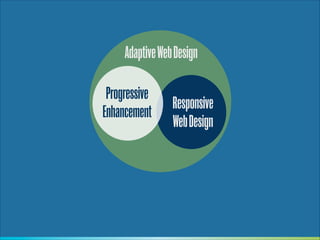
![Apply no styles before it is time
var collapseWidgets = $("[data-widget=collapse]");
collapseWidgets.each(function() {
!
$(this).attr('aria-expanded', 'false');
$(this).addClass('is-collapsed');
!
.
.
.](https://image.slidesharecdn.com/nowyouseeme-131213065631-phpapp01/85/Now-you-see-me-Adaptive-Web-Design-and-Development-67-320.jpg)


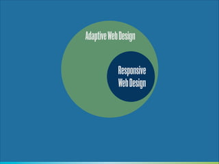
![”
[The] distinction isn’t clear. Many sites
morph from one into the other. Is Wikipedia
a website up until the point that I start
editing an article? Are Twitter and Pinterest
websites while I’m browsing through them
but then flip into being web apps the
moment that I post something?
— Jeremy Keith
http://adactio.com/journal/6246/](https://image.slidesharecdn.com/nowyouseeme-131213065631-phpapp01/85/Now-you-see-me-Adaptive-Web-Design-and-Development-105-320.jpg)


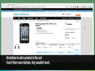


Progressive enhancement is still an important approach for building responsive websites and web applications. While JavaScript can now be assumed to be widely available, progressive enhancement avoids single points of failure and improves performance by loading critical content first before non-essential enhancements. The distinction between websites and applications is also blurred, so progressive techniques remain applicable to most digital experiences on the web.


![Getting Started with Apache Spark: Big Data Made Simple [Free Meetup]](https://cdn.slidesharecdn.com/ss_thumbnails/apachesparkgettingstarted-260203175547-8361bcc3-thumbnail.jpg?width=640&height=640&fit=bounds)

