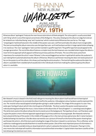
1. Rihannasalbum‘apologetic’featuresthe mainhouse stylecoloursof blackandgold.The colourgoldis usuallyassociated
with‘bling’ whichisone of the typical conventionsof the RnBgenre .The colourblackgivesthe albuman edgyfeel andcan
be relatedtoan individual being‘sexy’and‘mysterious’whichiswhatmostof Rihannasfanssee heras.The large
‘Unapologetic’boldtextfeaturedinthe middle of the posterusessans-serif fontandmakesthe albummore recognizable.
The textsurroundingthe albumname alsousesthe type face sans-serif andhasbeenwritteninlarge capital lettersallowing
it to standout.The main‘apologetic’textiswrittenslantedinagraffiti type font.The graffiti type fontwouldappeal tothe
youngergeneration.The restof the albumfeaturesasimplertext;the texthoweverusesroundedletterstogive the albuma
more feminineapproachwhichappeals toRihannasprimaryaudience of females.The size of the textsvariesfrom
importance forexample the artist’sname ‘Rihanna’isthe secondbiggesttextwritteningoldwhichcatchesthe audience’s
eye makingthemautomaticallyknow the albumisRihannas. Rihannaiswellknownmeaningshe doesnotneedapicture of
heron the posterto sell the album,thisshowsjusthow bigthe artistactuallyis.The texttellingthe audiencethe date the
albumisavailable fromisboldedwhichwouldstickinthe individualsmindmore makingthe audience gobuythe album
whenitis available.
BenHoward’smusicis basedinthe folk/rock/indiegenre meaningthe albumadvertitself wouldhave tohave typical
conventionsof the genrestoconclude the albumitself tothe audience.A blue/greencolourhasbeenusedtorepresentthe
sea.The neutral colourwouldappeal tobothgendersgivingita wideraudience.The image of the seagivesita care-free,
wide openfeelingof nature whichlinksintothe genre of folk/indie. The diverusedonthe postercouldrepresentan
individualdiving/searchingforthe music.Italsorelatestothe albumtitle of ‘EveryKingdom’ i.e.searchingeverykingdom.
The white textusedonthe albumallowsthe texttostand outon the background.The typeface of sans-serif hasbeenused
to give the postera more informal approachappealingtoitsprimaryaudience of youngpeople.BenHowardsname has
beenplacedatthe top of the posterinthe middle of the page as thisis the mainprimaryoptical area.Ben’sname hasbeen
boldedallowingittostandout. AlsoBendoesnotneedtouse a picture of himself onthe frontof the postershowinghow
well knownthe artistis.All of the textusedincludingthe image of the diverisbasedina central area.Thisis effective asthe
audiencesreadinggravitywouldallowthemtoreadthe whole poster.One of the mostimportantpiecesof informationis
the date the albumisavailable tobuyor downloadwhichiswhyitisplacedat the bottomof the poster.Placingitinthis
area meansthe individual will readthisinformationlastandtherefore rememberit.Capital lettershave beenusedforall the
textallowingittostandout evenmore.
2. Jesse J’smusicisbasedinthe pop and RnB genre.Her
posterand albumcoverhave beencreatedusing
typical conventionsfromthisgenre toappeal to
audiences.The image used onthe frontof thisposter
isthe same as Jesse J’salbumcoverwhichmakesit
more recognizable. The house style coloursusedare
blackgoldand white.Blackisseenasa ‘sexy’colour
and can seemmysterious.The colourblackusedon
the postercould relate tothe songson the album
beingseriousissues.Jesse Jusesdirectaddressto
capture the audience’sattention.The openmouth
pose makesthisthe firstthingthe audience would
lookat. Blacklipstickhasbeenusedonherlipswitha
hintof gold. Thisallowsthe lipstostandoutfrom her
pale complexion.The hintof goldfeature ontopof her
blacklipsaccompaniesthe house style.The goldcolour
isassociatedwiththe RnB genre throughthe use of
typical conventionssuchas‘bling’.The typeface ‘Jesse
J’ isserif givingita formal feel.Thisgivesthe albuma
rich looklinkingintothe RnBgenre. The fontusedfor
the albumtitle ‘WhoYou Are’looksasthoughit has
beenhandwrittenand‘Jesse J’ina fun,fancyfont
whichwouldappeal tothe youngergeneration.JesseJ
isa well-knownartistandhasbeenplacedonthe front
of the posterto bringinmore of an audience and
allow the postertobe more recognizable. The black
backgroundwhichfeaturesinformationaboutthe
albumand Jesse herself allowsthe whiteandyellow
textto standout. The more recognizable songssuchas
‘whoyouare’ and ‘price tag’have beenplacedupon
the black backgroundusing na larger fontto entice
the audience.Interestinglythereisnodate stating
whenthe albumwill be outmakingthisan
unconventional musicposter.