
More Related Content
What's hot
What's hot (18)
Viewers also liked
Viewers also liked (17)
Similar to In what ways does your media product
Similar to In what ways does your media product (20)
More from John Smith
In what ways does your media product
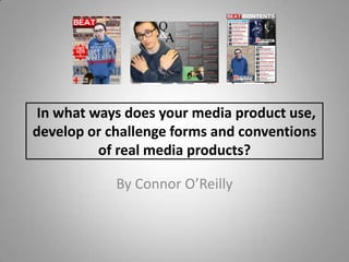
- 1. In what ways does your media product use, develop or challenge forms and conventions of real media products? By Connor O’Reilly
- 2. Fonts • The fonts used throughout my media product are very conventional for music magazines. On my front cover sans serif fonts are used to make reading easier and quicker for the audience, this is used a lot in real media products. • The fonts on the double page spread and contents page include more serif fonts for bulk text and descriptions. These fonts are easier to read when combined it small fonts and magazines conventionally use serif fonts on double page spreads. The descriptions on the contents page of my magazine are in a serif font as they are a fairly small font which creates an easier read for the audience. • Various different fonts are used on the front cover to attract the target audience which is a convention too.
- 3. Images • The main image on the front cover uses gaze theory and direct address to attract the audience. This image also somewhat conforms to the rule of thirds with the model just being slightly off centre to make room for lures. • The image on the DPS takes up the whole left page. Having a complimenting photo that takes up a whole page is a convention of a DPS. There is also another photo on the DPS that is linked to the article which is another convention to create a better understanding for the audience. Images of “Just Jack” feature on the front cover, DPS and the contents page. This is a convention too as he is the main article/feature which is made clear on the front cover. The main image on the front cover is usually the big feature of the magazine which is made clear in my media product by placing different images of him on each page.
- 4. Lures • The front cover and contents page are the only parts of my media product that include lures. This is because things like the DPS are the items being advertised. • The front cover is full of lures which attract the audience as much as it can. The descriptions on the contents page also act as lures but not as much as those on the front cover. This is because the front cover is the first thing the audience sees so you have to try and entice the audience as much as possible to ensure they purchase it. In this case my magazine follows the conventions of lures on the front cover.
- 5. Contents Page • The contents page uses conventions of real media products. It does this with the easy “Cover Story” and “Inside” columns. It features a large black number next to a page title and description. The description is in a small serif font which makes it easier to read. It keeps a similar house style with the headers of both columns keeping the same colours just different placement. •There is a coventional header with the logo of the magazine and “contents” clearly seen so the audience knows what page they are on. The house style still stays intact with read and black being dominant still on this page. There are photos which compliment the articles features in the two columns which provoke greater interest from the audience and act as lures. There is a conventional footer with the logo of the magazine, month and page number.