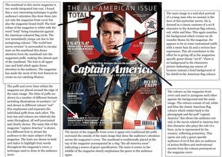
The magazine cover uses color and layout techniques to draw attention to its content about the movie Captain America. The masthead integrates the magazine's name in white letters against a red, white, and blue circular background. Surrounding stars draw the eye from the masthead to promotional text and the central image of the hero in an American flag-themed costume. The puffs around the edge also emphasize different movie details in varying colors and fonts. Overall, the traditional layout and patriotic colors are designed to promote both the sci-fi genre and American heroism of the film.
1. The masthead in this movie magazine is
two words integrated into one. I found
this a very interesting technique to grabs The main image is a mid-shot portrait
audience’s attention this drew them into of a young man who we assume is the
not only the magazine front cover but hero of this particular movie. He is
also the magazine brand itself. The font dressed in a classic costume of a sci-fi
colour of the magazine is white with the character in the American flag colours,
word “total” being translucent against red, white and blue. This again matches
the American coloured flag circle. The the background which creates an all-
text immediately jumps out due to the rounder theme for the magazine. He
juxtaposing colours. “The world best appears to be in some customized outfit
movie reviews” is surrounded in circular with a smart hair do and a serious face
stars on the masthead this draws expression. This all contributes to the
attention from the masthead into the effect he is giving off as the magazines
magazines puffs, making this almost part specific genre theme “sci-fi”. There is
of the masthead. The font is all upper no background to the characters
case and bold which again draws picture indicating any source of
attention to the audience. The magazine location instead a fixed background of
has made the most of the font features to his shield in the American flag colours.
create an eye catching illusion.
The puffs and cover lines within the
magazine are placed around the edge of
The colours on the magazine front
the main image. The titles of puffs are
cover and used to juxtapose each other
shown in a number of different formats
against the background and the main
including illustrations of numbers “10”
image. The colours consist of red, white
and shown in different colours “red”
and blue the classic American flag
this emphasises and separates the
colours which relates back to the
individual puffs from each other. The
photograph and the puff “captain
font size and colours are relatively the
America” this shows the audience not
same throughout, all well punctuated
only is the movie related to America but
and clearly shown. The main title of the
this character also plays the role of a
magazine “captain America” is shown
hero, as he is represented by his
in a different font to attract the The layout of the magazine front cover is again very traditional the puffs country, reflecting protection. This
audience to the main subject of the surround the outside of the main image that draw the audience’s attention opens not only a genre specific
magazine. The fonts are shown in bold across the magazine’s cover. The masthead is traditionally placed at the audience of sci-fi but also an audience
and italics to highlight buzz words top of the magazine accompanied by a slug “the all-America issue” of action thrillers and motivational
throughout the magazine’s cover, a indicating a source of genre specification. The main is centre in the movies from the colours portrayed on
technique used to draw in the audience middle of the magazine clearly emphasises the genre to the audience the magazine cover.
more. again.