SlideShare a Scribd company logo
1 of 3
Lighting                                      Framing                                                        Body Language/Staging
The lighting on the photo is quite a          The main image is centred in the middle of the magazine        The main image is a simple shot which has
natural lighting but has probably been        cover, taking up most of the space of the background of the    the basic foreground/background format with
taken with a flash camera to make it          cover. Overlaid on top of it are more pictures, but they are   no extra props. The foreground features Lana
brighter. It will then have been make         example of the posters which come with the magazine            Del Rey in a simple pose with her hands on
brighter in Photoshop but there is still                                                                     her hips and tongue sticking out. This photos
some shadowing in the bottom right                                                                           body language backs up her quote which was
corner. The target audience would                                                                            featured on the front of the article. In the
probably not be interested in elaborate                                                                      background there is a white wall for one third
lighting or sets so they would prefer                                                                        along the bottom, and the rest features the
this style of lighting.                                                                                      American flag which has been pinned up.
                                                                                                             The American flag can be linked with the sell
Colour                                                                                                       line also as they call her an American icon.
The colouring on the magazine features
3 main colours; white, blue and black                                                                        Text
which is simplistic. The white is used                                                                       The main sell line uses a quote from the
on the masthead and to highlight the                                                                         article and the name of the cover image to
few sell lines which are along side the                                                                      attract the audience of that singer.
main sell line. The blue emphasised the                                                                      Underneath the name of the singer, there is a
names of the subjects inside the                                                                             declarative sentence making a statement
magazine and the red is just a                                                                               about the singer, and showing the general
background colour used to help sell the                                                                      opinion of the magazine of her. In this
main story and support its quote.                                                                            instance, it is positive as they call her a
                                                                                                             “MODERN AMERICAN ICON”. The 3
Composition                                                                                                  other sell points featured on the magazine
In most countries, readers read from left to
                                                                                                             feature the name of the subject of the article
right, from the top to bottom. Having the
masthead at the top left of the magazine so
                                                                                                             and either a quote from them or something
it is the first thing they will see. Moving                                                                  exclusive. For example, fans of Pete Doherty
from left to right, they will then be attracted                                                              may buy this magazine because it has the
to the smaller photos of band members, and        Font                                                       promise of new tracks and album details.
read the offer underneath them. Going back        Almost the entire of the magazine is in the same font in The bottom of the page also includes smaller
to the left side, they will then come across      different colours. The separating between the main sell sell lines where other acts are featured. There
minor selling points, then the main sell          point and the subheads are the use of italics. The word is also an emphasis on the “FREE
points and the main image. The final thing
                                                  “Plus” is written in an entirely different font which will POSTERS!” which are on the right of the
s the reader will come across are the small
                                                  catch the eye of the reader when they are looking at the main image which peoples eyes will be
mentions at the bottom which are just
incentives to buy the magazine.                   cover and they will read the subheadings which inform drawn to and may purchase the magazine for
                                                  the reader of other acts featured.                         the posters.
Body Language/Staging                      Lighting                                                                      Text
                                           The lighting on the photo is a standard lighting with no depth and highlights
                                           the faces of the three main people on the front on the magazine.
The main image was probably staged                                                                                      The main sell line is the name of
on a blank wall as the image                                                                                            the band, “GREEN DAY” with a
background has been made transparent                                                                                    quote from their interwiew with
and places onto a block colour. They                                                                                    the magazine featured in the essay.
have also been shot separately so they                                                                                  On the left of the main sell image,
can be placed at different positions on                                                                                 there are three sell lines featuring
the cover, as well as being scaled to                                                                                   three different bands of different
make the singer more eye catching. All                                                                                  genres and hints about what they
three have also had their hands                                                                                         are talking about. Notably, they
photoshopped so they have a likeness                                                                                    use alliteration “Sun! Surf!” in the
to disney characters. The hands are the                                                                                 subhead for “PARKWAY
first thing that you see and all of them                                                                                DRIVE”. Below that, there is a
have inappropriate references, much                                                                                     compilation album with a track list
like the bands general attitude and                                                                                     featured, name dropping some
connotations about them.                                                                                                artists on it. Below that is tour
                                                                                                                        news for UK fans of the famous
Composition
                                                                                                                        “WARPED TOUR” , which most
                                                                                                                        of the audience would know about
The masthead is mostly obscured by
                                                                                                                        and would show interest in. There
the main sell image, complete with the
                                                                                                                        is also another sell point with a
main sell point and a quote from the
                                                                                                                        picture to accompany it of the lead
article. On the left, they have 3 sell
                                                                                                                        singer of the band.
lines. In the middle, they have the logo
of the magazine with an offer of an                                                                                     Framing
compilation album. Along the bottom is
a bigger sell line, and bonus                                                                                           The main image is framed towards
information .                                                                                                           the upper right of the cover with
                                                                                                                        the front man being the biggest
Font                                                                                                                    and overlapping the masthead. To
                                                                                                                        the left of him is the bassist, who
The fonts mainly used in this are bold                                                                                  is slightly over lapped by a sell
letters or a font that resembles a                                                                                      line. At the bottom, the drummer is
                                             Colour                                                                     much smaller and over lapping the
handwriting. The font varies in sizes        The colours used on the cover are bold CMYK (cyan, magenta, yellow)
and colours, depending on the                                                                                           main sell line.
                                             colouring which contrast together, and make the front cover more eye
importance of the sell line or subhead.      catching on the shelves.
Body Language/Staging
                                             Text
The main image was probably staged
on a blank wall as the image
                                             In the middle left of the magazine,
background has been made transparent
                                             there is the main sell point which is
and places onto a gradient colour,
                                             all in white. To the right there is only
coming from the middle outwards. The
                                             one sell line, name dropping several
pose of the image is a dominant stance
                                             popular musicians which are
and she has her head up but still
                                             “finalists” and the promise of more
remaining eye contact. This could be
                                             featured inside. Below that there is
seen as her looking down on the reader.
                                             an advertisement for the “Billboard
Composition                                  Music Awards” which is sponsored
                                             by the magazine. On the left there is
The masthead is mostly obscured by           more selling points for the award
the main sell image which over               show, as this is a special edition of
overlayed by sell lines on both the right    the magazine commemorating the
and the left side of her. On the bottom      show. Underneath the sell line there
right, the last place a reader sees, is an   is a fashion aspect which the target
advertisement for an award show.             audience may be interested in and a
                                             feature for artists who are making a
Font
                                             comeback as another sell line.
Most of the cover uses the same font         Framing
which is long and bold. However, the
main sell line uses an italic, handwriten    The main image is framed directly in
font for the quote and a plain font for      the middle of the magazine and
the name of the main image. Above the        overlaps the masthead to allow the
name is an announcement of her return        full image to be shown.
to music, also in a different font.
Colour                                        Lighting

The colours used on the cover are             The lighting on the photo is a
neutral red tones for the main sell           standard lighting with no depth and
image and the background. The fonts           highlights the faces of the three
are white and yellow which                    main people on the front on the
compliment the background nicely and          magazine.
makes the yellow stand out.

More Related Content

What's hot

Music Magazine Case Study
Music Magazine Case StudyMusic Magazine Case Study
Music Magazine Case Study0blivi4te
 
Unit 30 - LO 3 - Be able to produce materials for an original uk-based media ...
Unit 30 - LO 3 - Be able to produce materials for an original uk-based media ...Unit 30 - LO 3 - Be able to produce materials for an original uk-based media ...
Unit 30 - LO 3 - Be able to produce materials for an original uk-based media ...andyp0810
 
Analysis of magazines
Analysis of magazinesAnalysis of magazines
Analysis of magazinestomhall2
 
Analysing articles dizzee mag ppt
Analysing articles dizzee mag pptAnalysing articles dizzee mag ppt
Analysing articles dizzee mag pptmeena_j
 
Music Magazine Analysis; Front Cover, Contents & Dps
Music Magazine Analysis; Front Cover, Contents & DpsMusic Magazine Analysis; Front Cover, Contents & Dps
Music Magazine Analysis; Front Cover, Contents & DpsWill Drummee
 
The generic conventions of magazines cover
The generic conventions of magazines   coverThe generic conventions of magazines   cover
The generic conventions of magazines coverJenny McNulty
 
The similarities in music magazines
The similarities in music magazinesThe similarities in music magazines
The similarities in music magazinesFleur Gascoigne
 
film magazine analysis
film magazine analysis film magazine analysis
film magazine analysis Shanice1
 
MUSIC MAGAZINE LIIAR ANALYSIS
MUSIC MAGAZINE LIIAR ANALYSISMUSIC MAGAZINE LIIAR ANALYSIS
MUSIC MAGAZINE LIIAR ANALYSISshehasnotime1135
 
Music Magazine Analysis
Music Magazine AnalysisMusic Magazine Analysis
Music Magazine Analysisjackrichmond
 
Magazine overview
Magazine overviewMagazine overview
Magazine overviewtonym17
 
Task 3 nme arctic monkeys
Task 3 nme arctic monkeys Task 3 nme arctic monkeys
Task 3 nme arctic monkeys quinnf1
 

What's hot (19)

Media Front Cover Analysis
Media Front Cover Analysis Media Front Cover Analysis
Media Front Cover Analysis
 
Question One
Question OneQuestion One
Question One
 
Front covers
Front coversFront covers
Front covers
 
Three artists
Three artistsThree artists
Three artists
 
Music Magazine Case Study
Music Magazine Case StudyMusic Magazine Case Study
Music Magazine Case Study
 
Unit 30 - LO 3 - Be able to produce materials for an original uk-based media ...
Unit 30 - LO 3 - Be able to produce materials for an original uk-based media ...Unit 30 - LO 3 - Be able to produce materials for an original uk-based media ...
Unit 30 - LO 3 - Be able to produce materials for an original uk-based media ...
 
DPS deconstruction
DPS deconstructionDPS deconstruction
DPS deconstruction
 
Analysis of magazines
Analysis of magazinesAnalysis of magazines
Analysis of magazines
 
Analysing articles dizzee mag ppt
Analysing articles dizzee mag pptAnalysing articles dizzee mag ppt
Analysing articles dizzee mag ppt
 
Music Magazine Analysis; Front Cover, Contents & Dps
Music Magazine Analysis; Front Cover, Contents & DpsMusic Magazine Analysis; Front Cover, Contents & Dps
Music Magazine Analysis; Front Cover, Contents & Dps
 
Research PowerPoint
Research PowerPointResearch PowerPoint
Research PowerPoint
 
The generic conventions of magazines cover
The generic conventions of magazines   coverThe generic conventions of magazines   cover
The generic conventions of magazines cover
 
The fly
The flyThe fly
The fly
 
The similarities in music magazines
The similarities in music magazinesThe similarities in music magazines
The similarities in music magazines
 
film magazine analysis
film magazine analysis film magazine analysis
film magazine analysis
 
MUSIC MAGAZINE LIIAR ANALYSIS
MUSIC MAGAZINE LIIAR ANALYSISMUSIC MAGAZINE LIIAR ANALYSIS
MUSIC MAGAZINE LIIAR ANALYSIS
 
Music Magazine Analysis
Music Magazine AnalysisMusic Magazine Analysis
Music Magazine Analysis
 
Magazine overview
Magazine overviewMagazine overview
Magazine overview
 
Task 3 nme arctic monkeys
Task 3 nme arctic monkeys Task 3 nme arctic monkeys
Task 3 nme arctic monkeys
 

Viewers also liked (15)

Magazine Anaylsis
Magazine AnaylsisMagazine Anaylsis
Magazine Anaylsis
 
Kt019
Kt019Kt019
Kt019
 
Presentation2
Presentation2Presentation2
Presentation2
 
Human rights: 5Cool
Human rights: 5CoolHuman rights: 5Cool
Human rights: 5Cool
 
Tema suelos presentacion
Tema suelos presentacionTema suelos presentacion
Tema suelos presentacion
 
Organisational Behavior
Organisational BehaviorOrganisational Behavior
Organisational Behavior
 
Presentación gráfica de valores
Presentación gráfica de valoresPresentación gráfica de valores
Presentación gráfica de valores
 
Ease Corporate Overview (PSL)
Ease Corporate Overview (PSL)Ease Corporate Overview (PSL)
Ease Corporate Overview (PSL)
 
ReThink - Generic Services Overview
ReThink - Generic Services OverviewReThink - Generic Services Overview
ReThink - Generic Services Overview
 
5C Performance
5C Performance5C Performance
5C Performance
 
Presentacion de mi vida
Presentacion de mi vidaPresentacion de mi vida
Presentacion de mi vida
 
32723 QA_OM (1)
32723 QA_OM (1)32723 QA_OM (1)
32723 QA_OM (1)
 
Ibm 2014-r1
Ibm 2014-r1Ibm 2014-r1
Ibm 2014-r1
 
Placa madre gigabyte
Placa madre gigabytePlaca madre gigabyte
Placa madre gigabyte
 
Project on snake bite
Project on snake biteProject on snake bite
Project on snake bite
 

Similar to Magazine Anaylsis

Music magazine front covers
Music magazine front coversMusic magazine front covers
Music magazine front coversmccrae1
 
Analysis of examples
Analysis of examplesAnalysis of examples
Analysis of exampleskatemeads
 
Analysing magazine features and connotations
Analysing magazine features and connotationsAnalysing magazine features and connotations
Analysing magazine features and connotationsJoshWilliamson14
 
Analysis of music magazines
Analysis of music magazinesAnalysis of music magazines
Analysis of music magazineskatemeads
 
Nme magazine analysis
Nme magazine analysisNme magazine analysis
Nme magazine analysisasmediaf12
 
Front Cover Analysis
Front Cover Analysis Front Cover Analysis
Front Cover Analysis perri_94
 
Zac mediai
Zac mediaiZac mediai
Zac mediaiZaCk321
 
Analysing a magazine front cover final
Analysing a magazine front cover finalAnalysing a magazine front cover final
Analysing a magazine front cover finaladuhenejas
 
Analysis of mag kerrang
Analysis of mag kerrangAnalysis of mag kerrang
Analysis of mag kerrangasmediaf12
 
Musicmagazine analysis
Musicmagazine analysisMusicmagazine analysis
Musicmagazine analysisAlan Fairnie
 
Front covers
Front covers Front covers
Front covers lbarsby
 
Front cover research
Front cover researchFront cover research
Front cover researchRayrayy
 
Analysis of professional magazine covers
Analysis of professional magazine coversAnalysis of professional magazine covers
Analysis of professional magazine coversJessikahBaard
 
Magazine cover analysis Kerrang! magazine
Magazine cover analysis Kerrang! magazineMagazine cover analysis Kerrang! magazine
Magazine cover analysis Kerrang! magazinegemma-louise
 

Similar to Magazine Anaylsis (20)

Music magazine front covers
Music magazine front coversMusic magazine front covers
Music magazine front covers
 
Analysis of examples
Analysis of examplesAnalysis of examples
Analysis of examples
 
Analysing magazine features and connotations
Analysing magazine features and connotationsAnalysing magazine features and connotations
Analysing magazine features and connotations
 
Music mag analysed
Music mag analysedMusic mag analysed
Music mag analysed
 
Analysis of music magazines
Analysis of music magazinesAnalysis of music magazines
Analysis of music magazines
 
Nme magazine analysis
Nme magazine analysisNme magazine analysis
Nme magazine analysis
 
Front Cover Analysis
Front Cover Analysis Front Cover Analysis
Front Cover Analysis
 
FC analysis
FC analysisFC analysis
FC analysis
 
Zac mediai
Zac mediaiZac mediai
Zac mediai
 
Analysing a magazine front cover final
Analysing a magazine front cover finalAnalysing a magazine front cover final
Analysing a magazine front cover final
 
Analysis of mag kerrang
Analysis of mag kerrangAnalysis of mag kerrang
Analysis of mag kerrang
 
Musicmagazine analysis
Musicmagazine analysisMusicmagazine analysis
Musicmagazine analysis
 
Magazine analysis
Magazine analysisMagazine analysis
Magazine analysis
 
Front covers
Front covers Front covers
Front covers
 
Front cover research
Front cover researchFront cover research
Front cover research
 
Joy division
Joy divisionJoy division
Joy division
 
Ali (1)
Ali (1)Ali (1)
Ali (1)
 
Ali (1)
Ali (1)Ali (1)
Ali (1)
 
Analysis of professional magazine covers
Analysis of professional magazine coversAnalysis of professional magazine covers
Analysis of professional magazine covers
 
Magazine cover analysis Kerrang! magazine
Magazine cover analysis Kerrang! magazineMagazine cover analysis Kerrang! magazine
Magazine cover analysis Kerrang! magazine
 

Magazine Anaylsis

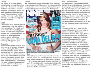
  • 1. Lighting Framing Body Language/Staging The lighting on the photo is quite a The main image is centred in the middle of the magazine The main image is a simple shot which has natural lighting but has probably been cover, taking up most of the space of the background of the the basic foreground/background format with taken with a flash camera to make it cover. Overlaid on top of it are more pictures, but they are no extra props. The foreground features Lana brighter. It will then have been make example of the posters which come with the magazine Del Rey in a simple pose with her hands on brighter in Photoshop but there is still her hips and tongue sticking out. This photos some shadowing in the bottom right body language backs up her quote which was corner. The target audience would featured on the front of the article. In the probably not be interested in elaborate background there is a white wall for one third lighting or sets so they would prefer along the bottom, and the rest features the this style of lighting. American flag which has been pinned up. The American flag can be linked with the sell Colour line also as they call her an American icon. The colouring on the magazine features 3 main colours; white, blue and black Text which is simplistic. The white is used The main sell line uses a quote from the on the masthead and to highlight the article and the name of the cover image to few sell lines which are along side the attract the audience of that singer. main sell line. The blue emphasised the Underneath the name of the singer, there is a names of the subjects inside the declarative sentence making a statement magazine and the red is just a about the singer, and showing the general background colour used to help sell the opinion of the magazine of her. In this main story and support its quote. instance, it is positive as they call her a “MODERN AMERICAN ICON”. The 3 Composition other sell points featured on the magazine In most countries, readers read from left to feature the name of the subject of the article right, from the top to bottom. Having the masthead at the top left of the magazine so and either a quote from them or something it is the first thing they will see. Moving exclusive. For example, fans of Pete Doherty from left to right, they will then be attracted may buy this magazine because it has the to the smaller photos of band members, and Font promise of new tracks and album details. read the offer underneath them. Going back Almost the entire of the magazine is in the same font in The bottom of the page also includes smaller to the left side, they will then come across different colours. The separating between the main sell sell lines where other acts are featured. There minor selling points, then the main sell point and the subheads are the use of italics. The word is also an emphasis on the “FREE points and the main image. The final thing “Plus” is written in an entirely different font which will POSTERS!” which are on the right of the s the reader will come across are the small catch the eye of the reader when they are looking at the main image which peoples eyes will be mentions at the bottom which are just incentives to buy the magazine. cover and they will read the subheadings which inform drawn to and may purchase the magazine for the reader of other acts featured. the posters.
  • 2. Body Language/Staging Lighting Text The lighting on the photo is a standard lighting with no depth and highlights the faces of the three main people on the front on the magazine. The main image was probably staged The main sell line is the name of on a blank wall as the image the band, “GREEN DAY” with a background has been made transparent quote from their interwiew with and places onto a block colour. They the magazine featured in the essay. have also been shot separately so they On the left of the main sell image, can be placed at different positions on there are three sell lines featuring the cover, as well as being scaled to three different bands of different make the singer more eye catching. All genres and hints about what they three have also had their hands are talking about. Notably, they photoshopped so they have a likeness use alliteration “Sun! Surf!” in the to disney characters. The hands are the subhead for “PARKWAY first thing that you see and all of them DRIVE”. Below that, there is a have inappropriate references, much compilation album with a track list like the bands general attitude and featured, name dropping some connotations about them. artists on it. Below that is tour news for UK fans of the famous Composition “WARPED TOUR” , which most of the audience would know about The masthead is mostly obscured by and would show interest in. There the main sell image, complete with the is also another sell point with a main sell point and a quote from the picture to accompany it of the lead article. On the left, they have 3 sell singer of the band. lines. In the middle, they have the logo of the magazine with an offer of an Framing compilation album. Along the bottom is a bigger sell line, and bonus The main image is framed towards information . the upper right of the cover with the front man being the biggest Font and overlapping the masthead. To the left of him is the bassist, who The fonts mainly used in this are bold is slightly over lapped by a sell letters or a font that resembles a line. At the bottom, the drummer is Colour much smaller and over lapping the handwriting. The font varies in sizes The colours used on the cover are bold CMYK (cyan, magenta, yellow) and colours, depending on the main sell line. colouring which contrast together, and make the front cover more eye importance of the sell line or subhead. catching on the shelves.
  • 3. Body Language/Staging Text The main image was probably staged on a blank wall as the image In the middle left of the magazine, background has been made transparent there is the main sell point which is and places onto a gradient colour, all in white. To the right there is only coming from the middle outwards. The one sell line, name dropping several pose of the image is a dominant stance popular musicians which are and she has her head up but still “finalists” and the promise of more remaining eye contact. This could be featured inside. Below that there is seen as her looking down on the reader. an advertisement for the “Billboard Composition Music Awards” which is sponsored by the magazine. On the left there is The masthead is mostly obscured by more selling points for the award the main sell image which over show, as this is a special edition of overlayed by sell lines on both the right the magazine commemorating the and the left side of her. On the bottom show. Underneath the sell line there right, the last place a reader sees, is an is a fashion aspect which the target advertisement for an award show. audience may be interested in and a feature for artists who are making a Font comeback as another sell line. Most of the cover uses the same font Framing which is long and bold. However, the main sell line uses an italic, handwriten The main image is framed directly in font for the quote and a plain font for the middle of the magazine and the name of the main image. Above the overlaps the masthead to allow the name is an announcement of her return full image to be shown. to music, also in a different font. Colour Lighting The colours used on the cover are The lighting on the photo is a neutral red tones for the main sell standard lighting with no depth and image and the background. The fonts highlights the faces of the three are white and yellow which main people on the front on the compliment the background nicely and magazine. makes the yellow stand out.