Vip Call Girls Noida ➡️ Delhi ➡️ 9999965857 No Advance 24HRS Live
Magazine cover analysis_q
1. Yves Robinson
Salford City College
Eccles Centre
AS Media Studies
Foundation Portfolio
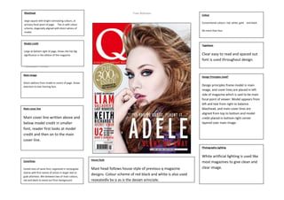
Colour
Conventional colours: red, white, gold and black
No more than four.
Masthead
large square with bright contrasting colours, at
primary focal point of page. Ties in with colour
scheme, diagonally aligned with direct adress of
model.
Typefaces
Clear easy to read and spaced out
font is used throughout design.
Main image
Direct address from model in centre of page. Draws
attention to text framing face.
Photography Lighting
White artificial lighting is used like
most magazines to give clean and
clear image.
Model credit
Large at bottom right of page, shows she has big
significance in the edition of the magazine
Coverlines
Varied sizes of same font, organized in rectangular
shame with first names of artists in larger text to
grab attention. Mix between two of main colours,
red and black to stand out from background.
Design Principles Used?
Design principles frame model in main
image, and cover lines are placed in left
side of magazine which is said to be main
focal point of viewer. Model appears from
left and text from right to balance.
Masthead, and main cover lines are
aligned from top to bottom and model
credit placed in bottom right corner
layered over main image.
Main cover line
Main cover line written above and
below model credit in smaller
font, reader first looks at model
credit and then on to the main
cover line.
House Style
Mast head follows house style of previous q magazine
designs. Colour scheme of red black and white is also used
repeatedly by q as is the design principle.
And