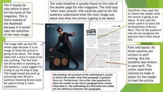
1. The image take up one the
whole page because it is an
image of what the article is
going to be about. The image
takes half a since it need to be
eye catching. The fact that
the Bruno Mars is standing on
the speakers, could suggest his
trying to say his king of pop.
The image would also end up
attracting more Bruno’s
audience meaning Bruno could
be used to bring in more
customers.
The V stands for
vibe which is short
for the name of the
magazine. This is
there instead of
the Masthead
because it is would
take the attention
of the main image.
The main headline is usually found on this side of
the double page for vibe magazine. The title says
‘when mars attacks’ this could be used to let the
audience understand what the main image was
about and what the article is going to be about.
Font and layout: All
three columns are
written in serif
writing. But the
standfist was written
in sans-serif. The
writer used three
columns to make it
easier for the reader
to read the article.
Standfirst: they used this
to inform the reader what
the article is going to be
about. In this case the
writer used it to state the
achievements of Bruno
Mars. This let the audience
who do not recognize the
pop star learn more about
him
Sub-heading: the purpose of the subheading is usually
to inform the reader what that paragraph is going to
focus on. Furthermore, the writer uses questions to
allow the reader to see which paragraph their mostly
interested in. the subheading are bold allow the reader
tell the difference between the paragraphs.
2. First paragraph in this
article is a standfist
which let us know
about who the main
image is and what the
article is going to be
about.
This article doesn’t
have doesn’t have a
heading or sub-
headings. This isn’t a
very effective way to
let the reader navigate
through article since
everything is all over
the place. This could
end up with the target
audience losing
interest.
The colour scheme of this magazine is
blue and grey. But the singer who is
wearing red which stands out from the
writing and the other content
The main image
completely stands out
to the rest of the article
since it is the only
image that has colour.
this is because the main
image need to be eye
catching.
The sub mages are all in
black and white so they
do not they do not steel
the attention off the
man image since it is the
most important image in
the whole page, even
though all of the picture
are of the same person
but in different posses
The article has three article
with 11 different paragraph
and the another column on
the other side of the page to
finish up the up the article.
The majority of the article is written
in serif apart from the quote and the
first paragraph which are written in
sans-serif. This is because it helps
the audience identify the important
part of the magazine