
Recommended
More Related Content
What's hot
What's hot (19)
Similar to Making wip
Similar to Making wip (20)
More from tyronedevereaux
Making wip
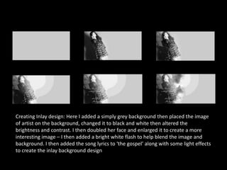
- 1. Creating Inlay design: Here I added a simply grey background then placed the image of artist on the background, changed it to black and white then altered the brightness and contrast. I then doubled her face and enlarged it to create a more interesting image – I then added a bright white flash to help blend the image and background. I then added the song lyrics to ‘the gospel’ along with some light effects to create the inlay background design
- 2. Creating Front Cover design: Firstly I filled the background layer with a grey colour, similar to the inlay , to keep the consistency in CD image I then added an image of artist on one half of the canvas – then edited the colours, brightness and contrast. I then copied and flipped the image to create a reflection type style to reflect the ‘reflective mood and songs’ of the album. I then copied each side two more time changing the opacity of the image each time to create a ghost/ illusion like design. Furthermore to add the artist name/logo I designed in adobe illustrator and finally album name ‘hopeless intentions’ on a slight tilt to re-create a hand written/signed effect
- 3. Creating Back Cover design: Firstly I filled the background layer with a grey colour, similar to the inlay and front cover , to keep the consistency in CD image I then added an image of a ruined wall to reflect the ‘down to earth/ real’ atmosphere the artist wants to create about her album. I then added a border and again bright white lights/flashes on each corner to create a more interesting design - and help show the more ‘popular/star’ side of the artist. Moving on I then added the album name to the design in the same typography used in the front cover to keep image consistency and simply changed the opacity to not make it so dominate. Furthermore then added the label logo, track names, again in the same typography as album name, and lastly album production and legal information at the very bottom in a smaller font size due to its importance to a fan of the artist and conventional positioning I gathered from previous album cover research.