The document summarizes the process of creating a digipak for a CD. It describes:
1) Taking a photo and converting it to black and white to use on the CD cover. Layering paint brushes on the image to make it look like dripping paint.
2) Designing the back cover with a list of song titles following the rule of thirds.
3) Assembling the finished CD cover, back cover, and inside artwork into the digipak with complementary colors and designs.
1. Digipak Creation
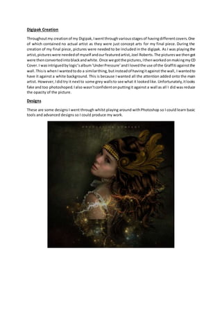
Throughoutmy creationof my Digipak,Iwentthroughvariousstagesof havingdifferentcovers.One
of which contained no actual artist as they were just concept arts for my final piece. During the
creation of my final piece, pictures were needed to be included in the digipak. As I was playing the
artist,pictureswere neededof myself andourfeaturedartist,Joel Roberts.The pictureswe thengot
were thenconvertedintoblackandwhite. Once we gotthe pictures,IthenworkedonmakingmyCD
Cover.I wasintriguedbylogic’salbum‘UnderPressure’andI lovedthe use of the Graffiti againstthe
wall.Thisis whenI wantedtodo a similarthing,butinsteadof havingitagainst the wall, I wantedto
have it against a white background. This is because I wanted all the attention added onto the main
artist. However,Idid try it nextto some grey wallsto see what it lookedlike.Unfortunately,itlooks
fake and too photoshoped.Ialso wasn’tconfidentonputtingit against a wall as all I did was reduce
the opacity of the picture.
Designs
These are some designs I went through whilst playing around withPhotoshop so I could learn basic
tools and advanced designs so I could produce my work.
2.
3. The Creation – CD Cover
Whilst making my final design, I had to use a
raw photo of myself, which I turned into black
and white. This is the image which I used.
Once I had the image, I then added a layer
mask onto the image and I cut around the
image with the paint brush to get rid of the
background. I could have used the lasso tool
or the magic wand, but I wanted to have it
more exact. I zoomed in pixel deep, so I could
get a realistic crop. Once I had this image
cropped out, I then went into photo gallery
and I added an effect to make the image look
less realistic. Once I had this, I then realised I
needed to turn it back into colour as I wanted
my CD Cover to be bright and vibrant. Once I
had the picture back in colour, I then
downloaded some wet drip paint brushes off
the internet. I made my coloured image its
own separate layer, and applied a layer mask
to it. This is when I placed the layer mask as
white and the brush as black. This is so you
can cut out the model. I set the hardness of
the brush on 100% and the opacity as well. I
then cropped out the whole lower waist of my
model image, then replaced the brush with a
wet paint brush, turned the colour of the
brush onto white (so the cropped areas
reappeared again) and then began to place
the wet paint onto areas I wanted. I then
accidentally placed the wet paint onto my
characters face. This is when I thought about
having the paint run down from the face and
onto the clothes. I then made this image into
its own copy and duplicated it a bunch of
times Within each copy, I added a huh
saturation onto it and targeted different
sections of the face. This then change the
colours of those parts.
4. Once the colours were changed, I then made
this into a separate image and placed it into
the gallery and added a paint effect to make it
look like its wet paint. Before this, I did add a
vibrant effect and created a Clipping mask
onto the image so part of the white dripping
down the face turned yellow. This is the
yellow which can be seen in the final product.
This effect made the picture look more
realistic and makes it look more as is the paint
was running. Once I had my main image, I
then just added in the text and the parental
advisory sticker. I also added in the title of the
album ‘Judicial Independence Vol 1’ in a
different font. In total, I used three fonts:
Arial, Freehand and then comic sans but the
comic sans font was bold. This is just to add a
stylistic and aesthetically pleasing effect to the
CD Cover.
CD Back Cover
The CD back cover was easy to make. As my
cover was simplistic, I wanted to match this. I
stuck to my rule of thirds and had the listed
song names all down the middle with the
same distance from the edge and from other
songs. At the start of my creation, my group
had to decide on the song names. A lot of the
names were just thought of on the spot, but
we did include our chosen song ‘Moment of
Silence’ and also the album name ‘Judicial
Independence.’ As this is a Hip-hop album, we
decided to add some skits as they are very
popular within the genre. At the very start, I
added in the title at the top. This is just to add
the name of the album where ever the reader
or buyer looks. This is because Distinct is an
upcoming artist and It looks stylistically
pleasing with the title at the top. After this, I
added in the songs on the back and the legal
writing at the bottom. I used an actual copy of
a CD to use the legal writing as an influential
idea. The font side on the back looks realistic
and it didn’t look fake which was something I
was really hoping I would avoid.
5. Digipak
Now that I have my CD Cover and back
Cover, I just used the cover for the Cd and
the inside cover. On the CD, I added a simple
bit of text ‘Distinct mix tape.’ I also applied a
flick on the bottom of ‘Tape’ just because it
looked stylistically pleasing for the reader.
With the main image on the CD, I placed it
over one side and the text on the other. I
thought this distinguishes the text from the
image and just makes it different from the
other covers I have used. On the inside
cover, I added a big letter ‘D’ and turned
down the opacity. This design came from my
magazine advertisement but that also came
from an advertisement for Jay-Z. For the side
of the Digipak, I just used a grey colour,
matching the grey on my images top, and
placed the institutional logo at the top. I also
put the title of the album and the artist
name on the side as well.