
Recommended
More Related Content
What's hot
What's hot (20)
Viewers also liked
Similar to Front Panel design updated for digipak and video
Similar to Front Panel design updated for digipak and video (20)
Recently uploaded
Recently uploaded (20)
Front Panel design updated for digipak and video
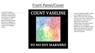
- 1. Front Panel/Cover In my Final audience feedback, lots of people said that I should use the same font on the digipak, as I had done on my poster. Therefore for the final edit I changed the font and text so both the poster and the digipak match. I was also told that maybe I should use the digital clock like in my video on the front cover, to relate it more to the video. I haven’t done this however, as it was not the digital clock in itself I was representing in the video, but the passage of time. Therefore I believe the use of a different clock adds to the elements of time and helps represent the repretitetive nature of the video.
- 2. Back cover I didn’t have much to change on the back cover, however I did make sure all the copyright information was visible, as some of it was missing on the last draft. And I also added the logo I added to from the video.
- 3. Extra panel I have added more blue into this image to help link it to the blue on my second inside panel.
- 5. Inside panel 2 I have made the image of the man sharper then it was, as said in my audience feedback. However I have kept the borders around him kind of wavy, this is to give the representation of a spirit, which is not fully solid. My feedback also said I should make all the panels on the inside black and white, as this image was too bright. However I have lowered the brightness on the image so it fits in better with the other slides. Without getting rid of the heaven like effect on the clouds., I also added a black border, to help the image blend in with the others.
- 6. Spines I have added a spine with a saying from one of the intros of the songs, this is to relate the album to the artist.
- 7. CD panelWith CD Without CD I have used pictures with and without bottles to reference the digipak to the video, and to show the decline of the character in the video, starting off with no bottles and ending up having lots.