1. Font Ideas-
In horror films, one of the main things that get the audiences attention is
having a good title and font. Many movies can be predicted by whatyou
see on the adverts and the title of the film, it all depends on the name
and the way the color and font contrasts.
Audiences tend to see the title even beforethe movie is out, as it seen
on the adverts and many more production. If the film production has
more than one film it tends to have the samefont and title, that’s why it
is important to make the title
visible and one to remember.
There are many big movies that
have a great font idea and title
that links well with the
production such as; Harry Potter.
This was one of those titles any
audience can recognize as it seen
throughoutall the harry potter films and it creates a fiction and magical
feel to the audience justby looking at the theme of the title and its font.
The Harry Potter logo firstused for the American edition of the novel
series (and someother editions worldwide), and then the film series.
As my group and I are planning on doing a horror opening sequence and
have decided on the name we still need the font and colours to contrast
the opening sequence. Having looked at many other horror filmtitles we
want ours to be different but noticeable.
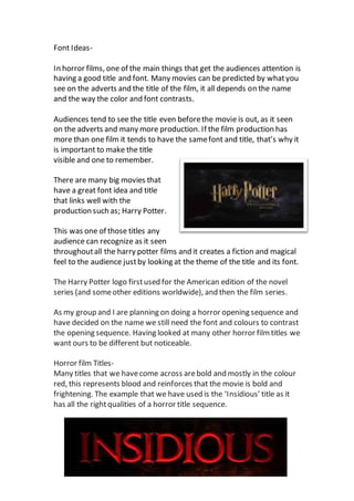
Horror film Titles-
Many titles that we havecome across arebold and mostly in the colour
red, this represents blood and reinforces that the movie is bold and
frightening. The example that we have used is the ‘Insidious’ title as it
has all the rightqualities of a horror title sequence.