Rapple "Scholarly Communications and the Sustainable Development Goals"
Feedback
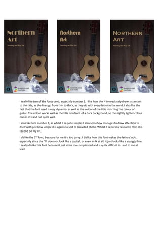
1. I really like two of the fonts used, especially number 1. I like how the N immediately draws attention
to the title, as the lines go from thin to thick, as they do with every letter in the word. I also like the
fact that the font used is very dynamic- as well as the colour of the title matching the colour of
guitar. The colour works well as the title is in front of a dark background, so the slightly lighter colour
makes it stand out quite well.
I also like font number 3, as whilst it is quite simple it also somehow manages to draw attention to
itself with just how simple it is against a sort of crowded photo. Whilst it is not my favourite font, it is
second on my list.
I dislike the 2nd
font, because for me it is too curvy. I dislike how this font makes the letters look,
especially since the ‘N’ does not look like a capital, or even an N at all, it just looks like a squiggly line.
I really dislike this font because it just looks too complicated and is quite difficult to read to me at
least.