
Recommended
More Related Content
What's hot
Viewers also liked
Viewers also liked (20)
Similar to Kerrang analysis dps
Similar to Kerrang analysis dps (20)
Recently uploaded
Recently uploaded (20)
Kerrang analysis dps
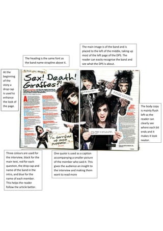
- 1. The main image is of the band and is placed to the left of the middle, taking up most of the left page of the DPS. The The heading is the same font as reader can easily recognise the band and the band name strapline above it. see what the DPS is about. At the beginning of the story a drop cap is used to enhance the look of the page. The body copy is mainly flush left so the reader can clearly see where each bit ends and it makes it look neater. Three colours are used for One quote is used as a caption the interview, black for the accompanying a smaller picture main text, red for each of the member who said it. This question, the drop cap and gives the audience an insight to name of the band in the the interview and making them intro, and blue for the want to read more name of each member. This helps the reader follow the article better.