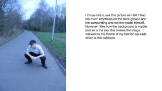
1. I chose not to use this picture as i felt it had
too much emphasis on the back ground and
the surrounding and not the model himself.
However I like how the background is visible
and so is the sky, this makes the image
relevant to the theme of my fashion spreads
which is the outdoors.
2. I like this image because it clearly shows
the model’s full outfit and displays it well
due to high key natural lighting and
framing. However I chose not to use this
image as too much of it is taken up by the
pavement, distracting from the outfit.
3. I like this picture as it makes use of the rule
of thirds well, it also includes the
background in full focus. I also like the way
this image makes the model look small,
however I chose not to use this image as it
doesn't focus enough on the model or his
clothes enough.
4. I like this image as the camera is on level with
the model and he can be seen in detail
properly. However I chose not to use this
image as I do not like how the camera seems
to be at a slight angle causing a tilted frame.
5. I chose to use this image as i think there is enough
balance between the inclusion of nature, so that
the theme of the outdoors comes across, and
focus on the model’s outfit which is the purpose of
a fashion spread. I also like this picture because it
makes use of the rule of thirds, this allows the
setting to be shown more clearly, displaying the
theme more.