Download as PDF, PPTX


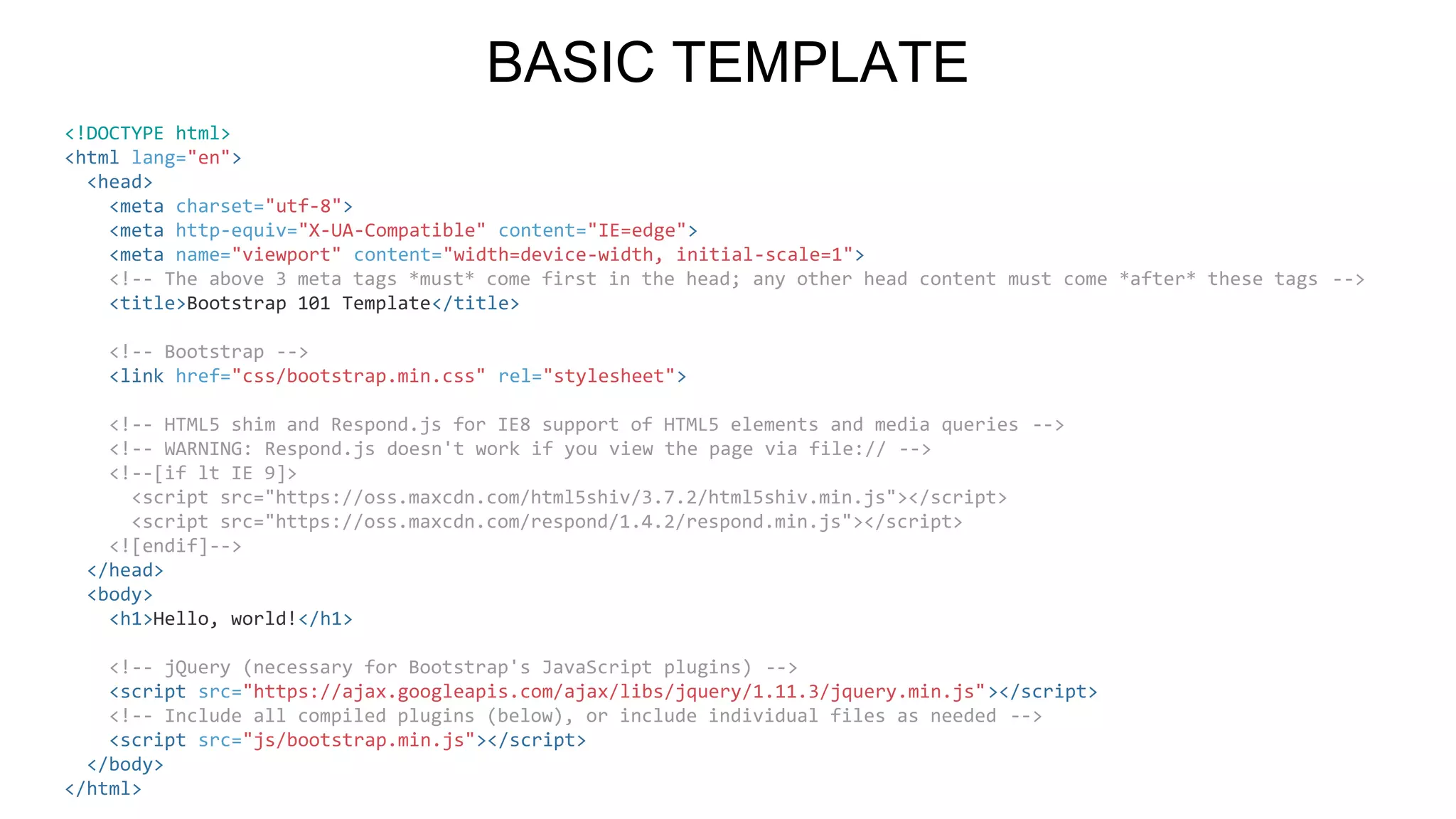
![<!DOCTYPE html>
<html lang="en">
<head>
<meta charset="utf-8">
<meta http-equiv="X-UA-Compatible" content="IE=edge">
<meta name="viewport" content="width=device-width, initial-scale=1">
<!-- The above 3 meta tags *must* come first in the head; any other head content must come *after* these tags -->
<title>Bootstrap 101 Template</title>
<!-- Bootstrap -->
<link href="css/bootstrap.min.css" rel="stylesheet">
<!-- HTML5 shim and Respond.js for IE8 support of HTML5 elements and media queries -->
<!-- WARNING: Respond.js doesn't work if you view the page via file:// -->
<!--[if lt IE 9]>
<script src="https://oss.maxcdn.com/html5shiv/3.7.2/html5shiv.min.js"></script>
<script src="https://oss.maxcdn.com/respond/1.4.2/respond.min.js"></script>
<![endif]-->
</head>
<body>
<h1>Hello, world!</h1>
<!-- jQuery (necessary for Bootstrap's JavaScript plugins) -->
<script src="https://ajax.googleapis.com/ajax/libs/jquery/1.11.3/jquery.min.js"></script>
<!-- Include all compiled plugins (below), or include individual files as needed -->
<script src="js/bootstrap.min.js"></script>
</body>
</html>
BASIC TEMPLATE](https://image.slidesharecdn.com/workshopdesignertools-160330133245/75/Workshop-6-Designer-tools-81-2048.jpg)

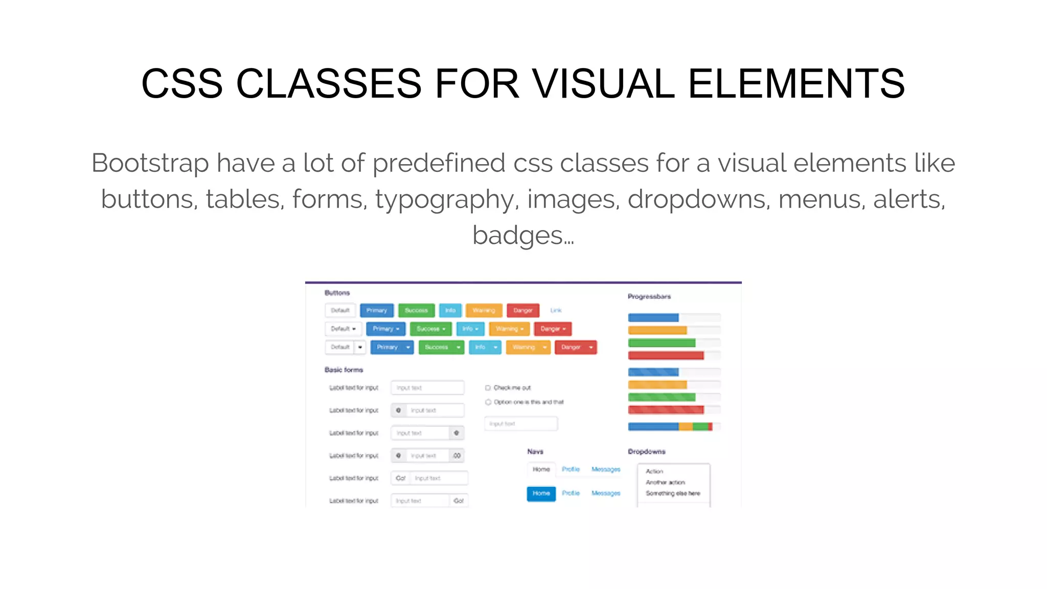
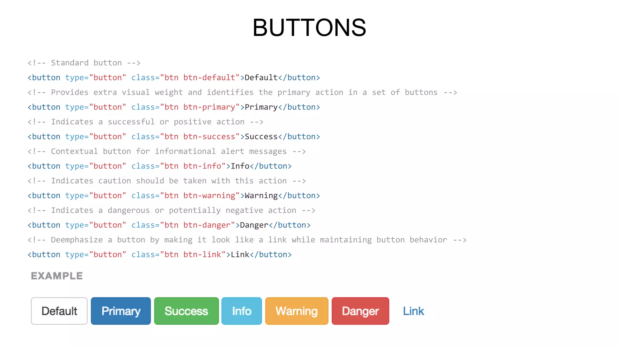
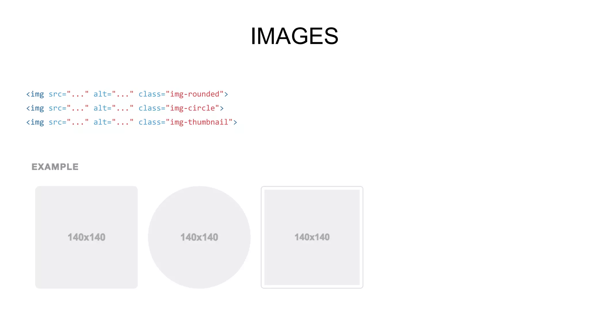
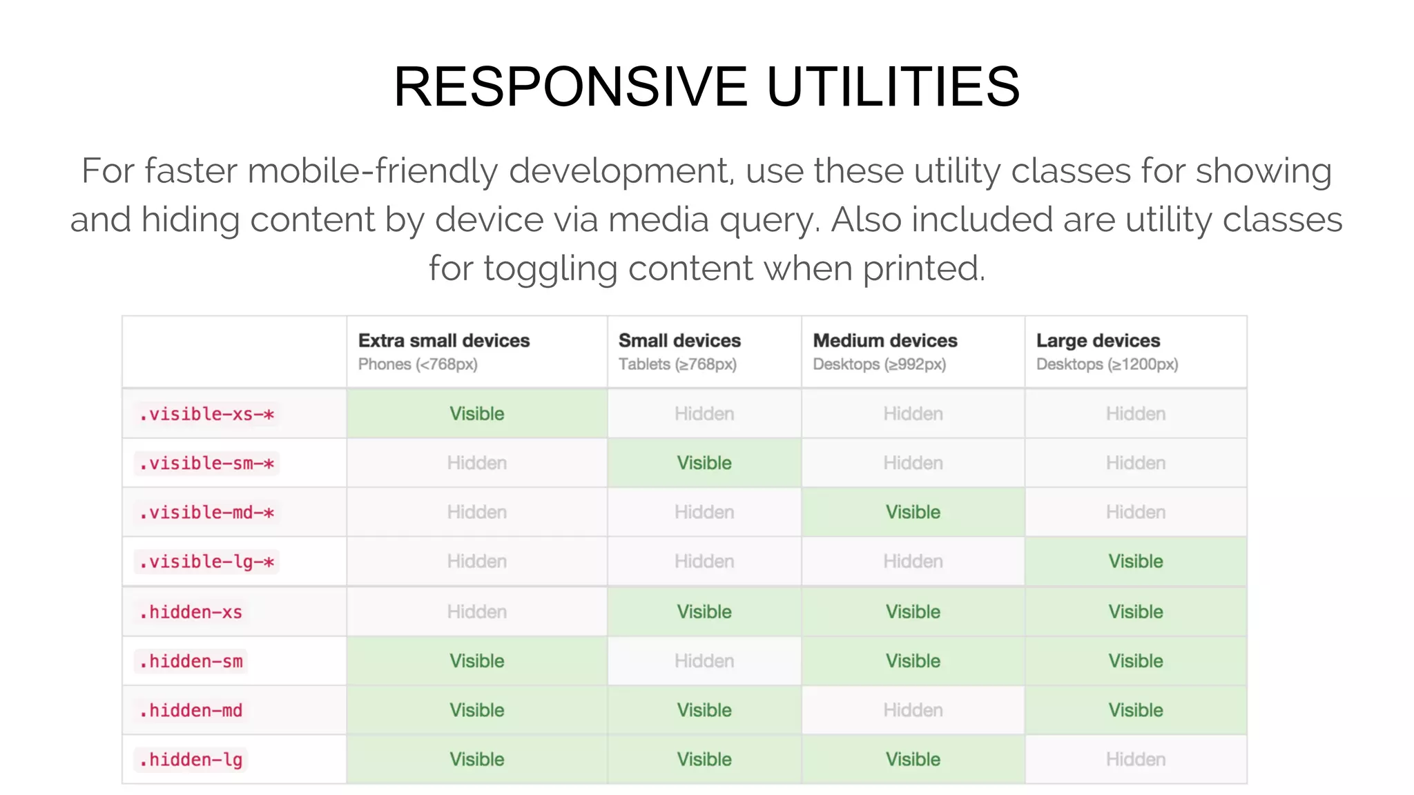
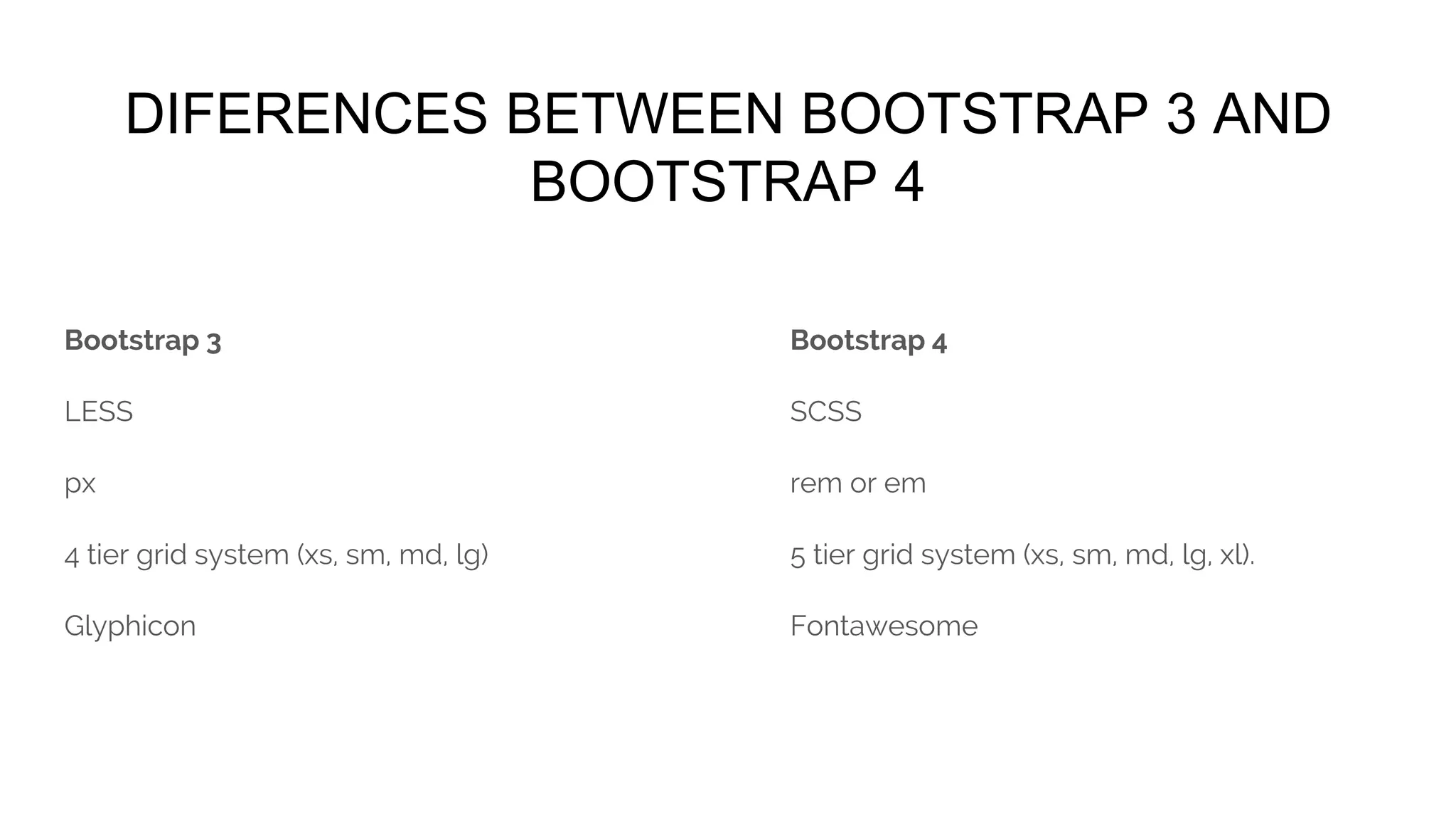

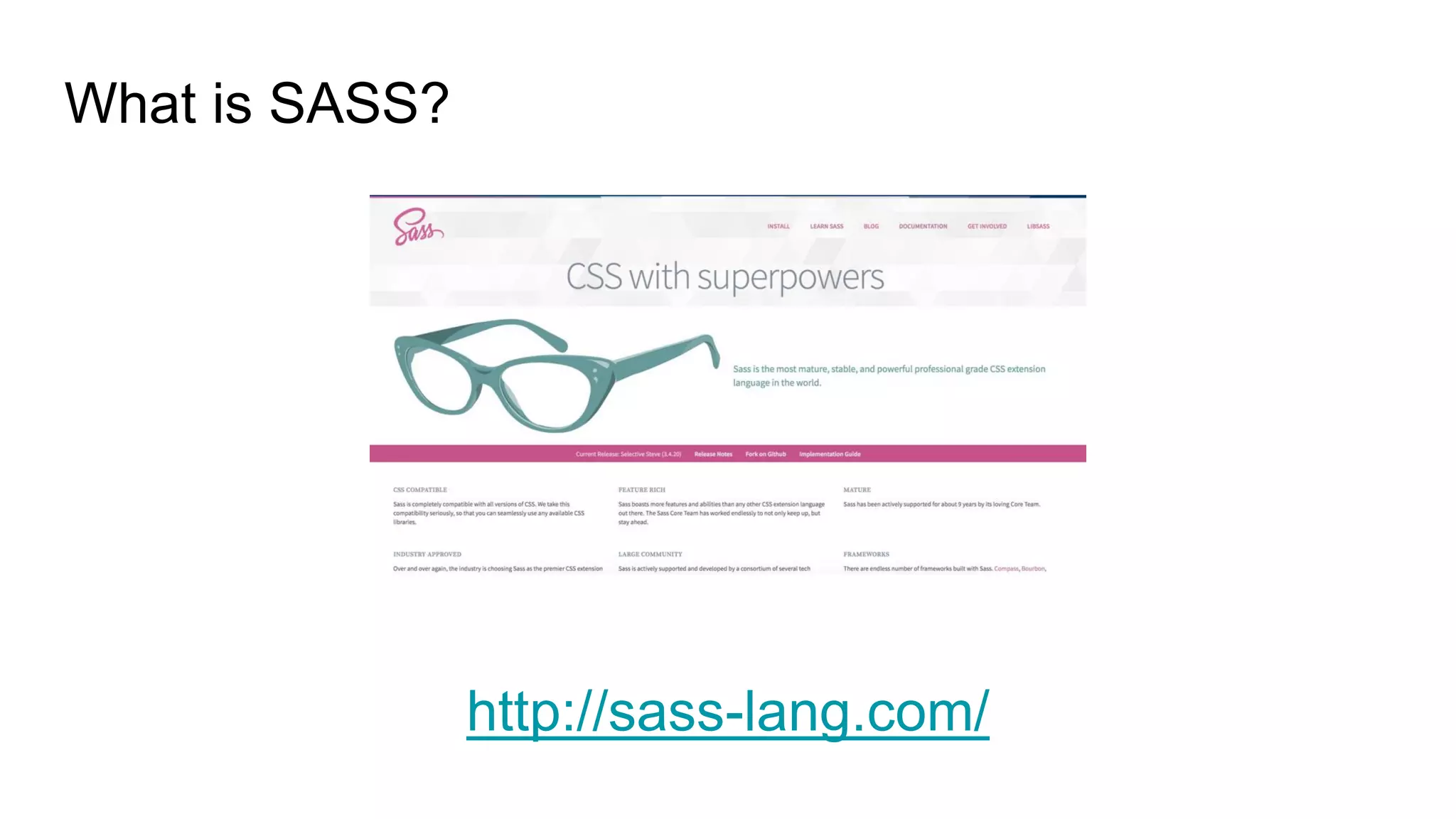
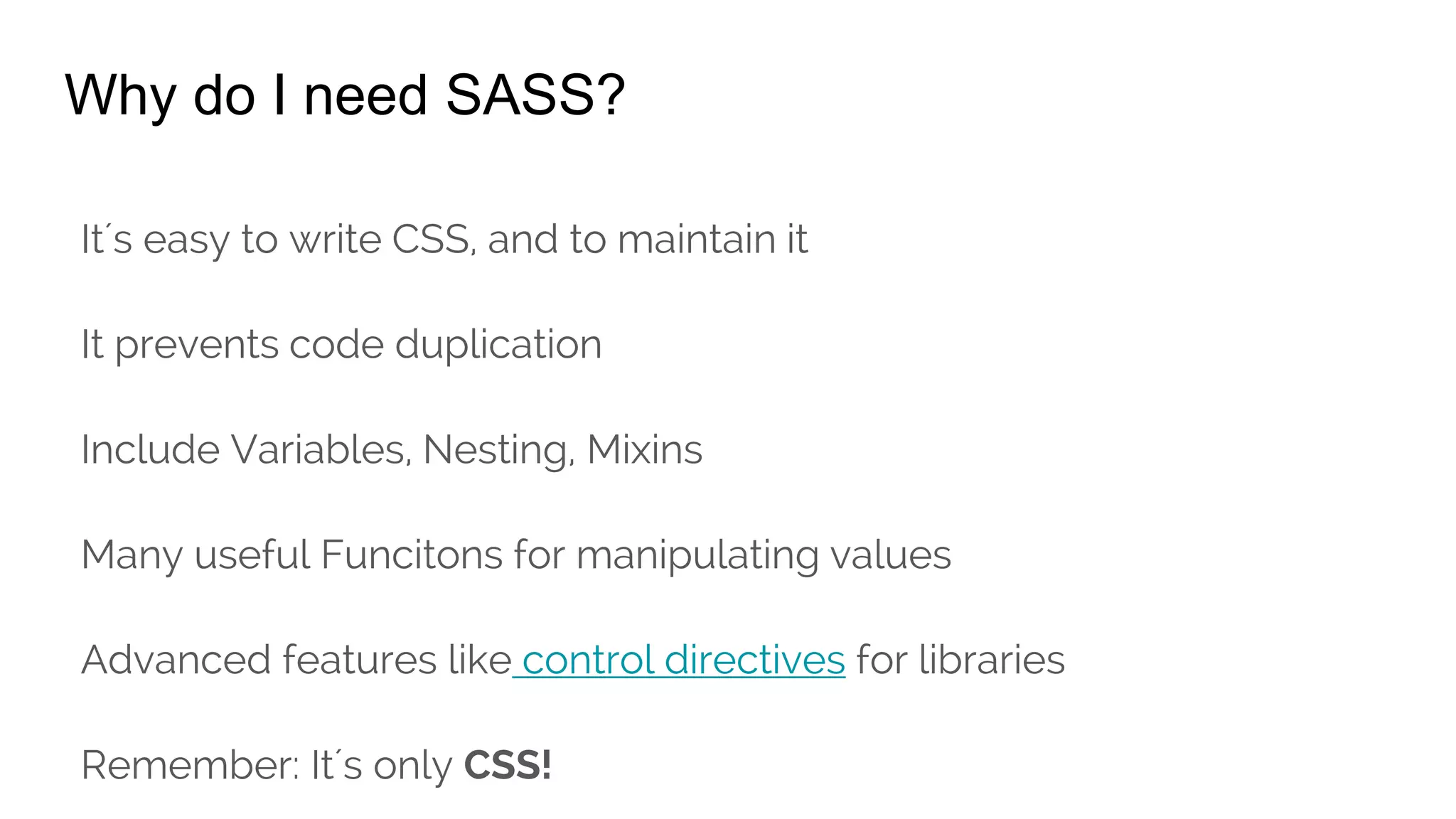
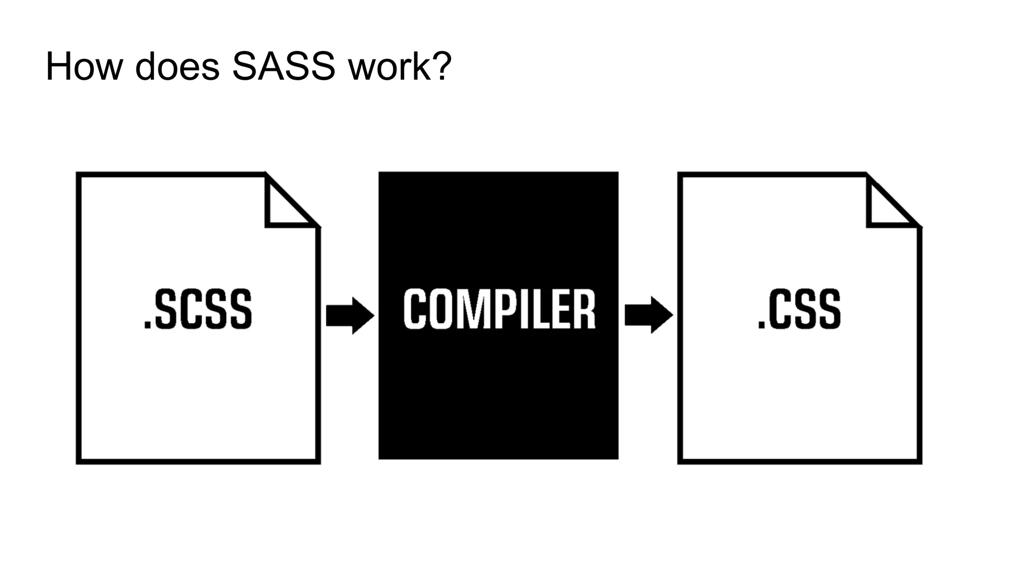
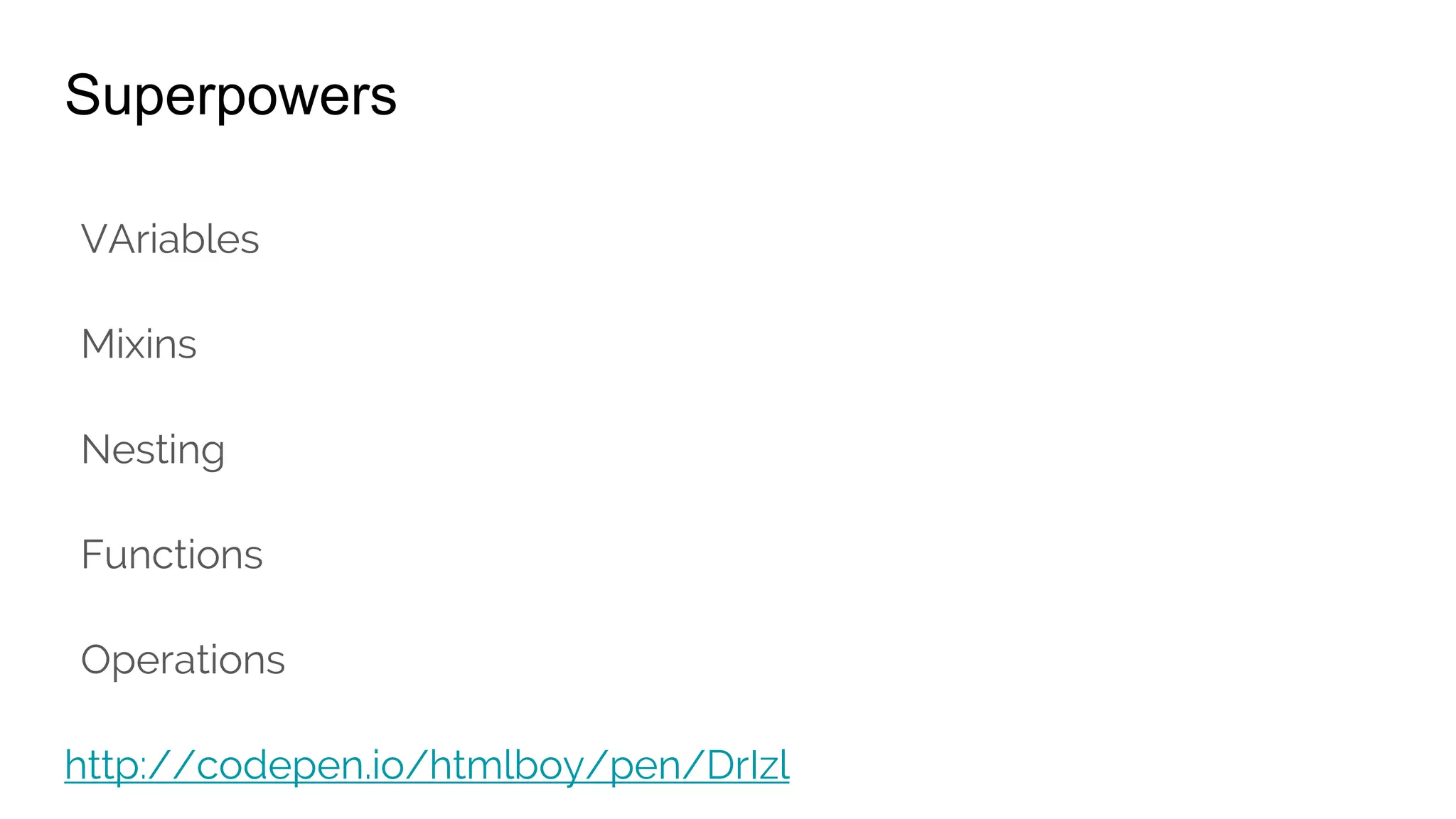
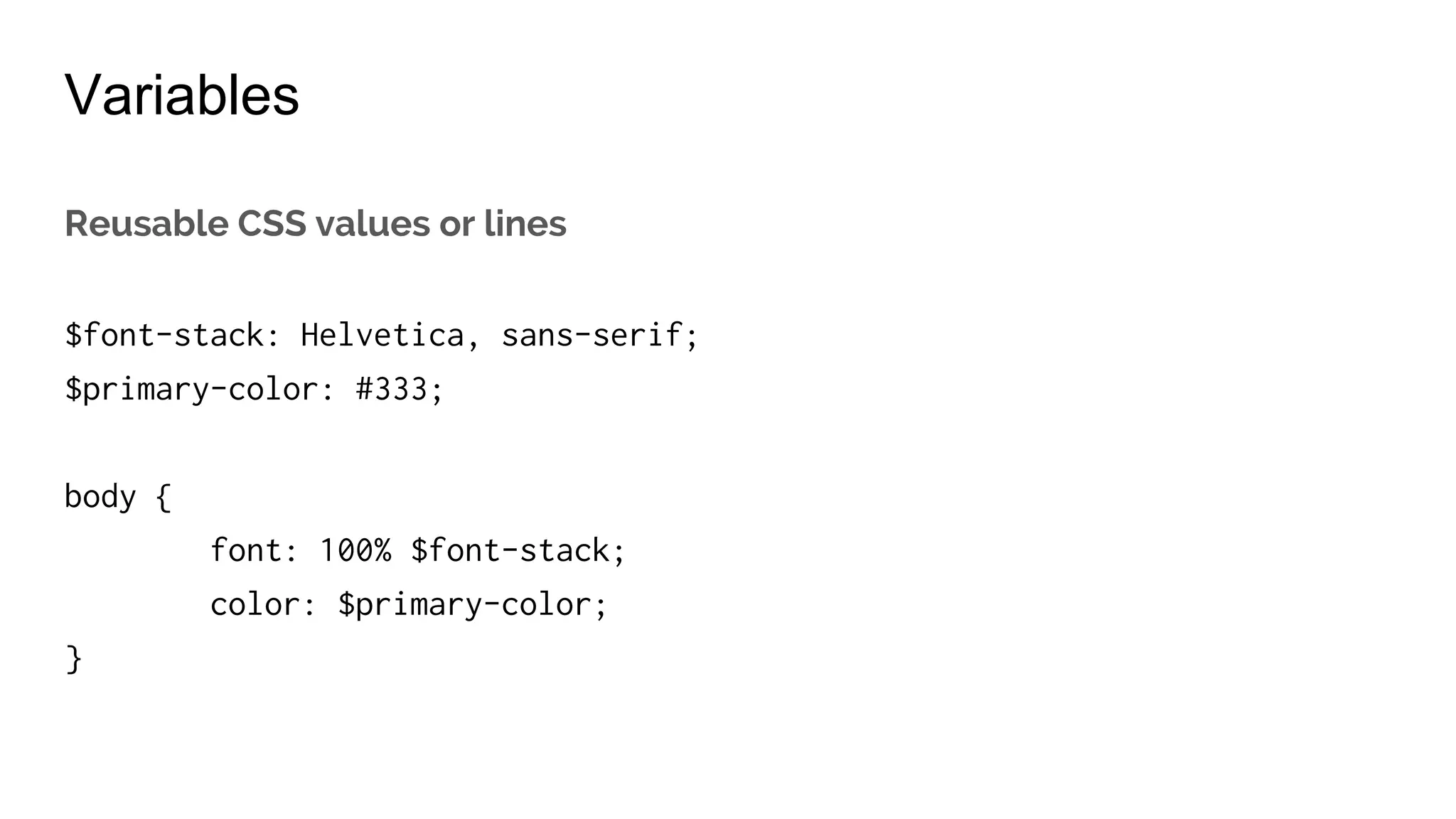
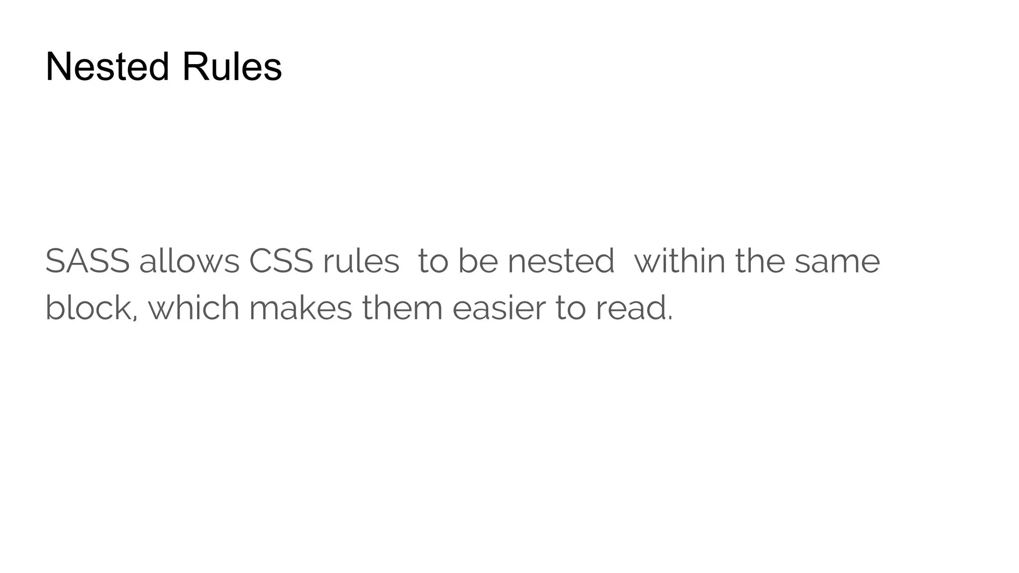
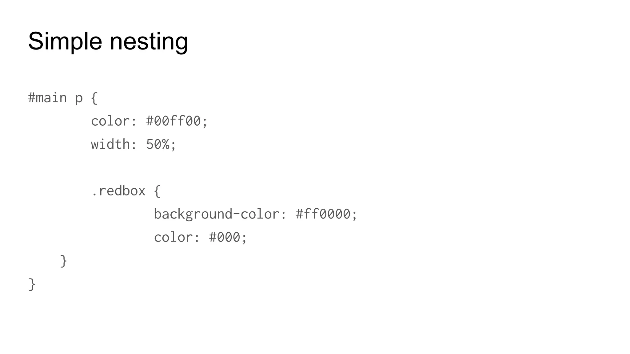
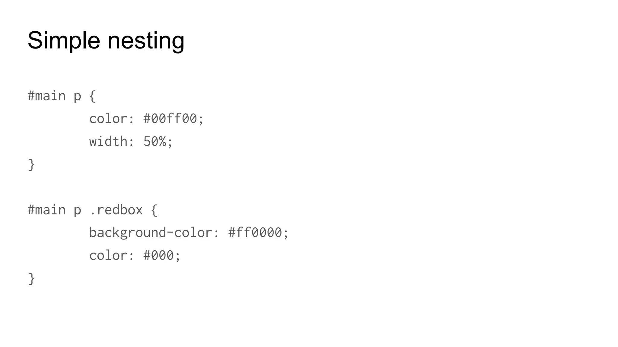
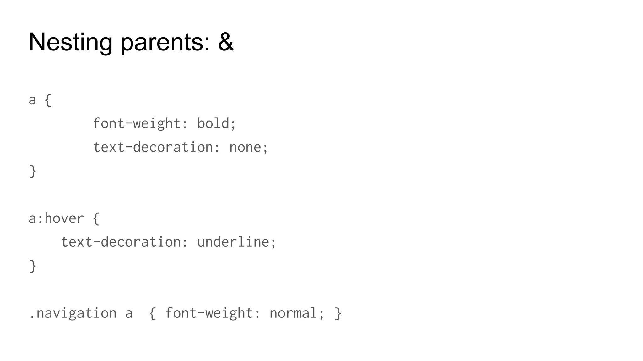
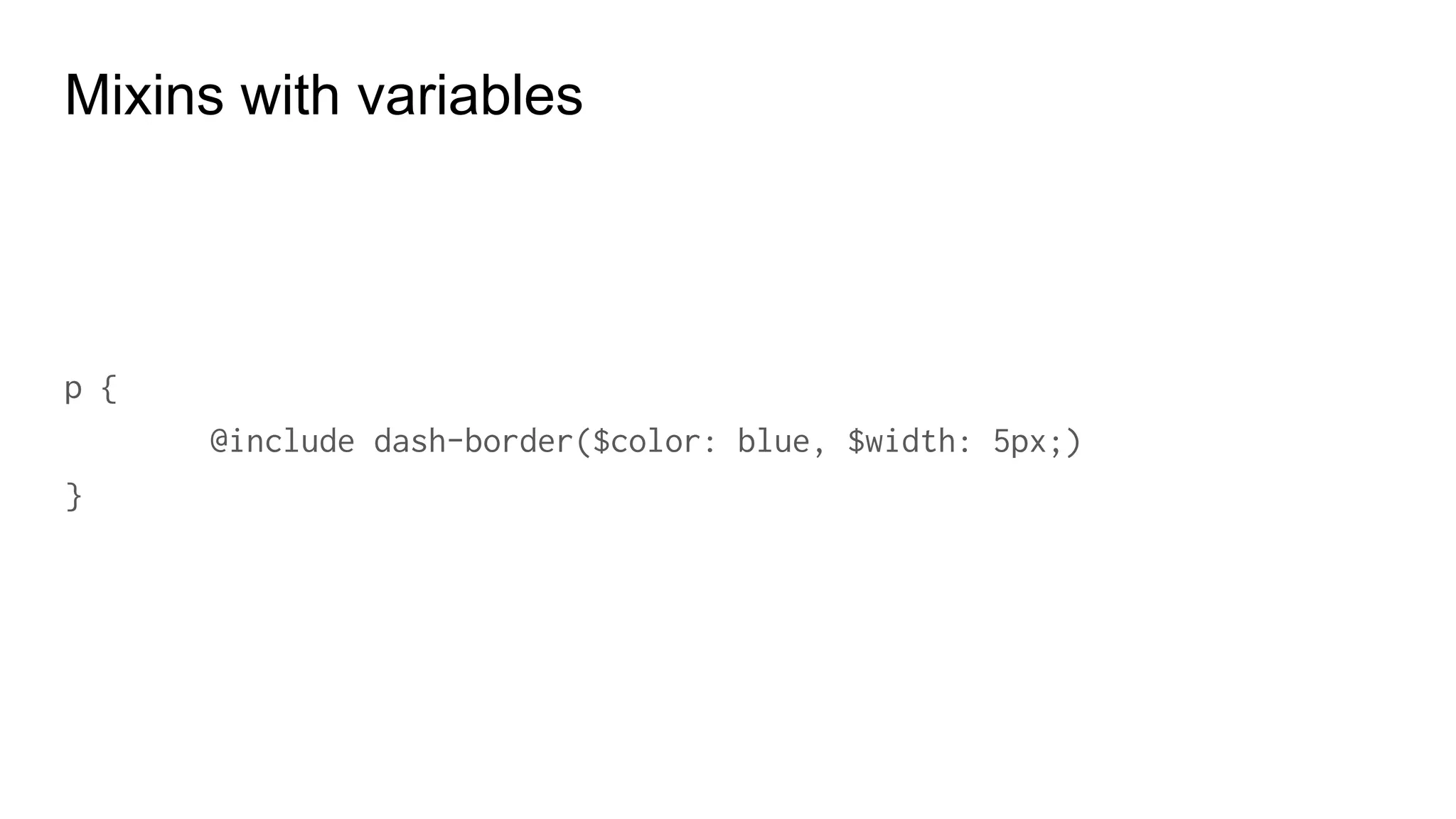
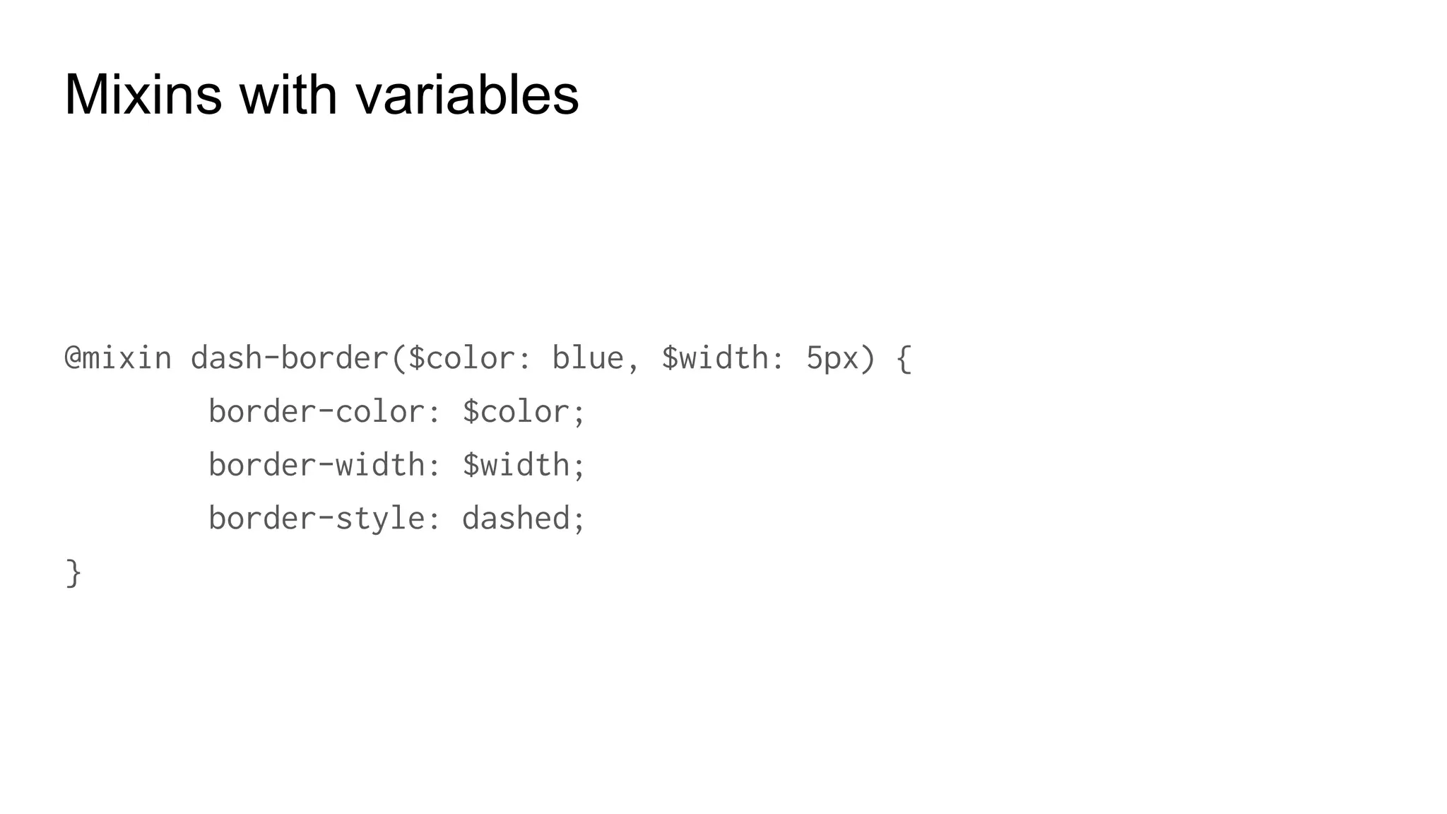
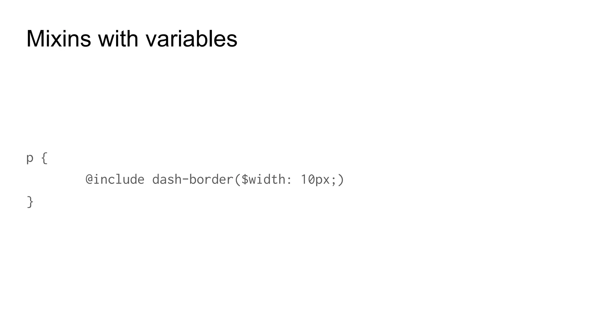
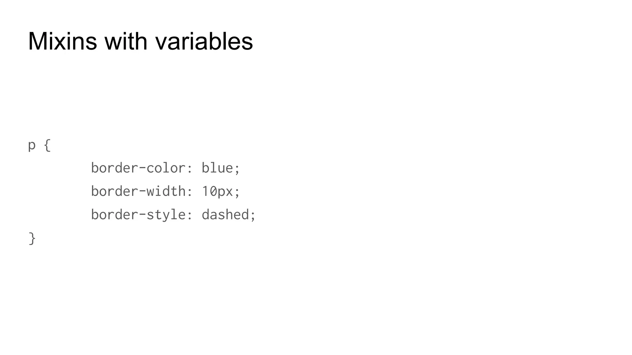
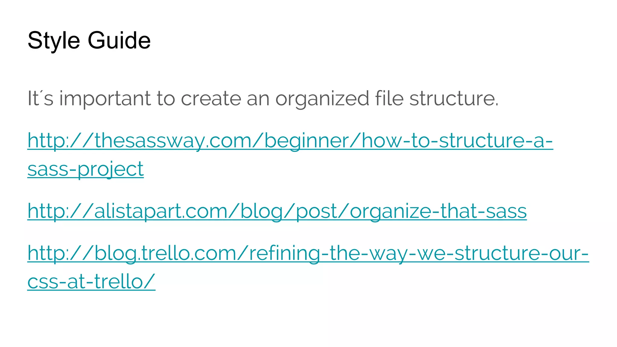
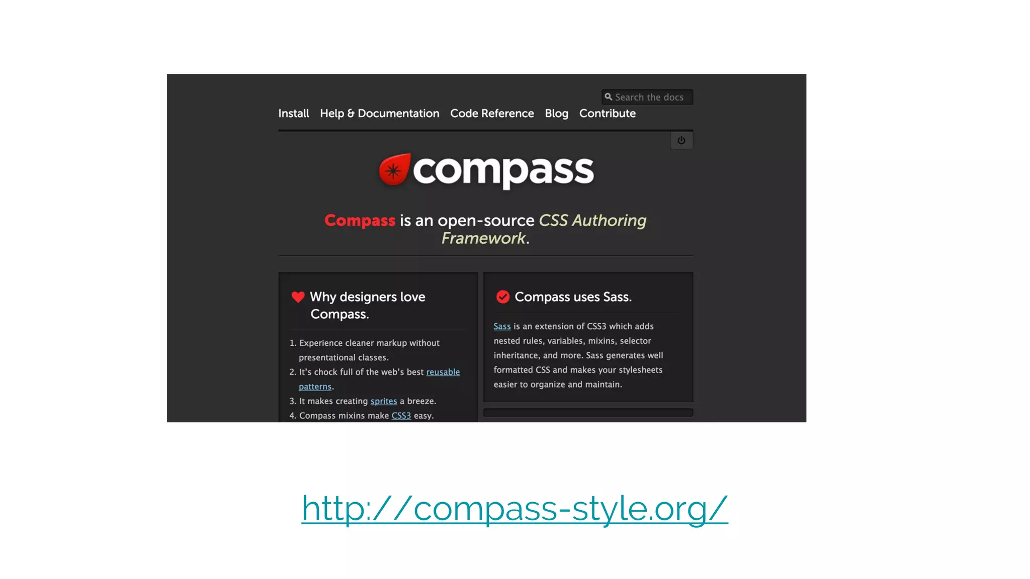
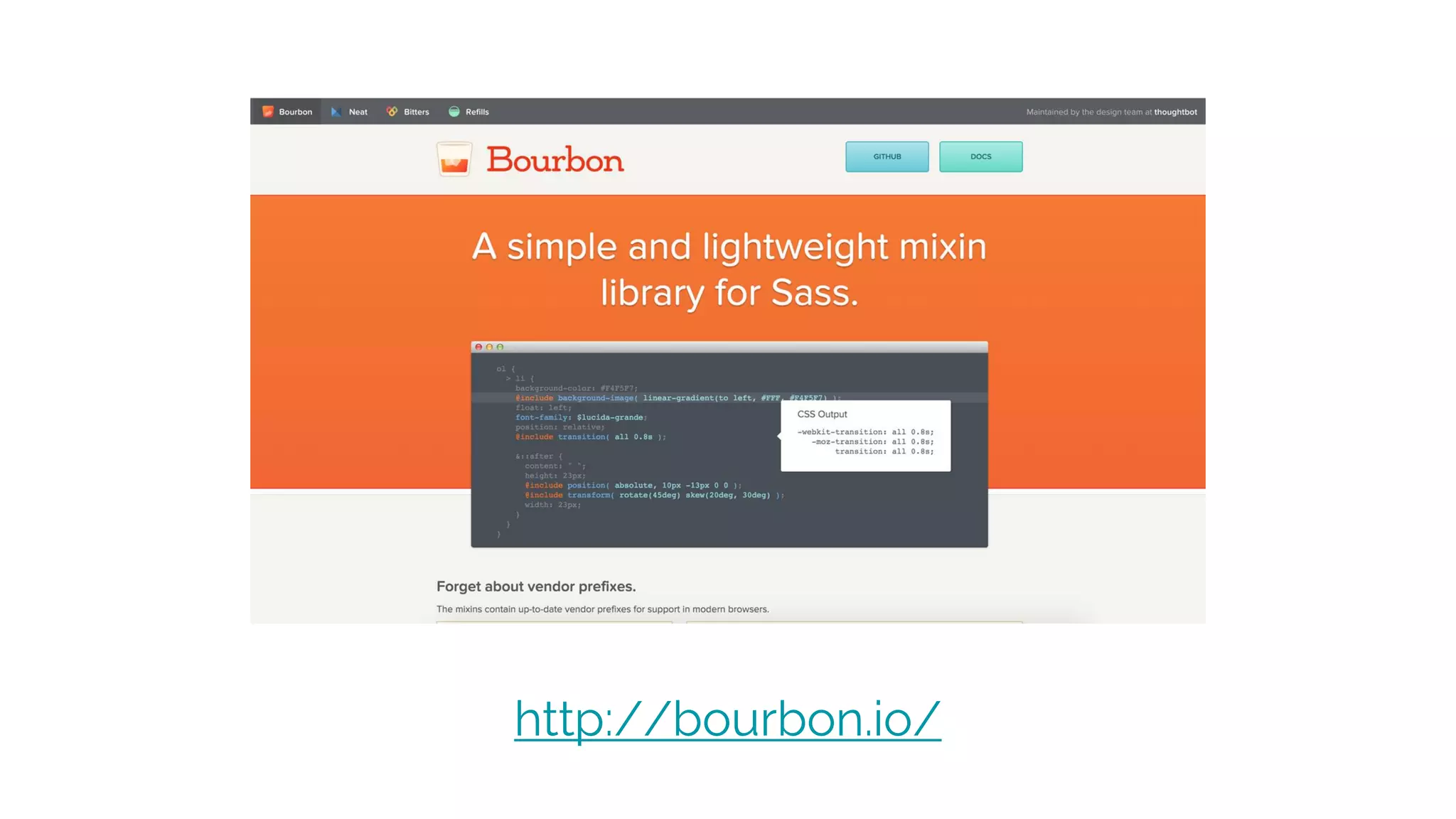
This document serves as a comprehensive guide to using Sass and Bootstrap, highlighting their features and advantages for web development. It covers essential Sass functionalities such as variables, mixins, nesting, and control directives, along with Bootstrap's responsive design capabilities and grid system. Additionally, it includes installation instructions, code snippets, and links to resources for further learning.