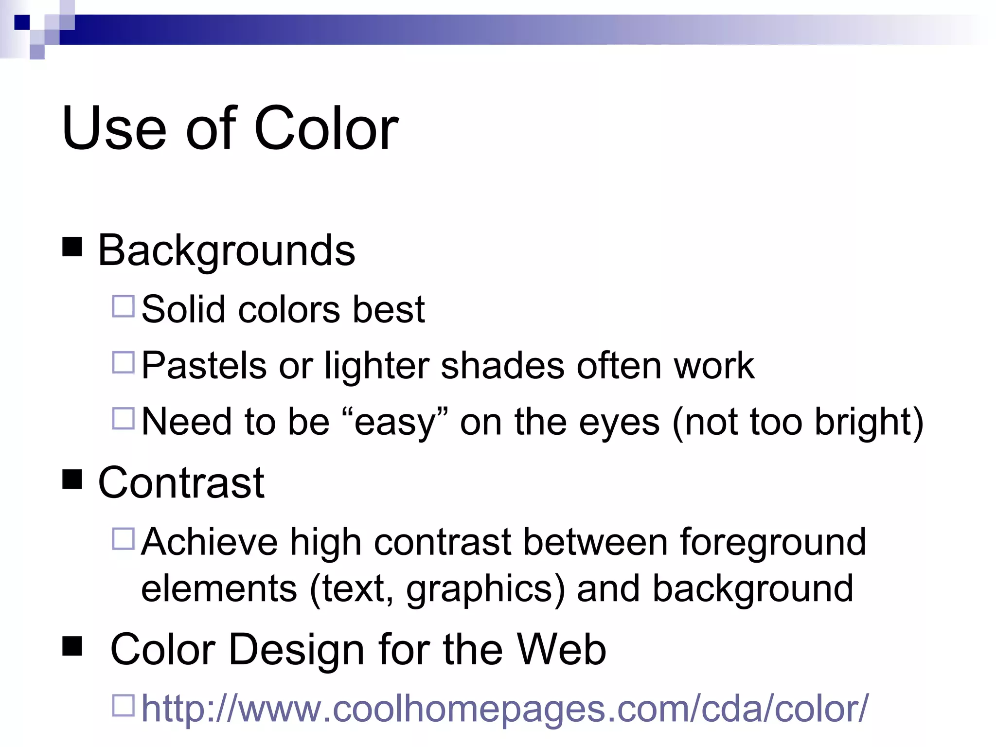
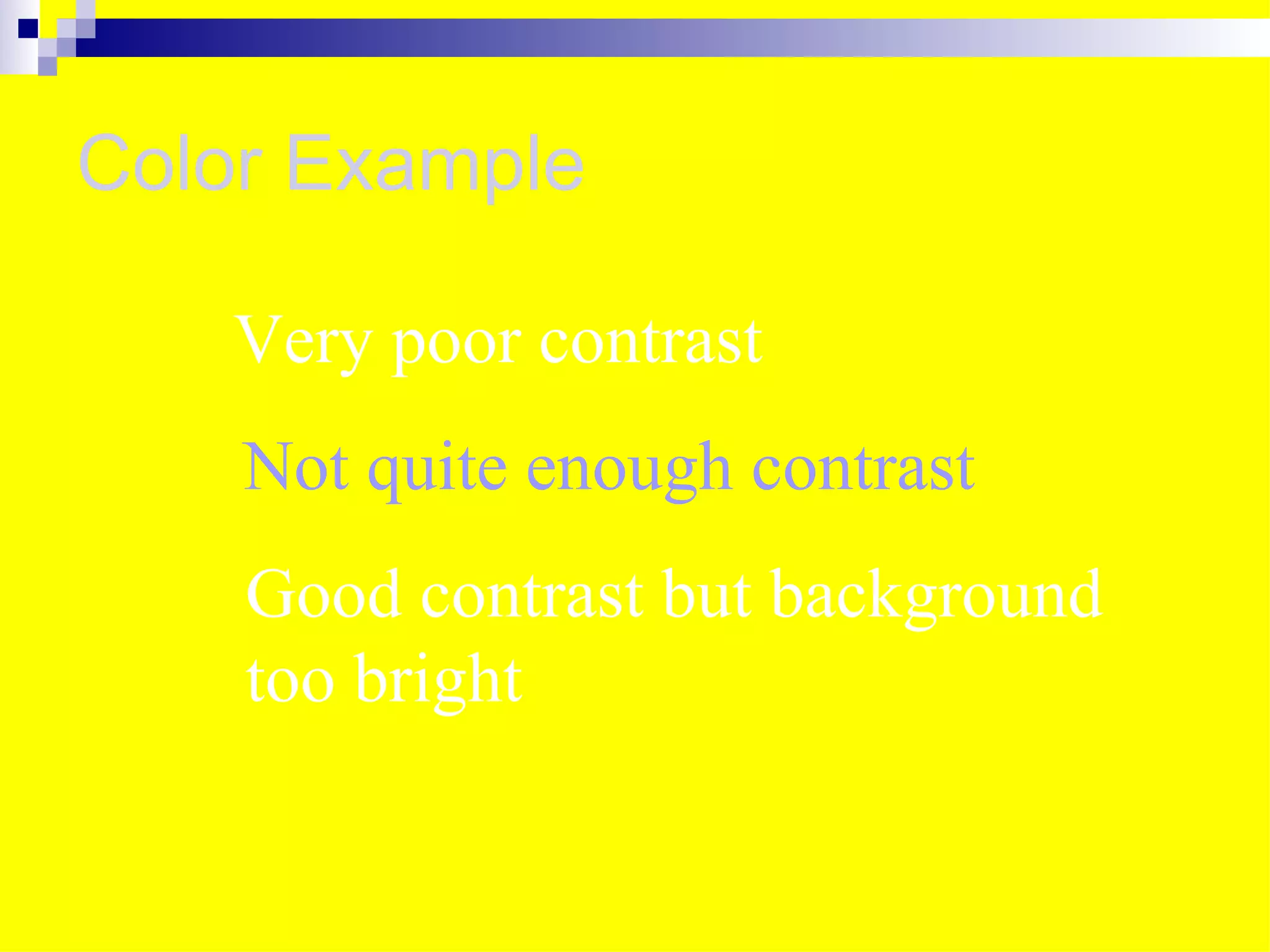
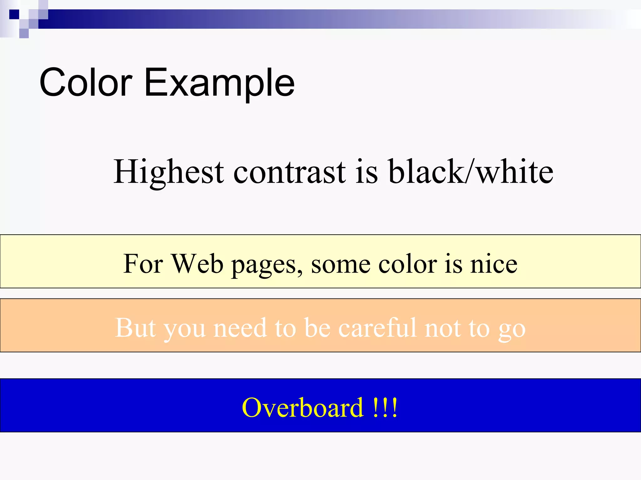
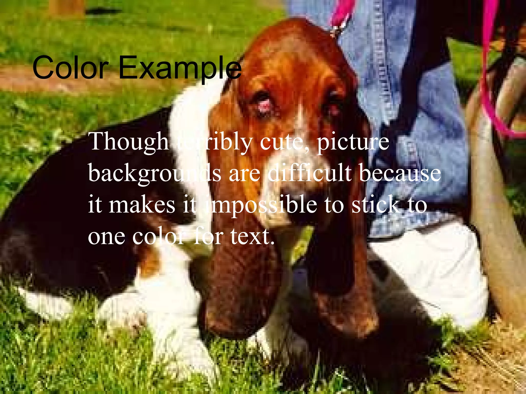
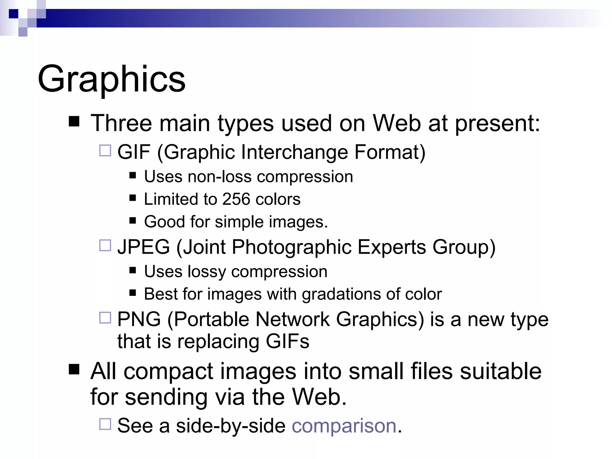
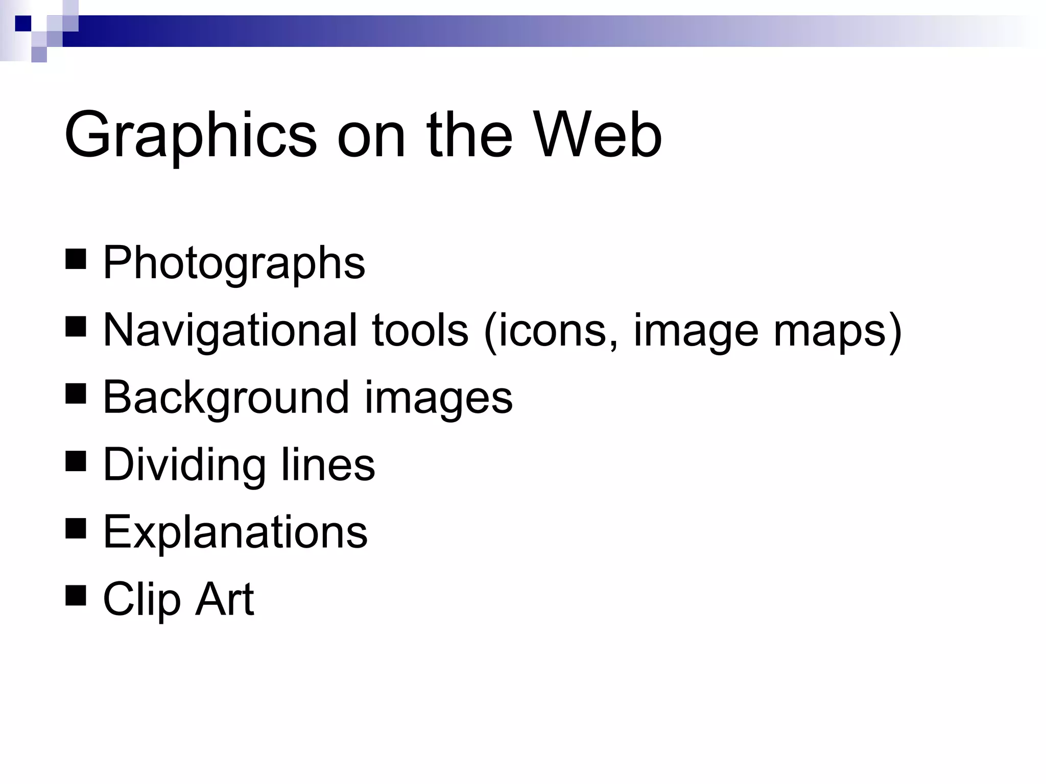
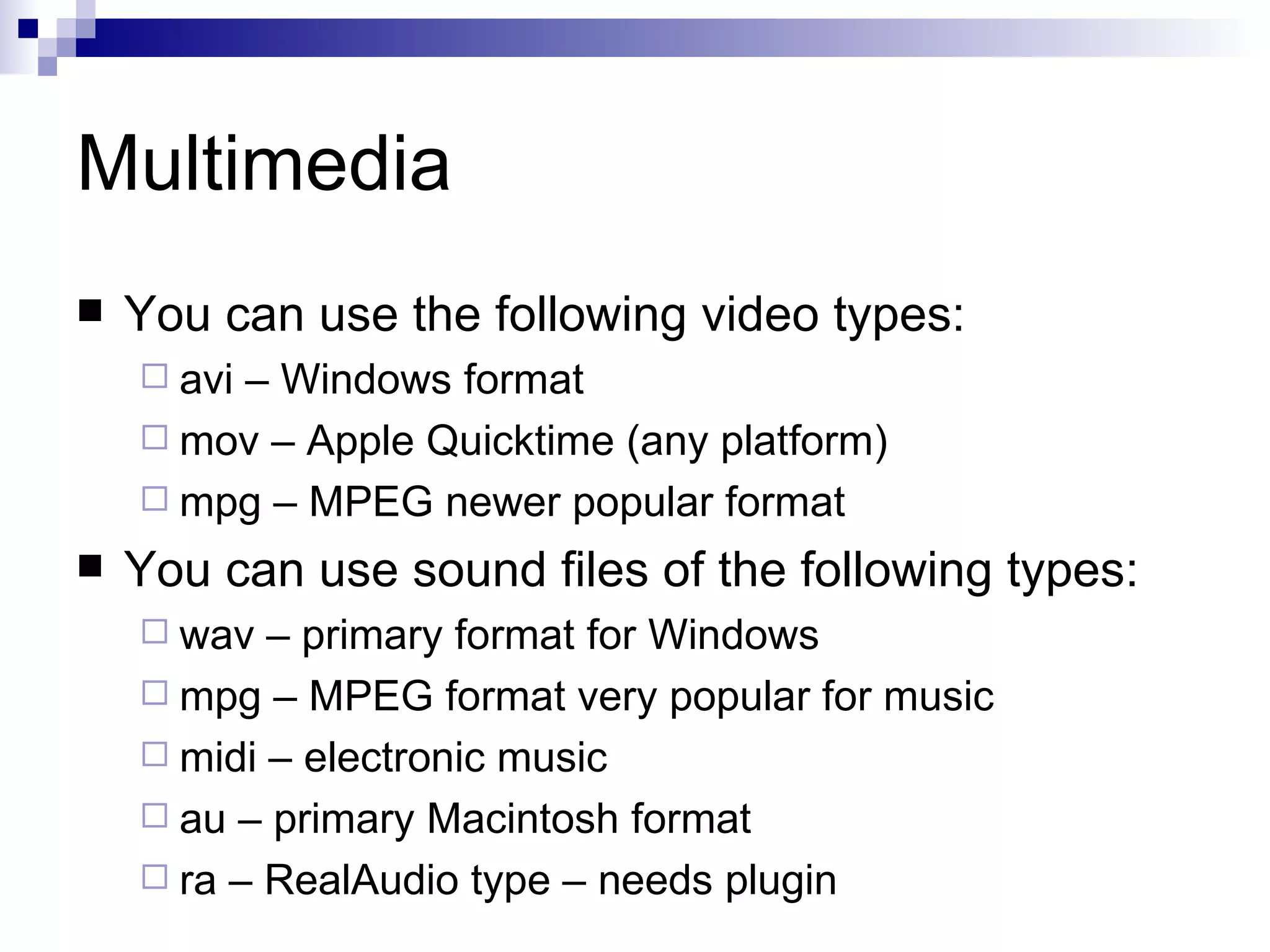
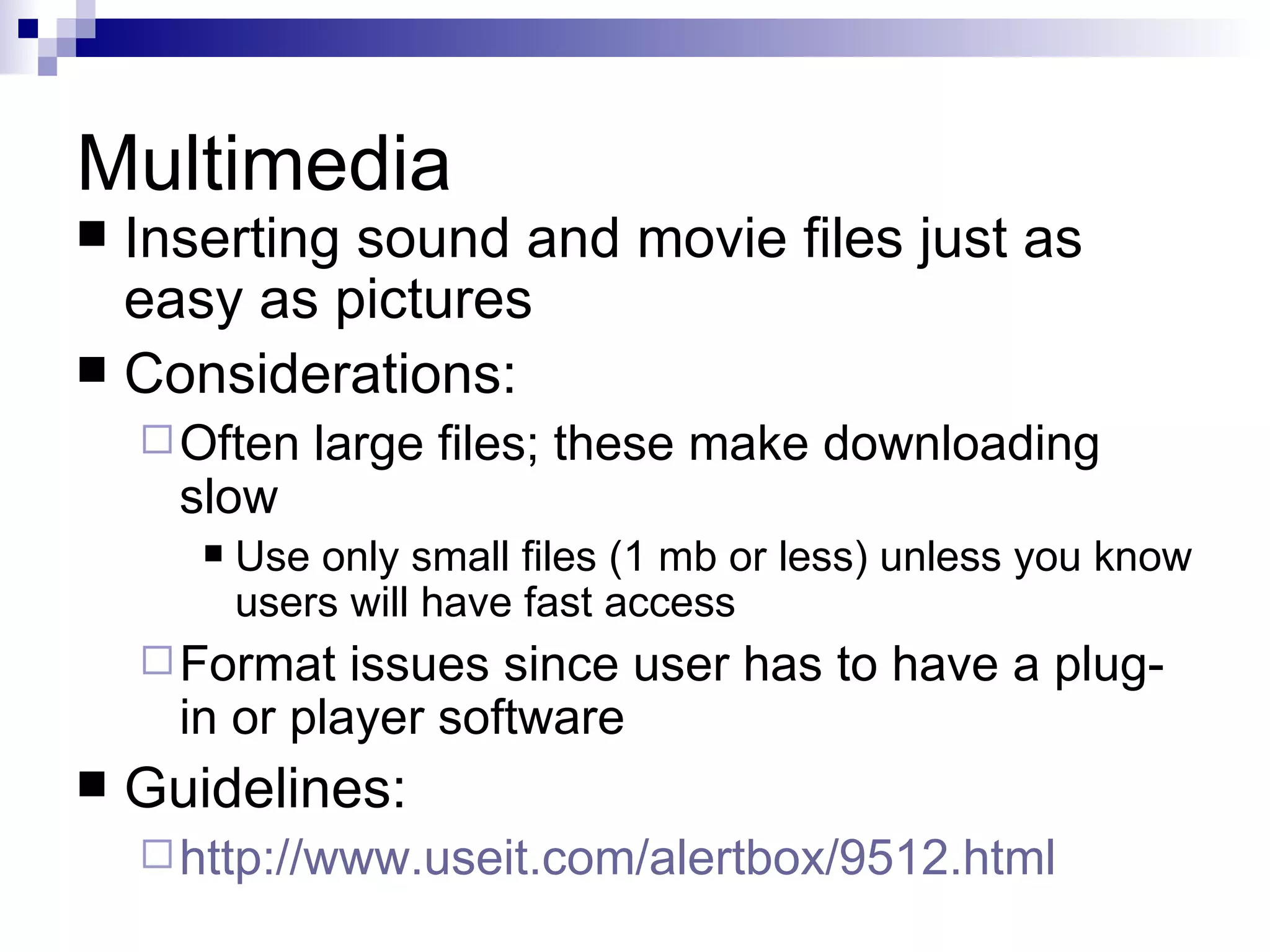
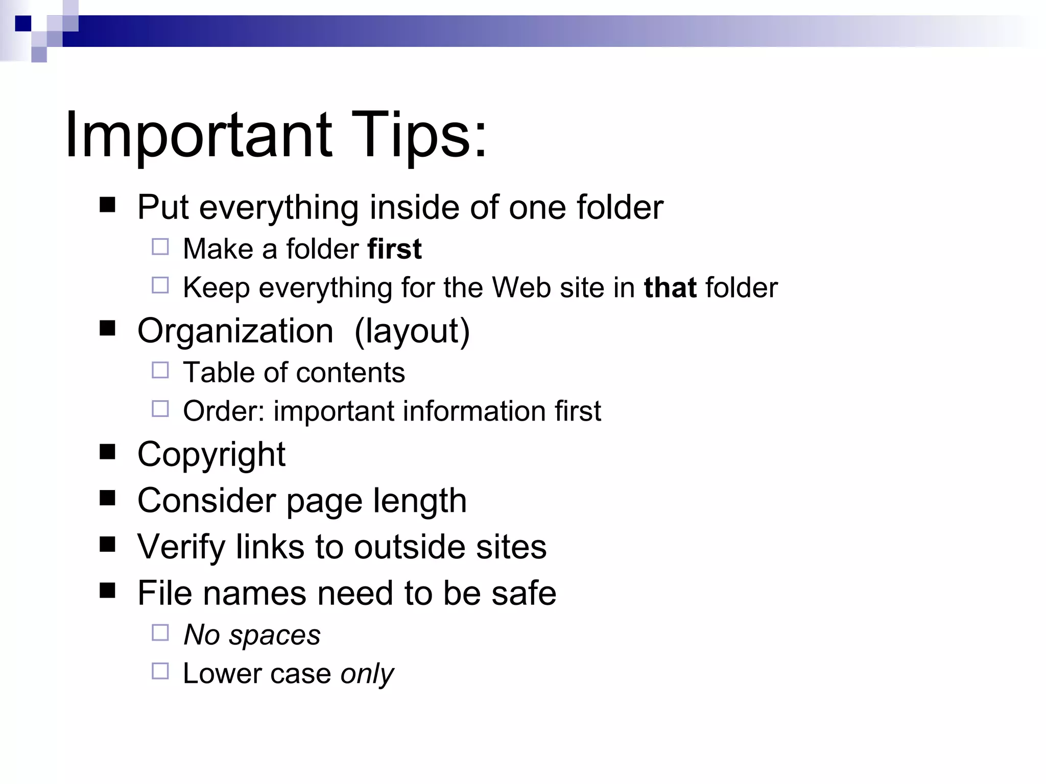
Web Pages: Basics


INTC 5340 Summer 2012
Defining Terms
   Hypertext
     Hypertext  refers to the idea of linking different
      documents together using hyperlinks. A
      hyperlink often appears in a hypertext
      document as a piece of highlighted text.
      When the user activates the hyperlink,
      typically by clicking on it using a mouse, the
      user's view of the document is changed so as
      to show more information on the word or
      phrase concerned.
Defining Terms
   Hypermedia
     Hypermedia   is a term created to describe the
      fusion of two other new technologies:
      multimedia and hypertext
     Hypermedia documents are simply hypertext
      documents with multimedia capabilities in
      addition.
What it does for you
   Multiple channels of information for the
    learner helps with processing
     Read it, hear it, see it – links the information
      via multiple pathways
   Provide for learner control of how
    information is presented
     Adaptive to learner preferences (styles?)
     Navigation can allow for a variety of paths
   Interest and motivational benefits
Potential problems
   Information overload
     Too  many channels make it hard for learner to
      attend to important information
     Can obscure information as well
   “Lost in cyberspace”
     Navigation   difficulties can trap users
     If lost, focused on navigation not content
   Difficult to produce
     Time   consuming for teachers to develop
Start with a Plan
    Start by sketching out your site and pages
      Flowchart the pages/screens and how they
       connect (hierarchy or web)
      Common flows for web pages:
           Organizational
           Linear
           Heirarchical
           Web (or Network)
      More    info at:
           http://www.usu.edu/sanderso/multinet/wwwnavi.html
Start with a Plan
   Start by sketching out your site and pages
     Storyboard your common page setup by drawing it
      freehand (or using software)
          Does not have to be artistic – just convey what needs to be
           on the page
     Be   sure to include your navigation in the storyboard
          Use your flowchart as a guide
     More    info at:
          http://www.public.iastate.edu/~nielandj/SCM/anatomySB.html
Start with a Plan
   Both flowcharts and storyboards help you:
     Organize
     Insure
           completeness
     Reduce errors and changes
 Do not get started on the pages until you
  do a flowchart and storyboard!
 Flowchart your site now, and storyboard
  the first page.
Tools for Prototyping Designs
   Some great Web 2.0 tools can help:
     https://gomockingbird.com/mockingbird/
     http://productplanner.com/
   More tools at:http
    ://www.uxbooth.com/blog/15-desktop-online-w
Navigation
   How will users get around at your site?
   Navigation benefits from:
     Clarity:links are obvious visually
     Coherence: makes sense to the content and structure
     Simplicity: limited options
     Completeness: allows all necessary movement

   Three-click (five-click?) rule: guideline stating
    that user can get from one part of site to any
    other in 3 clicks of mouse or less
     Useful     as a guideline in designing navigation
Links
   How you link depends on your design:
     You can embed a link in the text.
     You can make the link an image.


     Too   many links can confuse the learner.
   Website Navigation Tips
     http://www.grantasticdesigns.com/navigation.html
Use of Color
   Backgrounds
     Solidcolors best
     Pastels or lighter shades often work
     Need to be “easy” on the eyes (not too bright)
   Contrast
     Achieve high contrast between foreground
      elements (text, graphics) and background
   Color Design for the Web
     http://www.coolhomepages.com/cda/color/
Color Example

   Very poor contrast
    Not quite enough contrast
    Good contrast but background
    too bright
Color Example

   Highest contrast is black/white

    For Web pages, some color is nice

   But you need to be careful not to go

              Overboard !!!
Color Example

   Though terribly cute, picture
   backgrounds are difficult because
   it makes it impossible to stick to
   one color for text.
Fonts

 Larger      is not better!
   Don’t use multiple styles - one is enough!
   Generally, 12 point font works best.
   Some fonts safe for the Web:
     Arial
     Comic sans
     Times New Roman
Graphics
    Three main types used on Web at present:
      GIF   (Graphic Interchange Format)
           Uses non-loss compression
           Limited to 256 colors
           Good for simple images.
      JPEG     (Joint Photographic Experts Group)
           Uses lossy compression
           Best for images with gradations of color
      PNG    (Portable Network Graphics) is a new type
       that is replacing GIFs
    All compact images into small files suitable
     for sending via the Web.
      See    a side-by-side comparison.
Graphics on the Web
 Photographs
 Navigational tools (icons, image maps)
 Background images
 Dividing lines
 Explanations
 Clip Art
Multimedia
   You can use the following video types:
     avi
        – Windows format
     mov – Apple Quicktime (any platform)
     mpg – MPEG newer popular format

   You can use sound files of the following types:
     wav  – primary format for Windows
     mpg – MPEG format very popular for music
     midi – electronic music
     au – primary Macintosh format
     ra – RealAudio type – needs plugin
Multimedia
 Inserting sound and movie files just as
  easy as pictures
 Considerations:
     Often    large files; these make downloading
      slow
          Use only small files (1 mb or less) unless you know
           users will have fast access
     Format   issues since user has to have a plug-
      in or player software
   Guidelines:
     http://www.useit.com/alertbox/9512.html
Important Tips:
    Put everything inside of one folder
      Make a folder first
      Keep everything for the Web site in that folder
    Organization (layout)
      Table of contents
      Order: important information first
    Copyright
    Consider page length
    Verify links to outside sites
    File names need to be safe
      No spaces
      Lower case only

Web basics southern

  • 1.
    Web Pages: Basics INTC5340 Summer 2012
  • 2.
    Defining Terms  Hypertext  Hypertext refers to the idea of linking different documents together using hyperlinks. A hyperlink often appears in a hypertext document as a piece of highlighted text. When the user activates the hyperlink, typically by clicking on it using a mouse, the user's view of the document is changed so as to show more information on the word or phrase concerned.
  • 3.
    Defining Terms  Hypermedia  Hypermedia is a term created to describe the fusion of two other new technologies: multimedia and hypertext  Hypermedia documents are simply hypertext documents with multimedia capabilities in addition.
  • 4.
    What it doesfor you  Multiple channels of information for the learner helps with processing  Read it, hear it, see it – links the information via multiple pathways  Provide for learner control of how information is presented  Adaptive to learner preferences (styles?)  Navigation can allow for a variety of paths  Interest and motivational benefits
  • 5.
    Potential problems  Information overload  Too many channels make it hard for learner to attend to important information  Can obscure information as well  “Lost in cyberspace”  Navigation difficulties can trap users  If lost, focused on navigation not content  Difficult to produce  Time consuming for teachers to develop
  • 6.
    Start with aPlan  Start by sketching out your site and pages  Flowchart the pages/screens and how they connect (hierarchy or web)  Common flows for web pages:  Organizational  Linear  Heirarchical  Web (or Network)  More info at:  http://www.usu.edu/sanderso/multinet/wwwnavi.html
  • 7.
    Start with aPlan  Start by sketching out your site and pages  Storyboard your common page setup by drawing it freehand (or using software)  Does not have to be artistic – just convey what needs to be on the page  Be sure to include your navigation in the storyboard  Use your flowchart as a guide  More info at:  http://www.public.iastate.edu/~nielandj/SCM/anatomySB.html
  • 8.
    Start with aPlan  Both flowcharts and storyboards help you:  Organize  Insure completeness  Reduce errors and changes  Do not get started on the pages until you do a flowchart and storyboard!  Flowchart your site now, and storyboard the first page.
  • 9.
    Tools for PrototypingDesigns  Some great Web 2.0 tools can help:  https://gomockingbird.com/mockingbird/  http://productplanner.com/  More tools at:http ://www.uxbooth.com/blog/15-desktop-online-w
  • 10.
    Navigation  How will users get around at your site?  Navigation benefits from:  Clarity:links are obvious visually  Coherence: makes sense to the content and structure  Simplicity: limited options  Completeness: allows all necessary movement  Three-click (five-click?) rule: guideline stating that user can get from one part of site to any other in 3 clicks of mouse or less  Useful as a guideline in designing navigation
  • 11.
    Links  How you link depends on your design:  You can embed a link in the text.  You can make the link an image.  Too many links can confuse the learner.  Website Navigation Tips  http://www.grantasticdesigns.com/navigation.html
  • 12.
    Use of Color  Backgrounds  Solidcolors best  Pastels or lighter shades often work  Need to be “easy” on the eyes (not too bright)  Contrast  Achieve high contrast between foreground elements (text, graphics) and background  Color Design for the Web  http://www.coolhomepages.com/cda/color/
  • 13.
    Color Example Very poor contrast Not quite enough contrast Good contrast but background too bright
  • 14.
    Color Example Highest contrast is black/white For Web pages, some color is nice But you need to be careful not to go Overboard !!!
  • 15.
    Color Example Though terribly cute, picture backgrounds are difficult because it makes it impossible to stick to one color for text.
  • 16.
    Fonts  Larger is not better!  Don’t use multiple styles - one is enough!  Generally, 12 point font works best.  Some fonts safe for the Web:  Arial  Comic sans  Times New Roman
  • 17.
    Graphics  Three main types used on Web at present:  GIF (Graphic Interchange Format)  Uses non-loss compression  Limited to 256 colors  Good for simple images.  JPEG (Joint Photographic Experts Group)  Uses lossy compression  Best for images with gradations of color  PNG (Portable Network Graphics) is a new type that is replacing GIFs  All compact images into small files suitable for sending via the Web.  See a side-by-side comparison.
  • 18.
    Graphics on theWeb  Photographs  Navigational tools (icons, image maps)  Background images  Dividing lines  Explanations  Clip Art
  • 19.
    Multimedia  You can use the following video types:  avi – Windows format  mov – Apple Quicktime (any platform)  mpg – MPEG newer popular format  You can use sound files of the following types:  wav – primary format for Windows  mpg – MPEG format very popular for music  midi – electronic music  au – primary Macintosh format  ra – RealAudio type – needs plugin
  • 20.
    Multimedia  Inserting soundand movie files just as easy as pictures  Considerations:  Often large files; these make downloading slow  Use only small files (1 mb or less) unless you know users will have fast access  Format issues since user has to have a plug- in or player software  Guidelines:  http://www.useit.com/alertbox/9512.html
  • 21.
    Important Tips:  Put everything inside of one folder  Make a folder first  Keep everything for the Web site in that folder  Organization (layout)  Table of contents  Order: important information first  Copyright  Consider page length  Verify links to outside sites  File names need to be safe  No spaces  Lower case only

Editor's Notes