Website Architecture 
 
Page | 1  
 
The term "Website Architecture" means "the way you organize 
your website." 
You will want to organize the pages in your website so they are 
grouped  by  sections.  The  sections  have  to  be  labeled  so  that 
visitors can easily understand them without having to think. 
The whole point in doing this is to make it easy for your visitors 
locate topics and pages they are interested in. If you have good 
website architecture, visitors will be able to navigate easily. 
Start by collecting content 
You  cannot  organize  sections  and  topics  if  you  don't  have 
sections  and  topics  to  organize.  If  an  interior  decorator  has  a 
room  and  furniture  to work  with, you,  as  a  website architect, 
need copy and images to work with.  
Quite  obviously,  you  need  to  start  by  understanding  what  copy  and  images  will  be  going  into  the 
website. Even if the copy or images do not exist yet, you have to at least know that they will appear in 
the website. So, the first steps are to: 
 collect all the copy 
 collect images 
 list down copy and images that are not yet available but will be needed 
What’s the right way to organize? 
There is no standard model that can apply to all websites. This is because topics are organized based 
on  what  the  owner  wants,  and  how  the  visitor  naturally  navigates.  In  the  end  it  all  boils  down  to 
common sense.  
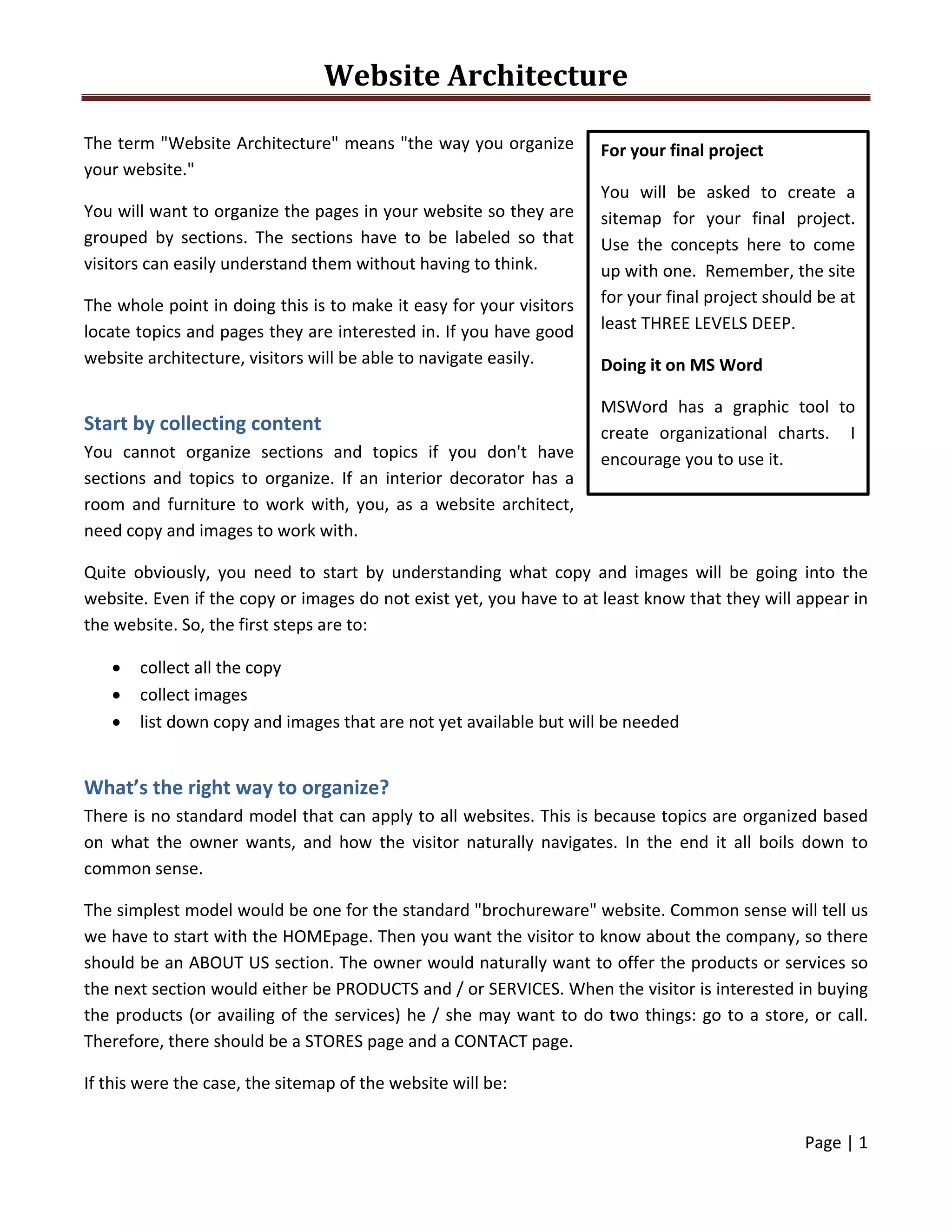
The simplest model would be one for the standard "brochureware" website. Common sense will tell us 
we have to start with the HOMEpage. Then you want the visitor to know about the company, so there 
should be an ABOUT US section. The owner would naturally want to offer the products or services so 
the next section would either be PRODUCTS and / or SERVICES. When the visitor is interested in buying 
the products (or availing of the services) he / she may want to do two things: go to a store, or call. 
Therefore, there should be a STORES page and a CONTACT page. 
If this were the case, the sitemap of the website will be: 
For your final project 
You  will  be  asked  to  create  a 
sitemap  for  your  final  project.  
Use  the  concepts  here  to  come 
up with one.  Remember, the site 
for your final project should be at 
least THREE LEVELS DEEP. 
Doing it on MS Word 
MSWord  has  a  graphic  tool  to 
create  organizational  charts.    I 
encourage you to use it. 
Website Architecture 
 
Page | 2  
 
 
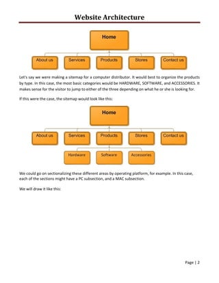
Let's say we were making a sitemap for a computer distributor. It would best to organize the products 
by type. In this case, the most basic categories would be HARDWARE, SOFTWARE, and ACCESSORIES. It 
makes sense for the visitor to jump to either of the three depending on what he or she is looking for. 
If this were the case, the sitemap would look like this: 
 
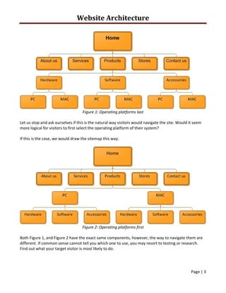
We could go on sectionalizing these different areas by operating platform, for example. In this case, 
each of the sections might have a PC subsection, and a MAC subsection. 
We will draw it like this: 
Website Architecture 
 
Page | 3  
 
 
Figure 1: Operating platforms last 
Let us stop and ask ourselves if this is the natural way visitors would navigate the site. Would it seem 
more logical for visitors to first select the operating platform of their system? 
If this is the case, we would draw the sitemap this way: 
 
Figure 2: Operating platforms first 
Both Figure 1, and Figure 2 have the exact same components, however, the way to navigate them are 
different. If common sense cannot tell you which one to use, you may resort to testing or research. 
Find out what your target visitor is most likely to do. 
Website Architecture 
 
Page | 4  
 
In this case, researchers have found out that computer users are quite loyal to their operating 
platform, and therefore would navigate better using the sitemap in Figure 2, where they get to choose 
the operating platform early on. 
 
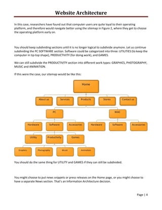
You should keep subdividing sections until it is no longer logical to subdivide anymore. Let us continue 
subdividing the PC SOFTWARE section. Software could be categorized into three: UTILITIES (to keep the 
computer in tip‐top shape), PRODUCTIVITY (for doing work), and GAMES. 
We can still subdivide the PRODUCTIVITY section into different work types: GRAPHICS, PHOTOGRAPHY, 
MUSIC and ANIMATION. 
If this were the case, our sitemap would be like this: 
 
You should do the same thing for UTILITY and GAMES if they can still be subdivided. 
 
You might choose to put news snippets or press releases on the Home page, or you might choose to 
have a separate News section. That's an Information Architecture decision.  
Website Architecture 
 
Page | 5  
 
Taking the placement of News items as an example, there are several considerations that you might 
take into account:  
 Site’s goals:  Do you want all visitors to the site to be made aware of all the latest news? 
 User’s goals:  is company news of interest to all visitors to the site? 
 How much news is there truthfully likely to be?  Is there enough to put on its own page without 
looking bad? 
 Are news snippets standalone, or do they link to articles or press releases? 
 Is all news relevant to all users of the site, or is it more appropriate to divide it by 
product/service/region/user group, etc. 
For a simple e‐commerce site, you'd add your list of products, and a shopping/purchasing process. The 
products may naturally belong in separate categories.  
With more content, there are more choices to make, and the way you choose becomes more 
important. It simply isn't possible to describe everything on one page; you have to start splitting a site 
up into sections, and provide useful navigation between those sections. 
 
Architecture mirroring real systems 
The most obvious starting point (particularly to clients) can be to arrange content on the web site in 
the way it's arranged in real life. 
For example:  
 A different section for each geographical sales region (Europe, U.S., Asia) 
 Sections for each area of business (e.g. sales, service, fulfillment, human resources) 
Check out Qatar Holidays. 
 
Architecture based on users' goals 
An alternative approach is to follow your users' goals and structure your pages around their likely flow 
through the site. 
For example:  
 A site that sells train tickets might have "Quick booking" from the home page, favourite 
journeys for registered users, and "Trip planner" that lets users book hotels and car hire at the 
same time. 
 A software vendor might construct their site around their different audiences 
Website Architecture 
 
Page | 6  
 
o Technology expert is offered "Technical white papers" or "Feature comparisons” 
o Business buyer is offered "Benefits of switching to us" or "Business case studies” 
o Press audience is offered "Press releases" and "Press contacts” 
o Hackers looking for clues to penetrate the software are offered nothing at all (in this 
case fulfilling the company's goal, not the user's!) 
These types of content or function don't necessarily map to the organization’s own structure or 
product range. They're designed around the needs of the different groups that might use the 
site.  
Check out MetrobankCard. 
 
Multi‐dimensional architecture 
Sometimes, it is appropriate to offer many views, not a single rigid hierarchy. 
Taking an online bookstore for example, which shows how you can offer many routes to the same 
content, and show that content in many different views:  
 It might let users browse by category: which will be a many‐levelled tree, but one book can be 
in more than one category 
 Users might want to search for a specific author or title 
 To increase sales, the site would also advertise other titles similar to the ones the user is 
interested in 
 Smart content management can offer plenty of other cross‐selling opportunities, such 
promoting "people who bought this also bought", "this is recommended by 90% of the people 
who bought it", "Buy this together with that, and get 33% off" etc. etc. etc. 
Check out FullybookedOnline. 
 
What structure is best? 
Website Architecture is a huge topic with its own text books. In general, though, it is common sense. 
There are lots of ways to arrange content and functions, and it's usually a case of working out which 
will work best. It's hard to get it very wrong; the goal is to let different types of user succeed. 
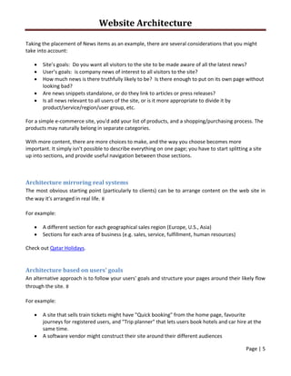
A simple Information Architecture is basically wide and flat. Any pages could be accessed from any 
point, because the whole structure was exposed via the side navigation.  
Website Architecture 
 
Page | 7  
 
 
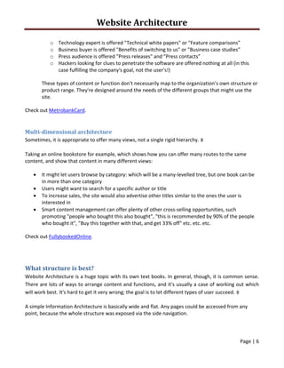
While this is a very straightforward model, it could take quite a lot of decoding to scan and navigate 
this  many  elements.  For  that  reason,  I've  overlaid  a  pseudo‐tiered  structure,  which  arranges  the 
articles  into  main  sections  (Home,  Basics,  and  Principles),  and  sections  within  those  (such  as  'Web 
design process', 'How people use web pages', and 'Other online factors' in the Basics section). Note 
that this isn't a real‐life order: it doesn't represent any particular workflow or even directory structure. 
 
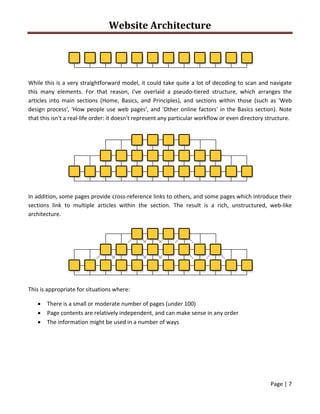
In addition, some pages provide cross‐reference links to others, and some pages which introduce their 
sections  link  to  multiple  articles  within  the  section.  The  result  is  a  rich,  unstructured,  web‐like 
architecture. 
 
This is appropriate for situations where:  
 There is a small or moderate number of pages (under 100) 
 Page contents are relatively independent, and can make sense in any order 
 The information might be used in a number of ways 

Web architecture