Download as PDF, PPTX
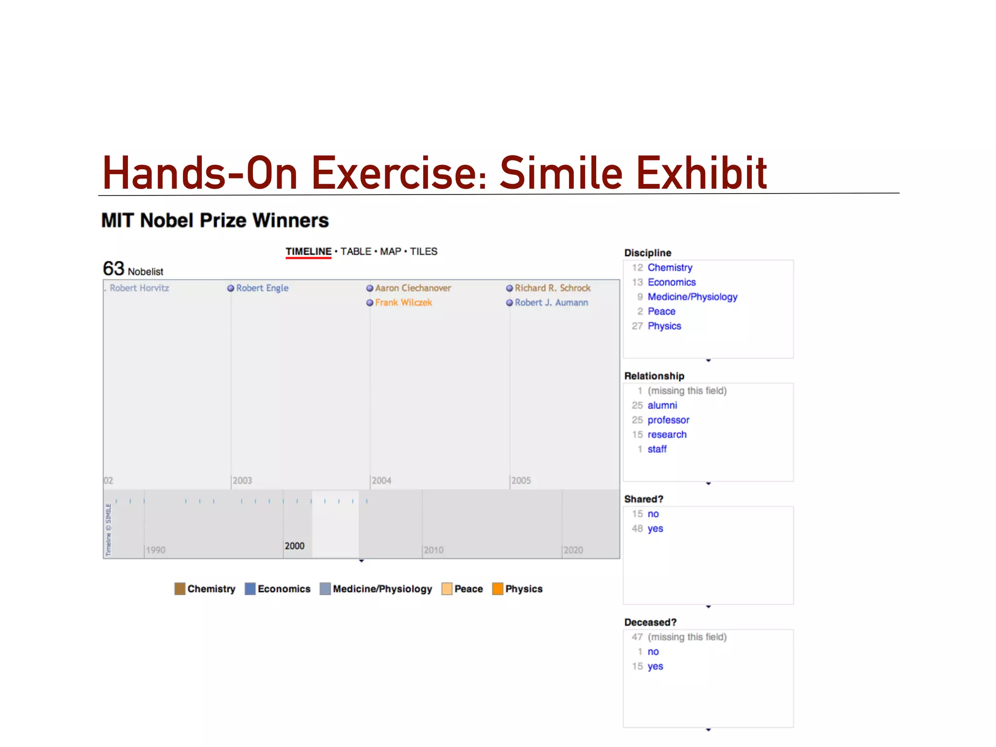
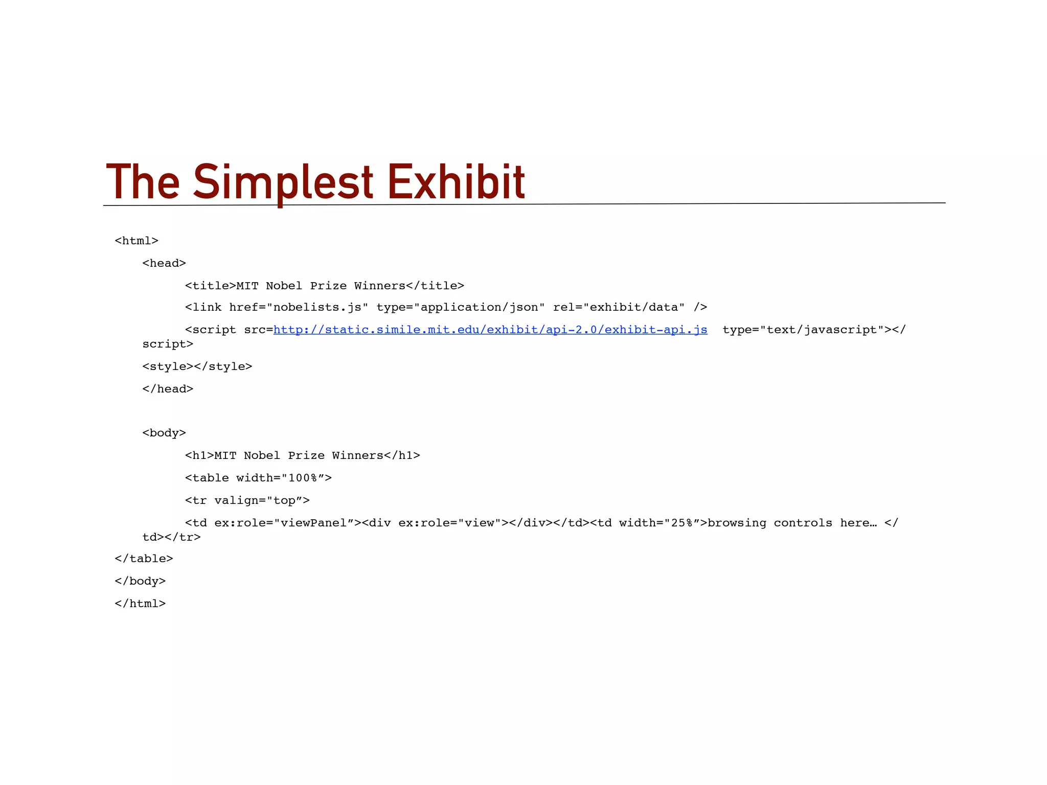
![The Data
{
"items" : [
{ type : "Nobelist",
label : "Burton Richter",
! ! ! latlng: "42.359089,-71.093412",
discipline : "Physics",
shared : "yes",
"last-name" : "Richter",
"nobel-year" : "1976",
relationship : "alumni",
"co-winner" : "Samuel C.C. Ting",
"relationship-detail" : "MIT S.B. 1952, Ph.D. 1956",
imageURL : "http://nobelprize.org/nobel_prizes/
physics/laureates/1976/richter_thumb.jpg"
},
………
]
}](https://image.slidesharecdn.com/mphilnov2012lecturestructureddatapresentationrs-121112161755-phpapp01/75/Structured-Data-Presentation-27-2048.jpg)
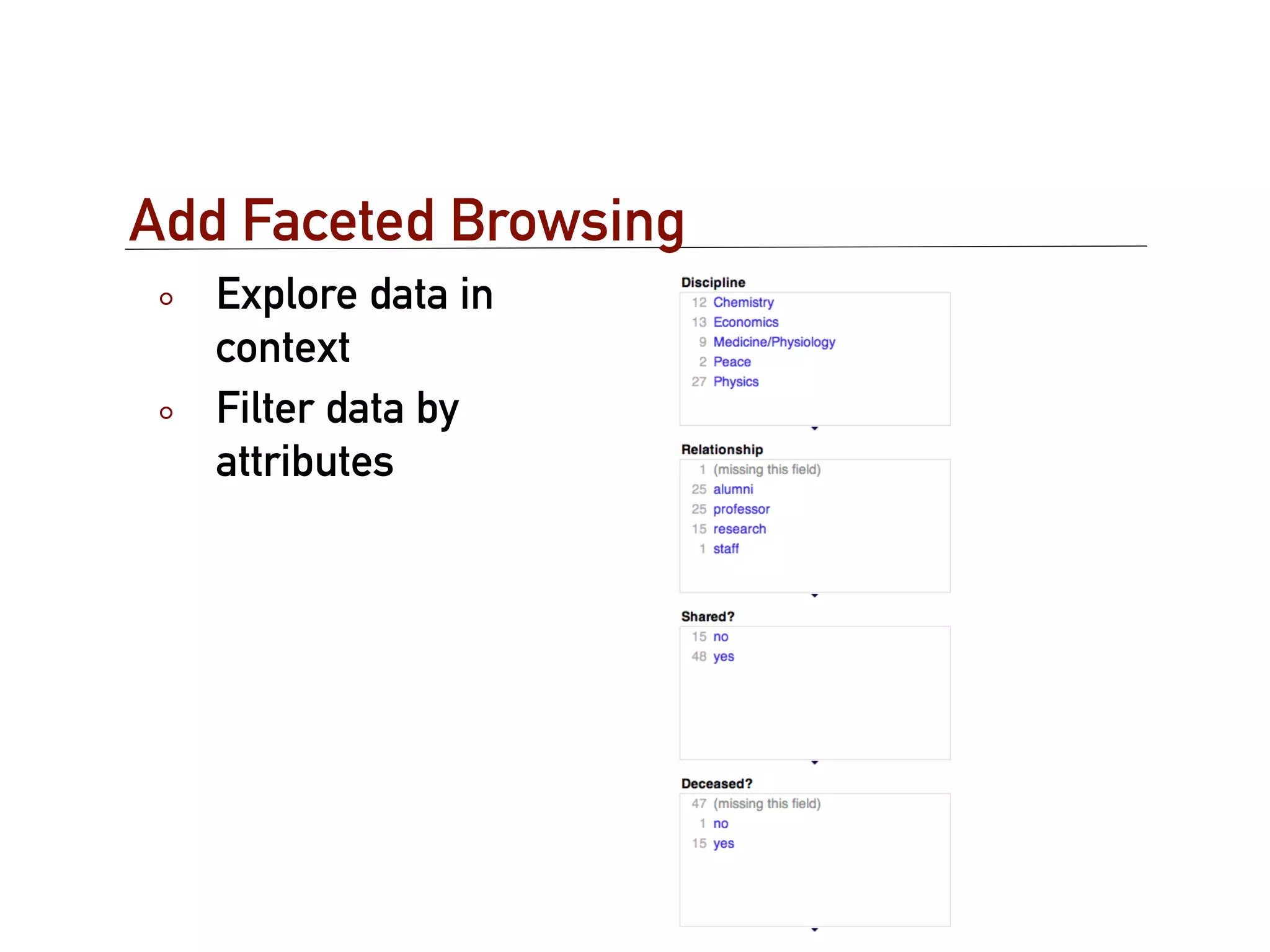
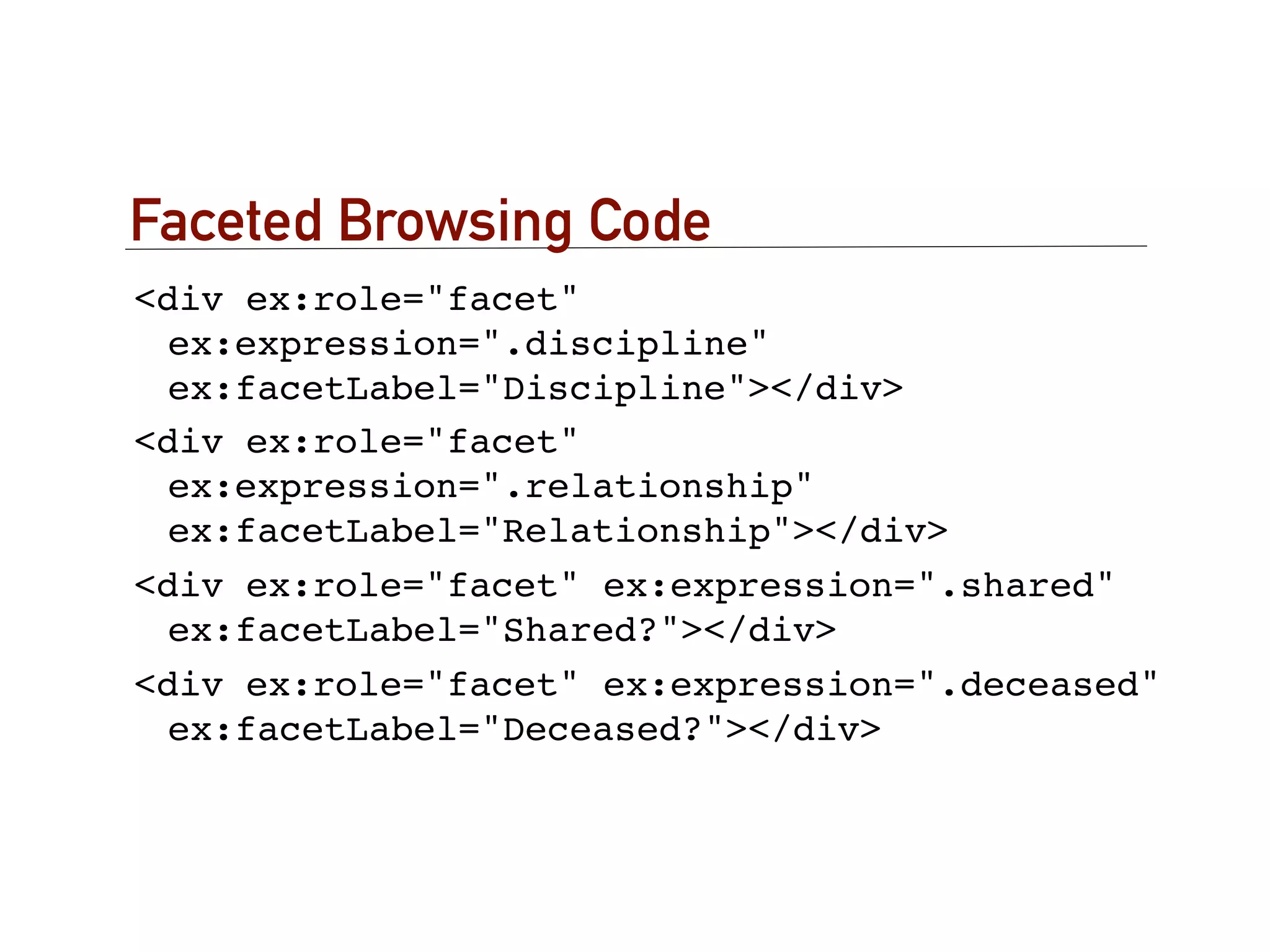
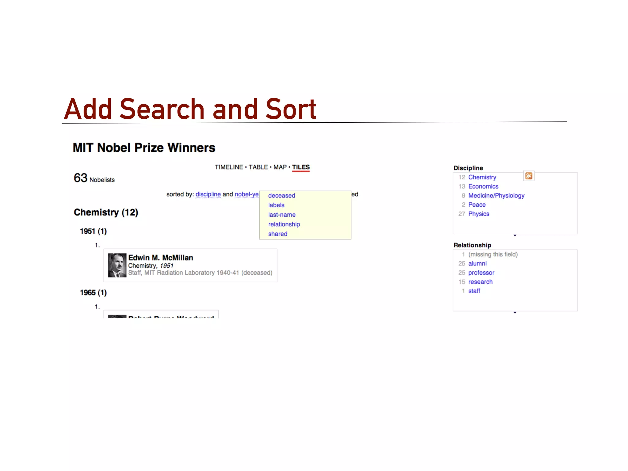
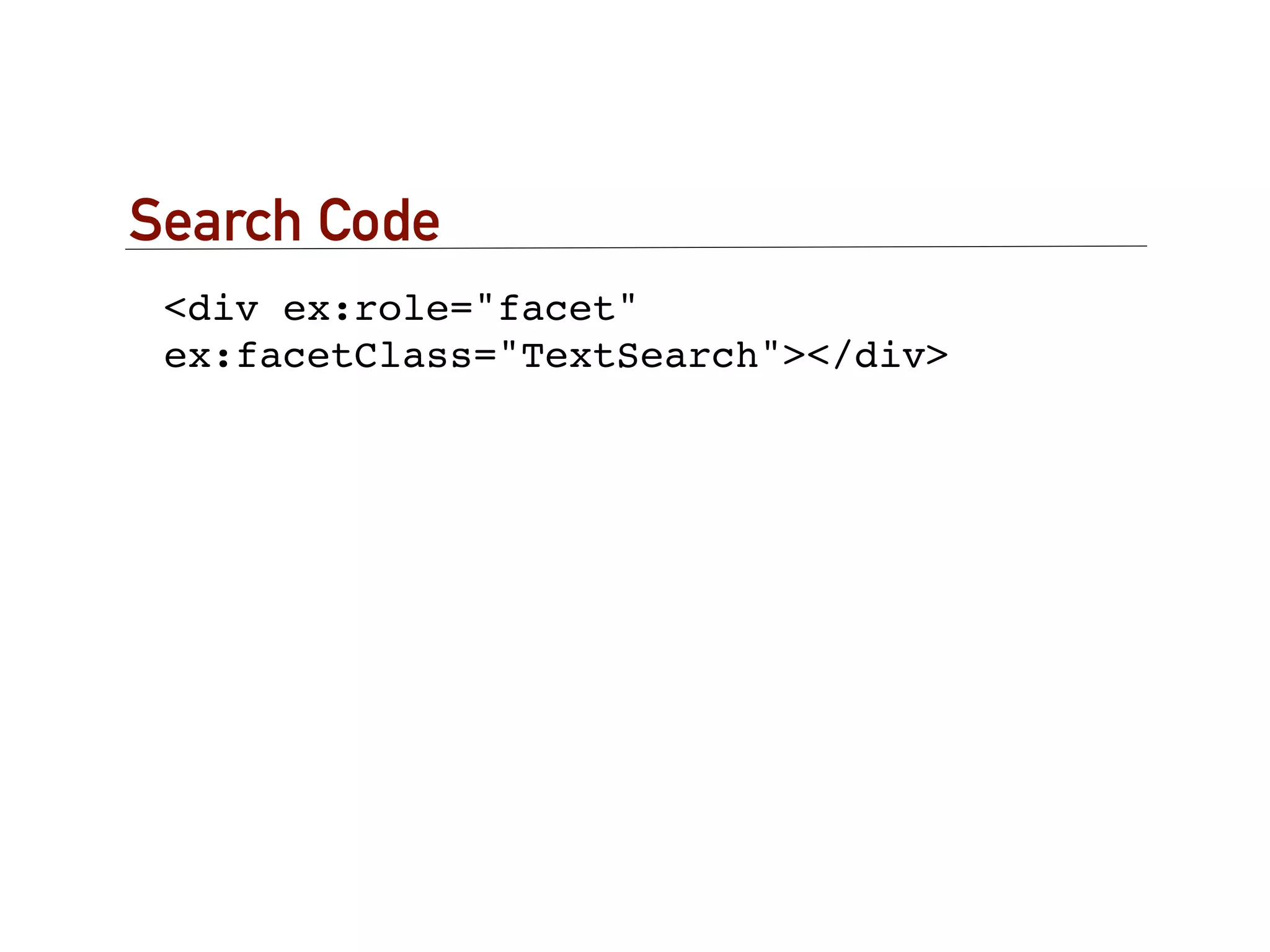
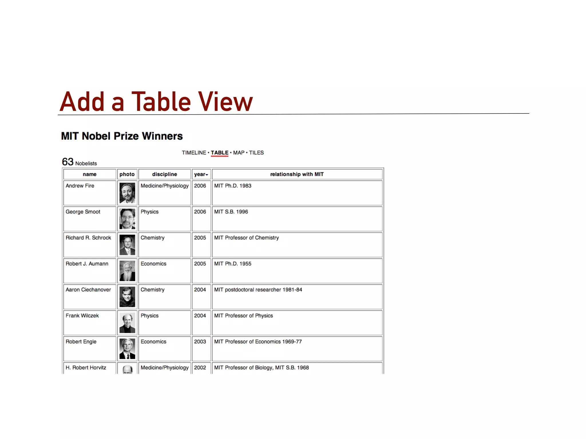
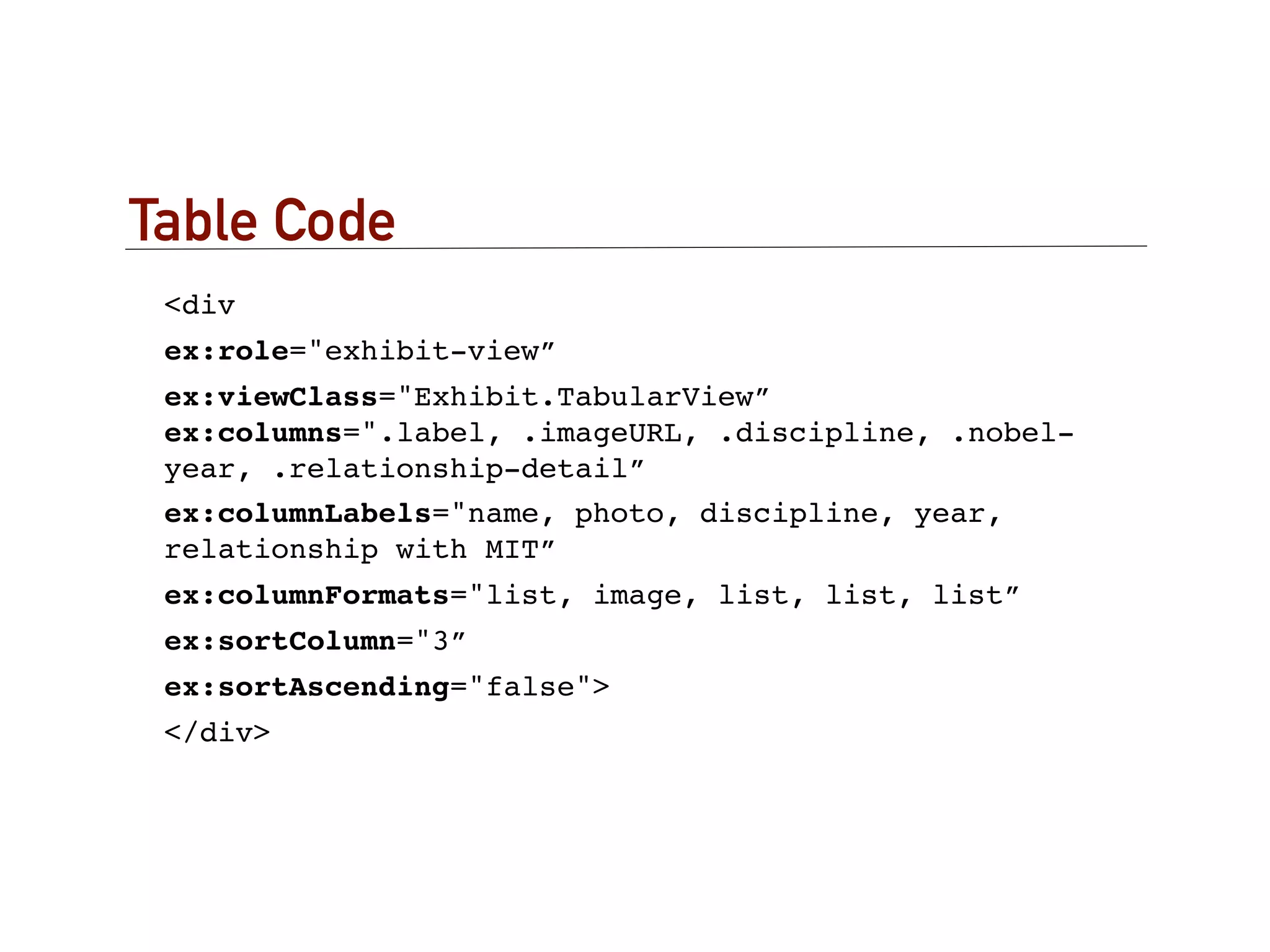
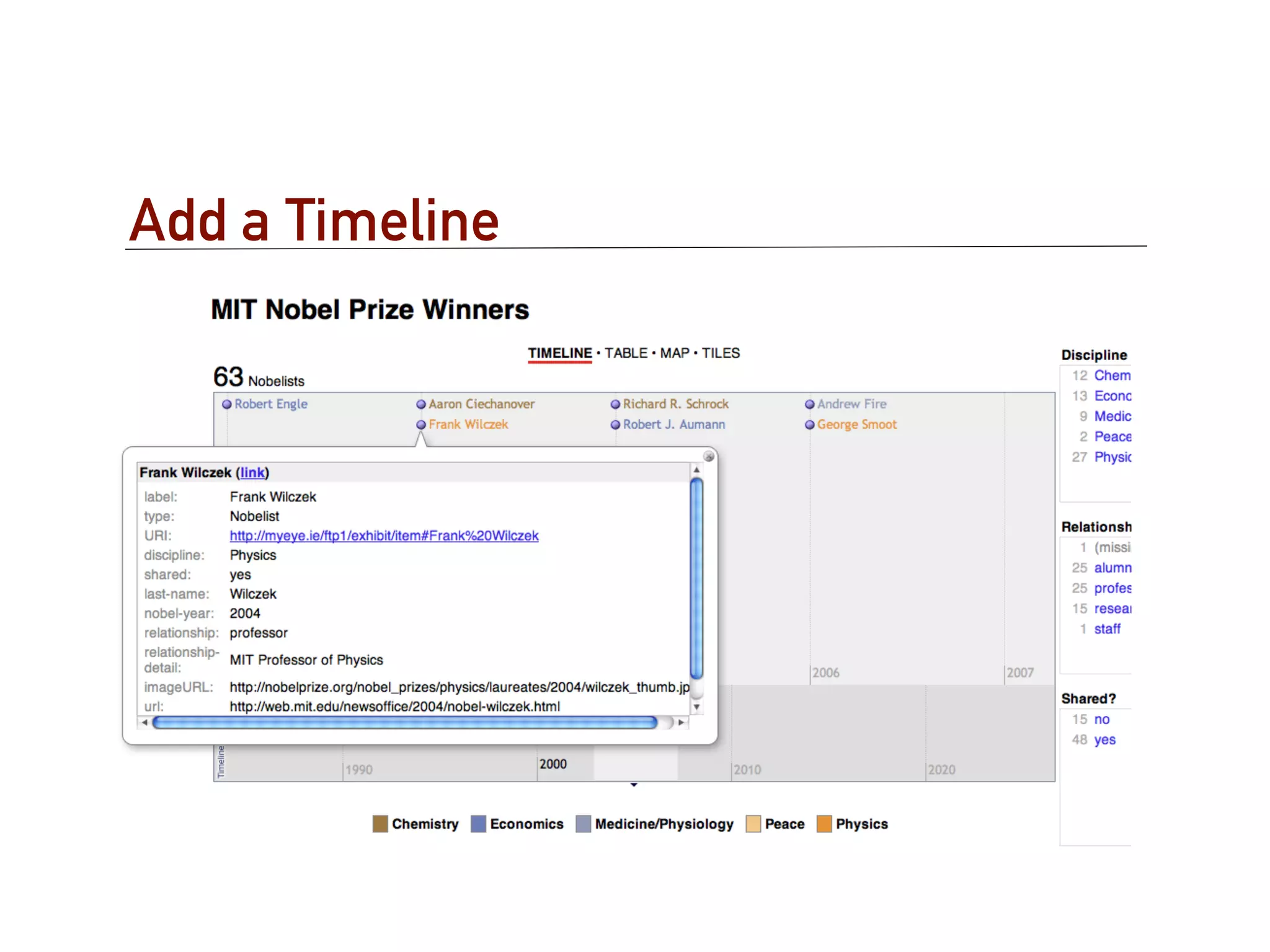
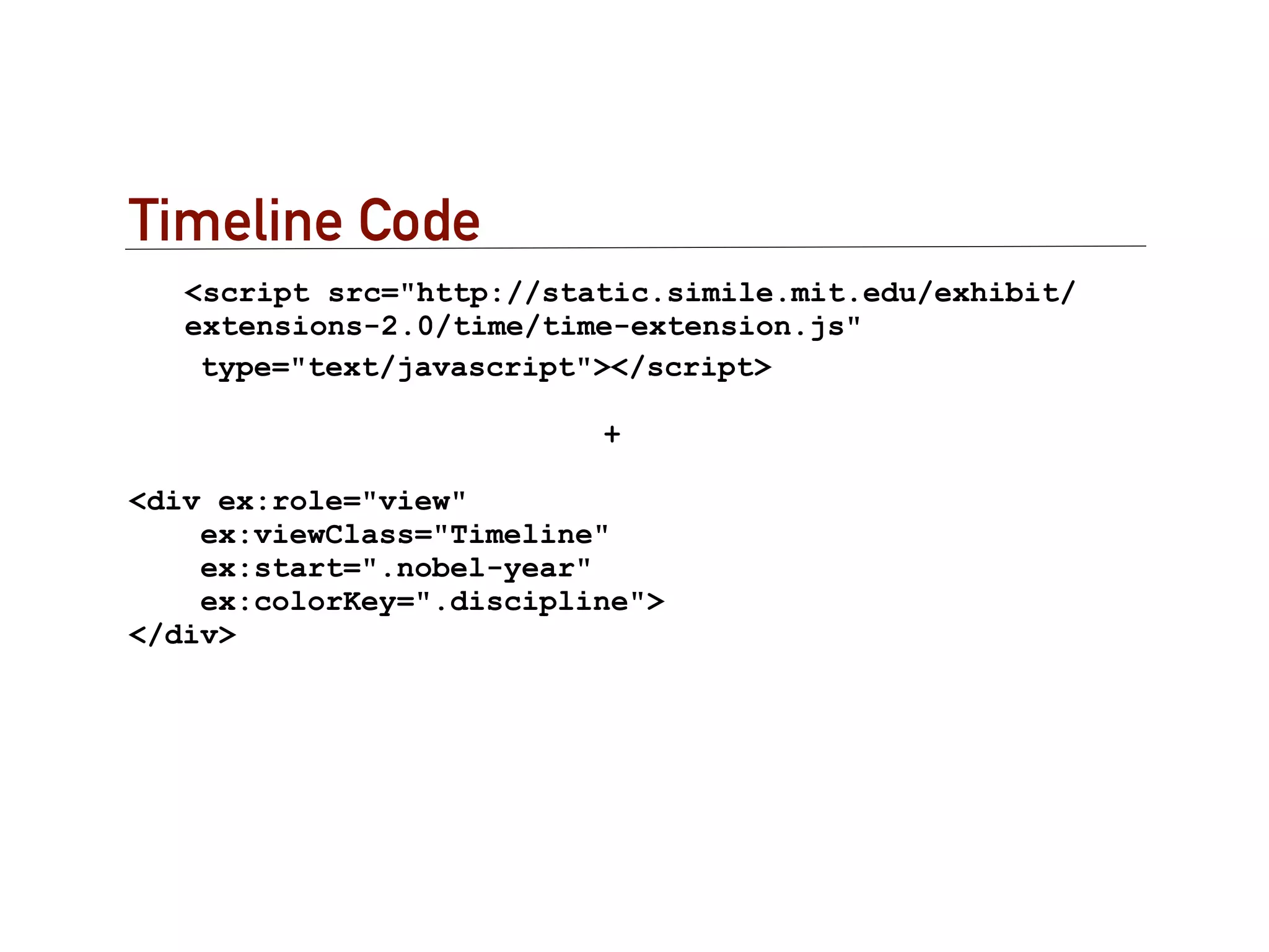
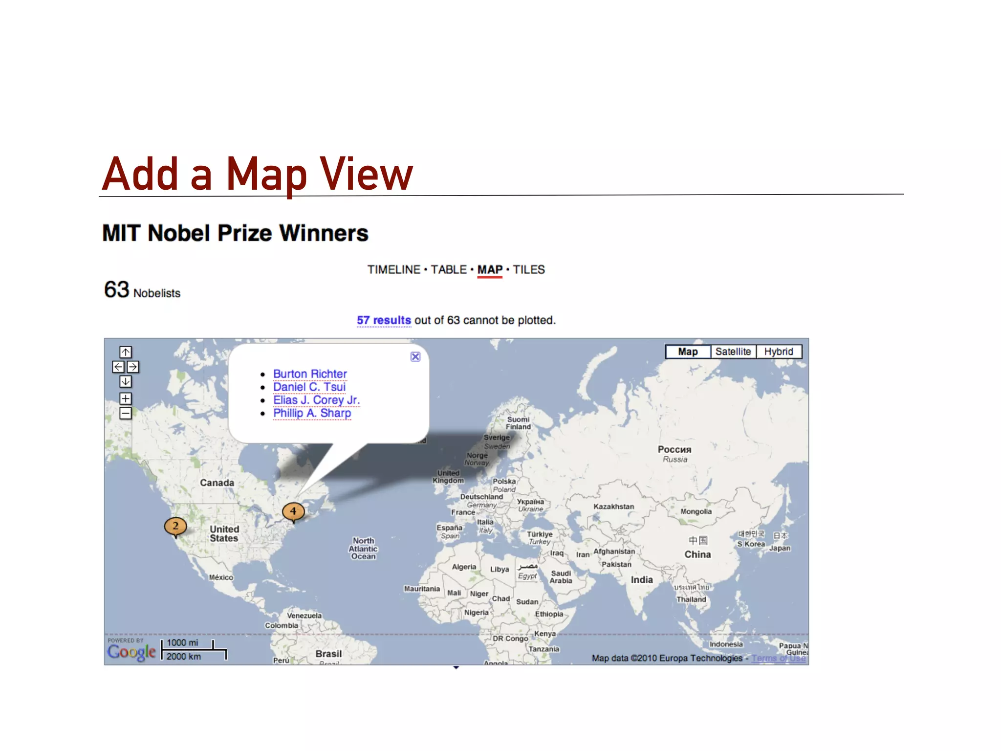
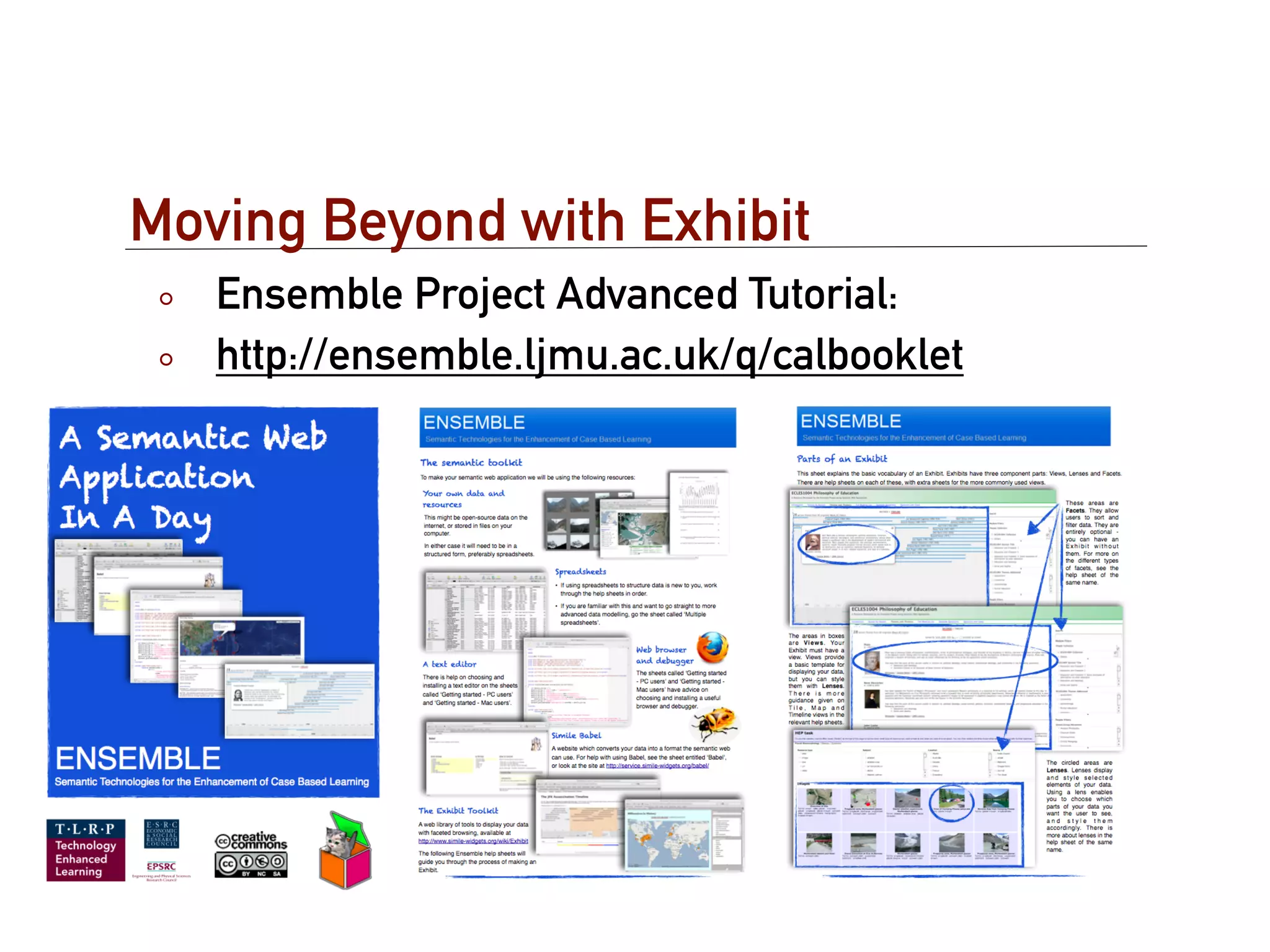
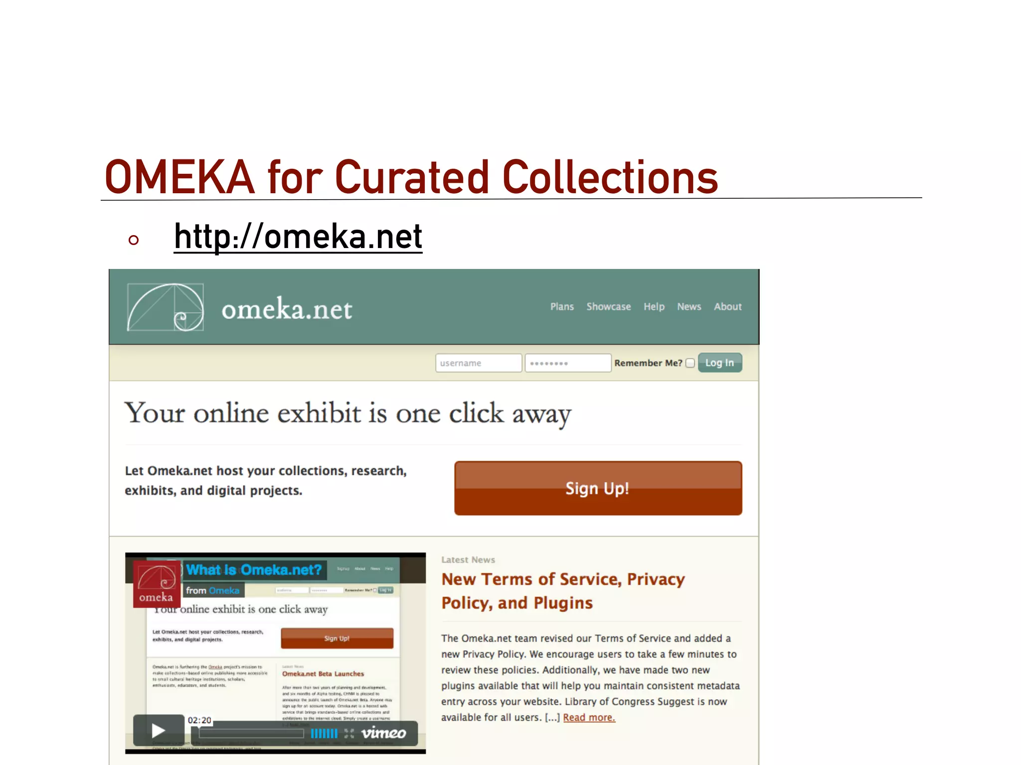
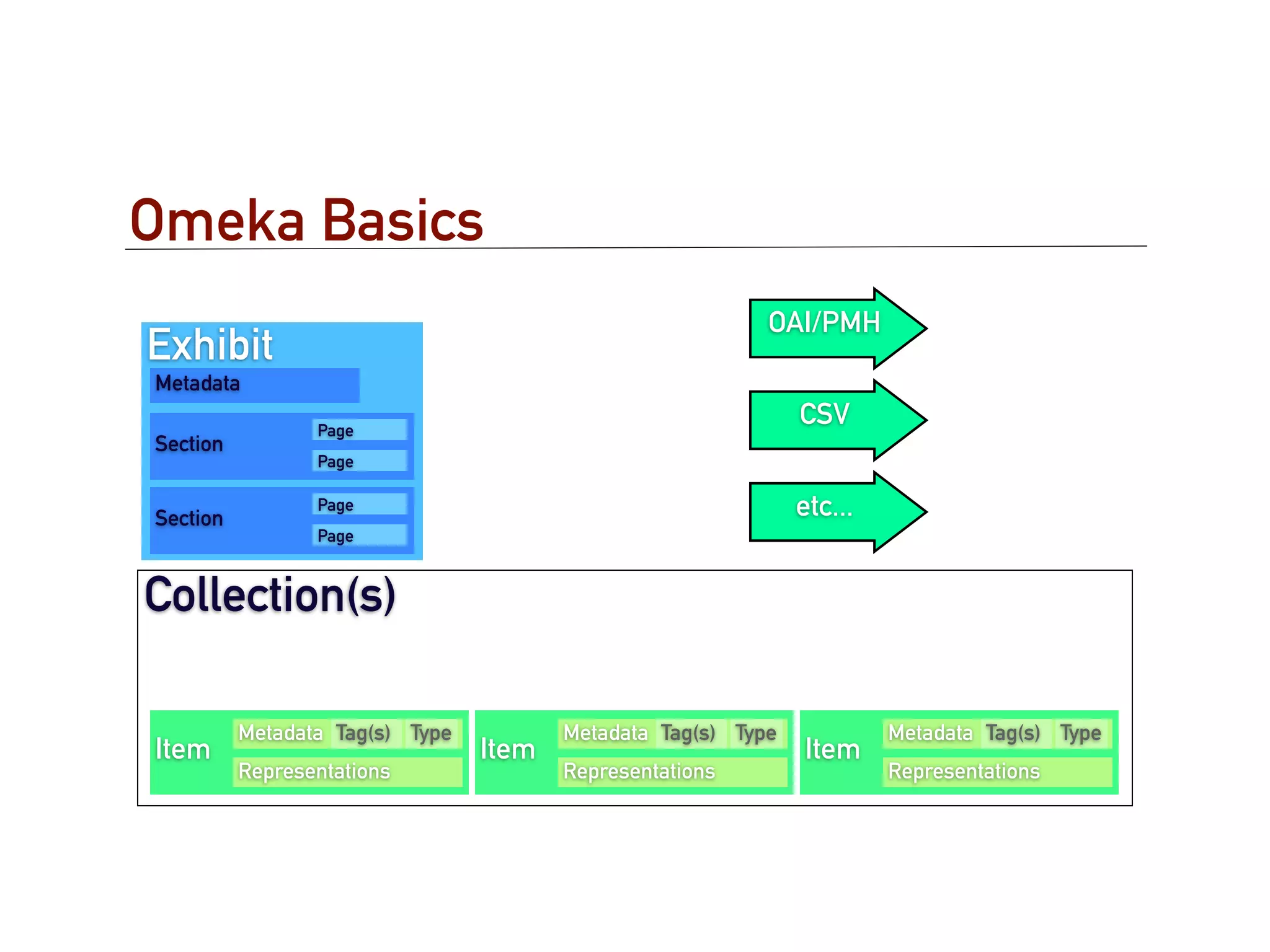
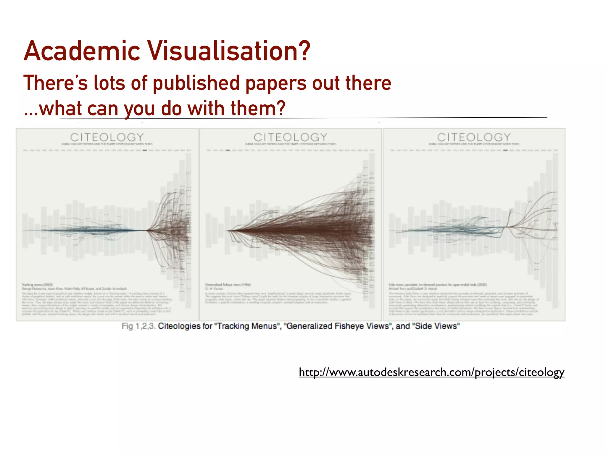


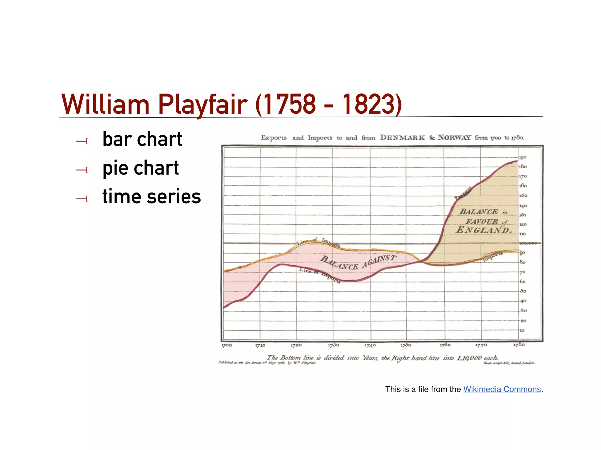
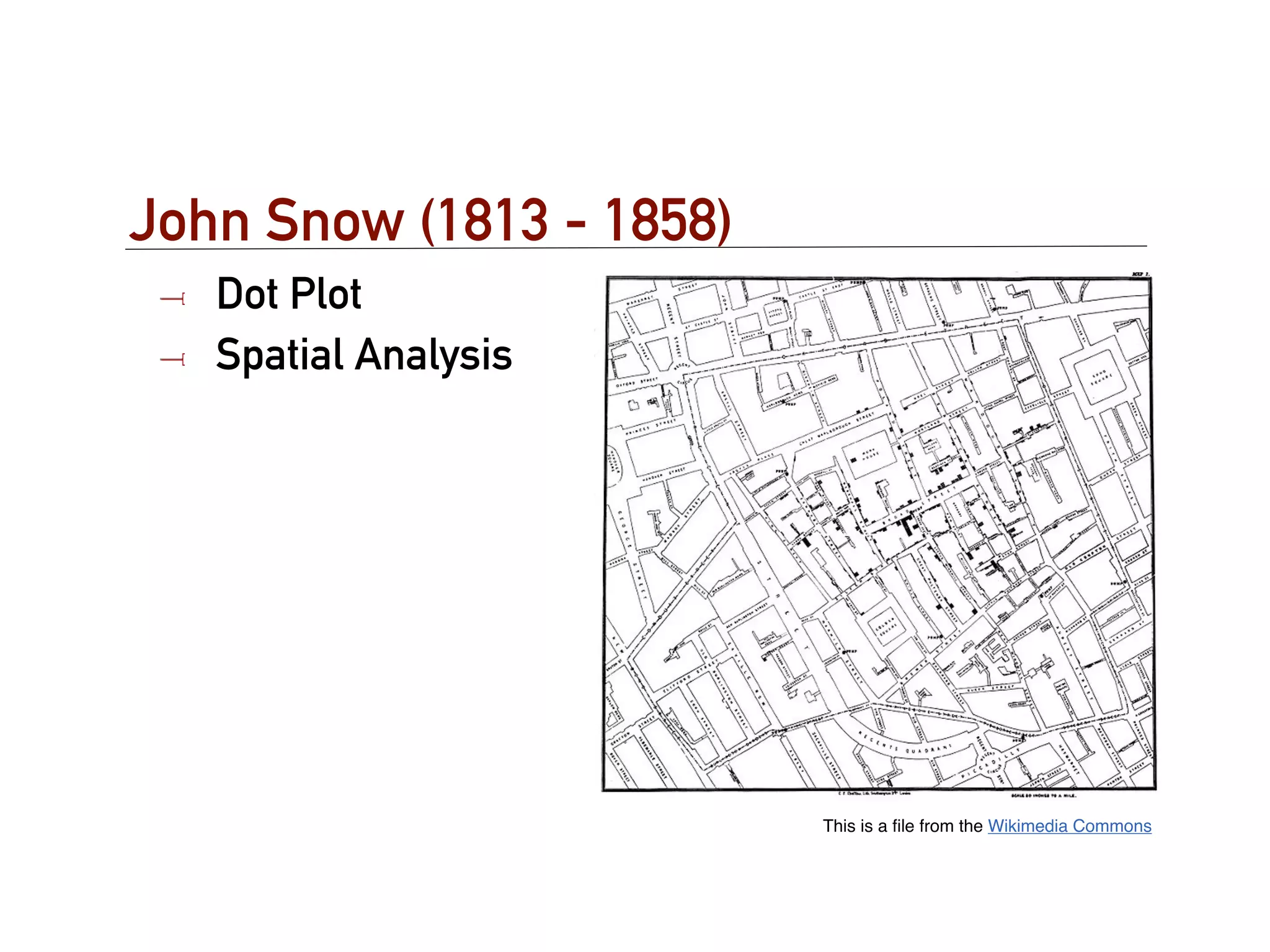
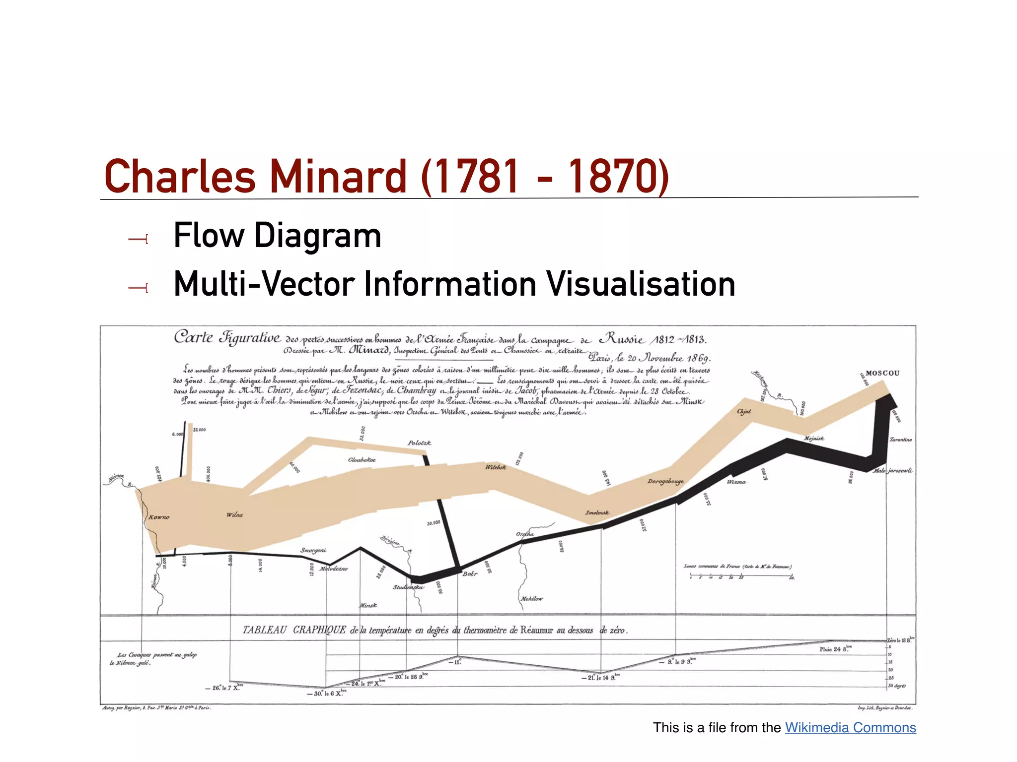
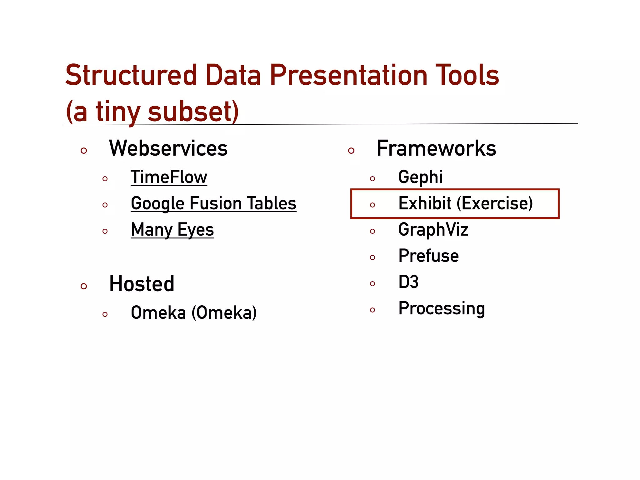
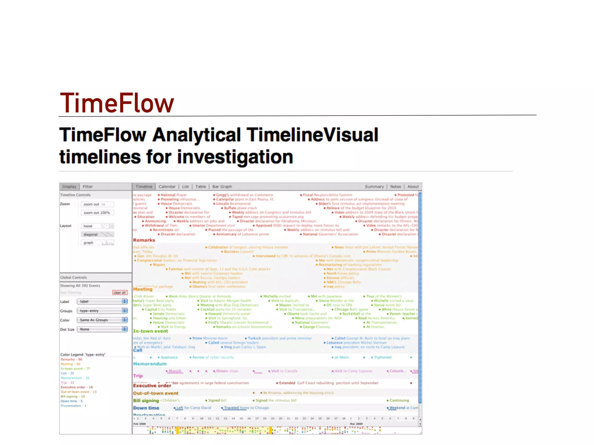
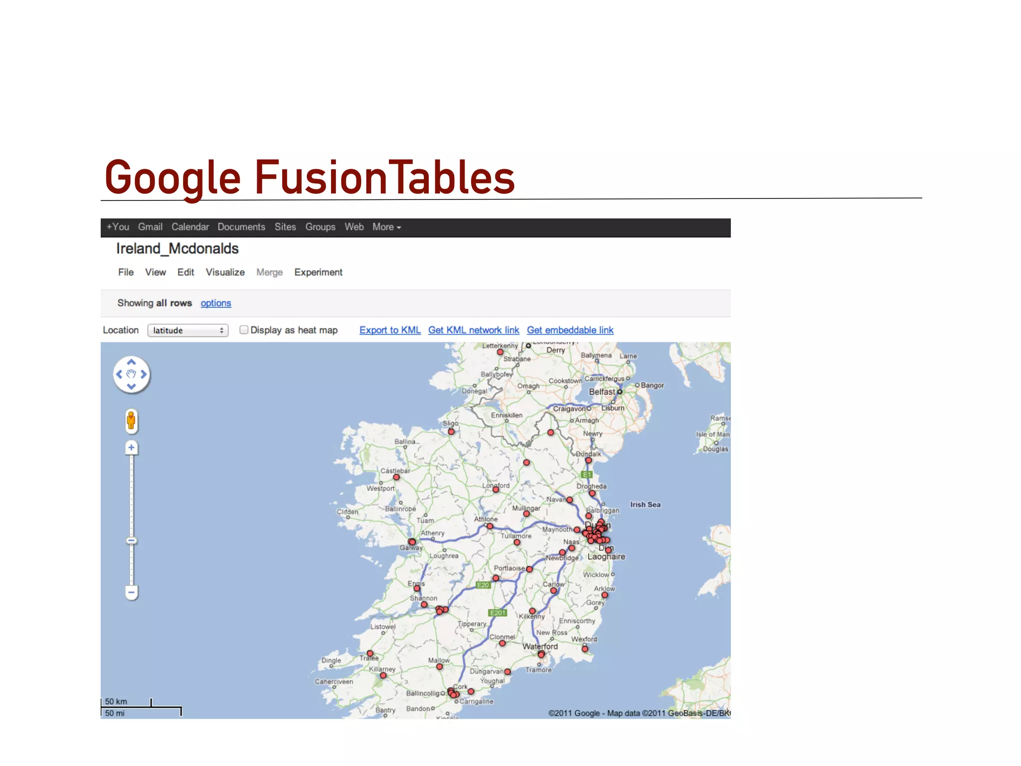
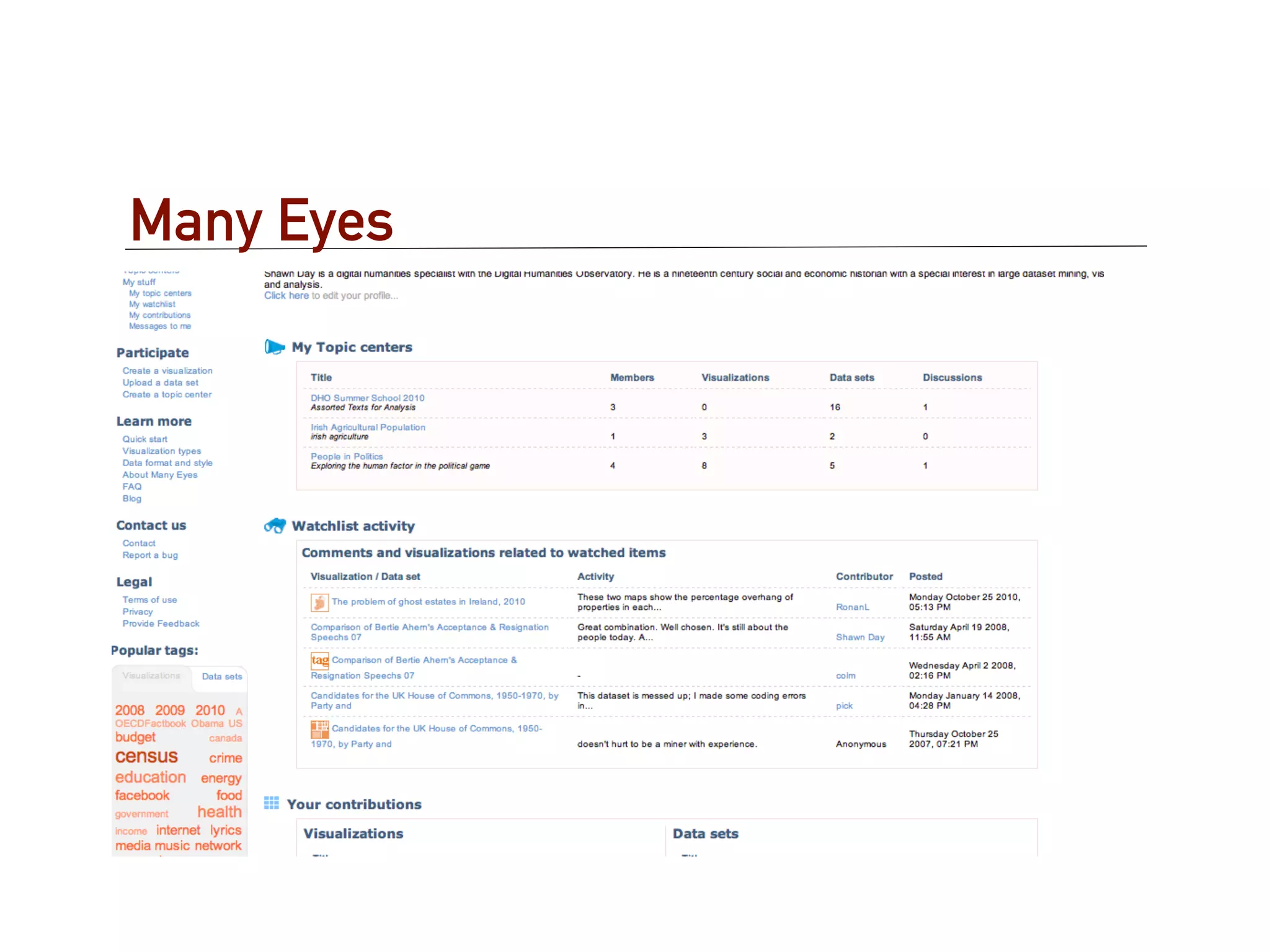
The document provides an overview of structured data presentation tools for digital humanities scholars. It discusses the difference between data presentation and analysis, and highlights some early pioneers of data visualization like William Playfair and Charles Minard. The document then examines challenges in using visualization for the humanities. It also profiles several structured data presentation tools, including TimeFlow, Google Fusion Tables, Many Eyes, and Omeka. Hands-on examples are provided using the Exhibit framework to create interactive visualizations like faceted browsing, searching, tables, timelines, and maps.