Download as PDF, PPTX

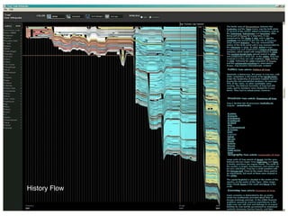
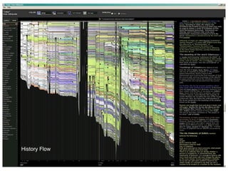

The document discusses the evolution of information visualization in art history, highlighting key developments from the 1830s to the present, including scientific and artistic visualization techniques. It emphasizes the potential of high-performance computing in humanities for analyzing and visualizing large cultural data sets, which can lead to new insights. Additionally, it presents various visualization projects that illustrate trends and patterns across diverse media and cultural resources.


