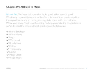
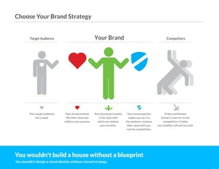
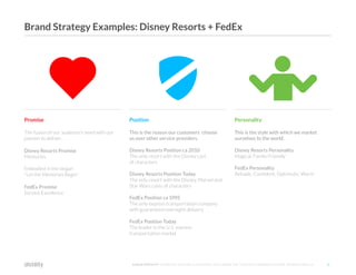
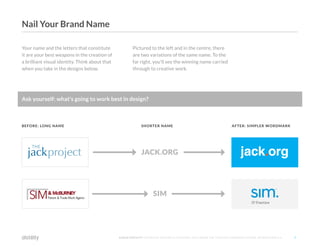
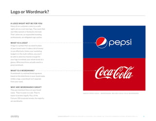
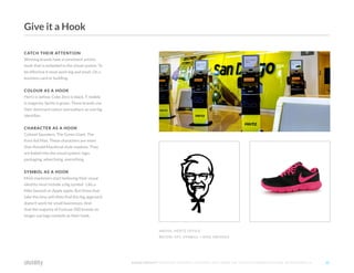
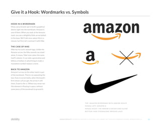
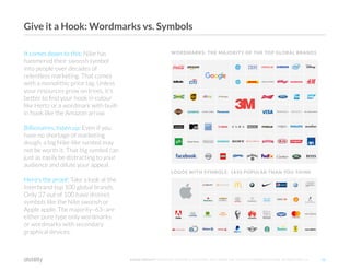
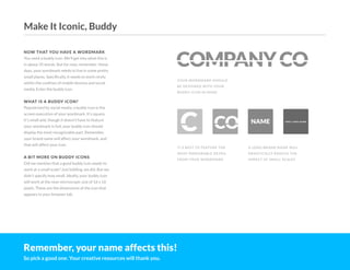
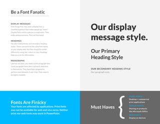
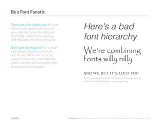
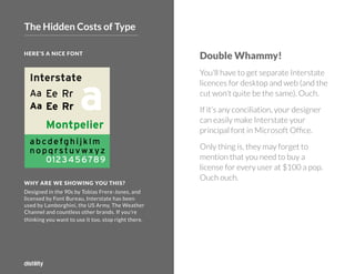
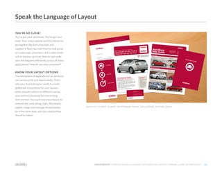
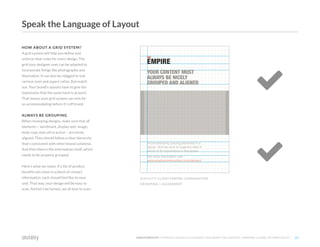
How to Build a Visual Identity
Proven practices to get the best from your design team.
©2O19 DISTILITY COPYRIGHT HOLDER IS LICENSING THIS UNDER THE CREATIVE COMMONS LICENSE, ATTRIBUTION 3.0 2
It's not fair. You have to know what looks good. What sounds good.
What truly represents your firm, its offers, its team. You have to sacrifice
ideas you love dearly so the big message hits home with the customer.
We're very sorry. That's just branding. To help you make the tough choices,
we've distilled the essential best-practices on the following.
 Brand Strategy
 Brand Name
 Logo
 Wordmark
 Buddy Icon
 Colour
 Typography
 Layout
 Paper Stock
 Visual Hook
Choices We All Have to Make
3
©2O19 DISTILITY COPYRIGHT HOLDER IS LICENSING THIS UNDER THE CREATIVE COMMONS LICENSE, ATTRIBUTION 3.0 3
ready.set.
GO
Target Audience Your Brand Competitors
Your target audience
has a need.
Your brand promise
fills their need and
reflects your passion.
Your brand personality
is the style with
which you deliver
your promise.
Your brand position
makes you no.1 so
the audience resolves
their need with you,
not the competition.
A dear and honest
brand is a barrier to the
competition. It helps
you simplify, sell and succeed.
©2O19 DISTILITY COPYRIGHT HOLDER IS LICENSING THIS UNDER THE CREATIVE COMMONS LICENSE, ATTRIBUTION 3.0 4
You wouldn't build a house without a blueprint
You shouldn't design a visual identity without a brand strategy
Choose Your Brand Strategy
©2O16 DISTILITY COPYRIGHT HOLDER IS LICENSING THIS UNDER THE CREATIVE COMMONS LICENSE, ATTRIBUTION 3.0 5
Promise
The fusion of our audience’s need with our
passion to deliver.
Disney Resorts Promise
Memories
Embodied in the slogan
"Let the Memories Begin"
FedEx Promise
Service Excellence
Personality
This is the style with which we market
ourselves to the world.
Disney Resorts Personality
Magical, Family Friendly
FedEx Personality
Reliable, Confident, Optimistic, Warm
Position
This is the reason our customers choose
us over other service providers.
Disney Resorts Position ca 2010
The only resort with the Disney cast
of characters
Disney Resorts Position Today
The only resort with the Disney, Marvel and
Star Wars casts of characters
FedEx Position ca 1995
The only express transportation company
with guaranteed overnight delivery
FedEx Position Today
The leader in the U.S. express
transportation market
Brand Strategy Examples: Disney Resorts + FedEx
©2O19 DISTILITY COPYRIGHT HOLDER IS LICENSING THIS UNDER THE CREATIVE COMMONS LICENSE, ATTRIBUTION 3.0 6
If you've got a name, we hope it meets the following criteria.
 Short
 Appealing
 Memorable
 Legally protected
 Easy to find via search
Your name
is your most
important
marketing tool
If you're choosing
a name, make sure
you consider what's
on the next page . . .
Company Co. 
Nail Your Brand Name
©2O16 DISTILITY COPYRIGHT HOLDER IS LICENSING THIS UNDER THE CREATIVE COMMONS LICENSE, ATTRIBUTION 3.0 7
Your name and the letters that constitute
it are your best weapons in the creation of
a brilliant visual identity. Think about that
when you take in the designs below.
Pictured to the left and in the centre, there
are two variations of the same name. To the
far right, you'll see the winning name carried
through to creative work.
JACK.ORG
SIM
BEFORE: LONG NAME SHORTER NAME AFTER: SIMPLER WORDMARK
Ask yourself: what's going to work best in design?
Nail Your Brand Name
8
©2O19 DISTILITY COPYRIGHT HOLDER IS LICENSING THIS UNDER THE CREATIVE COMMONS LICENSE, ATTRIBUTION 3.0 8
nowit's
timeto
getvisual
©2O16 DISTILITY COPYRIGHT HOLDER IS LICENSING THIS UNDER THE CREATIVE COMMONS LICENSE, ATTRIBUTION 3.0 9
A LOGO MIGHT NOT BE FOR YOU
Many of our customers come to us with
sights set on a cool new logo. They want their
own Nike swoosh or Starbucks mermaid.
That's when we, as responsible branding
professionals, are obligated urge caution.
WHAT IS A LOGO?
A logo is a symbol that can stand in place
of your brand name. It takes a lot of money
to use effectively. Unless your marketing
budget is in the multi-millions, you won't
be able to advertise heavily enough for
your logo to embody your whole brand at a
glance. What most firms actually need is a
great wordmark.
WHAT IS A WORDMARK?
A wordmark is a stylized brand signature
based on the letterforms in your brand name.
Unlike a logo, a wordmark isn't separate
from your name.
WHY ARE WORDMARKS GREAT?
They put maximum focus on your brand
name. They're easier to scale. They're
easier to protect legally. Plus, of the
Fortune 100 corporate brands, the majority
are wordmarks.
ABOVE PEPSI LOGO + WORDMARK BELOW COCA-COLA WORDMARK
Logo or Wordmark?
©2O16 DISTILITY COPYRIGHT HOLDER IS LICENSING THIS UNDER THE CREATIVE COMMONS LICENSE, ATTRIBUTION 3.0 10
CATCH THEIR ATTENTION
Winning brands have a consistent artistic
hook that is embeded in the visual system. To
be effective it must work big and small. On a
business card or building.
COLOUR AS A HOOK
Hertz is yellow. Coke Zero is black. T-mobile
is magenta. Sprite is green. These brands use
their dominant colour everywhere as one big
identifier.
CHARACTER AS A HOOK
Colonel Saunders. The Green Giant. The
Kool Aid Man. These characters are more
than Ronald Macdonal style maskots. They
are baked into the visual system: logo,
packaging, advertising, everything.
SYMBOL AS A HOOK
Most marketers start believing their visual
identity must include a big symbol. Like a
Nike Swoosh or Apple apple. But those that
take the time will often find this big approach
doesn't work for small businesses. And
that the majority of Fortune 500 brands no
longer use logo symbols as their hook.
ABOVE: HERTZ OFFICE
BELOW: KFC SYMBOL + NIKE SWOOSH
Give it a Hook
©2O16 DISTILITY COPYRIGHT HOLDER IS LICENSING THIS UNDER THE CREATIVE COMMONS LICENSE, ATTRIBUTION 3.0 11
HOOK IN A WORDMARK
Many savvy brands opt to build a graphical
device right into the wordmark. Amazon is
one of them. When you look at the Amazon
mark, you see a delightful little arrow bolted
to the base. We'll talk more about this in a
minute, but first, let's contrast it with Nike.
THE CASE OF NIKE
Nike has its iconic swoosh logo. Unlike the
Amazon arrow, the Nike swoosh can stand
alone. It means 'Nike' even when the name
itself is absent. It can take a generation and
billions of dollars in advertising to make a
standalone symbol replace a name.
BACK TO AMAZON
Amazon's arrow, on the other hand, is part
of the wordmark. There's no separating the
two. Even in social media, when the brand's
first initial is all you get, the arrow is still
there, fused to the 'a.' Where you never see
this element is floating in space, without
some piece of the wordmark to ground it.
TOP: AMAZON WORDMARK WITH ARROW DEVICE
MIDDLE LEFT: AMAZON A
MIDDLE RIGHT: THE ARROW IS NEVER USED ALONE
BOTTOM: NIKE STANDALONE SWOOSH LOGO
Give it a Hook: Wordmarks vs. Symbols
©2O16 DISTILITY COPYRIGHT HOLDER IS LICENSING THIS UNDER THE CREATIVE COMMONS LICENSE, ATTRIBUTION 3.0 12
It comes down to this: Nike has
hammered their swoosh symbol
into people over decades of
relentless marketing. That comes
with a monolithic price tag. Unless
your resources grow on trees, it's
better to find your hook in colour
like Hertz or a wordmark with built-
in hook like the Amazon arrow.
Billionaires, listen up: Even if you
have no shortage of marketing
dough, a big Nike-like symbol may
not be worth it. That big symbol can
just as easily be distracting to your
audience and dilute your appeal.
Here's the proof: Take a look at the
Interbrand top 100 global brands.
Only 37 out of 100 have distinct
symbols like the Nike swoosh or
Apple apple. The majority–63–are
either pure type only wordmarks
or wordmarks with secondary
graphical devices.
WORDMARKS: THE MAJORITY OF THE TOP GLOBAL BRANDS
LOGOS WITH SYMBOLS: LESS POPULAR THAN YOU THINK
Give it a Hook: Wordmarks vs. Symbols
C CO
COMPANYCO
NAME V E R Y LO N G N A M E
NOW THAT YOU HAVE A WORDMARK
You need a buddy icon. We'll get into what this is
in about 35 words. But for now, remember: these
days, your wordmark needs to live in some pretty
small places. Specifically, it needs to work nicely
within the confines of mobile devices and social
media. Enter the buddy icon.
WHAT IS A BUDDY ICON?
Popularized by social media, a buddy icon is the
screen execution of your wordmark. It's square,
it's small and, though it doesn't have to feature
your wordmark in full, your buddy icon should
display the most recognizable part. Remember,
your brand name will affect your wordmark, and
that will affect your icon.
A BIT MORE ON BUDDY ICONS
Did we mention that a good buddy icon needs to
work at a small scale? Just kidding, we did. But we
didn't specify how small. Ideally, your buddy icon
will work at the near microscopic size of 16 x 16
pixels. These are the dimensions of the icon that
appears in your browser tab.
YOUR WORDMARK SHOULD
BE DESIGNED WITH YOUR
BUDDY ICON IN MIND
IT'S BEST TO FEATURE THE
MOST MEMORABLE DETAIL
FROM YOUR WORDMARK
A LONG BRAND NAME WILL
DRASTICALLY REDUCE THE
IMPACT AT SMALL SCALES
Remember, your name affects this!
So pick a good one. Your creative resources will thank you.
Make It Iconic, Buddy
PURITY +
SIMPLICITY
PEACE +
INTELLIGENCE
LOVE +
EXCITEMENT
WARMTH +
FRIENDLINESS
LUXURY +
RICHNESS
©2O16 DISTILITY COPYRIGHT HOLDER IS LICENSING THIS UNDER THE CREATIVE COMMONS LICENSE, ATTRIBUTION 3.0 14
Start with colour strategy. The colours you choose for your brand are as
important as the actual message. Use colour to evoke emotional, subconscious
responses, and to differentiate from your competitors.
If the other guys are blue, be the opposite of blue: orange. If they’re green, be
red. The more you can start to think like this, the better. Especially when it's
time to sign off on your team's design work.
Show Your True Colours
©2O19 DISTILITY COPYRIGHT HOLDER IS LICENSING THIS UNDER THE CREATIVE COMMONS LICENSE, ATTRIBUTION 3.0 15
CONSISTENCY IS KEY
It's no secret that colour plays a vital role in a
great visual identity. It seems simple, but it isn’t.
Your identity needs to look consistent in multiple
colour formats for screen and print.
KNOW THE FORMATS
Screen and digital media use red, green and blue
(RGB). Four-colour process printing uses cyan,
magenta, yellow and black (CMYK). Spot colour
printing uses the Pantone colour matching system
(PAN) for premium results.
GET THE RESULTS
RGB achieves repeated colour fidelity most easily
because, here, colours are produced with light.
Print is more difficult, especially when it comes to
secondary colours like purple and orange. (Don't
get us started on orange.)The more complex the
colour formulation, the more difficult and costly it
is to reproduce.
WE'RE NOT QUITE DONE YET
Commercial applications use industrial paint, vinyl
and other synthetic materials matched to CMYK
and Pantone values. To nail colour reproduction
here, bring a keen eye and a swear jar.
PRINT: CYAN MAGENTA YELLOW BLACK (CMYK) PRINT: PANTONE SPOT
SCREEN: RED GREEN BLUE (RGB)
Show Your True Colours
16
©2O19 DISTILITY COPYRIGHT HOLDER IS LICENSING THIS UNDER THE CREATIVE COMMONS LICENSE, ATTRIBUTION 3.0
Don't forget
RGB = Screen
CMYK = Print
Pantone = Spot colour print
*
Your visual identity also
needs to work in pure black,
greyscale and halftone.
FYI
DISPLAY MESSAGES
First things first. You need a display font, a
headline typeface that makes people go "wow!"
Display fonts entice a person to read more. They
make announcements. They set the mood.
HEADINGS
You also need primary and secondary heading
styles. These can hail from the same font family
as your display text, but they should be styled
differently using size, colour or case. Headings
help you scan for information.
PARAGRAPHS
Last but not least, you need a solid paragraph font.
Good paragraph fonts don't call much attention
to themselves. They have been designed to
perform best between 6 and 14 pt. They need to
be highly readable.
Our display
message style.
OUR SECONDARY HEADING STYLE
Our Primary
Heading Style
Our paragraph style.
Fonts Are Finicky
Your fonts are affected by applications. Print fonts
may not be available for web and vice versa. Neither
print nor web fonts may work in PowerPoint. {
PRINT FONTS
Desktop + commercial
print applications
WEB FONTS
Display on devices
OFFICE FONTS
Sharing on products
like Microsoft Office
Must Haves
Be a Font Fanatic
©2O19 DISTILITY COPYRIGHT HOLDER IS LICENSING THIS UNDER THE CREATIVE COMMONS LICENSE, ATTRIBUTION 3.0 19
Type says a lot about you. It's one
of the most viewed elements of
your identity. Smart brands use
fonts that embody the strategy,
and that work for print and web.
Don't get too excited. For a clean
look, keep fonts to a minimum:
one or two. While we're on the
subject, keep font sizes carefully
under control, with no more than
three sizes in one space.
Here's a bad
font hierarchy
AND WE BET IT'S LOST YOU
We're combining
fonts willy nilly
By the time you get through these headings – by the time you realize that your eye is gravitating
towards the sub-headis before the display text – you have stopped reading.
Be a Font Fanatic
©2O19 DISTILITY COPYRIGHT HOLDER IS LICENSING THIS UNDER THE CREATIVE COMMONS LICENSE, ATTRIBUTION 3.0 20
HERE'S A NICE FONT
WHY ARE WE SHOWING YOU THIS?
Designed in the 90s by Tobias Frere-Jones, and
licensed by Font Bureau, Interstate has been
used by Lamborghini, the US Army, The Weather
Channel and countless other brands. If you're
thinking you want to use it too, stop right there.
Double Whammy!
You'll have to get separate Interstate
licences for desktop and web (and the
cut won't quite be the same). Ouch.
If it's any conciliation, your designer
can easily make Interstate your
principal font in Microsoft Office.
Only thing is, they may forget to
mention that you need to buy a
license for every user at $100 a pop.
Ouch ouch.
The Hidden Costs of Type
21
©2O19 DISTILITY COPYRIGHT HOLDER IS LICENSING THIS UNDER THE CREATIVE COMMONS LICENSE, ATTRIBUTION 3.0
Typography is an art, even when
it comes to letter spacing. Letter
spacing includes tracking, the
space between characters, and
leading, the space between lines.
Both need to be ultra consistent.
FYI
©2O19 DISTILITY COPYRIGHT HOLDER IS LICENSING THIS UNDER THE CREATIVE COMMONS LICENSE, ATTRIBUTION 3.0 22
YOU'RE SO CLOSE!
You've got your wordmark. You've got your
hook. Your colour palette and font hierarchy
go together like dark chocolate and
raspberry. Now you need them to look great
on a web page, a business card, a sales sheet
and an outdoor print ad. How do you make
sure this happens effectively across all these
applications? How do you stay consistent?
KNOW YOUR LAYOUT OPTIONS
The dimensions of applications can seriously
vary across print and digital media. That's
why your brand designer needs to create
deliberate conventions for your layouts,
which should conform to different canvas
sizes without breaking the overarching
look and feel. You want every touchpoint to
embody the same design logic. Wordmark,
tagline, image and message should always
be in the same zone, and size relationships
should be baked.
DISTILITY'S FIRST CLIENT: AUTOSHARE PRINT COLLATERAL SYSTEM (2001)
Speak the Language of Layout
©2O19 DISTILITY COPYRIGHT HOLDER IS LICENSING THIS UNDER THE CREATIVE COMMONS LICENSE, ATTRIBUTION 3.0 23
HOW ABOUT A GRID SYSTEM?
A grid system will help you define and
enforce clear rules for every design. The
grid your designer uses can be adapted to
incorporate things like photography and
illustration. It can also be rejigged to suit
various sizes and aspect ratios. But watch
out. Your brand's layouts have to give the
impression that the same hand is at work.
That means your grid system can only be
so accommodating before it's off brand.
ALWAYS BE GROUPING
When reviewing designs, make sure that all
elements – wordmark, display text, image,
body copy and call to action – are nicely
aligned. They should follow a clear hierarchy
that's consistent with other brand collateral.
And then there's the information itself, which
needs to be properly grouped.
Here's what we mean: If a list of product
benefits sits close to a block of contact
information, each should feel like its own
unit. That way, your design will be easy to
scan. And let's be honest, we all love to scan.
DISTILITY CLIENT EMPIRE COMMUNITIES
GROUPING + ALIGNMENT


Speak the Language of Layout
©2O19 DISTILITY COPYRIGHT HOLDER IS LICENSING THIS UNDER THE CREATIVE COMMONS LICENSE, ATTRIBUTION 3.0 24
DON'T SKIMP ON THE STOCK
No print job will look better than the paper
it's printed on. That's a fact. When the time
comes to print, it's a good idea to get the best
possible materials. Keep in mind, that doesn't
always mean the most expensive materials. It
simply means the right stuff for the job.
THINGS TO THINK ABOUT
OTHER THAN COST
• Thickness, measured in pounds per 500
sheets; standard printer paper is 20 lbs
• Texture: felt, linen or something else?
• Brightness, based on the amount of
bleach in the product
• Finish: glossy or matte?
• Folding: the thicker the stock
the harder it is to fold
• Composition: percentage of virgin
to recycled material
DOMTAR PAPER PRODUCTS
©2O16 DISTILITY COPYRIGHT HOLDER IS LICENSING THIS UNDER THE CREATIVE COMMONS LICENSE, ATTRIBUTION 3.0
What's that saying about the medium again?
The medium is the message. Or the mess, if your paper stock belongs in the bin.
Pick Your Paper Stock
©2O19 DISTILITY COPYRIGHT HOLDER IS LICENSING THIS UNDER THE CREATIVE COMMONS LICENSE, ATTRIBUTION 3.0 25
Be Consistent Across
All Media
Back in the day, everything was
printed. Today, you need to think
about multiple display formats.
A sales sheets is a great example of
something you need both print and
screen ready. No matter the media,
your applications should share the
same look and feel.
YOU'LL NEED A COUPLE WEIGHTS
First, you need to consider the paper
stock for some basic brand infrastructure.
Applications that benefit from different stocks
are letterheads, business cards, brochures
and folders.
KNOW WHEN TO CHANGE IT UP
It's good to use the same paper stock for multiple
applications, say a letterhead and a sales sheet.
But when something has a distinct function or
feel, it may be time to change it up.
REMEMBER: LOW TOUCH,
LOW CONFIDENCE
Ever been handed a business card so flimsy you
could've sworn it dissolved a bit in your grasp?
Or a sales sheet so thin it could've passed for the
skin of an onion? Not too confidence building.
If a brand pays no attention to materials, it can
feel like there's no concern for your journey as a
potential customer. If, on the other hand, a brand
takes pride in how it presents, it feels like a high-
touch experience is headed your way.
Pick Your Paper Stock
©2O19 DISTILITY COPYRIGHT HOLDER IS LICENSING THIS UNDER THE CREATIVE COMMONS LICENSE, ATTRIBUTION 3.0 26
REMEMBER THE IDEA OF THE HOOK?
This is where we expand on it. Again, don't hate
us, but your brand's visual hook does not have to
revolve around a swoosh in your wordmark. It can
be driven by any of the stylistic elements we've
covered in this ebook.
BUT WHY?
A visual identity isn't just one thing. It's an
amalgam of text, form, colour, imagery and layout.
All of these ingredients have to be there. But one
or two of them can drive the identity's hook.
LOOK AT COKE ZERO
If there's one element Coke Zero leads with, it's
colour. Admittedly, this product has the classic
Coca-Cola wordmark going for it. But the brand
makes a serious point of dominating the shade
black in the soft drink space.
COKE ZERO LEANS ON BLACK
Bring It All Together for the Win
©2O19 DISTILITY COPYRIGHT HOLDER IS LICENSING THIS UNDER THE CREATIVE COMMONS LICENSE, ATTRIBUTION 3.0 27
FEDEX USES COLOUR + TYPOGRAPHY TO BRAND MULTIPLE DIVISIONS
TD CANADA TRUST LEADS WITH COLOUR + CHAIR APPEAL
Bring It All Together for the Win
FEDEX IS ANOTHER GOOD ONE
The shipping giant has a simple wordmark, but it's
genius. Why's that? Well, the space between the
'E' and the 'x' is shaped like an arrow. Plus, the 'Ex'
is a different colour for every corporate division.
For these folks, typography + colour = oomph.
That's why, even at its barest bones, the FedEx
brand stays eye catching and memorable.
IF YOU'RE NOT FROM CANADA
Our Canadian readers will tell you that TD
Canada Trust bank has used the same green
leather chair in its photography for over a decade.
Talk about a hook with legs!
28
©2O19 DISTILITY COPYRIGHT HOLDER IS LICENSING THIS UNDER THE CREATIVE COMMONS LICENSE, ATTRIBUTION 3.0
A great visual identity can
associate positive feelings
with your brand over time.
It's your job to settle on one
that's authentic, compelling
and unique. Make us proud!
©2O19 DISTILITY COPYRIGHT HOLDER IS LICENSING THIS UNDER THE CREATIVE COMMONS LICENSE, ATTRIBUTION 3.0 29
Remember, This Is Just the Tip of the Iceberg
There's a lot more to a brand than what we've covered
here. Designing a brilliant visual identity takes
someone with years of experience and lots of talent.
The reality is that more firms get it wrong than right.
Getting it wrong comes with costly inefficiencies and
wasted market share. Who needs that!?
There's No Need to Overcomplicate Things
We’re big fans of the simplest approach that works.
To that end, we champion clean, flexible visual identity
systems that are driven by strategy. Regardless
of your firm's goals, your identity should drive
brand awareness and equity. To endure, it has to be
streamlined, it has to scale and it has to stand out.
Contact Us
Find out how we can get your brand in gear, starting
with our accelerated brand strategy workflow.
Speak to us directly at 417 413 7777 x1 or email us at
hello@distility.com
     
Avoid an Identity Crisis
With some best practices in your
back pocket, you're set to lead
better discussions about your
visual identity. Get your team
on the same page. Send them this
ebook and start the conversation.
Before You Go
©2O19 DISTILITY COPYRIGHT HOLDER IS LICENSING THIS UNDER THE CREATIVE COMMONS LICENSE, ATTRIBUTION 3.0 30
domtarblueline.com
http://domtarblueline.com/wp-content/uploads/2014/02/feature_all_products-1.jpg
All trademarks, service marks, trade names, trade dress, product names and logos appearing in this ebook are the property
of their respective owners including, in some instances, Distility. Any rights not expressly granted herein are reserved.
brandfolder.com
https://brandfolder.com/blog/shared-story/biggest-branding-mistakes/
cocacolaportugal.com
http://www.cocacolaportugal.pt/19201201/jopt/post_images/standard/detail_lbITzYnZakM0pchLQsx9frA8wmHFdO.png
businessinsider.com
http://www.businessinsider.com/hidden-meanings-in-tech-company-logos-2014-6
logok.org
http://logok.org/nike-logo/
pantone.com
https://www.pantone.com/fashion-home-interiors-color-guide
en.wikipedia.org
By no machine-readable author provided. GearedBull assumed (based on copyright claims). [CC BY-SA 2.5 (http://creativecommons.org/licenses/by-sa/2.5)], via Wikimedia Commons
https://commons.wikimedia.org/w/index.php?curid=1656999)]
Image Credits
©2O19 DISTILITY COPYRIGHT HOLDER IS LICENSING THIS UNDER THE CREATIVE COMMONS LICENSE, ATTRIBUTION 3.0 31
coca-colacompany.com
http://www.coca-colacompany.com/coca-cola-unbottled/sports/2015/coke-zero-brings-drinkable-commercials-to-football-enters-third-year-with-espns-college-gameday/_jcr_content/
articleBody/par1/image/promoImage.resize.w_584.h_329.jpg/rDJGb7LjkJ7kwDlatCCp2w/1441391736278.jpg
coca-colacompany.com
http://www.coca-colacompany.com/content/dam/journey/us/en/global/2013/03/coke-zero-final-four-march-madness-604-604-337-9effa9ff.jpg
lbITzYnZakM0pchLQsx9frA8wmHFdO.png
fedex.com
http://about.van.fedex.com/wp-content/uploads/2016/04/FedEx-solutions-people.jpg
brandchannel.com
http://www.brandchannel.com/wp-content/uploads/2015/11/td-banking-can-be-this-comfortable-600.jpg
Image Credits Continued
3
2
WHAT IS GRAPHIC DESIGN?
Graphic design is the practice of combining
text, colour, imagery and layout to communicate
an idea or create an experience. Though it is very
much an art, graphic design is nothing without
logic and problem solving. It's visual planning.
WHAT IS BRAND DESIGN?
Brand design is the practice of developing
a brand's visual identity based on its brand
strategy. It's a highly specific discipline, and
it demands a firm grasp of brand design and brand
strategy dos and don'ts.
WHAT IS A VISUAL IDENTITY?
A visual identity is the visible embodiment of
a brand strategy. It's the end product of the
brand design process. A good visual identity is
compelling, scalable and clearly differentiated
from the competition. It's a system. In other
words, it has rules.
WHAT IS AN APPLICATION?
It's a fancy way of saying "thing you need to
brand." Classic applications include business
cards, letterheads, brochures and websites.
WHAT HAVE WE DONE!?
This ebook focuses on the basic elements of an
effective visual identity, and the best practices
you need to follow to ensure its success.
Get Ready. Get Set.
33
©2O19 DISTILITY COPYRIGHT HOLDER IS LICENSING THIS UNDER THE CREATIVE COMMONS LICENSE, ATTRIBUTION 3.0
Commercial applications use
industrial paint, vinyl and other
synthetic materials matched to
CMYK and Pantone values. To
nail colour reproduction here,
bring a keen eye and a swear jar.
FYI
©2O19 DISTILITY COPYRIGHT HOLDER IS LICENSING THIS UNDER THE CREATIVE COMMONS LICENSE, ATTRIBUTION 3.0 34
Don't Forget the Wayfinding
THE SIGN OF A GREAT BRAND
What good is any of this stuff if your location doesn't
also embody your brand? When it comes to your
environment, you've got to design a wayfinding system
that goes great with your space as well as your brand.
WHAT IS WAYFINDING?
First coined by architect Kevin Lynch in his book Image
of the City (1960), wayfinding is "a consistent use and
organization of definite sensory cues from the external
environment." In other words, it's the visual and
auditory cues that show you where you are, where you
want to be, and how to get from A to B.
GO ALL THE WAY
A good brand has clear wayfinding that embodies
the brand strategy. A great brand uses wayfinding to
heighten the experience of the space. Either way you
slice it, wayfinding should never be an afterthought. It
should be built into your brand design from day one.
©2O19 DISTILITY COPYRIGHT HOLDER IS LICENSING THIS UNDER THE CREATIVE COMMONS LICENSE, ATTRIBUTION 3.0 35
Axle Davids is the founder of Distility.
He has over 20 years of experience building and
marketing brands. He created Distility in 2005 to
make the branding process smoother and faster
for industry innovators.
For each project, Axle leads brand and business
strategy development. He makes sure every
client has the clarity they need to launch their
brand with confidence, and with their whole
team on board.
Connect with Axle on LinkedIn
See how Distility gets branding done
Just head over to distility.com
Kalan Vuksanovich is creative lead at Distility.
With years of experience as a brand strategist
and copywriter, he helps guide brand strategy
development while overseeing all things written.
After a client goes through our brand strategy
process, Kalan crafts their brand message and
develops their voice. Then he works with our
design team to bring it home in winning visual
identity systems.
If you would like to discuss your brand with
the Distility team, feel free to contact our
office at 416 417 7777 x1
About the Authors
©2O19 DISTILITY COPYRIGHT HOLDER IS LICENSING THIS UNDER THE CREATIVE COMMONS LICENSE, ATTRIBUTION 3.0 36
SO WHAT'S A MONOGRAM?
A monogram is a motif of one to four letters. It's
typically a person's initials, interwoven or otherwise
combined in a decorative design. It often identifies a
personal possession. Some brands have monograms.
WHY A MONOGRAM IS DIFFERENT
A monogram isn't the same as a buddy icon. It can be
more stylistically driven, and it isn't necessarily a detail
from the wordmark.
WHERE YOU MIGHT SEE ONE
Imagine a high-end restaurant. It has a clean, ultra
modern wordmark on the sign out front. But when you
sit down, the menu presents something else. Something
that makes you feel sophisticated and exclusive: a
monogram! Get the picture?
THE POINT
A monogram can reinforce the feeling of a brand
after the customer has already been exposed to the
wordmark. This is not always true of a buddy icon,
which may be someone's first encounter with a brand.
So a buddy icon *must* be an application of the
wordmark. And the wordmark has to be designed with
this in mind. Not every brand needs a monogram. But a
buddy icon? You've got to have one of those.
Make it Iconic
©2O19 DISTILITY COPYRIGHT HOLDER IS LICENSING THIS UNDER THE CREATIVE COMMONS LICENSE, ATTRIBUTION 3.0 37
©2O16 DISTILITY COPYRIGHT HOLDER IS LICENSING THIS UNDER THE CREATIVE COMMONS LICENSE, ATTRIBUTION 3.0 3
7
WHAT IS GRAPHIC DESIGN?
The practice of combining text, colour, form
and layout to communicate an idea or create an
experience. Though it's very much an art, graphic
design is nothing without logic and problem
solving. It's visual planning.
WHAT IS BRAND DESIGN?
The practice of developing a brand's visual
identity based on its brand strategy. It's a highly
specific discipline, and it demands a firm grasp of
brand design and brand strategy dos and don'ts.
WHAT IS A VISUAL IDENTITY?
The visible embodiment of a brand strategy.
It's the end product of the brand design process.
A good visual identity is compelling, scalable and
well differentiated from the competition. It's a
system. It has rules.
WHAT IS AN APPLICATION?
A fancy way of saying "thing you need to brand."
Common applications include business cards,
letterheads, brochures and websites.
Don't Forget
This ebook focuses on the basic
moving parts of a visual identity, and
the best practices surrounding them.
It doesn't teach you how to design
an identity. It gives you the tools to
evaluate one.
Are We on the Same Page?

Visual Identity

  • 1.
    How to Builda Visual Identity Proven practices to get the best from your design team.
  • 2.
    ©2O19 DISTILITY COPYRIGHTHOLDER IS LICENSING THIS UNDER THE CREATIVE COMMONS LICENSE, ATTRIBUTION 3.0 2 It's not fair. You have to know what looks good. What sounds good. What truly represents your firm, its offers, its team. You have to sacrifice ideas you love dearly so the big message hits home with the customer. We're very sorry. That's just branding. To help you make the tough choices, we've distilled the essential best-practices on the following.  Brand Strategy  Brand Name  Logo  Wordmark  Buddy Icon  Colour  Typography  Layout  Paper Stock  Visual Hook Choices We All Have to Make
  • 3.
    3 ©2O19 DISTILITY COPYRIGHTHOLDER IS LICENSING THIS UNDER THE CREATIVE COMMONS LICENSE, ATTRIBUTION 3.0 3 ready.set. GO
  • 4.
    Target Audience YourBrand Competitors Your target audience has a need. Your brand promise fills their need and reflects your passion. Your brand personality is the style with which you deliver your promise. Your brand position makes you no.1 so the audience resolves their need with you, not the competition. A dear and honest brand is a barrier to the competition. It helps you simplify, sell and succeed. ©2O19 DISTILITY COPYRIGHT HOLDER IS LICENSING THIS UNDER THE CREATIVE COMMONS LICENSE, ATTRIBUTION 3.0 4 You wouldn't build a house without a blueprint You shouldn't design a visual identity without a brand strategy Choose Your Brand Strategy
  • 5.
    ©2O16 DISTILITY COPYRIGHTHOLDER IS LICENSING THIS UNDER THE CREATIVE COMMONS LICENSE, ATTRIBUTION 3.0 5 Promise The fusion of our audience’s need with our passion to deliver. Disney Resorts Promise Memories Embodied in the slogan "Let the Memories Begin" FedEx Promise Service Excellence Personality This is the style with which we market ourselves to the world. Disney Resorts Personality Magical, Family Friendly FedEx Personality Reliable, Confident, Optimistic, Warm Position This is the reason our customers choose us over other service providers. Disney Resorts Position ca 2010 The only resort with the Disney cast of characters Disney Resorts Position Today The only resort with the Disney, Marvel and Star Wars casts of characters FedEx Position ca 1995 The only express transportation company with guaranteed overnight delivery FedEx Position Today The leader in the U.S. express transportation market Brand Strategy Examples: Disney Resorts + FedEx
  • 6.
    ©2O19 DISTILITY COPYRIGHTHOLDER IS LICENSING THIS UNDER THE CREATIVE COMMONS LICENSE, ATTRIBUTION 3.0 6 If you've got a name, we hope it meets the following criteria.  Short  Appealing  Memorable  Legally protected  Easy to find via search Your name is your most important marketing tool If you're choosing a name, make sure you consider what's on the next page . . . Company Co.  Nail Your Brand Name
  • 7.
    ©2O16 DISTILITY COPYRIGHTHOLDER IS LICENSING THIS UNDER THE CREATIVE COMMONS LICENSE, ATTRIBUTION 3.0 7 Your name and the letters that constitute it are your best weapons in the creation of a brilliant visual identity. Think about that when you take in the designs below. Pictured to the left and in the centre, there are two variations of the same name. To the far right, you'll see the winning name carried through to creative work. JACK.ORG SIM BEFORE: LONG NAME SHORTER NAME AFTER: SIMPLER WORDMARK Ask yourself: what's going to work best in design? Nail Your Brand Name
  • 8.
    8 ©2O19 DISTILITY COPYRIGHTHOLDER IS LICENSING THIS UNDER THE CREATIVE COMMONS LICENSE, ATTRIBUTION 3.0 8 nowit's timeto getvisual
  • 9.
    ©2O16 DISTILITY COPYRIGHTHOLDER IS LICENSING THIS UNDER THE CREATIVE COMMONS LICENSE, ATTRIBUTION 3.0 9 A LOGO MIGHT NOT BE FOR YOU Many of our customers come to us with sights set on a cool new logo. They want their own Nike swoosh or Starbucks mermaid. That's when we, as responsible branding professionals, are obligated urge caution. WHAT IS A LOGO? A logo is a symbol that can stand in place of your brand name. It takes a lot of money to use effectively. Unless your marketing budget is in the multi-millions, you won't be able to advertise heavily enough for your logo to embody your whole brand at a glance. What most firms actually need is a great wordmark. WHAT IS A WORDMARK? A wordmark is a stylized brand signature based on the letterforms in your brand name. Unlike a logo, a wordmark isn't separate from your name. WHY ARE WORDMARKS GREAT? They put maximum focus on your brand name. They're easier to scale. They're easier to protect legally. Plus, of the Fortune 100 corporate brands, the majority are wordmarks. ABOVE PEPSI LOGO + WORDMARK BELOW COCA-COLA WORDMARK Logo or Wordmark?
  • 10.
    ©2O16 DISTILITY COPYRIGHTHOLDER IS LICENSING THIS UNDER THE CREATIVE COMMONS LICENSE, ATTRIBUTION 3.0 10 CATCH THEIR ATTENTION Winning brands have a consistent artistic hook that is embeded in the visual system. To be effective it must work big and small. On a business card or building. COLOUR AS A HOOK Hertz is yellow. Coke Zero is black. T-mobile is magenta. Sprite is green. These brands use their dominant colour everywhere as one big identifier. CHARACTER AS A HOOK Colonel Saunders. The Green Giant. The Kool Aid Man. These characters are more than Ronald Macdonal style maskots. They are baked into the visual system: logo, packaging, advertising, everything. SYMBOL AS A HOOK Most marketers start believing their visual identity must include a big symbol. Like a Nike Swoosh or Apple apple. But those that take the time will often find this big approach doesn't work for small businesses. And that the majority of Fortune 500 brands no longer use logo symbols as their hook. ABOVE: HERTZ OFFICE BELOW: KFC SYMBOL + NIKE SWOOSH Give it a Hook
  • 11.
    ©2O16 DISTILITY COPYRIGHTHOLDER IS LICENSING THIS UNDER THE CREATIVE COMMONS LICENSE, ATTRIBUTION 3.0 11 HOOK IN A WORDMARK Many savvy brands opt to build a graphical device right into the wordmark. Amazon is one of them. When you look at the Amazon mark, you see a delightful little arrow bolted to the base. We'll talk more about this in a minute, but first, let's contrast it with Nike. THE CASE OF NIKE Nike has its iconic swoosh logo. Unlike the Amazon arrow, the Nike swoosh can stand alone. It means 'Nike' even when the name itself is absent. It can take a generation and billions of dollars in advertising to make a standalone symbol replace a name. BACK TO AMAZON Amazon's arrow, on the other hand, is part of the wordmark. There's no separating the two. Even in social media, when the brand's first initial is all you get, the arrow is still there, fused to the 'a.' Where you never see this element is floating in space, without some piece of the wordmark to ground it. TOP: AMAZON WORDMARK WITH ARROW DEVICE MIDDLE LEFT: AMAZON A MIDDLE RIGHT: THE ARROW IS NEVER USED ALONE BOTTOM: NIKE STANDALONE SWOOSH LOGO Give it a Hook: Wordmarks vs. Symbols
  • 12.
    ©2O16 DISTILITY COPYRIGHTHOLDER IS LICENSING THIS UNDER THE CREATIVE COMMONS LICENSE, ATTRIBUTION 3.0 12 It comes down to this: Nike has hammered their swoosh symbol into people over decades of relentless marketing. That comes with a monolithic price tag. Unless your resources grow on trees, it's better to find your hook in colour like Hertz or a wordmark with built- in hook like the Amazon arrow. Billionaires, listen up: Even if you have no shortage of marketing dough, a big Nike-like symbol may not be worth it. That big symbol can just as easily be distracting to your audience and dilute your appeal. Here's the proof: Take a look at the Interbrand top 100 global brands. Only 37 out of 100 have distinct symbols like the Nike swoosh or Apple apple. The majority–63–are either pure type only wordmarks or wordmarks with secondary graphical devices. WORDMARKS: THE MAJORITY OF THE TOP GLOBAL BRANDS LOGOS WITH SYMBOLS: LESS POPULAR THAN YOU THINK Give it a Hook: Wordmarks vs. Symbols
  • 13.
    C CO COMPANYCO NAME VE R Y LO N G N A M E NOW THAT YOU HAVE A WORDMARK You need a buddy icon. We'll get into what this is in about 35 words. But for now, remember: these days, your wordmark needs to live in some pretty small places. Specifically, it needs to work nicely within the confines of mobile devices and social media. Enter the buddy icon. WHAT IS A BUDDY ICON? Popularized by social media, a buddy icon is the screen execution of your wordmark. It's square, it's small and, though it doesn't have to feature your wordmark in full, your buddy icon should display the most recognizable part. Remember, your brand name will affect your wordmark, and that will affect your icon. A BIT MORE ON BUDDY ICONS Did we mention that a good buddy icon needs to work at a small scale? Just kidding, we did. But we didn't specify how small. Ideally, your buddy icon will work at the near microscopic size of 16 x 16 pixels. These are the dimensions of the icon that appears in your browser tab. YOUR WORDMARK SHOULD BE DESIGNED WITH YOUR BUDDY ICON IN MIND IT'S BEST TO FEATURE THE MOST MEMORABLE DETAIL FROM YOUR WORDMARK A LONG BRAND NAME WILL DRASTICALLY REDUCE THE IMPACT AT SMALL SCALES Remember, your name affects this! So pick a good one. Your creative resources will thank you. Make It Iconic, Buddy
  • 14.
    PURITY + SIMPLICITY PEACE + INTELLIGENCE LOVE+ EXCITEMENT WARMTH + FRIENDLINESS LUXURY + RICHNESS ©2O16 DISTILITY COPYRIGHT HOLDER IS LICENSING THIS UNDER THE CREATIVE COMMONS LICENSE, ATTRIBUTION 3.0 14 Start with colour strategy. The colours you choose for your brand are as important as the actual message. Use colour to evoke emotional, subconscious responses, and to differentiate from your competitors. If the other guys are blue, be the opposite of blue: orange. If they’re green, be red. The more you can start to think like this, the better. Especially when it's time to sign off on your team's design work. Show Your True Colours
  • 15.
    ©2O19 DISTILITY COPYRIGHTHOLDER IS LICENSING THIS UNDER THE CREATIVE COMMONS LICENSE, ATTRIBUTION 3.0 15 CONSISTENCY IS KEY It's no secret that colour plays a vital role in a great visual identity. It seems simple, but it isn’t. Your identity needs to look consistent in multiple colour formats for screen and print. KNOW THE FORMATS Screen and digital media use red, green and blue (RGB). Four-colour process printing uses cyan, magenta, yellow and black (CMYK). Spot colour printing uses the Pantone colour matching system (PAN) for premium results. GET THE RESULTS RGB achieves repeated colour fidelity most easily because, here, colours are produced with light. Print is more difficult, especially when it comes to secondary colours like purple and orange. (Don't get us started on orange.)The more complex the colour formulation, the more difficult and costly it is to reproduce. WE'RE NOT QUITE DONE YET Commercial applications use industrial paint, vinyl and other synthetic materials matched to CMYK and Pantone values. To nail colour reproduction here, bring a keen eye and a swear jar. PRINT: CYAN MAGENTA YELLOW BLACK (CMYK) PRINT: PANTONE SPOT SCREEN: RED GREEN BLUE (RGB) Show Your True Colours
  • 16.
    16 ©2O19 DISTILITY COPYRIGHTHOLDER IS LICENSING THIS UNDER THE CREATIVE COMMONS LICENSE, ATTRIBUTION 3.0 Don't forget RGB = Screen CMYK = Print Pantone = Spot colour print *
  • 17.
    Your visual identityalso needs to work in pure black, greyscale and halftone. FYI
  • 18.
    DISPLAY MESSAGES First thingsfirst. You need a display font, a headline typeface that makes people go "wow!" Display fonts entice a person to read more. They make announcements. They set the mood. HEADINGS You also need primary and secondary heading styles. These can hail from the same font family as your display text, but they should be styled differently using size, colour or case. Headings help you scan for information. PARAGRAPHS Last but not least, you need a solid paragraph font. Good paragraph fonts don't call much attention to themselves. They have been designed to perform best between 6 and 14 pt. They need to be highly readable. Our display message style. OUR SECONDARY HEADING STYLE Our Primary Heading Style Our paragraph style. Fonts Are Finicky Your fonts are affected by applications. Print fonts may not be available for web and vice versa. Neither print nor web fonts may work in PowerPoint. { PRINT FONTS Desktop + commercial print applications WEB FONTS Display on devices OFFICE FONTS Sharing on products like Microsoft Office Must Haves Be a Font Fanatic
  • 19.
    ©2O19 DISTILITY COPYRIGHTHOLDER IS LICENSING THIS UNDER THE CREATIVE COMMONS LICENSE, ATTRIBUTION 3.0 19 Type says a lot about you. It's one of the most viewed elements of your identity. Smart brands use fonts that embody the strategy, and that work for print and web. Don't get too excited. For a clean look, keep fonts to a minimum: one or two. While we're on the subject, keep font sizes carefully under control, with no more than three sizes in one space. Here's a bad font hierarchy AND WE BET IT'S LOST YOU We're combining fonts willy nilly By the time you get through these headings – by the time you realize that your eye is gravitating towards the sub-headis before the display text – you have stopped reading. Be a Font Fanatic
  • 20.
    ©2O19 DISTILITY COPYRIGHTHOLDER IS LICENSING THIS UNDER THE CREATIVE COMMONS LICENSE, ATTRIBUTION 3.0 20 HERE'S A NICE FONT WHY ARE WE SHOWING YOU THIS? Designed in the 90s by Tobias Frere-Jones, and licensed by Font Bureau, Interstate has been used by Lamborghini, the US Army, The Weather Channel and countless other brands. If you're thinking you want to use it too, stop right there. Double Whammy! You'll have to get separate Interstate licences for desktop and web (and the cut won't quite be the same). Ouch. If it's any conciliation, your designer can easily make Interstate your principal font in Microsoft Office. Only thing is, they may forget to mention that you need to buy a license for every user at $100 a pop. Ouch ouch. The Hidden Costs of Type
  • 21.
    21 ©2O19 DISTILITY COPYRIGHTHOLDER IS LICENSING THIS UNDER THE CREATIVE COMMONS LICENSE, ATTRIBUTION 3.0 Typography is an art, even when it comes to letter spacing. Letter spacing includes tracking, the space between characters, and leading, the space between lines. Both need to be ultra consistent. FYI
  • 22.
    ©2O19 DISTILITY COPYRIGHTHOLDER IS LICENSING THIS UNDER THE CREATIVE COMMONS LICENSE, ATTRIBUTION 3.0 22 YOU'RE SO CLOSE! You've got your wordmark. You've got your hook. Your colour palette and font hierarchy go together like dark chocolate and raspberry. Now you need them to look great on a web page, a business card, a sales sheet and an outdoor print ad. How do you make sure this happens effectively across all these applications? How do you stay consistent? KNOW YOUR LAYOUT OPTIONS The dimensions of applications can seriously vary across print and digital media. That's why your brand designer needs to create deliberate conventions for your layouts, which should conform to different canvas sizes without breaking the overarching look and feel. You want every touchpoint to embody the same design logic. Wordmark, tagline, image and message should always be in the same zone, and size relationships should be baked. DISTILITY'S FIRST CLIENT: AUTOSHARE PRINT COLLATERAL SYSTEM (2001) Speak the Language of Layout
  • 23.
    ©2O19 DISTILITY COPYRIGHTHOLDER IS LICENSING THIS UNDER THE CREATIVE COMMONS LICENSE, ATTRIBUTION 3.0 23 HOW ABOUT A GRID SYSTEM? A grid system will help you define and enforce clear rules for every design. The grid your designer uses can be adapted to incorporate things like photography and illustration. It can also be rejigged to suit various sizes and aspect ratios. But watch out. Your brand's layouts have to give the impression that the same hand is at work. That means your grid system can only be so accommodating before it's off brand. ALWAYS BE GROUPING When reviewing designs, make sure that all elements – wordmark, display text, image, body copy and call to action – are nicely aligned. They should follow a clear hierarchy that's consistent with other brand collateral. And then there's the information itself, which needs to be properly grouped. Here's what we mean: If a list of product benefits sits close to a block of contact information, each should feel like its own unit. That way, your design will be easy to scan. And let's be honest, we all love to scan. DISTILITY CLIENT EMPIRE COMMUNITIES GROUPING + ALIGNMENT   Speak the Language of Layout
  • 24.
    ©2O19 DISTILITY COPYRIGHTHOLDER IS LICENSING THIS UNDER THE CREATIVE COMMONS LICENSE, ATTRIBUTION 3.0 24 DON'T SKIMP ON THE STOCK No print job will look better than the paper it's printed on. That's a fact. When the time comes to print, it's a good idea to get the best possible materials. Keep in mind, that doesn't always mean the most expensive materials. It simply means the right stuff for the job. THINGS TO THINK ABOUT OTHER THAN COST • Thickness, measured in pounds per 500 sheets; standard printer paper is 20 lbs • Texture: felt, linen or something else? • Brightness, based on the amount of bleach in the product • Finish: glossy or matte? • Folding: the thicker the stock the harder it is to fold • Composition: percentage of virgin to recycled material DOMTAR PAPER PRODUCTS ©2O16 DISTILITY COPYRIGHT HOLDER IS LICENSING THIS UNDER THE CREATIVE COMMONS LICENSE, ATTRIBUTION 3.0 What's that saying about the medium again? The medium is the message. Or the mess, if your paper stock belongs in the bin. Pick Your Paper Stock
  • 25.
    ©2O19 DISTILITY COPYRIGHTHOLDER IS LICENSING THIS UNDER THE CREATIVE COMMONS LICENSE, ATTRIBUTION 3.0 25 Be Consistent Across All Media Back in the day, everything was printed. Today, you need to think about multiple display formats. A sales sheets is a great example of something you need both print and screen ready. No matter the media, your applications should share the same look and feel. YOU'LL NEED A COUPLE WEIGHTS First, you need to consider the paper stock for some basic brand infrastructure. Applications that benefit from different stocks are letterheads, business cards, brochures and folders. KNOW WHEN TO CHANGE IT UP It's good to use the same paper stock for multiple applications, say a letterhead and a sales sheet. But when something has a distinct function or feel, it may be time to change it up. REMEMBER: LOW TOUCH, LOW CONFIDENCE Ever been handed a business card so flimsy you could've sworn it dissolved a bit in your grasp? Or a sales sheet so thin it could've passed for the skin of an onion? Not too confidence building. If a brand pays no attention to materials, it can feel like there's no concern for your journey as a potential customer. If, on the other hand, a brand takes pride in how it presents, it feels like a high- touch experience is headed your way. Pick Your Paper Stock
  • 26.
    ©2O19 DISTILITY COPYRIGHTHOLDER IS LICENSING THIS UNDER THE CREATIVE COMMONS LICENSE, ATTRIBUTION 3.0 26 REMEMBER THE IDEA OF THE HOOK? This is where we expand on it. Again, don't hate us, but your brand's visual hook does not have to revolve around a swoosh in your wordmark. It can be driven by any of the stylistic elements we've covered in this ebook. BUT WHY? A visual identity isn't just one thing. It's an amalgam of text, form, colour, imagery and layout. All of these ingredients have to be there. But one or two of them can drive the identity's hook. LOOK AT COKE ZERO If there's one element Coke Zero leads with, it's colour. Admittedly, this product has the classic Coca-Cola wordmark going for it. But the brand makes a serious point of dominating the shade black in the soft drink space. COKE ZERO LEANS ON BLACK Bring It All Together for the Win
  • 27.
    ©2O19 DISTILITY COPYRIGHTHOLDER IS LICENSING THIS UNDER THE CREATIVE COMMONS LICENSE, ATTRIBUTION 3.0 27 FEDEX USES COLOUR + TYPOGRAPHY TO BRAND MULTIPLE DIVISIONS TD CANADA TRUST LEADS WITH COLOUR + CHAIR APPEAL Bring It All Together for the Win FEDEX IS ANOTHER GOOD ONE The shipping giant has a simple wordmark, but it's genius. Why's that? Well, the space between the 'E' and the 'x' is shaped like an arrow. Plus, the 'Ex' is a different colour for every corporate division. For these folks, typography + colour = oomph. That's why, even at its barest bones, the FedEx brand stays eye catching and memorable. IF YOU'RE NOT FROM CANADA Our Canadian readers will tell you that TD Canada Trust bank has used the same green leather chair in its photography for over a decade. Talk about a hook with legs!
  • 28.
    28 ©2O19 DISTILITY COPYRIGHTHOLDER IS LICENSING THIS UNDER THE CREATIVE COMMONS LICENSE, ATTRIBUTION 3.0 A great visual identity can associate positive feelings with your brand over time. It's your job to settle on one that's authentic, compelling and unique. Make us proud!
  • 29.
    ©2O19 DISTILITY COPYRIGHTHOLDER IS LICENSING THIS UNDER THE CREATIVE COMMONS LICENSE, ATTRIBUTION 3.0 29 Remember, This Is Just the Tip of the Iceberg There's a lot more to a brand than what we've covered here. Designing a brilliant visual identity takes someone with years of experience and lots of talent. The reality is that more firms get it wrong than right. Getting it wrong comes with costly inefficiencies and wasted market share. Who needs that!? There's No Need to Overcomplicate Things We’re big fans of the simplest approach that works. To that end, we champion clean, flexible visual identity systems that are driven by strategy. Regardless of your firm's goals, your identity should drive brand awareness and equity. To endure, it has to be streamlined, it has to scale and it has to stand out. Contact Us Find out how we can get your brand in gear, starting with our accelerated brand strategy workflow. Speak to us directly at 417 413 7777 x1 or email us at hello@distility.com       Avoid an Identity Crisis With some best practices in your back pocket, you're set to lead better discussions about your visual identity. Get your team on the same page. Send them this ebook and start the conversation. Before You Go
  • 30.
    ©2O19 DISTILITY COPYRIGHTHOLDER IS LICENSING THIS UNDER THE CREATIVE COMMONS LICENSE, ATTRIBUTION 3.0 30 domtarblueline.com http://domtarblueline.com/wp-content/uploads/2014/02/feature_all_products-1.jpg All trademarks, service marks, trade names, trade dress, product names and logos appearing in this ebook are the property of their respective owners including, in some instances, Distility. Any rights not expressly granted herein are reserved. brandfolder.com https://brandfolder.com/blog/shared-story/biggest-branding-mistakes/ cocacolaportugal.com http://www.cocacolaportugal.pt/19201201/jopt/post_images/standard/detail_lbITzYnZakM0pchLQsx9frA8wmHFdO.png businessinsider.com http://www.businessinsider.com/hidden-meanings-in-tech-company-logos-2014-6 logok.org http://logok.org/nike-logo/ pantone.com https://www.pantone.com/fashion-home-interiors-color-guide en.wikipedia.org By no machine-readable author provided. GearedBull assumed (based on copyright claims). [CC BY-SA 2.5 (http://creativecommons.org/licenses/by-sa/2.5)], via Wikimedia Commons https://commons.wikimedia.org/w/index.php?curid=1656999)] Image Credits
  • 31.
    ©2O19 DISTILITY COPYRIGHTHOLDER IS LICENSING THIS UNDER THE CREATIVE COMMONS LICENSE, ATTRIBUTION 3.0 31 coca-colacompany.com http://www.coca-colacompany.com/coca-cola-unbottled/sports/2015/coke-zero-brings-drinkable-commercials-to-football-enters-third-year-with-espns-college-gameday/_jcr_content/ articleBody/par1/image/promoImage.resize.w_584.h_329.jpg/rDJGb7LjkJ7kwDlatCCp2w/1441391736278.jpg coca-colacompany.com http://www.coca-colacompany.com/content/dam/journey/us/en/global/2013/03/coke-zero-final-four-march-madness-604-604-337-9effa9ff.jpg lbITzYnZakM0pchLQsx9frA8wmHFdO.png fedex.com http://about.van.fedex.com/wp-content/uploads/2016/04/FedEx-solutions-people.jpg brandchannel.com http://www.brandchannel.com/wp-content/uploads/2015/11/td-banking-can-be-this-comfortable-600.jpg Image Credits Continued
  • 32.
    3 2 WHAT IS GRAPHICDESIGN? Graphic design is the practice of combining text, colour, imagery and layout to communicate an idea or create an experience. Though it is very much an art, graphic design is nothing without logic and problem solving. It's visual planning. WHAT IS BRAND DESIGN? Brand design is the practice of developing a brand's visual identity based on its brand strategy. It's a highly specific discipline, and it demands a firm grasp of brand design and brand strategy dos and don'ts. WHAT IS A VISUAL IDENTITY? A visual identity is the visible embodiment of a brand strategy. It's the end product of the brand design process. A good visual identity is compelling, scalable and clearly differentiated from the competition. It's a system. In other words, it has rules. WHAT IS AN APPLICATION? It's a fancy way of saying "thing you need to brand." Classic applications include business cards, letterheads, brochures and websites. WHAT HAVE WE DONE!? This ebook focuses on the basic elements of an effective visual identity, and the best practices you need to follow to ensure its success. Get Ready. Get Set.
  • 33.
    33 ©2O19 DISTILITY COPYRIGHTHOLDER IS LICENSING THIS UNDER THE CREATIVE COMMONS LICENSE, ATTRIBUTION 3.0 Commercial applications use industrial paint, vinyl and other synthetic materials matched to CMYK and Pantone values. To nail colour reproduction here, bring a keen eye and a swear jar. FYI
  • 34.
    ©2O19 DISTILITY COPYRIGHTHOLDER IS LICENSING THIS UNDER THE CREATIVE COMMONS LICENSE, ATTRIBUTION 3.0 34 Don't Forget the Wayfinding THE SIGN OF A GREAT BRAND What good is any of this stuff if your location doesn't also embody your brand? When it comes to your environment, you've got to design a wayfinding system that goes great with your space as well as your brand. WHAT IS WAYFINDING? First coined by architect Kevin Lynch in his book Image of the City (1960), wayfinding is "a consistent use and organization of definite sensory cues from the external environment." In other words, it's the visual and auditory cues that show you where you are, where you want to be, and how to get from A to B. GO ALL THE WAY A good brand has clear wayfinding that embodies the brand strategy. A great brand uses wayfinding to heighten the experience of the space. Either way you slice it, wayfinding should never be an afterthought. It should be built into your brand design from day one.
  • 35.
    ©2O19 DISTILITY COPYRIGHTHOLDER IS LICENSING THIS UNDER THE CREATIVE COMMONS LICENSE, ATTRIBUTION 3.0 35 Axle Davids is the founder of Distility. He has over 20 years of experience building and marketing brands. He created Distility in 2005 to make the branding process smoother and faster for industry innovators. For each project, Axle leads brand and business strategy development. He makes sure every client has the clarity they need to launch their brand with confidence, and with their whole team on board. Connect with Axle on LinkedIn See how Distility gets branding done Just head over to distility.com Kalan Vuksanovich is creative lead at Distility. With years of experience as a brand strategist and copywriter, he helps guide brand strategy development while overseeing all things written. After a client goes through our brand strategy process, Kalan crafts their brand message and develops their voice. Then he works with our design team to bring it home in winning visual identity systems. If you would like to discuss your brand with the Distility team, feel free to contact our office at 416 417 7777 x1 About the Authors
  • 36.
    ©2O19 DISTILITY COPYRIGHTHOLDER IS LICENSING THIS UNDER THE CREATIVE COMMONS LICENSE, ATTRIBUTION 3.0 36 SO WHAT'S A MONOGRAM? A monogram is a motif of one to four letters. It's typically a person's initials, interwoven or otherwise combined in a decorative design. It often identifies a personal possession. Some brands have monograms. WHY A MONOGRAM IS DIFFERENT A monogram isn't the same as a buddy icon. It can be more stylistically driven, and it isn't necessarily a detail from the wordmark. WHERE YOU MIGHT SEE ONE Imagine a high-end restaurant. It has a clean, ultra modern wordmark on the sign out front. But when you sit down, the menu presents something else. Something that makes you feel sophisticated and exclusive: a monogram! Get the picture? THE POINT A monogram can reinforce the feeling of a brand after the customer has already been exposed to the wordmark. This is not always true of a buddy icon, which may be someone's first encounter with a brand. So a buddy icon *must* be an application of the wordmark. And the wordmark has to be designed with this in mind. Not every brand needs a monogram. But a buddy icon? You've got to have one of those. Make it Iconic
  • 37.
    ©2O19 DISTILITY COPYRIGHTHOLDER IS LICENSING THIS UNDER THE CREATIVE COMMONS LICENSE, ATTRIBUTION 3.0 37 ©2O16 DISTILITY COPYRIGHT HOLDER IS LICENSING THIS UNDER THE CREATIVE COMMONS LICENSE, ATTRIBUTION 3.0 3 7 WHAT IS GRAPHIC DESIGN? The practice of combining text, colour, form and layout to communicate an idea or create an experience. Though it's very much an art, graphic design is nothing without logic and problem solving. It's visual planning. WHAT IS BRAND DESIGN? The practice of developing a brand's visual identity based on its brand strategy. It's a highly specific discipline, and it demands a firm grasp of brand design and brand strategy dos and don'ts. WHAT IS A VISUAL IDENTITY? The visible embodiment of a brand strategy. It's the end product of the brand design process. A good visual identity is compelling, scalable and well differentiated from the competition. It's a system. It has rules. WHAT IS AN APPLICATION? A fancy way of saying "thing you need to brand." Common applications include business cards, letterheads, brochures and websites. Don't Forget This ebook focuses on the basic moving parts of a visual identity, and the best practices surrounding them. It doesn't teach you how to design an identity. It gives you the tools to evaluate one. Are We on the Same Page?