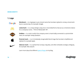
Branding
Guide to building a brand
ebaqdesign.com
© COPYRIGHT 2019
AREK DVORNECHUCK
BRANDING EXPERT
929.245.9811
AREK@EBAQDESIGN.COM
EBAQDESIGN.COM
video
tutorials
How to become a branding expert, by Arek Dvornechuck
Introduction
Hello, My name is Arek Dvornechuck and at Ebaqdesign
my mission is to help people create iconic brands.
INTRO
2
Good business people know the value design can have
on their brands. The creation of a fitting brand identity
is an investment that can pay off year after year.
This guide is for everyone who wants to
grow their business through great design.
I’ve helped dozens of entrepreneurs build brands
and successful businesses and now I want to help you!
I’ve created a simple guide to understanding
what brand identity is really all about.
Read each page closely and put the suggestions
into practice and at by the end of this guide
you’ll become a branding expert.
Arek Dvornechuck
3
Branding Guide
CONTENTS
THE BASICS
Brand, Branding & Brand Identity
01 BRAND TOUCHPOINTS
Creating Brand Touchpoints
04
BRAND STRATEGY
Developing Brand Strategy
02
BRAND GUIDELINES
Developing Style Guides
05
BRAND IDENTITY
Designing Brand Idenitity
03
4
THE BASICS
Brand, branding and brand identity
People use these terms: brand, branding and brand identity
as interchangeable synonyms every day, but they don’t mean the same.
THE BASICS
What’s your favorite brand? Don’t think too much!
Grab the first name that comes to mind - This
company has earned your loyalty & your money.
You keep coming back because you feel that the values
of the company are aligned with yours.
People fall in love with brands and believe in their
superiority.
As individuals, we have a sense of what a brand is: a set
of distinctive perceptions, ideas and feelings that people
have about a product or service. But as consumers,
we often don’t realize what it takes to build a strong
and memorable brand.
That brings us to branding: all the actions
that you take to build awareness and reputation
around your company.
There are many things that go into the making
of a brand, but design plays an essential role.
5
THE BASICS
Now you may wonder, how can I maximize my
chances of success? This is where brand identity
comes into play: the tangible expressions of your brand.
Brand identity takes disparate elements
and unifies them into a whole system.
The more distinct, specific and cohesive these elements
are. the stronger brand you can create.
And this is what my guide is all about—My goal is to
help you create a strong brand identity, so that you can
clearly communicate your values to the world.
Brand identity elements will vary depending on the
company, but the the basic must-have elements would
include:
- Logo
- Shape
- Color
- Typography
- Voice
6
THE BASICS
7
Logo: Your logo is the cornerstone of your brand identity. It is the most
immediate visual representation of your company—think of Apple’s logo
with a bite out of it.
Shape: The shape you use can say different things. For example circles can sig-
nify wholeness—think of MasterCard, while squares stand for stability—think of
Microsoft. And lines can add to dynamism — Think of Adidas for example.
Color: Your color choices are key to evoking emotions and differentiating your
brand. Think of McDonald’s golden arches & how they stand out. Did you know
that Tiffany trademarked its color, so that no other jewelry brand can use it?
Typography: A consistent typeface is key to instilling familiarity. Think of The
New York Times’ use of Georgia that gives it classic look or maybe you want
your brand to appear more sleek and modern like Google for example.
Voice: It’s important to design how brands look, but it’s equally important to
give the brand a voice. Are you friendly or more formal? Do you inspire others
to take action like Nike does?
8
BRAND STRATEGY
It’s tempting to dive right into the juicy stuff like creating a logo,
but before that it’s essential to look inwards.
BRAND STRATEGY
Understanding what your company is and what it
stands for is imperative before you start tackling
any of the specific design elements.
Investing time upfront to define and articulate
your brand strategy is key to success.
Internally, it provides the core concept around which
everything else revolves.
So that all your branding efforts are aligned according
to a clear strategic direction. Externally, an effective
strategy manifest itself in strong brand image.
You strategy can be very comprehensive but the basics
would include: your target audience, mission statement
and brand personality.
Developing Brand Strategy
9
BRAND STRATEGY
10
Knowing your brand’s target audience
is vital to building a brand.
It’s important to know your audience, because
we need to know how to connect with them.
So you want to know who they are in terms of demo-
graphics and psychographics as well.
Learn more about how to create customer profiles
on my blog.
1. Target Audience
Mmission statement is a written declaration of your
core purpose or belief. People are wired to care
about why you do things instead of what you do or how
you do it.
People want to see themselves—their values, goals and aspi-
rations—in the brands they choose.
A solid mission statement is where you clearly state what
your company wants to accomplish in the world.
The mission will serve you as filter to make decisions
within the organization that are “on brand”.
Learn more about how to create your mission statement
on my blog.
2. Mission statement
Like people, brands have personalities—if your compa-
ny was a person who would it be?
How would he or she act, talk and dress? For example:
luxury brands, such as Rolex, aim for sophistication.
There are five main types of brand personalities:
1. Excitement: carefree, spirited, and youthful
2. Sincerity: kindness, thoughtfulness, family values
3. Ruggedness: rough, tough, outdoorsy, and athletic
4. Competence: successful, accomplished, leadership
5. Sophistication: elegant, prestigious, pretentious
Learn more about how to define your brand personality
on my blog.
3. Brand Personality
BRAND STRATEGY
11
12
BRAND IDENTITY
Designing Brand Identity
BRAND IDENTITY
There are five basic elements: logo, color, shape, type and voice that come
together to create a cohesive image of your brand.
When we encounter new brands, we judge them
by how they look and feel.
But if you’re not a designer you may be unaware
of how these elements work together.
First, let’s talk about logo design and the different
types of logos.
We can put them into five basic categories:
1. Abstract marks
2. Word mark
3. Pictorial marks
4. Emblems
5. Letter marks
13
1. Logo
BRAND IDENTITY
Wordmark — or a logotype is just a brand name that has been stylized to convey a brand attri-
bute or positioning. For example: Google.
Lettermark — is a unique design using one or more letterforms that act as a mnemonic device
for a company’s name. - Think of McDonald’s “M”.
Emblem — is a mark in which the company name is inextricably connected to a pictorial ele-
ment, for example: Harley Davidson.
Pictorial mark ­— is an immediately recognizable literal image that has been simplified and
stylized, for example Apple.
Abstract mark — is a symbol that conveys a big idea, and often embodies strategic ambiguity,
for example: Nike swoosh.
Learn more about the different types of logos on my blog.
14
BRAND IDENTITY
15
Aprofessional logo must be: simple, memorable,
and appropriate
Simple—means that your logo should not contain too
many graphic elements. Simplicity is the key.
Memorable—if your logo is simple, and distinctive
enough, so that it can be easily remembered.
Appropriate—a great logo should be relevant to the
business industry and the target audience.
Check my logo design process described in detail
on my blog.
BRAND IDENTITY
2. Shape
Round shapes—ike circles, ovals, and ellipses—are all about positive feelings. Circles suggest
feelings of community, unity and love. Think of MasterCard and their use of circles.
Sharp shapes—like squares and rectangles—are representative of strength and efficiency. They
create a feeling of stability and trustworthiness. Think of Microsoft their use of squares.
Straight lines—also have their own implications: vertical lines suggest masculinity and strength
while horizontal lines suggest tranquility and mellow vibes. Diagonal lines can add to dynamism.
For example: Think of Adidas and their use of lines.
16
Red is the color of passion and excitement. It’s the per-
fect choice if your brand identity is loud, youthful and
exciting like Coca-Cola.
Orange: Orange is another high-energy color and is
great if you want to appear friendly and playful. It’s
bright and juicy.
Yellow, the color of sunshine, is all about happiness. The
cheerful vibe makes it a good choice if you want to feel
fun, accessible and affordable—think of McDonald’s.
Green is known for its exceptional versatility—nearly
every brand can use it. If your brand is tied to the envi-
ronment, green is a solid choice e.g. Whole Foods.
Blue: Pretty much everyone likes blue. It can help your
branding appear stable and trustworthy. Just look at
banks—most of hem go with the blue (Chase Bank).
Purple is the color of royalty, with a hint of femininity, so
if you’re going for a luxurious feel in your branding, this
a safe bet.
Pink: Nothing says girly quite like pink. But it’s more ver-
satile than that. Pink gives brands a modern and differ-
entiated look - think of T-mobile.
Black: If you want to be viewed as modern or sophisti-
cated, there’s nothing as classic and effective as black.
— Think of Nike.
BRAND IDENTITY
3. Color
17
BRAND IDENTITY
4. Typography
Serif fonts—have a little feet at the end of each letter. This classic typography is great if you
want your brand to appear trustworthy, and traditional.
Sans serif—if “serif” means feet then “sans serif” is without the feet. They’re just letters that
have smooth edges. They give a more sleek and modern feel to your brand identity.
Script—and we have script fonts that emulate cursive handwriting. It can be a great way to add
an authentic feel to your brand identity.
Learn more about typography on my blog.
Serif
Sans
Script
18
BRAND IDENTITY
5. Voice
It’s important how you look but also how you talk.
Think of Starbucks and their functional and expres-
sive tone of voice.
Functional means helpful so it organizes things in a
clear way. And expressive tone makes you smile and
by always making every word count.
Are you corporate or casual?
Straight to the point or more conversational?
How do you want to sound to your audience?
Check out my blog to learn more about not only
how to say it but also what to say.
19
20
BRAND TOUCHPOINTS
Creating Brand Touchpoints
BRAND TOUCHPOINTS
21
Most branding projects will require the design of a website,
stationery, social media graphic and maybe packaging.
Every single piece of collateral must work together to
deliver a strong and clear brand image.
Each touchpoint is an opportunity to increase
awareness and build customer loyalty.
Now it’s time to take the brand elements (color,
typography, shape and voice) we explored earlier
in this guide and use them consistently.
So that regardless of how your customers interact with
your brand, they have a seamless experience.
Brand touchpoints are simply ways in which your brand
interacts with people. Most businesses develop at least
several brand touchpoints, so let’s talk the basic ones.
Not every company will require every single touch-
point—your needs will depend on many factors, includ-
ing your product or service and your customer base.
BRAND TOUCHPOINTS
22
Website: This is where the brand identity, consistent typography, corporate colors, and unique
voice, come through in full force. Remember to communicate in clear language, and organize
content from the perspective of the user.
Stationery: While physical business cards and other printed materials are slowly being replaced
by their digital form, A well-designed stationery system offers the chance to reinforce a positive
opinion of your brand in the eyes of others.
Social Media: Social platforms are a great opportunity to connect with your audience on a more
personal level. So make sure your social media graphics as well as the content you share is on
brand and consistent with your brand voice.
Packaging: Whether you need a bottle for a beverage or shipping packaging for clothes, don’t
underestimate the value of good packaging. This is an opportunity for your company logo, col-
ors and typography to really shine.
Be authentic—it means that when developing your brand collateral don’t try to be something you’re not
but refer back to your strategy to ensure you support it.
Be different—it means that generic doesn’t work when developing brand collateral. You want to stand
out from the competition, so don’t be afraid to be bold and creative.
Be durable— means that branding takes a lot of time and effort, and once you’ve nailed it, you must
factor in even more time and effort to hook your audience and make a real impression. Choose designs
with longevity.
Be evolutionary—means that you will inevitably come a point when your branding starts to feel a little
stale and you’ll want to switch things up. Make sure that, despite changes, you stay true to your core val-
ues and offer a feel of continuity or an update.
BRAND TOUCHPOINTS
Brand Touchpoints Rules
23
24
BRAND GUIDELINES
Developing Brand Guidelines
BRAND GUIDELINES
25
Launching a new brand identity program is all dependent
on a set of solid guidelines.
ABrand Guidelines takes different brand elements
(everything we’ve discussed so far) and translates
them into tangible rules and standards.
This document will help you to ensure that you brand
looks and feels consistent across the board.
At the heart of your guidelines is what we like to call the
“special sauce” of your brand: the stuff that makes you
uniquely you (your strategy):
Your target audience, mission statement, positioning
statement and brand personality should be there.
These elements should be outlined at the beginning of
your document so that people within your organization
can make decision that are “on brand”.
Next, you want to make sure anyone who uses your
logo does so correctly, so include all approved versions
and lockups of your logo.
BRAND GUIDELINES
26
Also you would want to specify on primary and second-
ary color palette and provide people with RGB and
CMYK values and PANTONE color name and number.
Next you want to talk about typography and how each
font should be used and any pertinent info on spacing
and alignment.
You will also want to include an image library to give
your team an idea of how you want them to use pic-
tures or illustrations to support your brand image.
And lastly also talk about the tone of voice and sample
messages so that marketing and communication teams
know how you want your brand to sound to the target
audience.
And once you’ve locked down the basics of your brand
identity, it’s time to show how these elements work to-
gether on specific brand touchpoints.
Here, you want to include mockups of digital as well as
print collateral - and it will vary from brand to brand.
BRAND GUIDELINES
27
If you sell physical products you will want to include
packaging guidelines. If you host a ton of in-person
events, you’d want to include information on signage
and so on.
The more details you can include in your guidelines,
the more consistency you’ll achieve.
And as your brand evolves, so will your guide. So keep
updating it with any changes, upgrades or new informa-
tion.
And these days brands tend to go for digital form of
Brand Guidelines by having a dedicated website.
Congrats on your new brand!
Congrats on becoming a branding expert! Now, you have
everything you need to build a strong brand.
YOU’VE MADE IT!
You’ve reached the end of my Branding Guide and
now equipped with this knowledge, you got every-
thing to go out there and design an iconic brand
that your cusotmers will love.
Wishing you lots of luck on your branding journey!
28
Arek Dvornechuck
Want to work together?
I’ve helped dozens of entrepreneurs design strong brands
and successful businesses and now I want to help you!
NEED AN EXPERT?
29
S TA RT A P R O J E CT
I’m a branding expert who runs the popular design blog,
Ebaqdesign, which doubles as my award-winning
design & branding firm based in Brooklyn, New York.
My clients have included Nationwide, British Gas, Pepsi,
Caterpillar, Volvo and I’ve worked at the renowned
design studio Chermayeff & Gesimar & Haviv, been
featured in HubSpot, Entrepreneur & DesignWeek and
beeen awarded “Best of” for graphic design on Behance.
Need help with branding? Just shoot me an email.
Have a question? Talk to Arek
For tips on branding & design,
follow me on social media:
Want to learn more?
Check out my premium guides with secret agency frameworks,
worksheets and video tutorials and become a true expert.
PREMIUM GUIDES
30
Strategy Guide Storytelling Guide Naming Guide
AREK DVORNECHUCK
BRANDING EXPERT
929.245.9811
AREK@EBAQDESIGN.COM
EBAQDESIGN.COM

Brand Design Guide

  • 1.
    Branding Guide to buildinga brand ebaqdesign.com © COPYRIGHT 2019 AREK DVORNECHUCK BRANDING EXPERT 929.245.9811 AREK@EBAQDESIGN.COM EBAQDESIGN.COM video tutorials How to become a branding expert, by Arek Dvornechuck
  • 2.
    Introduction Hello, My nameis Arek Dvornechuck and at Ebaqdesign my mission is to help people create iconic brands. INTRO 2 Good business people know the value design can have on their brands. The creation of a fitting brand identity is an investment that can pay off year after year. This guide is for everyone who wants to grow their business through great design. I’ve helped dozens of entrepreneurs build brands and successful businesses and now I want to help you! I’ve created a simple guide to understanding what brand identity is really all about. Read each page closely and put the suggestions into practice and at by the end of this guide you’ll become a branding expert. Arek Dvornechuck
  • 3.
    3 Branding Guide CONTENTS THE BASICS Brand,Branding & Brand Identity 01 BRAND TOUCHPOINTS Creating Brand Touchpoints 04 BRAND STRATEGY Developing Brand Strategy 02 BRAND GUIDELINES Developing Style Guides 05 BRAND IDENTITY Designing Brand Idenitity 03
  • 4.
  • 5.
    Brand, branding andbrand identity People use these terms: brand, branding and brand identity as interchangeable synonyms every day, but they don’t mean the same. THE BASICS What’s your favorite brand? Don’t think too much! Grab the first name that comes to mind - This company has earned your loyalty & your money. You keep coming back because you feel that the values of the company are aligned with yours. People fall in love with brands and believe in their superiority. As individuals, we have a sense of what a brand is: a set of distinctive perceptions, ideas and feelings that people have about a product or service. But as consumers, we often don’t realize what it takes to build a strong and memorable brand. That brings us to branding: all the actions that you take to build awareness and reputation around your company. There are many things that go into the making of a brand, but design plays an essential role. 5
  • 6.
    THE BASICS Now youmay wonder, how can I maximize my chances of success? This is where brand identity comes into play: the tangible expressions of your brand. Brand identity takes disparate elements and unifies them into a whole system. The more distinct, specific and cohesive these elements are. the stronger brand you can create. And this is what my guide is all about—My goal is to help you create a strong brand identity, so that you can clearly communicate your values to the world. Brand identity elements will vary depending on the company, but the the basic must-have elements would include: - Logo - Shape - Color - Typography - Voice 6
  • 7.
    THE BASICS 7 Logo: Yourlogo is the cornerstone of your brand identity. It is the most immediate visual representation of your company—think of Apple’s logo with a bite out of it. Shape: The shape you use can say different things. For example circles can sig- nify wholeness—think of MasterCard, while squares stand for stability—think of Microsoft. And lines can add to dynamism — Think of Adidas for example. Color: Your color choices are key to evoking emotions and differentiating your brand. Think of McDonald’s golden arches & how they stand out. Did you know that Tiffany trademarked its color, so that no other jewelry brand can use it? Typography: A consistent typeface is key to instilling familiarity. Think of The New York Times’ use of Georgia that gives it classic look or maybe you want your brand to appear more sleek and modern like Google for example. Voice: It’s important to design how brands look, but it’s equally important to give the brand a voice. Are you friendly or more formal? Do you inspire others to take action like Nike does?
  • 8.
  • 9.
    It’s tempting todive right into the juicy stuff like creating a logo, but before that it’s essential to look inwards. BRAND STRATEGY Understanding what your company is and what it stands for is imperative before you start tackling any of the specific design elements. Investing time upfront to define and articulate your brand strategy is key to success. Internally, it provides the core concept around which everything else revolves. So that all your branding efforts are aligned according to a clear strategic direction. Externally, an effective strategy manifest itself in strong brand image. You strategy can be very comprehensive but the basics would include: your target audience, mission statement and brand personality. Developing Brand Strategy 9
  • 10.
    BRAND STRATEGY 10 Knowing yourbrand’s target audience is vital to building a brand. It’s important to know your audience, because we need to know how to connect with them. So you want to know who they are in terms of demo- graphics and psychographics as well. Learn more about how to create customer profiles on my blog. 1. Target Audience Mmission statement is a written declaration of your core purpose or belief. People are wired to care about why you do things instead of what you do or how you do it. People want to see themselves—their values, goals and aspi- rations—in the brands they choose. A solid mission statement is where you clearly state what your company wants to accomplish in the world. The mission will serve you as filter to make decisions within the organization that are “on brand”. Learn more about how to create your mission statement on my blog. 2. Mission statement
  • 11.
    Like people, brandshave personalities—if your compa- ny was a person who would it be? How would he or she act, talk and dress? For example: luxury brands, such as Rolex, aim for sophistication. There are five main types of brand personalities: 1. Excitement: carefree, spirited, and youthful 2. Sincerity: kindness, thoughtfulness, family values 3. Ruggedness: rough, tough, outdoorsy, and athletic 4. Competence: successful, accomplished, leadership 5. Sophistication: elegant, prestigious, pretentious Learn more about how to define your brand personality on my blog. 3. Brand Personality BRAND STRATEGY 11
  • 12.
  • 13.
    Designing Brand Identity BRANDIDENTITY There are five basic elements: logo, color, shape, type and voice that come together to create a cohesive image of your brand. When we encounter new brands, we judge them by how they look and feel. But if you’re not a designer you may be unaware of how these elements work together. First, let’s talk about logo design and the different types of logos. We can put them into five basic categories: 1. Abstract marks 2. Word mark 3. Pictorial marks 4. Emblems 5. Letter marks 13
  • 14.
    1. Logo BRAND IDENTITY Wordmark— or a logotype is just a brand name that has been stylized to convey a brand attri- bute or positioning. For example: Google. Lettermark — is a unique design using one or more letterforms that act as a mnemonic device for a company’s name. - Think of McDonald’s “M”. Emblem — is a mark in which the company name is inextricably connected to a pictorial ele- ment, for example: Harley Davidson. Pictorial mark ­— is an immediately recognizable literal image that has been simplified and stylized, for example Apple. Abstract mark — is a symbol that conveys a big idea, and often embodies strategic ambiguity, for example: Nike swoosh. Learn more about the different types of logos on my blog. 14
  • 15.
    BRAND IDENTITY 15 Aprofessional logomust be: simple, memorable, and appropriate Simple—means that your logo should not contain too many graphic elements. Simplicity is the key. Memorable—if your logo is simple, and distinctive enough, so that it can be easily remembered. Appropriate—a great logo should be relevant to the business industry and the target audience. Check my logo design process described in detail on my blog.
  • 16.
    BRAND IDENTITY 2. Shape Roundshapes—ike circles, ovals, and ellipses—are all about positive feelings. Circles suggest feelings of community, unity and love. Think of MasterCard and their use of circles. Sharp shapes—like squares and rectangles—are representative of strength and efficiency. They create a feeling of stability and trustworthiness. Think of Microsoft their use of squares. Straight lines—also have their own implications: vertical lines suggest masculinity and strength while horizontal lines suggest tranquility and mellow vibes. Diagonal lines can add to dynamism. For example: Think of Adidas and their use of lines. 16
  • 17.
    Red is thecolor of passion and excitement. It’s the per- fect choice if your brand identity is loud, youthful and exciting like Coca-Cola. Orange: Orange is another high-energy color and is great if you want to appear friendly and playful. It’s bright and juicy. Yellow, the color of sunshine, is all about happiness. The cheerful vibe makes it a good choice if you want to feel fun, accessible and affordable—think of McDonald’s. Green is known for its exceptional versatility—nearly every brand can use it. If your brand is tied to the envi- ronment, green is a solid choice e.g. Whole Foods. Blue: Pretty much everyone likes blue. It can help your branding appear stable and trustworthy. Just look at banks—most of hem go with the blue (Chase Bank). Purple is the color of royalty, with a hint of femininity, so if you’re going for a luxurious feel in your branding, this a safe bet. Pink: Nothing says girly quite like pink. But it’s more ver- satile than that. Pink gives brands a modern and differ- entiated look - think of T-mobile. Black: If you want to be viewed as modern or sophisti- cated, there’s nothing as classic and effective as black. — Think of Nike. BRAND IDENTITY 3. Color 17
  • 18.
    BRAND IDENTITY 4. Typography Seriffonts—have a little feet at the end of each letter. This classic typography is great if you want your brand to appear trustworthy, and traditional. Sans serif—if “serif” means feet then “sans serif” is without the feet. They’re just letters that have smooth edges. They give a more sleek and modern feel to your brand identity. Script—and we have script fonts that emulate cursive handwriting. It can be a great way to add an authentic feel to your brand identity. Learn more about typography on my blog. Serif Sans Script 18
  • 19.
    BRAND IDENTITY 5. Voice It’simportant how you look but also how you talk. Think of Starbucks and their functional and expres- sive tone of voice. Functional means helpful so it organizes things in a clear way. And expressive tone makes you smile and by always making every word count. Are you corporate or casual? Straight to the point or more conversational? How do you want to sound to your audience? Check out my blog to learn more about not only how to say it but also what to say. 19
  • 20.
  • 21.
    Creating Brand Touchpoints BRANDTOUCHPOINTS 21 Most branding projects will require the design of a website, stationery, social media graphic and maybe packaging. Every single piece of collateral must work together to deliver a strong and clear brand image. Each touchpoint is an opportunity to increase awareness and build customer loyalty. Now it’s time to take the brand elements (color, typography, shape and voice) we explored earlier in this guide and use them consistently. So that regardless of how your customers interact with your brand, they have a seamless experience. Brand touchpoints are simply ways in which your brand interacts with people. Most businesses develop at least several brand touchpoints, so let’s talk the basic ones. Not every company will require every single touch- point—your needs will depend on many factors, includ- ing your product or service and your customer base.
  • 22.
    BRAND TOUCHPOINTS 22 Website: Thisis where the brand identity, consistent typography, corporate colors, and unique voice, come through in full force. Remember to communicate in clear language, and organize content from the perspective of the user. Stationery: While physical business cards and other printed materials are slowly being replaced by their digital form, A well-designed stationery system offers the chance to reinforce a positive opinion of your brand in the eyes of others. Social Media: Social platforms are a great opportunity to connect with your audience on a more personal level. So make sure your social media graphics as well as the content you share is on brand and consistent with your brand voice. Packaging: Whether you need a bottle for a beverage or shipping packaging for clothes, don’t underestimate the value of good packaging. This is an opportunity for your company logo, col- ors and typography to really shine.
  • 23.
    Be authentic—it meansthat when developing your brand collateral don’t try to be something you’re not but refer back to your strategy to ensure you support it. Be different—it means that generic doesn’t work when developing brand collateral. You want to stand out from the competition, so don’t be afraid to be bold and creative. Be durable— means that branding takes a lot of time and effort, and once you’ve nailed it, you must factor in even more time and effort to hook your audience and make a real impression. Choose designs with longevity. Be evolutionary—means that you will inevitably come a point when your branding starts to feel a little stale and you’ll want to switch things up. Make sure that, despite changes, you stay true to your core val- ues and offer a feel of continuity or an update. BRAND TOUCHPOINTS Brand Touchpoints Rules 23
  • 24.
  • 25.
    Developing Brand Guidelines BRANDGUIDELINES 25 Launching a new brand identity program is all dependent on a set of solid guidelines. ABrand Guidelines takes different brand elements (everything we’ve discussed so far) and translates them into tangible rules and standards. This document will help you to ensure that you brand looks and feels consistent across the board. At the heart of your guidelines is what we like to call the “special sauce” of your brand: the stuff that makes you uniquely you (your strategy): Your target audience, mission statement, positioning statement and brand personality should be there. These elements should be outlined at the beginning of your document so that people within your organization can make decision that are “on brand”. Next, you want to make sure anyone who uses your logo does so correctly, so include all approved versions and lockups of your logo.
  • 26.
    BRAND GUIDELINES 26 Also youwould want to specify on primary and second- ary color palette and provide people with RGB and CMYK values and PANTONE color name and number. Next you want to talk about typography and how each font should be used and any pertinent info on spacing and alignment. You will also want to include an image library to give your team an idea of how you want them to use pic- tures or illustrations to support your brand image. And lastly also talk about the tone of voice and sample messages so that marketing and communication teams know how you want your brand to sound to the target audience. And once you’ve locked down the basics of your brand identity, it’s time to show how these elements work to- gether on specific brand touchpoints. Here, you want to include mockups of digital as well as print collateral - and it will vary from brand to brand.
  • 27.
    BRAND GUIDELINES 27 If yousell physical products you will want to include packaging guidelines. If you host a ton of in-person events, you’d want to include information on signage and so on. The more details you can include in your guidelines, the more consistency you’ll achieve. And as your brand evolves, so will your guide. So keep updating it with any changes, upgrades or new informa- tion. And these days brands tend to go for digital form of Brand Guidelines by having a dedicated website.
  • 28.
    Congrats on yournew brand! Congrats on becoming a branding expert! Now, you have everything you need to build a strong brand. YOU’VE MADE IT! You’ve reached the end of my Branding Guide and now equipped with this knowledge, you got every- thing to go out there and design an iconic brand that your cusotmers will love. Wishing you lots of luck on your branding journey! 28 Arek Dvornechuck
  • 29.
    Want to worktogether? I’ve helped dozens of entrepreneurs design strong brands and successful businesses and now I want to help you! NEED AN EXPERT? 29 S TA RT A P R O J E CT I’m a branding expert who runs the popular design blog, Ebaqdesign, which doubles as my award-winning design & branding firm based in Brooklyn, New York. My clients have included Nationwide, British Gas, Pepsi, Caterpillar, Volvo and I’ve worked at the renowned design studio Chermayeff & Gesimar & Haviv, been featured in HubSpot, Entrepreneur & DesignWeek and beeen awarded “Best of” for graphic design on Behance. Need help with branding? Just shoot me an email. Have a question? Talk to Arek For tips on branding & design, follow me on social media:
  • 30.
    Want to learnmore? Check out my premium guides with secret agency frameworks, worksheets and video tutorials and become a true expert. PREMIUM GUIDES 30 Strategy Guide Storytelling Guide Naming Guide
  • 31.