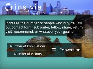
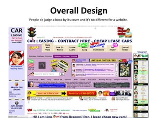
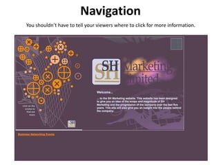
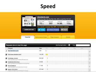
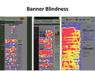
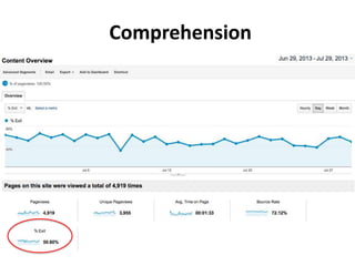
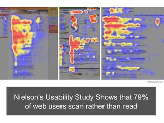
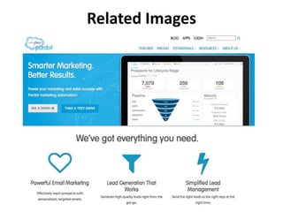
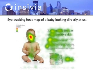
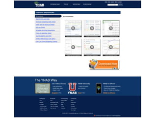
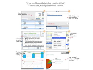
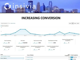
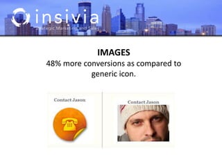
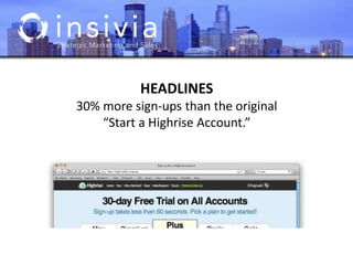
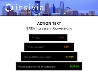
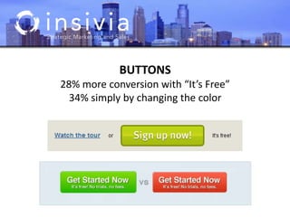
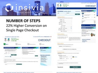
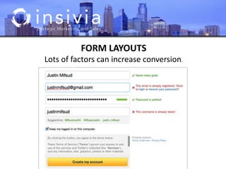
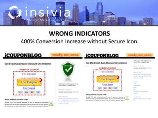
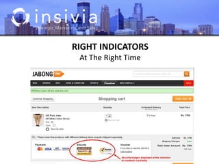
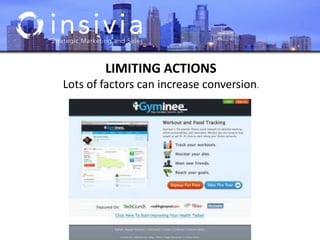
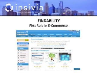
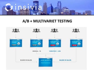
Usability & User Interface
“A brand is no longer what we tell the
consumer it is – it is what consumers tell
each other it is.”
– Scott Cook, Founder of Intuit
Usability
If they can’t use it..….people will leave.
Increase the number of people who buy, call, fill
out contact form, subscribe, follow, share, return
visit, recommend, or whatever your goal is.
Number of Completions
Number of Visitors
= Conversion
Bounce Rate
If your bounce rate is high, then your landing page is likely irrelevant to your
visitors and as a result, conversions are likely to be lower.
Overall Design
People do judge a book by its cover and it’s no different for a website.
Overall Design
Navigation
You shouldn’t have to tell your viewers where to click for more information.
Confirmation Message
Improved conversion rate from 25.3% to 47.8%
Clear Actions
Speed
Banner Blindness
Comprehension
Nielson’s Usability Study Shows that 79%
of web users scan rather than read
Promotional writing (control condition)
using the "marketese" found on many commercial
websites
Nebraska is filled with internationally recognized attractions that
draw large crowds of people every year, without fail. In 1996,
some of the most popular places were Fort Robinson State Park
(355,000 visitors), Scotts Bluff National Monument (132,166),
Arbor Lodge State Historical Park & Museum (100,000),
Carhenge (86,598), Stuhr Museum of the Prairie Pioneer
(60,002), and Buffalo Bill Ranch State Historical Park (28,446).
Control
Concise text
with about half the word count as the control condition
In 1996, six of the best-attended attractions in Nebraska were
Fort Robinson State Park, Scotts Bluff National Monument, Arbor
Lodge State Historical Park & Museum, Carhenge, Stuhr Museum
of the Prairie Pioneer, and Buffalo Bill Ranch State Historical Park.
Usability Improvement: 58%
Scannable layout
using the same text as the control condition in a layout
that facilitated scanning
Nebraska is filled with internationally recognized attractions that draw large crowds of
people every year, without fail. In 1996, some of the most popular places were: Fort
Robinson State Park (355,000 visitors)
• Scotts Bluff National Monument (132,166)
• Arbor Lodge State Historical Park & Museum (100,000)
• Carhenge (86,598)
• Stuhr Museum of the Prairie Pioneer (60,002)
• Buffalo Bill Ranch State Historical Park (28,446).
Usability Improvement: 47%
Objective language
using neutral rather than subjective, boastful, or
exaggerated language (otherwise the same as the
control condition)
Nebraska has several attractions. In 1996, some of the most-
visited places were Fort Robinson State Park (355,000 visitors),
Scotts Bluff National Monument (132,166), Arbor Lodge State
Historical Park & Museum (100,000), Carhenge (86,598), Stuhr
Museum of the Prairie Pioneer (60,002), and Buffalo Bill Ranch
State Historical Park (28,446).
Usability Improvement: 27%
Combined version
using all three improvements in writing style together:
concise, scannable, and objective
In 1996, six of the most-visited places in Nebraska were: Fort Robinson State
Park
• Scotts Bluff National Monument
• Arbor Lodge State Historical Park & Museum
• Carhenge
• Stuhr Museum of the Prairie Pioneer
• Buffalo Bill Ranch State Historical Park
Usability Improvement: 124%
Stock vs. Authentic
A 34% increase in memory retention
Related Images
Eye-tracking heat map of a baby looking directly at us.
Eye-tracking heat map of a baby looking at the text.
INCREASING CONVERSION
IMAGES
48% more conversions as compared to
generic icon.
HEADLINES
30% more sign-ups than the original
“Start a Highrise Account.”
ACTION TEXT
173% Increase in Conversions
BUTTONS
28% more conversion with “It’s Free”
34% simply by changing the color
NUMBER OF STEPS
22% Higher Conversion on
Single Page Checkout
FORM LAYOUTS
Lots of factors can increase conversion.
WRONG INDICATORS
400% Conversion Increase without Secure Icon.
RIGHT INDICATORS
At The Right Time
LIMITING ACTIONS
Lots of factors can increase conversion.
FINDABILITY
First Rule In E-Commerce.
A/B + MULTIVARIET TESTING
TEST GROUPS
What’s The Right Number of Users
TIMING
Limited time offer.
LAYOUT
Placement, Spacing, etc.
MESSAGING
Make it more valuable.
ACTIONS
Text, layout, look.
TESTS
What To Test
NAVIGATION
Text, layout, look, features.
DESIGN
Overall look, colors, etc.
IMAGES
Type, location, size.
EVERYTHING
Your site is unique.
TOOLS
Where To Start
USEIT.COM
Great articles.
ABTESTS.COM
Tons of examples.
OPTIMIZLY.COM
Online SAAS.
GOOGLE CONTENT
EXPERIEMENTS
Analytics integrated.
FIVESECONDTEST.COM
Simple tool.
INSIVIA
Hey, had to add us.
Usability Beyond the Web
Stay Connected: Upcoming Seminar:
Social Media
August 29th, 2013
QA

Insivia Seminar Series: Usability & User Interface

  • 1.
  • 3.
    “A brand isno longer what we tell the consumer it is – it is what consumers tell each other it is.” – Scott Cook, Founder of Intuit
  • 4.
  • 5.
    If they can’tuse it..….people will leave.
  • 6.
    Increase the numberof people who buy, call, fill out contact form, subscribe, follow, share, return visit, recommend, or whatever your goal is. Number of Completions Number of Visitors = Conversion
  • 8.
    Bounce Rate If yourbounce rate is high, then your landing page is likely irrelevant to your visitors and as a result, conversions are likely to be lower.
  • 9.
    Overall Design People dojudge a book by its cover and it’s no different for a website.
  • 10.
  • 11.
    Navigation You shouldn’t haveto tell your viewers where to click for more information.
  • 12.
  • 13.
  • 14.
  • 15.
  • 16.
  • 17.
    Nielson’s Usability StudyShows that 79% of web users scan rather than read
  • 18.
    Promotional writing (controlcondition) using the "marketese" found on many commercial websites Nebraska is filled with internationally recognized attractions that draw large crowds of people every year, without fail. In 1996, some of the most popular places were Fort Robinson State Park (355,000 visitors), Scotts Bluff National Monument (132,166), Arbor Lodge State Historical Park & Museum (100,000), Carhenge (86,598), Stuhr Museum of the Prairie Pioneer (60,002), and Buffalo Bill Ranch State Historical Park (28,446). Control
  • 19.
    Concise text with abouthalf the word count as the control condition In 1996, six of the best-attended attractions in Nebraska were Fort Robinson State Park, Scotts Bluff National Monument, Arbor Lodge State Historical Park & Museum, Carhenge, Stuhr Museum of the Prairie Pioneer, and Buffalo Bill Ranch State Historical Park. Usability Improvement: 58%
  • 20.
    Scannable layout using thesame text as the control condition in a layout that facilitated scanning Nebraska is filled with internationally recognized attractions that draw large crowds of people every year, without fail. In 1996, some of the most popular places were: Fort Robinson State Park (355,000 visitors) • Scotts Bluff National Monument (132,166) • Arbor Lodge State Historical Park & Museum (100,000) • Carhenge (86,598) • Stuhr Museum of the Prairie Pioneer (60,002) • Buffalo Bill Ranch State Historical Park (28,446). Usability Improvement: 47%
  • 21.
    Objective language using neutralrather than subjective, boastful, or exaggerated language (otherwise the same as the control condition) Nebraska has several attractions. In 1996, some of the most- visited places were Fort Robinson State Park (355,000 visitors), Scotts Bluff National Monument (132,166), Arbor Lodge State Historical Park & Museum (100,000), Carhenge (86,598), Stuhr Museum of the Prairie Pioneer (60,002), and Buffalo Bill Ranch State Historical Park (28,446). Usability Improvement: 27%
  • 22.
    Combined version using allthree improvements in writing style together: concise, scannable, and objective In 1996, six of the most-visited places in Nebraska were: Fort Robinson State Park • Scotts Bluff National Monument • Arbor Lodge State Historical Park & Museum • Carhenge • Stuhr Museum of the Prairie Pioneer • Buffalo Bill Ranch State Historical Park Usability Improvement: 124%
  • 23.
    Stock vs. Authentic A34% increase in memory retention
  • 24.
  • 25.
    Eye-tracking heat mapof a baby looking directly at us.
  • 26.
    Eye-tracking heat mapof a baby looking at the text.
  • 31.
  • 32.
    IMAGES 48% more conversionsas compared to generic icon.
  • 33.
    HEADLINES 30% more sign-upsthan the original “Start a Highrise Account.”
  • 34.
  • 35.
    BUTTONS 28% more conversionwith “It’s Free” 34% simply by changing the color
  • 36.
    NUMBER OF STEPS 22%Higher Conversion on Single Page Checkout
  • 37.
    FORM LAYOUTS Lots offactors can increase conversion.
  • 38.
    WRONG INDICATORS 400% ConversionIncrease without Secure Icon.
  • 39.
  • 40.
    LIMITING ACTIONS Lots offactors can increase conversion.
  • 41.
  • 42.
  • 43.
    TEST GROUPS What’s TheRight Number of Users
  • 44.
    TIMING Limited time offer. LAYOUT Placement,Spacing, etc. MESSAGING Make it more valuable. ACTIONS Text, layout, look. TESTS What To Test NAVIGATION Text, layout, look, features. DESIGN Overall look, colors, etc. IMAGES Type, location, size. EVERYTHING Your site is unique.
  • 45.
    TOOLS Where To Start USEIT.COM Greatarticles. ABTESTS.COM Tons of examples. OPTIMIZLY.COM Online SAAS. GOOGLE CONTENT EXPERIEMENTS Analytics integrated. FIVESECONDTEST.COM Simple tool. INSIVIA Hey, had to add us.
  • 46.
  • 47.
    Stay Connected: UpcomingSeminar: Social Media August 29th, 2013 QA

Editor's Notes

  • #13 Bad MesagingGoal of the Page: The conversion goal for this test was a click on their pricing plan.Version A - 25.3% Conversion RateBusinesses grow faster online! (original)
  • #15 Pingdom.com
  • #18 F-PatternStudies show that users really do judge a website by its design. Elements such as layout, consistency, typography, color and style all affect how users perceive your website and what kind of image you project.
  • #25 According to a Skyword study, articles that contain at least one image cab see an average of 70% more page views.
  • #28 Design/Layout – Using a new layout with screenshot call outsVersion A - BaselineThe control page.Version B - 85.0% ImprovementRequires less clicking by showing all screenshots as nice, large thumbnails. Freshens up the design of the page (having handwriting-type captions). Strengthens the call to action with a prominently placed testimonial at the very top.Big TakeawayScreenshot call-outs with strengthened value-propositions strongly increased conversions.
  • #29 Design/LayoutVersion B - 85.0% ImprovementRequires less clicking by showing all screenshots as nice, large thumbnails. Freshens up the design of the page (having handwriting-type captions). Strengthens the call to action with a prominently placed testimonial at the very top.Big TakeawayScreenshot call-outs with strengthened value-propositions strongly increased conversions.
  • #30 Design/LayoutGoal of the Page: Enter email + join the site.Version A - 0.3% Conversion RateThis is the page I used for about 11 months. Mostly everything is different from this original page compared to Version B. It converted at 1:300 from a steady source of traffic.
  • #31 Good use of whitespace and margins increases comprehension by 20% - NeilsonGoal of the Page: Enter email + join the site.Version B - 1% Conversion RateMuch more white space, less text up top, and more content (longer page ad copy compared to Version A). It also doesn't mention price on this page. It converts at 1:100 now. A 200% increase in conversions.
  • #33 IMAGESFor e-commerce, use of photos of people increase trustworthiness.
  • #34 KEY MESSAGES“30-Day Free Trial on All Accounts” generated 30% more sign-ups than the original “Start a Highrise Account.”
  • #35 “You Should Follow Me on Twitter Here” (Dustin Curtis)This much-hyped split-test involved testing multiple versions of a call to action for Twitter followers. Dustin found that “You should follow me on Twitter here” worked 173% better than his control text, “I’m on Twitter.”
  • #36 Two Magical Words Increased Conversion Rate by 28%The words “It’s free” increased the clicks on this sign-up button by 28%, illustrating the importance of testing call-to-action buttons and how minor changes can have surprisingly major results.
  • #37 Interesting thing is, this is not always the case. Multi step processes can be shown to increase conversion too when customers want confirmation about their order. This worked because all order details stayed on the page.
  • #38 Labels on top are fast, but labels on left increase comprehensionIndicators of successNaming Conventions – Generic ‘Submit’ can be bad
  • #39 Goal of the Page: Visitors click on "Use Coupon."Version A - BaselineBaseline variation.
  • #40 Goal of the Page: Visitors click on "Use Coupon."Version A - BaselineBaseline variation.
  • #41 Limiting the number of actions on a page can significantly increase conversions.This is smart for landing pages and why you often see navigation removed.
  • #42 Design/LayoutVersion B - 34.0% ImprovementThey replaced the promotional right sidebar by a left navigation bar that did not have the heavy focus on single visual elements. Note that all subcategory pages are neatly displayed in left navigation bar and it is much more intuitive to browse around different pages on the ecommerce store.Big TakeawayA homepage with a better-designed sidebar increased the number of items added to carts.
  • #44 Nielsen’s study revealed that just five users would reveal about 85% of all problems with your website.
  • #45 An A/B test is a process through which you provide different versions of a medium to statistically significant groups of users, and then measure their reactions to those versions in order to understand which is more effective at driving the behavior you prefer.