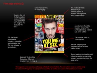
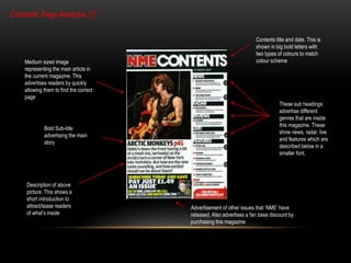
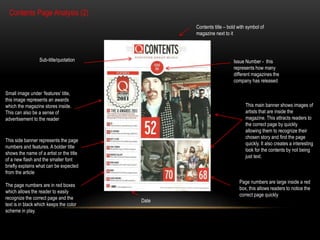
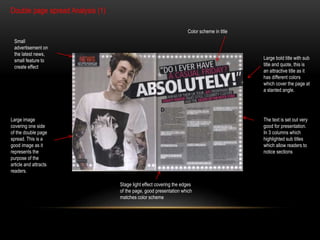
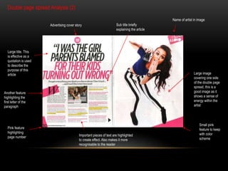
RESEARCH AND PLANNING 
Kyle Wales
PRELIMINARY TASK 
For the print preliminary task I will 
analyze a front cover and contents 
page of a new college magazine. I will 
analyze this by labeling and shortly 
describing the purpose of each 
feature
Name of artist from large 
image and why she 
appears there 
Front Page Analysis (1) 
Title of magazine. The 
title is always the 
largest and most eye 
catchy feature on the 
magazine for 
representation of the 
company 
Advertisement of what the 
magazine contains. The 
purpose of this is to inform 
readers on what artists are 
contained inside and the 
story behind them 
The Sub titles of artist or headlines are all 
larger than descriptions. This attracts the 
reader to their chosen story line 
Names of 
other artists 
added 
inside: This 
attracts fans 
to buying 
this 
magazine 
Large image 
covering Centre of 
page 
This magazine is simple but still has all the features needed to attract readers
Magazine title: only 
the first two letters 
are shown here as 
many ‘KERRANG!’ 
fans recognize the 
structure of the 
layout 
This side banner 
advertises the 
company’s posters that 
are contained in side. 
This may add value to 
fans/collectors 
Large sub title describing 
the purpose of the main 
image and who the image is 
This header advertises 
the company by 
informing readers of 
recent or new magazines 
which can be collected 
Advertisement of what the 
magazine contains. The 
numbers 25 is large and bold 
such as the subtitle 
Barcode: every magazine 
contains a barcode on either 
the font or back 
Bottom header is introduced to match 
color scheme advertising what the 
company have been doing over the 
latest period 
Large image covering 
the center of page 
Front page analysis (2) 
Second small image for 
advertisement 
This magazine is very eye catchy as the page is filled with various features. The color scheme is also on point by using 
the same colors through out. An example of this is subtitles, all subtitles are in yellow and descriptions are in white
Contents Page Analysis (1) 
Contents title and date. This is 
shown in big bold letters with 
two types of colours to match 
Medium sized image colour scheme 
representing the main article in 
the current magazine. This 
advertises readers by quickly 
allowing them to find the correct 
page 
Bold Sub-title 
advertising the main 
story 
Description of above 
picture. This shows a 
short introduction to 
attract/tease readers 
of what’s inside 
These sub headings 
advertise different 
genres that are inside 
this magazine. These 
show news, radar, live 
and features which are 
described below in a 
smaller font. 
Advertisement of other issues that ‘NME’ have 
released. Also advertises a fan base discount by 
purchasing this magazine
Contents Page Analysis (2) 
Contents title – bold with symbol of 
magazine next to it 
Sub-title/quotation Issue Number - this 
represents how many 
different magazines the 
company has released 
Small image under ‘features’ title, 
this image represents an awards 
which the magazine stores inside. 
This can also be a sense of 
advertisement to the reader 
This side banner represents the page 
numbers and features. A bolder title 
shows the name of a artist or the title 
of a new flash and the smaller font 
briefly explains what can be expected 
from the article 
The page numbers are in red boxes 
which allows the reader to easily 
recognize the correct page and the 
text is in black which keeps the color 
scheme in play. 
Date 
This main banner shows images of 
artists that are inside the 
magazine. This attracts readers to 
the correct page by quickly 
allowing them to recognize their 
chosen story and find the page 
quickly. It also creates a interesting 
look for the contents by not being 
just text. 
Page numbers are large inside a red 
box, this allows readers to notice the 
correct page quickly
Double page spread Analysis (1) 
Large bold title with sub 
title and quote, this is 
an attractive title as it 
has different colors 
which cover the page at 
a slanted angle. 
Small 
advertisement on 
the latest news, 
small feature to 
create effect 
Large image 
covering one side 
of the double page 
spread. This is a 
good image as it 
represents the 
purpose of the 
article and attracts 
readers. 
Stage light effect covering the edges 
of the page, good presentation which 
matches color scheme 
The text is set out very 
good for presentation. 
In 3 columns which 
highlighted sub titles 
which allow readers to 
notice sections 
Color scheme in title
Double page spread Analysis (2) 
Name of artist in image 
Large image 
covering one side 
of the double page 
spread, this is a 
good image as it 
shows a sense of 
energy within the 
artist 
Small pink 
feature to keep 
with color 
scheme 
Advertising cover story 
Large title. This 
is effective as a 
quotation is used 
to describe the 
purpose of this 
article 
Another feature 
highlighting the 
first letter of the 
paragraph 
Pink feature 
highlighting 
page number 
Sub title briefly 
explaining the article 
Important pieces of text are highlighted 
to create effect. Also makes it more 
recognisable to the reader

Research and Planning

  • 1.
  • 2.
    PRELIMINARY TASK Forthe print preliminary task I will analyze a front cover and contents page of a new college magazine. I will analyze this by labeling and shortly describing the purpose of each feature
  • 3.
    Name of artistfrom large image and why she appears there Front Page Analysis (1) Title of magazine. The title is always the largest and most eye catchy feature on the magazine for representation of the company Advertisement of what the magazine contains. The purpose of this is to inform readers on what artists are contained inside and the story behind them The Sub titles of artist or headlines are all larger than descriptions. This attracts the reader to their chosen story line Names of other artists added inside: This attracts fans to buying this magazine Large image covering Centre of page This magazine is simple but still has all the features needed to attract readers
  • 4.
    Magazine title: only the first two letters are shown here as many ‘KERRANG!’ fans recognize the structure of the layout This side banner advertises the company’s posters that are contained in side. This may add value to fans/collectors Large sub title describing the purpose of the main image and who the image is This header advertises the company by informing readers of recent or new magazines which can be collected Advertisement of what the magazine contains. The numbers 25 is large and bold such as the subtitle Barcode: every magazine contains a barcode on either the font or back Bottom header is introduced to match color scheme advertising what the company have been doing over the latest period Large image covering the center of page Front page analysis (2) Second small image for advertisement This magazine is very eye catchy as the page is filled with various features. The color scheme is also on point by using the same colors through out. An example of this is subtitles, all subtitles are in yellow and descriptions are in white
  • 5.
    Contents Page Analysis(1) Contents title and date. This is shown in big bold letters with two types of colours to match Medium sized image colour scheme representing the main article in the current magazine. This advertises readers by quickly allowing them to find the correct page Bold Sub-title advertising the main story Description of above picture. This shows a short introduction to attract/tease readers of what’s inside These sub headings advertise different genres that are inside this magazine. These show news, radar, live and features which are described below in a smaller font. Advertisement of other issues that ‘NME’ have released. Also advertises a fan base discount by purchasing this magazine
  • 6.
    Contents Page Analysis(2) Contents title – bold with symbol of magazine next to it Sub-title/quotation Issue Number - this represents how many different magazines the company has released Small image under ‘features’ title, this image represents an awards which the magazine stores inside. This can also be a sense of advertisement to the reader This side banner represents the page numbers and features. A bolder title shows the name of a artist or the title of a new flash and the smaller font briefly explains what can be expected from the article The page numbers are in red boxes which allows the reader to easily recognize the correct page and the text is in black which keeps the color scheme in play. Date This main banner shows images of artists that are inside the magazine. This attracts readers to the correct page by quickly allowing them to recognize their chosen story and find the page quickly. It also creates a interesting look for the contents by not being just text. Page numbers are large inside a red box, this allows readers to notice the correct page quickly
  • 7.
    Double page spreadAnalysis (1) Large bold title with sub title and quote, this is an attractive title as it has different colors which cover the page at a slanted angle. Small advertisement on the latest news, small feature to create effect Large image covering one side of the double page spread. This is a good image as it represents the purpose of the article and attracts readers. Stage light effect covering the edges of the page, good presentation which matches color scheme The text is set out very good for presentation. In 3 columns which highlighted sub titles which allow readers to notice sections Color scheme in title
  • 8.
    Double page spreadAnalysis (2) Name of artist in image Large image covering one side of the double page spread, this is a good image as it shows a sense of energy within the artist Small pink feature to keep with color scheme Advertising cover story Large title. This is effective as a quotation is used to describe the purpose of this article Another feature highlighting the first letter of the paragraph Pink feature highlighting page number Sub title briefly explaining the article Important pieces of text are highlighted to create effect. Also makes it more recognisable to the reader