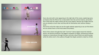
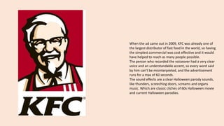
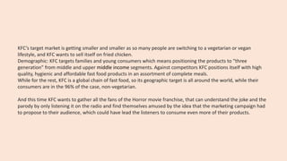
Unit 15: Advertising
Learning aim A
Print advertisements can be printed on paper sheets (to be shown on
printed magazines or posters) or digital (social medias, pop-up ads or
digital magazines).
The convention of print advertisements are usually things like a limited
use of words, graphics, the logo of the brand and an interesting
slogan/catchphrase.
To keep it simple, they summaries the whole message into one little
and quick element that makes the advertisement catchy.
The logo or the catchphrase are usually in the center of the page so
they can attract the human eye to see them, they use high-key lighting
to ensure the viewing, the images need to be perfectly visible so the
audience can remember it.
And just because the short amount spent to view a print
advertisement, the images, the logo and the slogan need to sell the
main point of the advertisement.
CODES AND CONVENTIONS OF A PRINT ADVERT:
We will be researching the effectiveness of the print
advertisement made by Virgin Media in collaboration
with gold medalist Usain Bolt to advertise their fast fiber
optic broadband connection.
The logo is on the very top of the
advertisement to show what product the
poster is advertising
The slogan takes CenterPoint of the
ad which makes you remember it
and tie it to the product “super” is
an emotive word that will connote
the product with it.
The addition of a celebrity icon widely known Usain
Bolt shows type 8 of Gunns’ 12 types of advertising:
Ongoing character & celebrities the average
passerby will recognize the gold medalist as a world
record holder for the fastest man in the world this
will convey that Virgin Media’s bundles will be the
fastest broadband in the world metaphorically and
will be better than its rivals.
This shows how you can contact the
provider of this product for more
information on its bundles through the
helpline most people can contact the
provider through a phone number or search
it online and every form of contact will
show you offers
The red color of the poster recalls the color
of the logo of the company, most of the
times when we think about a fast car, we
picture it red, just like the advertisement
wants us to think about the fast speed of the
broadband.
The first and last letters of word
“super” are fused with some
lightning shapes and the color is
also yellow, this because the lighting
is always drawn as a yellow shape,
and because the lightning recalls
speed just like Usain Bolt and Virgin
Media.
instead of trying to reach an entire market, Virgin Media uses the target to put their energy into connecting with a
specific defined group within that market.
Psychographic Segmentation: we’ve got the values, the personality, and the lifestyle of any sports or Olympic fans who
follows Usain Bolt in his career and likes him as an athlete so he will be attracted by seeing his image in the print
advert and will be interested in seeing what the Virgin Media company has to offer to him.
Demographic: The Olympics, have a new channel, and the channel is a new multimedia platform. The aim of the
channel is to create and sustain a global community for actively share the values of the Olympic movement. It will be
dynamic, interactive and fresh, in order to appeal to a target audience of 14 to 30 years old, the young demographic
known as millennials.
Geographic Areas: Virgin Media is a service that it's only available in the UK. Being a British telecommunications
company that provides telephone, television, and Internet services only in the United Kingdom, the target audience is
only seen as people that live in the UK that want that kind of services in their house or their routine life.
Codes and Conventions of TV Adverts
When we watch a commercial on our television, we can notice that all
the codes and conventions are meticulously prepared in order to
appeal to the target and to subconsciously bring the person who is
watching to purchase the product they’re showing.
The most important features in a TV advert are:
-The editing, such as cuts and fades. Each shot must be short in order
to keep the attention of the future customer constantly on the screen.
-The language and what the characters are doing help to attract the
target through the use of interesting scenes.
- Sound is a key aspect. It can be a sound effect such as footsteps. Or a
voice that says the name of the brand, this will make it easier for the
target to remember the name of the product. Or music, like for
example a song that is popular amongst the audience.
In one of the YouTube advertisement clips, Apple decided to use the type 4 of
Gunn’s 12 type of advertisements, which is ”contrast with the competition”.
The first thing we see is that the screen is perfectly split in two parts, the left
side represents any common mobile device that is not iPhone, while the right
side represents Apple products’ side.
There are many different clips split in the same way, this because in the Latin
alphabet we start reading from left to right, so in each clip, the video shows us
how the common device doesn’t work properly first, then we see how an
Apple product gets the job done in an easier and more secure way.
In this reference we see a woman that tries to get an app on the common web
store and experiences the faults with it, when she crosses the line that brings
her on the “Apple side” and after trying the App Store, she finds herself more
comfortable with it because it works better.
In this second reference, the structure of the screen is split exactly like in the
first one, but this time we have a different woman doing different actions.
This time the subject is just walking, but when she walks on the common
device part of the screen, we see that she’s doing it with a glitch effect, this
makes us think that any common device is not as fast as we want.
As soon as she crosses the line to get on the “Apple side”, the glitch effect is
not present anymore, we see her walking in a much smoother way than we
did in the first half of the video, this represents the smoothness that the Apple
device has while the other device does not.
Even the action of walking is about a normally ”simple” action, so Apple wants
us to think that the common device struggles to reproduce even the simple
features of a mobile device, while the iPhone does not show this kind of
problems.
This third reference has some differences between the first two, this because has
a different color scheme, all three references use a grey tone to be associated at
the common device, because the grey color shows the being standard, having no
personality and being like the others, in the first two reference we had a tone of
dark pink, which even if it’s darker than the pink per se that we think of, it still is
a light color, and it gives us confidence, but this third reference has a light brown.
The clip opens up with a man dressed up as a thief, which could be a metaphor
for viruses, not secure surfing, or cyber terrorists, that can easily break in
common devices, but as the two women could cross the line between the two
different devices, this man can’t, as a showing of the iPhone being unbreakable,
the brown color could be a recalling the color of a safe, so just as the safe needs
a key to be opened, the owners of an iPhone are the only key to open their own
device.
Every clip ends with a text appearing on the right side of the screen, explaining every
pro feature that the iPhone has or does better than the common device, personally I
don’t think that the videos need to be this much explicit, because the images that we
see are already so much clear and they talk for themselves even without saying a
word.
And at the end of the video we see the apple website appearing so we can find where
we can contact them or find more about the product.
Most of the viewers thought that with “common” device Apple meant the Android
device, this because Android is the biggest competitor of Apple, and because Android
releases so many phones through the year, and only a few of them are worth buying,
while the others aren’t, the audience thought that Apple wanted to make fun of that.
Apple always wants their products to be bought from as much people as possible, but they still have some group of
minorities that are not interested in buying them
Demographic: Apple Is Mostly White and Male, According to Its First Diversity Report. Apple, the latest tech company
to reveal its workforce demographics, said Tuesday that its U.S. staff is 55% white, 15% Asian, 11% Hispanic and 7%
black. Two percent of workers are multiracial, and another 9% did not declare their race
Psychographic: Apple has a branding strategy that focuses on the emotions. The Apple brand personality is about
lifestyle; imagination; liberty regained; innovation; passion; hopes, dreams and aspirations; and power-to-the-people
through technology.
And this time Apple also wants to approach new people, this because if any other smartphone user had issues with
their common smartphones in the past, then they are persuaded to buy an iPhone from looking at the advert and
realising how most of the feature are better on an iPhone than their previous smartphones.
Codes and Conventions of Radio Advertisements
When we talk about a radio advertisement, we are referring to
something we can only hear (and usually, while we are doing
something else, like driving). For this specific reason, the person talking
in the radio advertisement, must have a clear voice and an
understandable accent. And, since we’re probably distracted by
something else, it must engrave in our memory. That’s why radio
advertisements often include catchy jingles or quotes or slogans in
order to help the audience to link what they are hearing to the product
even if they are not paying attention to it.
They usually are 30 seconds long, but they can go from 15 to 60, it
depends on what the advertisement is about and who is the target.
A radio advertisement does not need to contain many information
that’s why they’re shorter than TV advertisements.
One of the most famous KFC’s tv advertisements uses the
12th type of the Gunns advertisements, which is “parody”,
in this case they are making fun of the Halloween movie
stereotypes. Because by having a funny advertisement
video, the audience would feel amused by watching it,
and they will show the ad to friends by searching it on a
website like YouTube, and this will help to spread the
video to more people.
The advertisement opens with announcing immediately
on how the spot is going to be Halloween themed, and
the voiceover starts to tell a story, that is a parody of
themselves as well because it puts the value hunger in a
scary mode, and scary stories also are a theme in every
other Halloween parody, and every time the Halloween
night has been made fun of, the scary stories are always a
factor.
https://www.youtube.com/watch?v=yRODqCQqBjw
When the ad came out in 2009, KFC was already one of
the largest distributor of fast food in the world, so having
the simplest commercial was cost effective and it would
have helped to reach as many people possible.
The person who recorded the voiceover had a very clear
voice and an understandable accent, so every word said
by him can’t be misinterpreted, and the advertisement
runs for a max of 60 seconds.
The sound effects are a clear Halloween parody sounds,
like thunders, screeching doors, screams and organs
music. Which are classic cliches of 60s Halloween movie
and current Halloween parodies.
KFC’s target market is getting smaller and smaller as so many people are switching to a vegetarian or vegan
lifestyle, and KFC wants to sell itself on fried chicken.
Demographic: KFC targets families and young consumers which means positioning the products to “three
generation” from middle and upper middle income segments. Against competitors KFC positions itself with high
quality, hygienic and affordable fast food products in an assortment of complete meals.
While for the rest, KFC is a global chain of fast food, so its geographic target is all around the world, while their
consumers are in the 96% of the case, non-vegetarian.
And this time KFC wants to gather all the fans of the Horror movie franchise, that can understand the joke and the
parody by only listening it on the radio and find themselves amused by the idea that the marketing campaign had
to propose to their audience, which could have lead the listeners to consume even more of their products.
Target
In order to convert the audience into customers a brand needs to
understand the specific group of people they want to reach with their
ads and that can be interested in the product, service or content the
brand has to offer.
It is important for companies to connect with their clients, and to make
them associate positive feelings to the brand, not only to make them
purchase a specific product, but mostly to make them remain LOYAL to
the brand.
A brand must divide its target into four different categories:
-demographic: age, gender, education, how many members there in
someone’s family, ethnicity, religion…
-psychographic: beliefs, values, opinions, lifestyle…
-behavioral: products they already purchased in the past, habits…
-geographic: where the customers live

Unit 15- Advertising

  • 1.
  • 2.
    Print advertisements canbe printed on paper sheets (to be shown on printed magazines or posters) or digital (social medias, pop-up ads or digital magazines). The convention of print advertisements are usually things like a limited use of words, graphics, the logo of the brand and an interesting slogan/catchphrase. To keep it simple, they summaries the whole message into one little and quick element that makes the advertisement catchy. The logo or the catchphrase are usually in the center of the page so they can attract the human eye to see them, they use high-key lighting to ensure the viewing, the images need to be perfectly visible so the audience can remember it. And just because the short amount spent to view a print advertisement, the images, the logo and the slogan need to sell the main point of the advertisement. CODES AND CONVENTIONS OF A PRINT ADVERT:
  • 3.
    We will beresearching the effectiveness of the print advertisement made by Virgin Media in collaboration with gold medalist Usain Bolt to advertise their fast fiber optic broadband connection. The logo is on the very top of the advertisement to show what product the poster is advertising The slogan takes CenterPoint of the ad which makes you remember it and tie it to the product “super” is an emotive word that will connote the product with it.
  • 4.
    The addition ofa celebrity icon widely known Usain Bolt shows type 8 of Gunns’ 12 types of advertising: Ongoing character & celebrities the average passerby will recognize the gold medalist as a world record holder for the fastest man in the world this will convey that Virgin Media’s bundles will be the fastest broadband in the world metaphorically and will be better than its rivals. This shows how you can contact the provider of this product for more information on its bundles through the helpline most people can contact the provider through a phone number or search it online and every form of contact will show you offers
  • 5.
    The red colorof the poster recalls the color of the logo of the company, most of the times when we think about a fast car, we picture it red, just like the advertisement wants us to think about the fast speed of the broadband. The first and last letters of word “super” are fused with some lightning shapes and the color is also yellow, this because the lighting is always drawn as a yellow shape, and because the lightning recalls speed just like Usain Bolt and Virgin Media.
  • 6.
    instead of tryingto reach an entire market, Virgin Media uses the target to put their energy into connecting with a specific defined group within that market. Psychographic Segmentation: we’ve got the values, the personality, and the lifestyle of any sports or Olympic fans who follows Usain Bolt in his career and likes him as an athlete so he will be attracted by seeing his image in the print advert and will be interested in seeing what the Virgin Media company has to offer to him. Demographic: The Olympics, have a new channel, and the channel is a new multimedia platform. The aim of the channel is to create and sustain a global community for actively share the values of the Olympic movement. It will be dynamic, interactive and fresh, in order to appeal to a target audience of 14 to 30 years old, the young demographic known as millennials. Geographic Areas: Virgin Media is a service that it's only available in the UK. Being a British telecommunications company that provides telephone, television, and Internet services only in the United Kingdom, the target audience is only seen as people that live in the UK that want that kind of services in their house or their routine life.
  • 7.
    Codes and Conventionsof TV Adverts When we watch a commercial on our television, we can notice that all the codes and conventions are meticulously prepared in order to appeal to the target and to subconsciously bring the person who is watching to purchase the product they’re showing. The most important features in a TV advert are: -The editing, such as cuts and fades. Each shot must be short in order to keep the attention of the future customer constantly on the screen. -The language and what the characters are doing help to attract the target through the use of interesting scenes. - Sound is a key aspect. It can be a sound effect such as footsteps. Or a voice that says the name of the brand, this will make it easier for the target to remember the name of the product. Or music, like for example a song that is popular amongst the audience.
  • 8.
    In one ofthe YouTube advertisement clips, Apple decided to use the type 4 of Gunn’s 12 type of advertisements, which is ”contrast with the competition”. The first thing we see is that the screen is perfectly split in two parts, the left side represents any common mobile device that is not iPhone, while the right side represents Apple products’ side. There are many different clips split in the same way, this because in the Latin alphabet we start reading from left to right, so in each clip, the video shows us how the common device doesn’t work properly first, then we see how an Apple product gets the job done in an easier and more secure way. In this reference we see a woman that tries to get an app on the common web store and experiences the faults with it, when she crosses the line that brings her on the “Apple side” and after trying the App Store, she finds herself more comfortable with it because it works better.
  • 9.
    In this secondreference, the structure of the screen is split exactly like in the first one, but this time we have a different woman doing different actions. This time the subject is just walking, but when she walks on the common device part of the screen, we see that she’s doing it with a glitch effect, this makes us think that any common device is not as fast as we want. As soon as she crosses the line to get on the “Apple side”, the glitch effect is not present anymore, we see her walking in a much smoother way than we did in the first half of the video, this represents the smoothness that the Apple device has while the other device does not. Even the action of walking is about a normally ”simple” action, so Apple wants us to think that the common device struggles to reproduce even the simple features of a mobile device, while the iPhone does not show this kind of problems.
  • 10.
    This third referencehas some differences between the first two, this because has a different color scheme, all three references use a grey tone to be associated at the common device, because the grey color shows the being standard, having no personality and being like the others, in the first two reference we had a tone of dark pink, which even if it’s darker than the pink per se that we think of, it still is a light color, and it gives us confidence, but this third reference has a light brown. The clip opens up with a man dressed up as a thief, which could be a metaphor for viruses, not secure surfing, or cyber terrorists, that can easily break in common devices, but as the two women could cross the line between the two different devices, this man can’t, as a showing of the iPhone being unbreakable, the brown color could be a recalling the color of a safe, so just as the safe needs a key to be opened, the owners of an iPhone are the only key to open their own device.
  • 11.
    Every clip endswith a text appearing on the right side of the screen, explaining every pro feature that the iPhone has or does better than the common device, personally I don’t think that the videos need to be this much explicit, because the images that we see are already so much clear and they talk for themselves even without saying a word. And at the end of the video we see the apple website appearing so we can find where we can contact them or find more about the product. Most of the viewers thought that with “common” device Apple meant the Android device, this because Android is the biggest competitor of Apple, and because Android releases so many phones through the year, and only a few of them are worth buying, while the others aren’t, the audience thought that Apple wanted to make fun of that.
  • 12.
    Apple always wantstheir products to be bought from as much people as possible, but they still have some group of minorities that are not interested in buying them Demographic: Apple Is Mostly White and Male, According to Its First Diversity Report. Apple, the latest tech company to reveal its workforce demographics, said Tuesday that its U.S. staff is 55% white, 15% Asian, 11% Hispanic and 7% black. Two percent of workers are multiracial, and another 9% did not declare their race Psychographic: Apple has a branding strategy that focuses on the emotions. The Apple brand personality is about lifestyle; imagination; liberty regained; innovation; passion; hopes, dreams and aspirations; and power-to-the-people through technology. And this time Apple also wants to approach new people, this because if any other smartphone user had issues with their common smartphones in the past, then they are persuaded to buy an iPhone from looking at the advert and realising how most of the feature are better on an iPhone than their previous smartphones.
  • 13.
    Codes and Conventionsof Radio Advertisements When we talk about a radio advertisement, we are referring to something we can only hear (and usually, while we are doing something else, like driving). For this specific reason, the person talking in the radio advertisement, must have a clear voice and an understandable accent. And, since we’re probably distracted by something else, it must engrave in our memory. That’s why radio advertisements often include catchy jingles or quotes or slogans in order to help the audience to link what they are hearing to the product even if they are not paying attention to it. They usually are 30 seconds long, but they can go from 15 to 60, it depends on what the advertisement is about and who is the target. A radio advertisement does not need to contain many information that’s why they’re shorter than TV advertisements.
  • 14.
    One of themost famous KFC’s tv advertisements uses the 12th type of the Gunns advertisements, which is “parody”, in this case they are making fun of the Halloween movie stereotypes. Because by having a funny advertisement video, the audience would feel amused by watching it, and they will show the ad to friends by searching it on a website like YouTube, and this will help to spread the video to more people. The advertisement opens with announcing immediately on how the spot is going to be Halloween themed, and the voiceover starts to tell a story, that is a parody of themselves as well because it puts the value hunger in a scary mode, and scary stories also are a theme in every other Halloween parody, and every time the Halloween night has been made fun of, the scary stories are always a factor. https://www.youtube.com/watch?v=yRODqCQqBjw
  • 15.
    When the adcame out in 2009, KFC was already one of the largest distributor of fast food in the world, so having the simplest commercial was cost effective and it would have helped to reach as many people possible. The person who recorded the voiceover had a very clear voice and an understandable accent, so every word said by him can’t be misinterpreted, and the advertisement runs for a max of 60 seconds. The sound effects are a clear Halloween parody sounds, like thunders, screeching doors, screams and organs music. Which are classic cliches of 60s Halloween movie and current Halloween parodies.
  • 16.
    KFC’s target marketis getting smaller and smaller as so many people are switching to a vegetarian or vegan lifestyle, and KFC wants to sell itself on fried chicken. Demographic: KFC targets families and young consumers which means positioning the products to “three generation” from middle and upper middle income segments. Against competitors KFC positions itself with high quality, hygienic and affordable fast food products in an assortment of complete meals. While for the rest, KFC is a global chain of fast food, so its geographic target is all around the world, while their consumers are in the 96% of the case, non-vegetarian. And this time KFC wants to gather all the fans of the Horror movie franchise, that can understand the joke and the parody by only listening it on the radio and find themselves amused by the idea that the marketing campaign had to propose to their audience, which could have lead the listeners to consume even more of their products.
  • 17.
    Target In order toconvert the audience into customers a brand needs to understand the specific group of people they want to reach with their ads and that can be interested in the product, service or content the brand has to offer. It is important for companies to connect with their clients, and to make them associate positive feelings to the brand, not only to make them purchase a specific product, but mostly to make them remain LOYAL to the brand. A brand must divide its target into four different categories: -demographic: age, gender, education, how many members there in someone’s family, ethnicity, religion… -psychographic: beliefs, values, opinions, lifestyle… -behavioral: products they already purchased in the past, habits… -geographic: where the customers live