SlideShare a Scribd company logo
Film posters – what were their conventions?
When designing my film poster and creating my film trailer I looked to other social realism films and posters to try and pick
out certain convention to that genre that I could use in my own work. ‘Billy Elliot’ was the film I took most inspiration from
and here is the poster. What are its conventions. When you look online for Billy Elliot film posters there are many different
ones that have been produced.
• Very few fonts used. Only two or
three in this case with simple
complementary colours.
• With fewer fonts it keeps the
poster looking tidy and
professional
• Quite amount of empty space
• The title and picture is clearly the
largest part of the poster so it’s
the first things the audience pick
up on.
• Decent sized picture that
doesn’t give to much away, but
relates to the film.
Main character at
the edge of the
poster
Reviews or
quotes, star ratings.
Eye catching
words in larger
fonts or centred.
Large title in the
centre of the
screen
‘credits’ including
producers directors and
authors name and
music titles.Tag line immediately
underneath, so people read it
straight away after the title
How much does my poster match
the conventions of
‘Billy Elliot’?
Decent sized
background photo.
Not of the character in
my poster as I didn’t
want to give anything
away. However it does
relate too the film.
Used
credits, including
the names of
characters
producers artist's
and directors.
Extra names. These are the
names of the main
characters. Added my own
feature.
Title is the
largest text
that stands
out
Not so much as
tag line, but a
valuable piece
of information
relating to the
trailer and film.
Within my poster I kept to a
simple colour theme of black
white greys and a slight hint of
blue. I think this makes it more
professional as I haven’t tried
to juggle around with to many
confusing colours. I chose to
stick to these colours as it
follows the conventions of
‘Billy Elliot’ poster with simple
colours and fonts. On my
poster I used the same font
names and sizes as I did in my
actual trailer. The free space
around the writing and photo
compliment the genre of
social realism as the genre is
also known the be quite
hollow and empty.
Other genres
Although I am focusing on social realism I thought it would be a good idea to look at an evaluate other film posters and
their genres, for example there is horror, rom com, war film, comedy etc.
Rom com Horror War
Firstly my poster only have a photo of
dancing shoes so an object, however
these posters include characters. In that
sense my poster challenges the
conventions of a traditional film poster.
This may be due to the fact that these
posters are going to be used for billboards
or bus stops for example. Distribution
companies aim to get their film
recognised by as much of their target
audience as possible, which involves
creating supporting media products such
as film posters available in a rang of
environments.
CONTINUED
Secondly there is much more emphasis on the actual picture than much of the supporting
text to try and attract more of an audience, contrasting to my film poster where he picture I feel isn’t as necessary in
attracting an audience; that is left to the reviews at the top and bottom of the page. Again, this is another difference in
conventions to the wider spectrum of film posters.
There are some similarities however; both my poster and 2 of the other posters have ‘credits’ underneath the main title
heading, and use a minimal range of fonts and colours. The rom com film poster however has stars and reviews to attract
potential audience members, I did not use star or reviews as I feel personally it is kept more professional with little writing.
Although my film posters does challenge most conventions of traditional film posters, but seems to fit quite feel with my main
inspirational text. If I knew what I know now I maybe would have included a photo of the main character in order to match
more conventions of traditional texts, but I feel my created works quite effectively for the genre as it gives a general idea that
the film will be about dancing but doesn’t show who the characters are.
Magazine covers – what were their conventions
When designing my magazine cover I decided to look at a popular magazine
company called ‘Total Film’ here are two posters that I can analyse to see what
their conventions are.
Largest font again is
the Title. Even
though its behind
the characters.
Issue number and
date of release
One single large
image of a
main character
Supporting stories at
the side. So its not just
about one film. As it is
a magazine
Barcode
My magazine cover – how does my magazine
cover match the conventions of others?
Big title of the
magazine, this time it
just over laps the
photo.
Suitable barcode and
date of magazine issue
The release date of the
film, including credits
about the film.
A good use of colours and
fonts, stay the same not to
confusing
Other stories on other
films to keep the page
looking busy and
interesting.
A good size film
title. Using the same
font colour and
style through out
my poster and
trailer.
After comparing my magazines cover with that of published magazines, I have
noticed that it fits in particularly well the conventions.
From analysing the conventions of traditional media, I feel that I can confidently say that my own magazine cover
fits In with these conventions quite comfortably. Technical conventions such as the placement of the photos on
the page and the titles have bee met, for example the title of the magazine had remained at the top it takes up a
reasonable amount of space but it doesn’t hid anything.
I have also used a limited range of colours texts and font, I stuck with the navy blues greys and blacks so its
corresponded with my film poster. However the background picture of the main character was white which I feel
contrasts very well, by keeping the fonts and colours the same in my poster and magazine it gave my work
continuity and hopefully that came across.
The stories around the outside of the character are there to try and entice readers to buy the magazine, which is
why I added information about other films that are available to see as they might also be interested in them. I
didn’t meet the convention of having more than one photo on my cover, if I could go back I would probably add
some more photos to surround the main image to make it look realistic.

More Related Content

What's hot

Detailed Film Poster Analysis
Detailed Film Poster Analysis Detailed Film Poster Analysis
Detailed Film Poster Analysis Emily Cooke
 
Empire magazine film analysis
Empire magazine film  analysisEmpire magazine film  analysis
Empire magazine film analysisleahwatts
 
Campaign analysis
Campaign analysisCampaign analysis
Campaign analysisJamieleek
 
Question 2: Evaluation
Question 2: EvaluationQuestion 2: Evaluation
Question 2: Evaluationharry_donnelly
 
Question 2 - Evaluation
Question 2 - EvaluationQuestion 2 - Evaluation
Question 2 - Evaluationjworgan
 
Empire magazine film analysis
Empire magazine film  analysisEmpire magazine film  analysis
Empire magazine film analysisleahwatts
 
Evaluation Question 2
Evaluation Question 2Evaluation Question 2
Evaluation Question 2MattCairns98
 
How effective is the combination of your main product and ancillary texts?
How effective is the combination of your main product and ancillary texts?How effective is the combination of your main product and ancillary texts?
How effective is the combination of your main product and ancillary texts?jordangriffin1
 
Question 2 - James Pinnock
Question 2 - James PinnockQuestion 2 - James Pinnock
Question 2 - James PinnockJPinnock
 
Evaluation q2 how effective is he combination of
Evaluation q2 how effective is he combination ofEvaluation q2 how effective is he combination of
Evaluation q2 how effective is he combination ofTom Jenkins
 
Hunger Games: Catching Fire
Hunger Games: Catching Fire Hunger Games: Catching Fire
Hunger Games: Catching Fire FrankieHall0
 
Film poster and magazine front cover research
Film poster and magazine front cover researchFilm poster and magazine front cover research
Film poster and magazine front cover researchchynia
 
Film Poster and Magazine Front Cover Research
Film Poster and Magazine Front Cover ResearchFilm Poster and Magazine Front Cover Research
Film Poster and Magazine Front Cover Researchchynia
 
Media Evaluation: Question 1 & 2
Media Evaluation: Question 1 & 2 Media Evaluation: Question 1 & 2
Media Evaluation: Question 1 & 2 JoeTheJaxon1997
 

What's hot (20)

Question 1 magazine
Question 1 magazine Question 1 magazine
Question 1 magazine
 
Detailed Film Poster Analysis
Detailed Film Poster Analysis Detailed Film Poster Analysis
Detailed Film Poster Analysis
 
Empire magazine film analysis
Empire magazine film  analysisEmpire magazine film  analysis
Empire magazine film analysis
 
Campaign analysis
Campaign analysisCampaign analysis
Campaign analysis
 
Evaluation question 1
Evaluation question 1Evaluation question 1
Evaluation question 1
 
Question 2: Evaluation
Question 2: EvaluationQuestion 2: Evaluation
Question 2: Evaluation
 
Question 2 - Evaluation
Question 2 - EvaluationQuestion 2 - Evaluation
Question 2 - Evaluation
 
Empire magazine film analysis
Empire magazine film  analysisEmpire magazine film  analysis
Empire magazine film analysis
 
Evaluation q2
Evaluation q2Evaluation q2
Evaluation q2
 
Evaluation Question 2
Evaluation Question 2Evaluation Question 2
Evaluation Question 2
 
Question 1 magazine
Question 1 magazine Question 1 magazine
Question 1 magazine
 
How effective is the combination of your main product and ancillary texts?
How effective is the combination of your main product and ancillary texts?How effective is the combination of your main product and ancillary texts?
How effective is the combination of your main product and ancillary texts?
 
Question 2 - James Pinnock
Question 2 - James PinnockQuestion 2 - James Pinnock
Question 2 - James Pinnock
 
Evaluation q2 how effective is he combination of
Evaluation q2 how effective is he combination ofEvaluation q2 how effective is he combination of
Evaluation q2 how effective is he combination of
 
Hunger Games: Catching Fire
Hunger Games: Catching Fire Hunger Games: Catching Fire
Hunger Games: Catching Fire
 
Film poster and magazine front cover research
Film poster and magazine front cover researchFilm poster and magazine front cover research
Film poster and magazine front cover research
 
Film Poster and Magazine Front Cover Research
Film Poster and Magazine Front Cover ResearchFilm Poster and Magazine Front Cover Research
Film Poster and Magazine Front Cover Research
 
Media Evaluation: Question 1 & 2
Media Evaluation: Question 1 & 2 Media Evaluation: Question 1 & 2
Media Evaluation: Question 1 & 2
 
Part 2 print work
Part 2  print workPart 2  print work
Part 2 print work
 
Posterpattytake
PosterpattytakePosterpattytake
Posterpattytake
 

Similar to Evaluation question 1 part 2 Film poster and Magazine Cover

"It Goes On" Movie Poster Analysis
"It Goes On" Movie Poster Analysis"It Goes On" Movie Poster Analysis
"It Goes On" Movie Poster Analysisshannonedgar
 
Media Evaluation
Media EvaluationMedia Evaluation
Media EvaluationJohn Wood
 
What I have learnt from my research
What I have learnt from my researchWhat I have learnt from my research
What I have learnt from my researchtaliadonoghue
 
Evaluation q 1 poster
Evaluation q 1 posterEvaluation q 1 poster
Evaluation q 1 posterMaisyDyer
 
Movie Magazine Cover Analysis
Movie Magazine Cover AnalysisMovie Magazine Cover Analysis
Movie Magazine Cover Analysisshannonedgar
 
Movie Poster Codes and Conventions
Movie Poster Codes and ConventionsMovie Poster Codes and Conventions
Movie Poster Codes and ConventionsAoife Reilly
 
In what ways does your media prod
In what ways does your media prodIn what ways does your media prod
In what ways does your media prodpssaunders
 
In what ways does your media product use
In what ways does your media product useIn what ways does your media product use
In what ways does your media product useNT160371
 
Media evaluation
Media evaluationMedia evaluation
Media evaluationJack Street
 
Evaluation question one part two
Evaluation question one part twoEvaluation question one part two
Evaluation question one part twoaylin1405
 

Similar to Evaluation question 1 part 2 Film poster and Magazine Cover (20)

A2
A2A2
A2
 
Evaluation Q1
Evaluation Q1Evaluation Q1
Evaluation Q1
 
"It Goes On" Movie Poster Analysis
"It Goes On" Movie Poster Analysis"It Goes On" Movie Poster Analysis
"It Goes On" Movie Poster Analysis
 
Evaluation question 1
Evaluation question 1 Evaluation question 1
Evaluation question 1
 
Evaluation
EvaluationEvaluation
Evaluation
 
Media Evaluation
Media EvaluationMedia Evaluation
Media Evaluation
 
What I have learnt from my research
What I have learnt from my researchWhat I have learnt from my research
What I have learnt from my research
 
EVALUATION: 1
EVALUATION: 1EVALUATION: 1
EVALUATION: 1
 
Evaluation q 1 poster
Evaluation q 1 posterEvaluation q 1 poster
Evaluation q 1 poster
 
Movie Magazine Cover Analysis
Movie Magazine Cover AnalysisMovie Magazine Cover Analysis
Movie Magazine Cover Analysis
 
Movie Poster Codes and Conventions
Movie Poster Codes and ConventionsMovie Poster Codes and Conventions
Movie Poster Codes and Conventions
 
Evaluation
EvaluationEvaluation
Evaluation
 
Question 2
Question 2Question 2
Question 2
 
In what ways does your media prod
In what ways does your media prodIn what ways does your media prod
In what ways does your media prod
 
Question 2 powerpoint
Question 2 powerpointQuestion 2 powerpoint
Question 2 powerpoint
 
Evaluation
EvaluationEvaluation
Evaluation
 
In what ways does your media product use
In what ways does your media product useIn what ways does your media product use
In what ways does your media product use
 
Media evaluation
Media evaluationMedia evaluation
Media evaluation
 
Evaluation question one part two
Evaluation question one part twoEvaluation question one part two
Evaluation question one part two
 
Evaluation - q1
Evaluation - q1Evaluation - q1
Evaluation - q1
 

More from embrownchs

Presentation4 part 3
Presentation4 part 3Presentation4 part 3
Presentation4 part 3embrownchs
 
Evaluation question 2
Evaluation question 2Evaluation question 2
Evaluation question 2embrownchs
 
Evaluation 2 (3)
Evaluation 2 (3)Evaluation 2 (3)
Evaluation 2 (3)embrownchs
 
Evaluation question 6
Evaluation question 6Evaluation question 6
Evaluation question 6embrownchs
 
Evaluation question 6
Evaluation question 6Evaluation question 6
Evaluation question 6embrownchs
 
Evaluation Question 1
Evaluation Question 1 Evaluation Question 1
Evaluation Question 1 embrownchs
 

More from embrownchs (10)

Presentation4 part 3
Presentation4 part 3Presentation4 part 3
Presentation4 part 3
 
Evaluation 4
Evaluation 4Evaluation 4
Evaluation 4
 
Evaluation 4
Evaluation 4Evaluation 4
Evaluation 4
 
Evaluation question 2
Evaluation question 2Evaluation question 2
Evaluation question 2
 
Evaluation 2 (3)
Evaluation 2 (3)Evaluation 2 (3)
Evaluation 2 (3)
 
Evaluation
EvaluationEvaluation
Evaluation
 
Evaluation question 6
Evaluation question 6Evaluation question 6
Evaluation question 6
 
Evaluation question 6
Evaluation question 6Evaluation question 6
Evaluation question 6
 
Evaluation Question 1
Evaluation Question 1 Evaluation Question 1
Evaluation Question 1
 
Meg 1
Meg 1Meg 1
Meg 1
 

Recently uploaded

Dehradun Girls 9719300533 Heat-lava { Dehradun } Whiz ℂall Serviℂe By Our
Dehradun Girls 9719300533 Heat-lava { Dehradun } Whiz ℂall Serviℂe By OurDehradun Girls 9719300533 Heat-lava { Dehradun } Whiz ℂall Serviℂe By Our
Dehradun Girls 9719300533 Heat-lava { Dehradun } Whiz ℂall Serviℂe By Ourrajeshkumar821445
 
Reimagining Classics - What Makes a Remake a Success
Reimagining Classics - What Makes a Remake a SuccessReimagining Classics - What Makes a Remake a Success
Reimagining Classics - What Makes a Remake a SuccessMark Murphy Director
 
Barbie Presentation Template.pptx aaaaaa
Barbie Presentation Template.pptx aaaaaaBarbie Presentation Template.pptx aaaaaa
Barbie Presentation Template.pptx aaaaaaChristiandelacruz884686
 
A DARK AND HOLLOW STAR BY ASHLEY SHUTTLEWORTH
A DARK AND HOLLOW STAR BY ASHLEY SHUTTLEWORTHA DARK AND HOLLOW STAR BY ASHLEY SHUTTLEWORTH
A DARK AND HOLLOW STAR BY ASHLEY SHUTTLEWORTHaavanipavithran29
 
Skeem Saam in June 2024 available on Forum
Skeem Saam in June 2024 available on ForumSkeem Saam in June 2024 available on Forum
Skeem Saam in June 2024 available on ForumIsaac More
 
Q4 WEEK 1 JUDGE THE RELEVANCE AND WORTH OF IDEAS.pptx
Q4 WEEK 1 JUDGE THE RELEVANCE AND WORTH OF IDEAS.pptxQ4 WEEK 1 JUDGE THE RELEVANCE AND WORTH OF IDEAS.pptx
Q4 WEEK 1 JUDGE THE RELEVANCE AND WORTH OF IDEAS.pptxramprakash8457
 
Meet Crazyjamjam - A TikTok Sensation | Blog Eternal
Meet Crazyjamjam - A TikTok Sensation | Blog EternalMeet Crazyjamjam - A TikTok Sensation | Blog Eternal
Meet Crazyjamjam - A TikTok Sensation | Blog EternalBlog Eternal
 
Panchayat Season 3 - Official Trailer.pdf
Panchayat Season 3 - Official Trailer.pdfPanchayat Season 3 - Official Trailer.pdf
Panchayat Season 3 - Official Trailer.pdfSuleman Rana
 
NO1 Pandit Black Magic Specialist Expert In Bahawalpur, Sargodha, Sialkot, Sh...
NO1 Pandit Black Magic Specialist Expert In Bahawalpur, Sargodha, Sialkot, Sh...NO1 Pandit Black Magic Specialist Expert In Bahawalpur, Sargodha, Sialkot, Sh...
NO1 Pandit Black Magic Specialist Expert In Bahawalpur, Sargodha, Sialkot, Sh...Amil baba
 
Lite version of elevator game simplified.pptx
Lite version of elevator game simplified.pptxLite version of elevator game simplified.pptx
Lite version of elevator game simplified.pptxeinarsvan32
 
The Evolution of Animation in Film - Mark Murphy Director
The Evolution of Animation in Film - Mark Murphy DirectorThe Evolution of Animation in Film - Mark Murphy Director
The Evolution of Animation in Film - Mark Murphy DirectorMark Murphy Director
 

Recently uploaded (11)

Dehradun Girls 9719300533 Heat-lava { Dehradun } Whiz ℂall Serviℂe By Our
Dehradun Girls 9719300533 Heat-lava { Dehradun } Whiz ℂall Serviℂe By OurDehradun Girls 9719300533 Heat-lava { Dehradun } Whiz ℂall Serviℂe By Our
Dehradun Girls 9719300533 Heat-lava { Dehradun } Whiz ℂall Serviℂe By Our
 
Reimagining Classics - What Makes a Remake a Success
Reimagining Classics - What Makes a Remake a SuccessReimagining Classics - What Makes a Remake a Success
Reimagining Classics - What Makes a Remake a Success
 
Barbie Presentation Template.pptx aaaaaa
Barbie Presentation Template.pptx aaaaaaBarbie Presentation Template.pptx aaaaaa
Barbie Presentation Template.pptx aaaaaa
 
A DARK AND HOLLOW STAR BY ASHLEY SHUTTLEWORTH
A DARK AND HOLLOW STAR BY ASHLEY SHUTTLEWORTHA DARK AND HOLLOW STAR BY ASHLEY SHUTTLEWORTH
A DARK AND HOLLOW STAR BY ASHLEY SHUTTLEWORTH
 
Skeem Saam in June 2024 available on Forum
Skeem Saam in June 2024 available on ForumSkeem Saam in June 2024 available on Forum
Skeem Saam in June 2024 available on Forum
 
Q4 WEEK 1 JUDGE THE RELEVANCE AND WORTH OF IDEAS.pptx
Q4 WEEK 1 JUDGE THE RELEVANCE AND WORTH OF IDEAS.pptxQ4 WEEK 1 JUDGE THE RELEVANCE AND WORTH OF IDEAS.pptx
Q4 WEEK 1 JUDGE THE RELEVANCE AND WORTH OF IDEAS.pptx
 
Meet Crazyjamjam - A TikTok Sensation | Blog Eternal
Meet Crazyjamjam - A TikTok Sensation | Blog EternalMeet Crazyjamjam - A TikTok Sensation | Blog Eternal
Meet Crazyjamjam - A TikTok Sensation | Blog Eternal
 
Panchayat Season 3 - Official Trailer.pdf
Panchayat Season 3 - Official Trailer.pdfPanchayat Season 3 - Official Trailer.pdf
Panchayat Season 3 - Official Trailer.pdf
 
NO1 Pandit Black Magic Specialist Expert In Bahawalpur, Sargodha, Sialkot, Sh...
NO1 Pandit Black Magic Specialist Expert In Bahawalpur, Sargodha, Sialkot, Sh...NO1 Pandit Black Magic Specialist Expert In Bahawalpur, Sargodha, Sialkot, Sh...
NO1 Pandit Black Magic Specialist Expert In Bahawalpur, Sargodha, Sialkot, Sh...
 
Lite version of elevator game simplified.pptx
Lite version of elevator game simplified.pptxLite version of elevator game simplified.pptx
Lite version of elevator game simplified.pptx
 
The Evolution of Animation in Film - Mark Murphy Director
The Evolution of Animation in Film - Mark Murphy DirectorThe Evolution of Animation in Film - Mark Murphy Director
The Evolution of Animation in Film - Mark Murphy Director
 

Evaluation question 1 part 2 Film poster and Magazine Cover

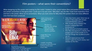
  • 1. Film posters – what were their conventions? When designing my film poster and creating my film trailer I looked to other social realism films and posters to try and pick out certain convention to that genre that I could use in my own work. ‘Billy Elliot’ was the film I took most inspiration from and here is the poster. What are its conventions. When you look online for Billy Elliot film posters there are many different ones that have been produced. • Very few fonts used. Only two or three in this case with simple complementary colours. • With fewer fonts it keeps the poster looking tidy and professional • Quite amount of empty space • The title and picture is clearly the largest part of the poster so it’s the first things the audience pick up on. • Decent sized picture that doesn’t give to much away, but relates to the film. Main character at the edge of the poster Reviews or quotes, star ratings. Eye catching words in larger fonts or centred. Large title in the centre of the screen ‘credits’ including producers directors and authors name and music titles.Tag line immediately underneath, so people read it straight away after the title
  • 2. How much does my poster match the conventions of ‘Billy Elliot’? Decent sized background photo. Not of the character in my poster as I didn’t want to give anything away. However it does relate too the film. Used credits, including the names of characters producers artist's and directors. Extra names. These are the names of the main characters. Added my own feature. Title is the largest text that stands out Not so much as tag line, but a valuable piece of information relating to the trailer and film. Within my poster I kept to a simple colour theme of black white greys and a slight hint of blue. I think this makes it more professional as I haven’t tried to juggle around with to many confusing colours. I chose to stick to these colours as it follows the conventions of ‘Billy Elliot’ poster with simple colours and fonts. On my poster I used the same font names and sizes as I did in my actual trailer. The free space around the writing and photo compliment the genre of social realism as the genre is also known the be quite hollow and empty.
  • 3. Other genres Although I am focusing on social realism I thought it would be a good idea to look at an evaluate other film posters and their genres, for example there is horror, rom com, war film, comedy etc. Rom com Horror War Firstly my poster only have a photo of dancing shoes so an object, however these posters include characters. In that sense my poster challenges the conventions of a traditional film poster. This may be due to the fact that these posters are going to be used for billboards or bus stops for example. Distribution companies aim to get their film recognised by as much of their target audience as possible, which involves creating supporting media products such as film posters available in a rang of environments.
  • 4. CONTINUED Secondly there is much more emphasis on the actual picture than much of the supporting text to try and attract more of an audience, contrasting to my film poster where he picture I feel isn’t as necessary in attracting an audience; that is left to the reviews at the top and bottom of the page. Again, this is another difference in conventions to the wider spectrum of film posters. There are some similarities however; both my poster and 2 of the other posters have ‘credits’ underneath the main title heading, and use a minimal range of fonts and colours. The rom com film poster however has stars and reviews to attract potential audience members, I did not use star or reviews as I feel personally it is kept more professional with little writing. Although my film posters does challenge most conventions of traditional film posters, but seems to fit quite feel with my main inspirational text. If I knew what I know now I maybe would have included a photo of the main character in order to match more conventions of traditional texts, but I feel my created works quite effectively for the genre as it gives a general idea that the film will be about dancing but doesn’t show who the characters are.
  • 5. Magazine covers – what were their conventions When designing my magazine cover I decided to look at a popular magazine company called ‘Total Film’ here are two posters that I can analyse to see what their conventions are. Largest font again is the Title. Even though its behind the characters. Issue number and date of release One single large image of a main character Supporting stories at the side. So its not just about one film. As it is a magazine Barcode
  • 6. My magazine cover – how does my magazine cover match the conventions of others? Big title of the magazine, this time it just over laps the photo. Suitable barcode and date of magazine issue The release date of the film, including credits about the film. A good use of colours and fonts, stay the same not to confusing Other stories on other films to keep the page looking busy and interesting. A good size film title. Using the same font colour and style through out my poster and trailer.
  • 7. After comparing my magazines cover with that of published magazines, I have noticed that it fits in particularly well the conventions. From analysing the conventions of traditional media, I feel that I can confidently say that my own magazine cover fits In with these conventions quite comfortably. Technical conventions such as the placement of the photos on the page and the titles have bee met, for example the title of the magazine had remained at the top it takes up a reasonable amount of space but it doesn’t hid anything. I have also used a limited range of colours texts and font, I stuck with the navy blues greys and blacks so its corresponded with my film poster. However the background picture of the main character was white which I feel contrasts very well, by keeping the fonts and colours the same in my poster and magazine it gave my work continuity and hopefully that came across. The stories around the outside of the character are there to try and entice readers to buy the magazine, which is why I added information about other films that are available to see as they might also be interested in them. I didn’t meet the convention of having more than one photo on my cover, if I could go back I would probably add some more photos to surround the main image to make it look realistic.