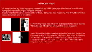
Lucknow 💋 Russian Call Girls Lucknow - Book 8923113531 Call Girls Available 2...
Unit 14: Digital Magazine-pt.2
1. DOUBLE PAGE SPREAD
For the realisation of my double-page spread I didn’t follow any kind of specify layout, this because I was constantly
making some correction during the application of my ideas.
This because before I could start working on the software, I did have the clear image in my mind of what the final result
was approximatively going to be look like.
I started with giving to it the look of the original poster of the movie, dividing
the double page in two perfect halves, a white one an a black one.
For my double page spread, I wanted to give a more “Romantic” influence, so
I searched a picture of Tony and Elvira, who are the main couple of the movie
and I found the perfect one on Jakpost.travel which I cropped, and from
which I selected the two characters and I placed them in the middle of the
image in the most suitable size.
2. As the romantic atmosphere has to be created, I wanted to add one of the most
important slogans of the movie, which is “The World Is Yours”. And when someone that
have never seen the movie can have is own interpretation of why the text is over the
image like this, thinking that it may be a Tony’s dialogue to cheer up Elvira.
For create the contrast between the two background halves, I added two other
additional smaller rectangles that fits with the limits of the central image, emphasising
also the difference between the two characters, giving them a frame where they have
eye contact but they’re divided by two different pages.
3. The romantic touch kept over with with one of the ‘sweetest’ quote of the movie, which is said by
Tony to Elvira when he asks her to marry him, which is “I like you. I liked you the first time I laid my
eyes on you. I said she’s a Tiger, she’ll belong to me”.
The font used is Arial Regular in 16 typographic point size with a drop shadow effect to create the
contrast with the back ground.
The first main headline is ‘PUSH IT TO THE LIMIT’ which is also the title of a song in the original
soundtrack album. And it also is the main message that the movie is giving us.
The idea of having more and more and never being happy of what you got is the main thought
in Tony’s mind for the whole movie, so I wanted to emphasize this idea giving as more space as
possible in the page.
4. I started writing my article talking about how Scarface has been a classic for nearly 40 years even
with all the negative messages, the strong violence and strong drugs abuse.
The main point of the article was giving credit to the perfect photography, color correction,
props and costumes the movie had and how the look of the characters and the locations keep
recalling the infinite luxury.
The second main heading is “Pacino’s Performance” this because he is the main star of the
movie, Al Pacino gave to the movie a tone that no one else could, so I wanted to dedicate to him
an entire “love letter” for the marvelous work he has done.
5. The whole article about Pacino’s performance gives him most credit for taking Tony
Montana’s role to a whole new level, I also talked about his career and how he is used to do
this kind of movies, especially when in the 70s he starred in movies like The Godfather,
Serpico and Dog day Afternoon.
I also talked about why Pacino’s Tony Montana left a brand and a legacy after all this years
and how it has been quoted and impressed lots of times.
I wanted to add some pictures from the movie just to create more the atmosphere, as I did
for my first layer with the Tony and Elvira photo, I wanted to use the same kind of
background delete by selecting Tony and what’s around him, and then adding a black
rectangle on the white side of the page, and a white rectangle on the black side of the page.
I found the perfect images on wallpaperplay.com which permitted me to download the
images in high quality for free.
6. As I did on my front page, I wanted to warn again anyone who has never seen the movie but
decides to watch it, of what he has to expect from it.
So I wrote ‘Strong Violence’ near a picture of Tony holding a gun, and I wrote ’Drugs Abuse’
near a picture of Tony with a pile of cocaine.
Nearly ending the double page spread I added my primary image, where I wanted to
reconfirm my theory about seeing Tony Montana in every guy who tries to emulates him.
So I tried to play a really similar gangster role for the modelling of my magazine, my dark skin
and my beard helped me have a serious and intimidating facial expression, and thanks to our
college’s props room I could get what I needed for make it more realistic.
I cropped the image in a 1:1 ratio and I draw a frame shape with the brush in white over the
picture to separate it from the background
7. During the studio session we tried to have as much options as possible, so we had a model and clothes changing while we were taking all
the pictures. When we were finally sure about which props to use, how to place them and who was going to model with certain
costumes, we took all the pictures with different exposure and different lights.
This is the the picture I chose to use as a primary image for my magazine, this because the red light naturally
killed all the props’ and my skin’s color creating a red-black-white effect without the use of any post-production.
My facial expression was consistent with the context of the gangster imaginary, the main feelings that the image
has to show are self confidence, power, money and respect.
The props are on the table in front of the subject and they all are visible, as an hail to consumerism and luxury.
9. The very last thing I did was adding an Al Pacino’s picture which I edited in the same way
I edited the pictures about the movie that warn about the negative messages of the
movie, and the central image of Tony and Elvira.
I wanted to add an image of Al Pacino out of the context of the movie because I also
talked about his career out of Scarface so I wanted to show him in a casual attitude and
appearance.
10. FINAL RESULT
My final result is exactly how I imagined it at first,
and this really makes me happy because during
the production I was keep changing ideas about
how to place some texts and some pictures.
When I see it I find everything I was trying to
transmit during the realization of it so I’m
completely satisfied with what I came out at the
end