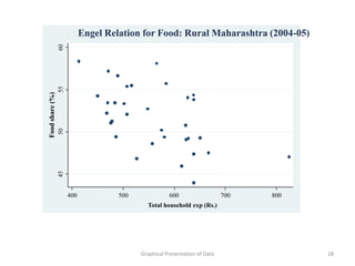
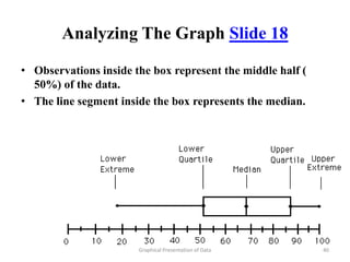
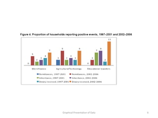
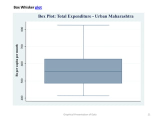
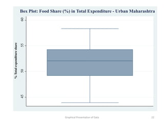
1) The document discusses various graphical methods for presenting qualitative and quantitative data, including bar diagrams, pie charts, and histograms.
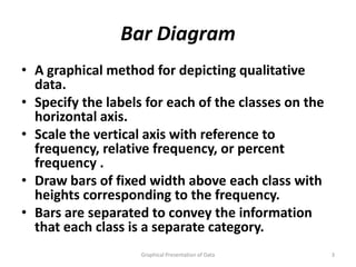
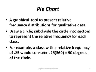
2) Bar diagrams and pie charts can be used to depict qualitative data by scaling the vertical axis by frequency or relative frequency of each class.
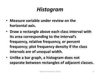
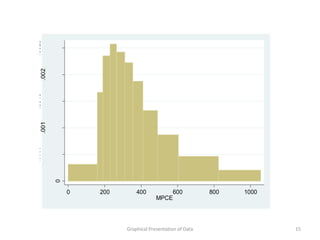
3) Histograms are used for quantitative data by drawing rectangles above each class interval, with the area corresponding to the frequency or density of observations in that interval.
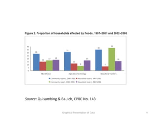
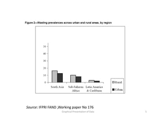
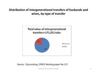
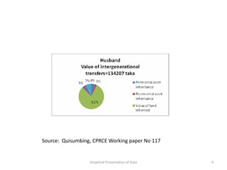
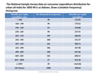
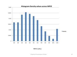
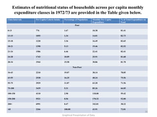
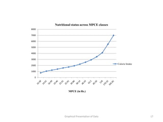
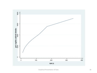
4) Examples of each type of graph are provided using real data on expenditures, calorie intake, and other variables to illustrate how the graphs can be made.


![. regress Foodshare Total_exp
Source SS df MS Number of obs = 34
F( 1, 32) = 42.14
Model 565.222061 1 565.222061 Prob > F = 0.0000
Residual 429.260208 32 13.4143815 R-squared = 0.5684
Adj R-squared = 0.5549
Total 994.482269 33 30.1358263 Root MSE = 3.6626
Foodshare Coef. Std. Err. t P>|t| [95% Conf. Interval]
Total_exp -.0151772 .0023381 -6.49 0.000 -.0199399 -.0104146
_cons 57.54894 2.256355 25.51 0.000 52.95289 62.14498
Graphical Presentation of Data 23](https://image.slidesharecdn.com/topic8graphs-120829005043-phpapp01/85/Topic-8-graphs-23-320.jpg)
![. regress shareoffood total
Source SS df MS Number of obs = 33
F( 1, 31) = 12.56
Model 126.172681 1 126.172681 Prob > F = 0.0013
Residual 311.400862 31 10.0451891 R-squared = 0.2883
Adj R-squared = 0.2654
Total 437.573542 32 13.6741732 Root MSE = 3.1694
shareoffood Coef. Std. Err. t P>|t| [95% Conf. Interval]
total -.023155 .0065334 -3.54 0.001 -.0364799 -.00983
_cons 64.68854 3.697611 17.49 0.000 57.14721 72.22987
Graphical Presentation of Data 27](https://image.slidesharecdn.com/topic8graphs-120829005043-phpapp01/85/Topic-8-graphs-27-320.jpg)