TOP TIPS FOR
POWERPOINT
PRESENTATION
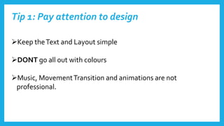
Tip 1: Pay attention to design
Keep theText and Layout simple
DONT go all out with colours
Music, MovementTransition and animations are not
professional.
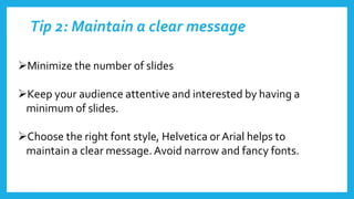
Tip 2: Maintain a clear message
Minimize the number of slides
Keep your audience attentive and interested by having a
minimum of slides.
Choose the right font style, Helvetica orArial helps to
maintain a clear message.Avoid narrow and fancy fonts.
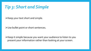
Tip 3: Short and Simple
Keep your text short and simple.
Use bullet point or short sentences.
Keep it simple because you want your audience to listen to you
present your information rather than looking at your screen.
Tip 4: Checking Spelling and used of colour
Check your spelling and grammar, this is to earn the respect from your
audience.
Don’t go over the top with the background or colour, keep it simple.
 Choose between a bright colour text with a dull background or a dull
colour text with a bright background. Don’t use dull with dull or bright
with bright because it wont go well.
Tip 5: Add images
Add images but don’t use It to decorate.
Use images to visualize and explain your work.
Don’t use to many that would take up the whole page, also use simple
images.
Images can send across great messages more than words.

Top tips for powerpoint2

  • 1.
  • 2.
    Tip 1: Payattention to design Keep theText and Layout simple DONT go all out with colours Music, MovementTransition and animations are not professional.
  • 3.
    Tip 2: Maintaina clear message Minimize the number of slides Keep your audience attentive and interested by having a minimum of slides. Choose the right font style, Helvetica orArial helps to maintain a clear message.Avoid narrow and fancy fonts.
  • 4.
    Tip 3: Shortand Simple Keep your text short and simple. Use bullet point or short sentences. Keep it simple because you want your audience to listen to you present your information rather than looking at your screen.
  • 5.
    Tip 4: CheckingSpelling and used of colour Check your spelling and grammar, this is to earn the respect from your audience. Don’t go over the top with the background or colour, keep it simple.  Choose between a bright colour text with a dull background or a dull colour text with a bright background. Don’t use dull with dull or bright with bright because it wont go well.
  • 6.
    Tip 5: Addimages Add images but don’t use It to decorate. Use images to visualize and explain your work. Don’t use to many that would take up the whole page, also use simple images. Images can send across great messages more than words.