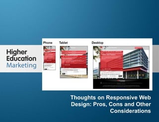
Thoughts on responsive web design pros, cons and other considerations
•Download as PPTX, PDF•
1 like•2,204 views

A summary of the pros,cons and other comments on Responsive Web Design, specifically in context of college and university website.

Recommended
More Related Content
Similar to Thoughts on responsive web design pros, cons and other considerations
Similar to Thoughts on responsive web design pros, cons and other considerations (20)
More from Higher Education Marketing
More from Higher Education Marketing (20)
Recently uploaded
Recently uploaded (20)
Thoughts on responsive web design pros, cons and other considerations
- 1. Thoughts On Responsive Web Design: Pros, Cons And Other Considerations Slide 1 Thoughts on Responsive Web Design: Pros, Cons and Other Considerations
- 2. Thoughts On Responsive Web Design: Pros, Cons And Other Considerations Slide 2 1. Site design considerations 2. Site production considerations 3. Site maintenance considerations 4. Site performance considerations 5. SEO considerations 6. Marketing considerations Overview Source: Higher Education Marketing – Thoughts On Responsive Web Design: Pros, Cons and Other Considerations
- 3. Thoughts On Responsive Web Design: Pros, Cons And Other Considerations Slide 3 Let’s take a look are RWD from the point of view of its impacts on different stages of a website’s development, lifecycle and marketing effectiveness. Source: Higher Education Marketing – Thoughts On Responsive Web Design: Pros, Cons and Other Considerations
- 4. Thoughts On Responsive Web Design: Pros, Cons And Other Considerations Slide 4 Creating one design in RWD, serving all platforms VS multiple designs for mobile, tablet, desktop or app saves time and money. One RWD design across all platforms provides a common user experience across those platforms. For example: A student discovers an interesting educational program using their mobile phone on the bus trip home, then go on their desktop at home to further investigate and enter into a website that has the look and feel and sensibilities of the one that drew them to it in the first place. That “scent trail” as referred to in conversion optimization, is a key factor in producing a positive outcome from a prospective student's web experience. Site Design Considerations Source: Higher Education Marketing – Thoughts On Responsive Web Design: Pros, Cons and Other Considerations
- 5. Thoughts On Responsive Web Design: Pros, Cons And Other Considerations Slide 5 Implementation of RWD requires a complete site redesign & reimaging of web applications across desktop & mobile. It is an all or nothing approach that cannot be phased in partially Building effective navigation in RWD for small screen formats (i.e. smartphones) can be a serious challenge. Sacrifices in design are often made to make it work effectively Image optimization in RWD across multiple formats can be a problem Site Design Considerations Source: Higher Education Marketing – Thoughts On Responsive Web Design: Pros, Cons and Other Considerations
- 6. Thoughts On Responsive Web Design: Pros, Cons And Other Considerations Slide 6 Advanced page functionality, for instance, forms, applications etc. can be difficult to implement. If user intent and/or user requirements are different across platforms, RWD can be difficult to apply, particularly if a mobile page or app is optimized for touch or lead conversion. Site Design Considerations Source: Higher Education Marketing – Thoughts On Responsive Web Design: Pros, Cons and Other Considerations
- 7. Thoughts On Responsive Web Design: Pros, Cons And Other Considerations Slide 7 This example of a mobile app from JP Morgan Chase Bank demonstrates: how a mobile device is intended to be used quite uniquely versus the purpose of a desktop site. According to the company, consumers used this feature to deposit over $4 billion dollars and the app has won several awards including the highly renowned Webby Award in 2011. Source: Higher Education Marketing – Thoughts On Responsive Web Design: Pros, Cons and Other Considerations
- 8. Thoughts On Responsive Web Design: Pros, Cons And Other Considerations Slide 8 Production of a RWD site is generally a more complex project management challenge than a traditional site, takes longer to build and the approvals process, because it is quite different can be more difficult to manage. A range of hardware platforms (and resolutions) are required to thoroughly test your RWD site. Emulators or simply scaling a browser window can be used but they never seem to be quite the same results as working on the real thing. Site Production Considerations Source: Higher Education Marketing – Thoughts On Responsive Web Design: Pros, Cons and Other Considerations
- 9. Thoughts On Responsive Web Design: Pros, Cons And Other Considerations Slide 9 One of the real benefits of RSW is that: it is much simpler to maintain one code base than two or three. This has important implications on: the skill set requirements of your team ( internal or external) the amount of time required for maintenance of your site your management resources to oversee them. Saving time, money and human resources is a high priority for minimally resourced higher Ed Marcom or IT web groups. Site Maintenance Considerations Source: Higher Education Marketing – Thoughts On Responsive Web Design: Pros, Cons and Other Considerations
- 10. Thoughts On Responsive Web Design: Pros, Cons And Other Considerations Slide 10 Site Performance Considerations RSW sites are generally slower to load than m.dot mobile sites. In the example below: the responsive mobile and responsive full web page take approximately the same time to load. Even though the mobile page only displays part of it, it needs the time to download all of it at the front end. An optimized mobile site with the same content would typically load much faster. And the really important part is that every extra second of delay in page loading causes a reduction, (reported up to 7%), in conversion rate Source: Higher Education Marketing – Thoughts On Responsive Web Design: Pros, Cons and Other Considerations
- 11. Thoughts On Responsive Web Design: Pros, Cons And Other Considerations Slide 11
- 12. Thoughts On Responsive Web Design: Pros, Cons And Other Considerations Slide 12 SEO Considerations Google has publically declared that it likes RWD sites , and apparently ranks them higher. A RWD site will reduce your bounce rate on mobile visitors which increases lead generation and ultimately trickles down to increased registrations. Because there is only once site, RWD sites typically get better page indexing Inbound links are directed to one site. All of the above typically improve your search engine page rankings If visitor search intent is different for your mobile vs desktop site RSW has its limitations. Source: Higher Education Marketing – Thoughts On Responsive Web Design: Pros, Cons and Other Considerations
- 13. Thoughts On Responsive Web Design: Pros, Cons And Other Considerations Slide 13 The example below demonstrates how keywords can be very specifically mobile and local search oriented. Often these are very different keywords than you would typically optimize your desktop site for.
- 14. Thoughts On Responsive Web Design: Pros, Cons And Other Considerations Slide 14 Marketing Considerations Analytics for RWD sites are collected under one Google analytics account making it much simpler to oversee your site’s visitor traffic, goals and marketing ROI. The example below demonstrates how traffic, funnel and goal conversions can be analyzed by screen size.
- 15. Thoughts On Responsive Web Design: Pros, Cons And Other Considerations Slide 15 Questions? 1.514.312.3968 info@higher-education-marketing.com Visit our Website: Higher Education Marketing FOLLOW US ON FACEBOOK FOLLOW US ON LINKEDIN FOLLOW US ON TWITTER FOLLOW US ON PINTEREST FOLLOW US ON GOOGLE+