1) A responsive website automatically changes its layout and appearance based on the size of the screen it is displayed on, allowing for an optimal viewing experience across different devices.
2) Responsive sites can make text larger and buttons easier to press on smaller screens. They can also hide or present different information depending on the device.
3) The key benefits of responsive websites include providing a consistent user experience and branding across devices, reducing development costs by only needing one website, improving visibility and usability on mobile, and ensuring the site remains optimized as mobile usage increases.
How not having a Responsive Website can be Detrimental to your business?Helios Solutions
Is your website responsive? Know about the benefits that you are losing out; collaborate with an outsourcing responsive website development agency now!
Today there are more ways than ever to access the internet. Anywhere from smartphones to tablets to even gaming consoles, the devices that can access the web has exploded and continues to explode every day. While this additional variety of devices drastically enhances our accessibility, it poses an enormous headache for website designers and programmers.
5 Top Web Design and Development Tips for an Awesome Web AppPixel Crayons
Read the full blog here: https://bit.ly/32RNOIy
Connect with us through:
Contact us : https://bit.ly/2IpPX7w
Facebook : https://www.facebook.com/PixelCrayons
Twitter : https://twitter.com/pixelcrayons
LinkedIn : https://www.linkedin.com/company/pixelcrayons
Instagram : https://www.instagram.com/pixelcrayons/
Pinterest : https://in.pinterest.com/pixelcrayons/
5 compelling reasons your website should be responsiveDesignveloper
5 compelling reasons your website should be responsive
There is no doubt that it’s the age of mobile devices now. I know it sounds ridiculous but more people in this world own smartphones than toothbrushes. Mobile seems to become everything surrounding us from doing business, checking email, shopping or even playing game.
Because of that insanely increase of mobile devices, it’s a must for any kind of business to have a website that is mobile friendly. Actually, it’s not a big problem. Usually, we have a website designed for desktop users and another one specifically developed for mobile users. But, the question is “Is is possible to have a website that can use for both desktop and mobile?”. Absolutely, it can! Responsive web design comes to your rescue.
Here's some of what it covers:
Mobile context
Mobile testing tools
Fixed vs. fluid layouts
Scalable layouts
Horizontal layouts
Designing for touch
Real-time content
I take a look at designing a modular template system. This is simply a group of reusable modules and email patterns, that can be combined together in various ways to generate different templates. Although not a new approach, I've seen a surge of interest in the last few years as everyone grapples with mobile redesigns.
The featured examples vary in scope and industry. Adorama started with just ten modules and have gone onto expand it, whereas Monster’s latest is 35. They also had different design challenges, which I go through along with our process, user testing and internal management.
Click the 'Notes' tab below right, to view the video transcript for each slide. The video shows the live templates and gives a bit more context than the deck. You can watch it here: http://bit.ly/1zumjAd
Carousel30: Optimizing for the mobile user experience whitepaperCarousel30
White paper by digital agency Carousel30 on how to optimize your mobile user experience through choosing the correct approach for your website, using responsive design or mobile apps.
Learn all about why you need to have a Responsive Website Design today. It's imperative the success of your website and getting found on the web. Beat your competitors to the bank with a responsive website design.
This webinar will demonstrate how professional and B2B brands are deftly handling the challenges of mobility and screen size, while also solving branding challenges bigger than any device. Joe Walsh, Principal and Creative Director at Greenfield/Belser will share a visual show and tell with lessons learned and best practices shared.
You will see and learn:
· The difference between responsive and adaptive designed mobile websites
· The pros and cons of device friendly options, including costs
· Four new responsive website case studies and the integrated branding approaches driving them
· Best brand and marketing practices across all devices.
Besides a quick explanation of what responsive email design is; I take a look at what’s possible, going through some of the responsive layout patterns we’ve deployed. I’ve also got a section on tablets, touch, performance and techniques for dealing with clients that don’t support media queries. I finish up by looking at testing…hope you find it useful. You can watch the video that goes with deck here: http://www.youtube.com/watch?v=T6GajEVabP4
Demystifying Mobile SEO - 2014 Search Engine Strategies Atlanta SessionTim Cannon
As mobile internet usage continues to climb having a solid mobile experience for your website is vitally important. This session will dive into choosing the right approach for search engine optimization (SEO), responsive or dedicated mobile site, and then explore the more technical and strategic aspects of SEO for responsive design which is Google's recommended approach. There are a lot of things to consider from using frameworks, architecture, indexing, and UX. We will explore all of these and also outline recommendations for performance improvements which is critical to successfully implementing responsive design.
Responsive & Adaptive Design: Delivering Websites That Delight Your UsersBBDO
Considering that mobile and tablet users constitute an ever-growing share Internet traffic, designing websites with a mobile-first strategy is crucial to a sites success. This paper considers the two UX design techniques that can bring beautiful web design to the smaller screen.
Understanding The Importance Of Responsive Design For Your WebsitesUma_sri
Responsive web design responds to the websites based on the device type and the screen size. It is hard and impractical to have unique design for devices from different companies such as Apple, Motorola, Blackberry, Samsung etc. Each device has specific screen resolution and it requires a unique design approach to fit the content for different gadgets.
Why responsive web design may be a must!bill87scott
It is a multi device world and time is often less. Folks are forever connected whereas on the go. They’re booking tickets, paying bills, browsing websites on their varied hand-held devices.
Business Advantage of Responsive DesignSqueeze Mobi
Responsive design is a web design and development technique that creates a site or system that reacts to the size of a user’s screen. It will optimise a user’s browsing experience by creating a flexible and responsive web page, optimized for the device that is accessing it.
You'll find in the slides tips and tricks on why responsive design is important to a business.
The templates shown in this presentation are all in the Squeezemobillionaire platform. The mobile app and site builder in this platform has the feature to add news feeds to the sites/apps. Get to know more about what is included in the platform here: https://www.squeezemobillionaire.com/sign-up/pricing/
Now, get flexible and compatible website designs through responsive web designing techniques. These web designing and development approach is practiced in order to attain maximum viewing experience.
[ http://tier10lab.com/2012/11/15/5-reasons-responsive-design/ ] Responsive web design is a methodology that incorporates flexible layouts, images and CSS media query components. Through the use of media query "breakpoints," the CSS can detect the current screen size of the browser. This guarantees the design functions correctly at any screen size ...
Responsive Web Design vs. Mobile Web App: What is best for Enterprise - Whit...RapidValue
The continuous evolution of smart phones, regular release of newer mobile OS versions, availability of a huge variety of mobile applications from different app stores and high speed internet connections have completely transformed the way consumers use their mobile devices. According to mobile industry reports, 7.12% of all website traffic worldwide came from handheld devices in 2011. In 2012, that figure rose to 11.78%.1 According to eMarketer (a leading digital media market research firm), more than 58% of American adults will be regular mobile web users by the end of 2016. Tablets and smartphones are becoming the default choice for connecting to the internet. The web has become an essential part of our lives, and users are connected to their internet devices from anywhere and all the time.
This revolution is influencing many companies to shift towards a “Mobile First, Desktop Second” strategy for their business. However, the shift from desktop to mobile requires web designers to refocus - not completely away from desktop design, but certainly with an inclination towards mobile. There are several ways to approach a mobile web presence, such as implementing a separate mobile site or a mobile web app. The most recent and popular approach seems to be Responsive Web Design.
This paper explains the difference between Mobile Web App and Responsive Web Design, and provides a framework for resolving some of the key questions decision makers have. These include what factors to consider when choosing between Responsive Web Design and Mobile Web App, and what type of industry Responsive Web Design is most suitable for. The paper examines the pros and cons of each approach, and presents a sample scenario from the retail industry as well as a case study. As the paper guides you in how to make the right choice, it draws upon RapidValue’s experience helping enterprises succeed in the complex and evolving mobile ecosystem by RapidValue.
Trimax solutions article why your website must now be responsive for smartp...trimaxsolutions
Recently mobile internet usage has been exploding and is now consumers preferred method of viewing. Alarmingly though however, a great amount of businesses do not yet have a mobile responsive website. Not only does having a non-mobile friendly website give users a headache, it also causes a great loss of opportunity for business owners.
Responsive vs. adaptive vs. device-specific: which one is best?Catalyst
Learn the differences between responsive design, adaptive design and device-specific sites, and when to use each one for maximum mobile website impact.
As a leading Web Development agency in Pakistan. We understand the importance of creating mobile-friendly websites in today’s world where more and more people are using mobile devices to access the web. Our team specializes in responsive design, ensuring that all of the websites we develop function seamlessly and provide an optimal user experience across a wide range of devices and screen sizes.
The ins and outs of Responsive Web Designmeijun_corp
1. What Responsive Web Design is?
Why Responsive Web Design is important for small and mid-sized businesses?
- Mobile Traffic, Increased mobile internet usage, mobile users experiences.
2. Why should this consider? Easy to manage and optimize your website
3. Pros and Cons of RWD - How would you deal with your website from a different kind of devices? People access your website's SEO. An issue with taking longer to load.
4. Examples of Responsive Web Design in different industries.
Healthcare, Non-profits, Education, Food and Drink, Retail, Publishing, and Creative.
5. Conclusion
- With an expectation that mobile sales will overtake desktop sales, you need to focus on how to make your website friendly on the mobile. Consumers are more likely to consider it is a good that a company has a positive viewing experience.
Transforming Brand Perception and Boosting Profitabilityaaryangarg12
In today's digital era, the dynamics of brand perception, consumer behavior, and profitability have been profoundly reshaped by the synergy of branding, social media, and website design. This research paper investigates the transformative power of these elements in influencing how individuals perceive brands and products and how this transformation can be harnessed to drive sales and profitability for businesses.
Through an exploration of brand psychology and consumer behavior, this study sheds light on the intricate ways in which effective branding strategies, strategic social media engagement, and user-centric website design contribute to altering consumers' perceptions. We delve into the principles that underlie successful brand transformations, examining how visual identity, messaging, and storytelling can captivate and resonate with target audiences.
Methodologically, this research employs a comprehensive approach, combining qualitative and quantitative analyses. Real-world case studies illustrate the impact of branding, social media campaigns, and website redesigns on consumer perception, sales figures, and profitability. We assess the various metrics, including brand awareness, customer engagement, conversion rates, and revenue growth, to measure the effectiveness of these strategies.
The results underscore the pivotal role of cohesive branding, social media influence, and website usability in shaping positive brand perceptions, influencing consumer decisions, and ultimately bolstering sales and profitability. This paper provides actionable insights and strategic recommendations for businesses seeking to leverage branding, social media, and website design as potent tools to enhance their market position and financial success.
Hello everyone! I am thrilled to present my latest portfolio on LinkedIn, marking the culmination of my architectural journey thus far. Over the span of five years, I've been fortunate to acquire a wealth of knowledge under the guidance of esteemed professors and industry mentors. From rigorous academic pursuits to practical engagements, each experience has contributed to my growth and refinement as an architecture student. This portfolio not only showcases my projects but also underscores my attention to detail and to innovative architecture as a profession.
Can AI do good? at 'offtheCanvas' India HCI preludeAlan Dix
Invited talk at 'offtheCanvas' IndiaHCI prelude, 29th June 2024.
https://www.alandix.com/academic/talks/offtheCanvas-IndiaHCI2024/
The world is being changed fundamentally by AI and we are constantly faced with newspaper headlines about its harmful effects. However, there is also the potential to both ameliorate theses harms and use the new abilities of AI to transform society for the good. Can you make the difference?
Storytelling For The Web: Integrate Storytelling in your Design ProcessChiara Aliotta
In this slides I explain how I have used storytelling techniques to elevate websites and brands and create memorable user experiences. You can discover practical tips as I showcase the elements of good storytelling and its applied to some examples of diverse brands/projects..
Technoblade The Legacy of a Minecraft Legend.Techno Merch
Technoblade, born Alex on June 1, 1999, was a legendary Minecraft YouTuber known for his sharp wit and exceptional PvP skills. Starting his channel in 2013, he gained nearly 11 million subscribers. His private battle with metastatic sarcoma ended in June 2022, but his enduring legacy continues to inspire millions.
White wonder, Work developed by Eva TschoppMansi Shah
White Wonder by Eva Tschopp
A tale about our culture around the use of fertilizers and pesticides visiting small farms around Ahmedabad in Matar and Shilaj.
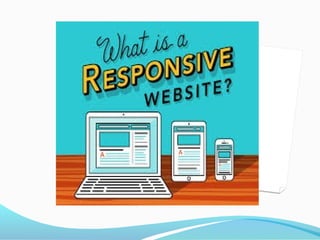
2. What Is A responsive Website ?
Responsive Web design (RWD) is a Web design approach aimed at crafting sites to
provide an optimal viewing experience—easy reading and navigation with a
minimum of resizing, panning, and scrolling—across a wide range of devices (from
mobile phones to desktop computer monitors)
A responsive website changes its appearance and layout based on the size of the
screen the website is displayed on. Responsive sites can be designed to make the
text on the page larger and easier to read on smaller screens. They can also be
configured to make the buttons on the phone's screen easier to press. More
sophisticated ways of using responsive design on a mobile device include:
formatting the website to hide or present entirely different information, radically
changing the graphics and colors, or even reducing the site to emphasize just its
most important piece.
3. what does a
responsive website
actually do?
Responsive site architecture
and design provides a fluid
layout for your website that
automatically changes
'responsively' and renders
the optimum website
experience to best suit the
user’s viewing device smartphones, Tablets,
Netbooks, Desktops, even
Widescreen TVs. It also
allows you to priorities your
key calls to action for a
reduced screen size.
What’s more, providing a
single, dynamic version of
your website to desktop and
mobile visitors makes it
search engine friendly. That
explains why Google loves
responsive website design. In
fact, Google have stated that
it is their 'recommended
configuration' for building
smartphone and tabletoptimised websites.
4. How Many Potential
Customers Could You
be Losing?
You don’t have to be a master
statistician to realise that the
trend towards internet access
via mobile devices is
gathering pace and is already
unstoppable.
This means that the chances
of your website being
accessed via a mobile device
are increasing every day, so
you need to make sure that
the visitor experience is a
good one. You may only get
one chance!
5. Why To Use
responsive
Website?
The internet is now an integral
part of our lives, and,
increasingly, people want access
to it, any time, anywhere, any
place. Websites are now being
viewed on devices with hugely
varied screen widths and
resolutions, ranging from 320 to
over 2500 pixels.
You need to know that,
whatever the screen, your
website content will be
delivered to a consistently high
standard. If a mobile user has
difficulty reading your website,
you’ll lose them, perhaps for
ever!
6. Why To Use
Responsive
Websites ?
Why Does It Matter?
Because it’s better, and
everyone else is doing it.
To illustrate why responsive
is better, I’ve taken the stats
from an anonymous website
that is widely representative
of many others. If you use a
tool like Google Analytics on
your website you can look at
these same stats and gauge
how urgent the matter is for
your company.
7. Why To Use Responsive Website?
Why Does It Matter?
Mobile vs. Desktop.
This pie chart on the right
shows the percentages for
visitors coming using mobile,
tablet, and desktop devices
for the past 12 months. You
can view this pie chart for
your own website by first
selecting the past 12 months
for your date range, and then
on the left navigating to
Audience > Mobile >
Overview in Google Analytics.
On the lower right you’ll see a
small pie chart button. Push
that, and you’ll see a chart
like this one.
In this case the website
receives almost 40% of its
traffic from mobile devices
(for the purposes of this post
I’m going to lump tablets into
the “mobile” category). Given
that this website is not
responsive, nor has a mobile
version, that’s a hefty chunk
of visitors who are receiving a
sub-optimal experience. But
wait, it gets better! And by
“better” I mean worse
8. Why To Use
responsive
Website?
Cost Effective
Responsive website design
means there is no longer a
need to build a separate
mobile website in addition to
your traditional desktop
website. A single website
covers all devices, and so
development time is
significantly reduced. Then
think about how many
potential customers you
might lose through not
having a responsive website.
Cost effective? You could say
it’s a no-brainer.
9. Why To Use
Responsive Websites
We all know that our websites need be
easily viewed on cell phones and tablets.
With Google essentially coming out and
saying they prefer responsive design in
lieu of a separate mobile website, I felt it
fitting to list the benefits of a responsive
website.
1. User Experience
Obviously having a design that effectively
utilizes the screen size of your visitor’s
preferred device is the main benefit.
Responsive trumps mobile here in its
ability to carry over all of the elements
from your website. Pictures, content, and
calls-to-action are all adjusted, providing a
feature-rich experience a separate mobile
website simply cannot replicate.
2. Development
Rather than developing multiple websites
for multiple devices, responsive design
allows you to develop one website. Think
about the process of updating multiple
sites simply for a page addition. You only
have one set of content to update instead
of several.
3. Stay Ahead of Your Competition
With responsive design still being
relatively new and not yet widely adopted,
you have the opportunity to stand out
from your competition and be on the
cutting-edge of design. Statistics indicate
users are far more likely to buy from a site
that is optimized for mobile devices.
10. Why To Use responsive Website?
4. Analytics
Analyzing one site is hard enough, let alone multiple sites. With
responsive design, you only have one site to look after, regardless
of the device your users visit your page with.
5. Consistent Branding
Often times when I am redirected to a mobile page, it has a
different look and feel than the desktop site. With a responsive
design, your site is consistent in appearance and branding,
helping to keep your image clear.
6. Conversions
When you want your site to convert, responsive design is the
way to go. You want as little friction between your user and a
call-to-action as possible. When you have a well thought-out
website with lead generation in mind, these elements carry over
and offer an experience visitors will want to engage with.
7. SEO
Today there may not be a lot of weight associated with
responsive vs. mobile design, but all indications point to Google
starting to favor the former. Responsive design simply offers a
better user experience than a separate mobile site, and that is
what the SERPS are after. Secondly, they don’t have to index and
associate multiple sites with you. It’s one site for all users.
11. Why To Use
responsive Website?
8.Allow Your Website to
Adapt :
By reworking your website
with responsive design, you
give it the capability to adapt
to multiple browsing
platforms. Rather than
building websites according
to static dimensions,
responsive design involves
constructing a page
according to proportional
parameters that allow it to
change its layout based on
the user’s device.
With so many different
smart phones and tablets on
the market, it’s important to
make sure that your web
pages can adapt to multiple
viewing platforms.
Responsive design provides
an elegantly simple solution
to this problem.
Improve
12. Why To Use responsive Website?
9 . Improve Visibility !!!
One of the most common problems with
mobile browsing is the usability issue.
Many people fail to make use of their
mobile device’s internet capabilities
because so many websites are not
optimized for mobile browsing. Pages take
too long to load, and their layouts often
become jumbled and unreadable on the
small screen. Building your site according
to responsive design principles makes sure
that users on any device will get the same
experience on your website. Improve
usability and your mobile potential will
skyrocket.
13. Why To Use
Responsive Website ?
One Website, Many Devices
One of the most appealing aspects of
responsive web design is that a
responsive website can provide a great
user-experience across many devices
and screen sizes. This is an important
characteristic, since it is impossible to
anticipate all the devices and screen
sizes searchers will use to access your
site. A site that works well regardless
of these variables will provide a better
and more consistent user-experience
than a separate mobile site that is
designed for a specific device and
screen size.
Let’s take the following example.
Someone searches for a product on
their smartphone during a lunch
break at work. They find a site that
has the product they’re looking for,
and decide to continue researching
this product on the same site when
they get home. Except, when they get
home, they will use their desktop
instead of their smartphone.
If the site in this example is
responsive, this person will have
a positive user-experience when
transitioning from mobile to desktop
because they will view the same site
on their desktop as they did on their
smartphone. On the other hand, if the
site is a dedicated mobile site, this
person will become frustrated with
the fact that they have to locate the
desktop version of the site, and find
the product all over again.
14. Why To Use
Responsive Website
Save Time and Money
In the past, the only solution
for mobile browsing was to
create a dedicated mobile
website. Many webmasters still
subscribe to this idea, but it
can be expensive and time
consuming. Your web hosting
needs will increase, you will
have two websites to manage,
and your IT expenses can shoot
through the roof when you
have twice as many pages to
troubleshoot on a regular basis.
Responsive web design allows
you to simplify your needs by
having only one website for
multiple platforms, thus saving
you both time and money.
15. Future Is Mobile ?!!!
The Future Is Mobile
While going responsive can present challenges for website
owners and online marketers, I return to my previous
point that without a mobile-friendly website your future
online is bleak. If you’re not providing a mobile-friendly
experience for your customers, they’ll bounce off your
website and go to your competitor whose website is easier
to use. The future is mobile, as we see people increasingly
favoring their mobile devices over desktop computers.
Nielsen says that over 60% of all mobile phone owners in
the US use a smartphone. A recent study by Walker Sands
Digital showed mobile traffic to its client base increasing
by 171 since Q3 2011. Statista says that 5 billion people will
use mobile phones by 2017. Making your website
responsive is a small price to pay to reach all these people.
By the way, in case you feel like I’m being a bit preachy,
I’m preaching as much to myself as to you–my own firm’s
website doesn’t have a responsive site yet. Yeah, yeah, the
cobbler’s children have no shoes.
16. Conclusion
Responsive web design is
recommended by Google, it allows
one website to provide a great
user-experience across many
devices and screen sizes, and it
also makes managing your SEO
strategy easier. For these reasons,
responsive web design is the best
option for your mobile SEO
strategy.