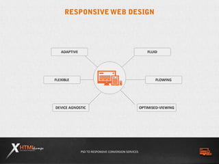
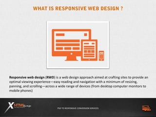
Responsive Introduction – Presented By
PSD TO RESPONSIVE CONVERSION SERVICES
Responsive web design (RWD) is a web design approach aimed at crafting sites to provide an
optimal viewing experience—easy reading and navigation with a minimum of resizing,
panning, and scrolling—across a wide range of devices (from desktop computer monitors to
mobile phones)
PSD TO RESPONSIVE CONVERSION SERVICES
As mobile web browsing becomes increasingly common all over the world, responsive web
design is fast emerging as the ultimate solution to several mobile problems. Mobile devices
use smaller screens on different formats, and their user interface is vastly different from
that of a home computer. Combined with their comparatively low processing power, these
problems can make mobile browsing a struggle. The following benefits of responsive web
design, however, make it a great solution to the mobile browsing predicament.
ALLOW YOUR WEBSITE TO ADAPT
By reworking your website with responsive design, you give it the
capability to adapt to multiple browsing platforms. Rather than
building websites according to static dimensions, responsive design
involves constructing a page according to proportional parameters
that allow it to change its layout based on the user’s device. With so
many different smart phones and tablets on the market, it’s important
to make sure that your web pages can adapt to multiple viewing
platforms. Responsive design provides an elegantly simple solution to
this problem.
PSD TO RESPONSIVE CONVERSION SERVICES
SAVE TIME AND MONEY
In the past, the only solution for mobile browsing was to create a
dedicated mobile website. Many webmasters still subscribe to this
idea, but it can be expensive and time consuming. Your web hosting
needs will increase, you will have two websites to manage, and your IT
expenses can shoot through the roof when you have twice as many
pages to troubleshoot on a regular basis. Responsive web design
allows you to simplify your needs by having only one website for
multiple platforms, thus saving you both time and money.
IMPROVE OVERALL USABILITY
One of the most common problems with mobile browsing is the
usability issue. Many people fail to make use of their mobile device’s
internet capabilities because so many websites are not optimized for
mobile browsing. Pages take too long to load, and their layouts often
become jumbled and unreadable on the small screen. Building your
site according to responsive design principles makes sure that users on
any device will get the same experience on your website. Improve
usability and your mobile potential will skyrocket.
PSD TO RESPONSIVE CONVERSION SERVICES
BEAT OUT THE COMPETITION
Everyone on the web is trying to edge out the competition, and
responsive design is a great way to get a head start. Despite its
obvious benefits, responsive design is still a budding movement
in web design in Cincinnati, Silicon Valley, and everywhere in between.
Getting on board with this new movement early gives you a leg up on
the pile, ensuring a strong standing for your website in the years to
come.
STEP UP YOUR SEO
Search engine optimization is on every webmaster’s mind today, and
responsive web design is a great way to improve your website’s SEO.
Google actually recommends responsive design as an SEO booster,
and everyone should heed the words of the undisputed king of search
engines. By using the same HTML and CSS across multiple platforms,
your website becomes easier for Google to search and index, and this
can have a direct effect on your search engine result rankings.
PSD TO RESPONSIVE CONVERSION SERVICES
 HTML5
 Css3
 Media Queries
 Design
PSD TO RESPONSIVE CONVERSION SERVICES
The fifth revision of HyperText Markup
Language, the core language for
presenting content on the web.
CSS3 is the newest implementation of
that markup language and enables
responsive markup.
CSS3
 Transitions
 Transforms / Rotations
 Animations
 Button Style
 Text Shadow
 Rounded corners
 Detect screen size, device
orientation
PSD TO RESPONSIVE CONVERSION SERVICES
A media query combines a media type
and a condition to specify how web
content will appear on a particular
receiving device.
 How to design website?
 Design from smallest to larger viewports/screen sizes.
 "Stop thinking in pages, start thinking in systems."
PSD TO RESPONSIVE CONVERSION SERVICES
ADVANTAGE
 User Experience (Mobile/Tablet/Desktop)
 Analytics
 Not separate mobile site (for Sharing/Linking)
 Optimized content (SEO best practice)
 Development (no redirects/user-agent targeting)
 Maintenance
 Information Architecture
PSD TO RESPONSIVE CONVERSION SERVICES
We are one of the leading web design and
development companies in the world and
were behind many award winning websites.
We always go for innovative ideas and come
up with unique designs and features.
With the support of most sophisticated
technology and well trained experts in our
team we proudly say
“Nothing is impossible.”
PSD TO RESPONSIVE CONVERSION SERVICES
 PSD to Responsive
 Responsive Web Design
 Responsive Boilerplate Framework
 Twitter Bootstrap
 HTML5 Boilerplate mobile
 960 Grid system
 Mobile compatibility
 Responsive theme
 WordPress Responsive HTML5
Template
 JavaScript Plugin For Responsive
PSD TO RESPONSIVE CONVERSION SERVICES
Our 24X7 customer support team is well prepared to address your queries and grievances
promptly. Strict quality measures and well experienced quality control team ensures a world
class quality of products.
By binding together as a single force, we remain strong and unconquerable.
We at XHTML Champs never compromise on
quality. We stick to this policy while selecting
technology as well as in human resources. We
can say with confidence that we have the best
in both.
Our experts are not only well versed with
technology but also good in effective
communication. No need for the clients to wait
till the top management answering their calls,
instead they can get their work done easily by
communicating directly with any of our team
members.
PSD TO RESPONSIVE CONVERSION SERVICES
By hiring a RWD developer from XHTML Champs, you can sail easily with RWD.
 When you hire a RWD Developer from us...
 You are getting access to a pool of
professionals
 You are able to finish the task in short time
limit
 You are getting the work done in minimum
cost
 You are avoiding recruitment tasks
 You are saving initial investments
PSD TO RESPONSIVE CONVERSION SERVICES
Phone. +1-619 618 0404
Email. info@xhtmlchamps.com
Skype. xhtmlchamps
Website
www.xhtmlchamps.com
Twitter
twitter.com/xhtmlchamps
Facebook
facebook.com/xhtmlchamps
PSD TO RESPONSIVE CONVERSION SERVICES
THANK YOU!

Responsive Web Design helps SEO Boost up by XHTMLChamps

  • 1.
  • 2.
    PSD TO RESPONSIVECONVERSION SERVICES
  • 3.
    PSD TO RESPONSIVECONVERSION SERVICES Responsive web design (RWD) is a web design approach aimed at crafting sites to provide an optimal viewing experience—easy reading and navigation with a minimum of resizing, panning, and scrolling—across a wide range of devices (from desktop computer monitors to mobile phones)
  • 4.
    PSD TO RESPONSIVECONVERSION SERVICES As mobile web browsing becomes increasingly common all over the world, responsive web design is fast emerging as the ultimate solution to several mobile problems. Mobile devices use smaller screens on different formats, and their user interface is vastly different from that of a home computer. Combined with their comparatively low processing power, these problems can make mobile browsing a struggle. The following benefits of responsive web design, however, make it a great solution to the mobile browsing predicament. ALLOW YOUR WEBSITE TO ADAPT By reworking your website with responsive design, you give it the capability to adapt to multiple browsing platforms. Rather than building websites according to static dimensions, responsive design involves constructing a page according to proportional parameters that allow it to change its layout based on the user’s device. With so many different smart phones and tablets on the market, it’s important to make sure that your web pages can adapt to multiple viewing platforms. Responsive design provides an elegantly simple solution to this problem.
  • 5.
    PSD TO RESPONSIVECONVERSION SERVICES SAVE TIME AND MONEY In the past, the only solution for mobile browsing was to create a dedicated mobile website. Many webmasters still subscribe to this idea, but it can be expensive and time consuming. Your web hosting needs will increase, you will have two websites to manage, and your IT expenses can shoot through the roof when you have twice as many pages to troubleshoot on a regular basis. Responsive web design allows you to simplify your needs by having only one website for multiple platforms, thus saving you both time and money. IMPROVE OVERALL USABILITY One of the most common problems with mobile browsing is the usability issue. Many people fail to make use of their mobile device’s internet capabilities because so many websites are not optimized for mobile browsing. Pages take too long to load, and their layouts often become jumbled and unreadable on the small screen. Building your site according to responsive design principles makes sure that users on any device will get the same experience on your website. Improve usability and your mobile potential will skyrocket.
  • 6.
    PSD TO RESPONSIVECONVERSION SERVICES BEAT OUT THE COMPETITION Everyone on the web is trying to edge out the competition, and responsive design is a great way to get a head start. Despite its obvious benefits, responsive design is still a budding movement in web design in Cincinnati, Silicon Valley, and everywhere in between. Getting on board with this new movement early gives you a leg up on the pile, ensuring a strong standing for your website in the years to come. STEP UP YOUR SEO Search engine optimization is on every webmaster’s mind today, and responsive web design is a great way to improve your website’s SEO. Google actually recommends responsive design as an SEO booster, and everyone should heed the words of the undisputed king of search engines. By using the same HTML and CSS across multiple platforms, your website becomes easier for Google to search and index, and this can have a direct effect on your search engine result rankings.
  • 7.
    PSD TO RESPONSIVECONVERSION SERVICES  HTML5  Css3  Media Queries  Design
  • 8.
    PSD TO RESPONSIVECONVERSION SERVICES The fifth revision of HyperText Markup Language, the core language for presenting content on the web. CSS3 is the newest implementation of that markup language and enables responsive markup. CSS3  Transitions  Transforms / Rotations  Animations  Button Style  Text Shadow  Rounded corners  Detect screen size, device orientation
  • 9.
    PSD TO RESPONSIVECONVERSION SERVICES A media query combines a media type and a condition to specify how web content will appear on a particular receiving device.  How to design website?  Design from smallest to larger viewports/screen sizes.  "Stop thinking in pages, start thinking in systems."
  • 10.
    PSD TO RESPONSIVECONVERSION SERVICES ADVANTAGE  User Experience (Mobile/Tablet/Desktop)  Analytics  Not separate mobile site (for Sharing/Linking)  Optimized content (SEO best practice)  Development (no redirects/user-agent targeting)  Maintenance  Information Architecture
  • 11.
    PSD TO RESPONSIVECONVERSION SERVICES We are one of the leading web design and development companies in the world and were behind many award winning websites. We always go for innovative ideas and come up with unique designs and features. With the support of most sophisticated technology and well trained experts in our team we proudly say “Nothing is impossible.”
  • 12.
    PSD TO RESPONSIVECONVERSION SERVICES  PSD to Responsive  Responsive Web Design  Responsive Boilerplate Framework  Twitter Bootstrap  HTML5 Boilerplate mobile  960 Grid system  Mobile compatibility  Responsive theme  WordPress Responsive HTML5 Template  JavaScript Plugin For Responsive
  • 13.
    PSD TO RESPONSIVECONVERSION SERVICES Our 24X7 customer support team is well prepared to address your queries and grievances promptly. Strict quality measures and well experienced quality control team ensures a world class quality of products. By binding together as a single force, we remain strong and unconquerable. We at XHTML Champs never compromise on quality. We stick to this policy while selecting technology as well as in human resources. We can say with confidence that we have the best in both. Our experts are not only well versed with technology but also good in effective communication. No need for the clients to wait till the top management answering their calls, instead they can get their work done easily by communicating directly with any of our team members.
  • 14.
    PSD TO RESPONSIVECONVERSION SERVICES By hiring a RWD developer from XHTML Champs, you can sail easily with RWD.  When you hire a RWD Developer from us...  You are getting access to a pool of professionals  You are able to finish the task in short time limit  You are getting the work done in minimum cost  You are avoiding recruitment tasks  You are saving initial investments
  • 15.
    PSD TO RESPONSIVECONVERSION SERVICES
  • 16.
    PSD TO RESPONSIVECONVERSION SERVICES Phone. +1-619 618 0404 Email. info@xhtmlchamps.com Skype. xhtmlchamps Website www.xhtmlchamps.com Twitter twitter.com/xhtmlchamps Facebook facebook.com/xhtmlchamps
  • 17.
    PSD TO RESPONSIVECONVERSION SERVICES THANK YOU!