Downloaded 11 times


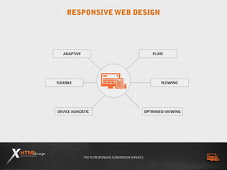


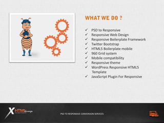


Responsive web design (RWD) allows websites to automatically adapt their layout to different screen sizes and devices. It provides an optimal viewing and interaction experience across a wide range of devices without the need for separate mobile websites. The document discusses the benefits of RWD, including allowing websites to adapt to different devices, saving time and money by eliminating separate mobile sites, improving usability across all devices, and boosting search engine optimization. It also provides an overview of the key technologies used in RWD like HTML5, CSS3, and media queries.


![Intro to Adaptive Web Design [ChaDev Lunch]](https://cdn.slidesharecdn.com/ss_thumbnails/introtoadaptivewebdesign-140414092630-phpapp02-thumbnail.jpg?width=640&height=640&fit=bounds)


