Download as KEY, PPTX
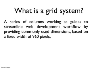

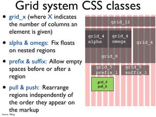
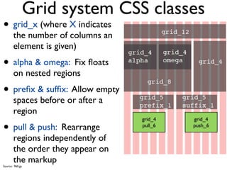


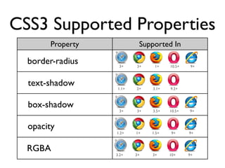


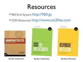


This document provides an introduction to visually appealing web design using CSS3. It discusses the 960 grid system as a framework for streamlining web development workflow. Key elements of great design such as color, texture, white space and typography are covered. The document also outlines supported CSS3 properties that are widely adopted like border-radius, text-shadow and box-shadow. Hands-on practice with these techniques is encouraged along with additional resources for further learning.