The Strokes
•Download as PPTX, PDF•
0 likes•67 views
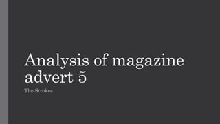
The advertisement uses the album cover art as the main image to effectively familiarize readers with what to look for. It draws attention through its bright colors and quirky shapes. The band name is written in a large, bold black font that stands out against the yellow background, forcing readers to take notice. Reviews are also featured to show other positive opinions and encourage readers to listen to the album. All key information like the band name and album title is placed at the top for clarity, since the bottom half contains a chaotic pattern that would make text difficult to read.
Report
Share
Report
Share

Recommended
SUPERBOWL adverts and endgame trailer
superbowl adverts in blue and the endgame trailer in orange annotations of the trailers and adverts school work in media studies
Billboard questionnaire
The questionnaire aims to gather consumer information about billboard advertisements for a regional magazine to help create a media product that meets consumer needs and targets a specific audience. It asks respondents about their preferences for colors, image styles, locations to place posters, inclusion of social media references, use of celebrities, attention paid to billboards, and influence of billboards on magazine purchases.
Task 8
The document summarizes the results of audience research for a music magazine. Key findings include:
1) The target audience prefers a variety of music genres and for the magazine to use bright colors like pink, blue, and white.
2) Readers enjoy full-page celebrity photos more than several smaller celebrity photos and like to receive free gifts with the magazine.
3) They are more interested in reading about the latest music charts than celebrity tweets and prefer articles with text speech and emoticons.
4) The audience likes articles about both male and female artists and musicians.
Task 7
The document outlines questions for a focus group interview about preferences for a magazine cover and content. It asks whether participants prefer a single celebrity image or multiple smaller ones on the cover, if the writing style suits the target audience, and if brighter colors make articles more engaging. It also asks about listening habits for pop music, preferences for cover design organization, likes and dislikes of one cover, and expectations for music charts in the magazine.
Audience research
The document discusses audience research conducted to inform the creation of promotional materials for a trailer, magazine, and poster targeting young people aged 15+. The research involved developing questions on the synopsis, poster, and magazine to ask the target audience through social media and in-person. Over 20 people provided feedback on their preferences. The results will be used to design final products that appeal to the target audience.
Research
The target audience for the magazine is males aged 15-25 who enjoy hip-hop music. To appeal to this audience, the magazine will feature popular hip-hop artists on the cover and in articles to attract fans of those artists. It will also include escapist content in articles that allows readers to engage with the hip-hop culture. As this demographic is generally middle/lower class, the magazine provides an affordable way to connect with hip-hop music and culture.
Focus group and feedback
The document discusses using focus groups to gather feedback on a media business or product. It notes that focus groups provide a grassroots way to understand perceptions of a company versus competitors. They can obtain detailed opinions and feelings from participants in a time and cost-effective way. The document then describes a focus group conducted for a music video project. The feedback was overall positive, indicating audiences understood the intended rebellious genre and cohesive elements across products. However, some technical aspects of the video were questioned but were actually intentional design choices alluding to conventions of similar past videos.
Hazardousness of common sense
People believe the common sense is common to everyone. And people believe what they see is what it is. But if you are a software designer, you fill face a large difficulty or hard challenge if you don't doubt about what customer say. Sometimes common sense is very hazardous.
This presentation explains why the common sense is hazardous. And this slides give you the hint to avoid the tragedy in software development.
Lo4 pro forma
This marketing and PR presentation outlines a campaign to promote a new alternative rock band called Theon Junior and their album "You can tell". The objectives are to target young adults and teenagers, sell 1 million records, and make the band popular among a large audience. The campaign would use social media, magazines, TV, radio, and merchandise to promote the band. Key messages are that the band creates exciting new music that appeals to youth through their style and contemporary influences. Events like secret shows and in-store signings would help generate buzz. The goals are achievable if the band receives proper promotion and their music resonates with listeners.
Representation of teenagers
This document provides an overview of key concepts for analyzing media representations of teenagers, including refraction, stereotyping, cultivation theory, and desensitization. It also outlines an activity where students will analyze shots and sounds in the opening scene of the film Harry Brown to understand how the director presents British teenagers.
Analyzing political cartoons
This document outlines lessons for analyzing political cartoons. It includes 5 sessions to develop critical questions, evaluate cartoons, identify and explain elements, and analyze meaning. Session 1 has students reflect on questions. Session 2 discusses analyzing cartoons. Sessions 3 and 4 have students discuss and reflect and relate cartoons to real issues. Session 5 involves student presentations on political cartoons. The goal is to teach students how to interpret political cartoons and understand the messages they convey.
Questionnaire review unit 5
The document summarizes the responses from a questionnaire about a presentation on murals. For qualitative questions, most respondents said they learned about traditional and non-traditional murals from the presentation and found the murals colorful, unique, and imaginative. For quantitative questions, most respondents indicated that they enjoyed the presentation, thought the speakers spoke loudly enough, and found the murals grabbed their attention and were colorful. Overall, the feedback suggested the presentation and murals were well-received and informative.
Music magazine analysis
The magazine cover features Drake and proclaims him as "Hip-Hop's New Religion". The main image of Drake conforms to magazine conventions by showing him facing the camera in a mid-shot. The use of bold colors and fonts draws attention and stands out against the dark background. The target audience is teenagers aged 16 and up as they are more likely to listen to Drake than adults.
Feedback from my target audience
Rebecca Stanley surveyed her target audience about a magazine concept called "POP PARTY" to get feedback on the front cover, contents page, and double page spread. She handed out copies of these pages along with a questionnaire that asked respondents about their gender, age, music tastes, interest in buying the magazine, ratings of the text and designs, and overall marks out of 10 for each page. The feedback provided quantitative data to help Rebecca improve her magazine materials.
Bruce springstein textual analysis
Bruce Springsteen's 1984 album "Born in the USA" features a mid-shot photo of his back against an American flag, wearing jeans and a t-shirt to relate to working-class citizens. The image is meant to portray Springsteen's political views on America in a subtle yet impactful way, using national symbols to start a discussion. The tight jeans and placement of a red cap draw attention to Springsteen's backside in a way that appeals to both male and female fans. Overall, the simple yet eye-catching cover art effectively conveys Springsteen's passion for his music and message through iconic American imagery and colors.
Task 4 critical approchaes
Participatory media allows audiences to interact with and discuss the media they consume through various social media platforms. Audiences share their views on TV shows, movies, music and more on sites like Facebook, Twitter, and Tumblr. These discussions help audiences connect with others who have similar interests and debate different perspectives. Reality TV shows like I'm A Celebrity...Get Me Out of Here! actively encourage audience participation through voting and sharing opinions on social media, which boosts viewer engagement with the shows. Fan culture is also a form of participatory media, where fans take an active role in the media they enjoy through writing fan fiction, attending fan conventions, and purchasing merchandise bearing logos and characters from their favorite movies, books and other
Front cover analysis
This document analyzes magazine covers from Kerrang!, Rock Sound, and Alternative Press magazines. It discusses various design elements of the covers including images, layouts, fonts, and color schemes. The target audience for these magazines is identified as teenagers and young adults aged 15-21 interested in rock and alternative music genres. Specific bands and artists featured on the covers are examined in terms of attracting readers and representing the styles of music covered in each magazine.
Horror magazine analysis
This magazine cover features a dominant image from the horror film Sweeney Todd that is meant to draw in audiences. Additional film images and headings about actors and directors are included to target a wide audience. The masthead uses a fun font related to the horror genre with red and white colors that stand out against the dark background. The cover is kept simple without promotions or barcodes, requiring audiences to buy the magazine to learn more about the featured films.
Music magazine analysis
The magazine cover features Drake and proclaims him as "Hip-Hop's New Religion". It uses bold colors and fonts to draw attention and features Drake in a mid-shot facing the camera, conforming to magazine conventions. The target audience is teenagers aged 16+ as they are more likely to listen to Drake than adults, and the banner advertises other artists teens may like to encourage sales.
Task 7
The document summarizes the results of a questionnaire conducted to research the target audience for a pop music magazine. Key findings include:
- The majority of respondents were teenage girls aged 16-17, indicating the right target age group was reached.
- Bright color schemes, solo artists, noticeable makeup, and photos of artists "in the moment" were most popular.
- Articles on artists, festival reviews, and fashion/makeup will be featured based on popularity.
- A female model on the cover and pricing the magazine at £2 were also supported by the research.
Magazine analysis
The document analyzes the magazine cover and contents page design of various music magazines. It discusses design elements like the masthead, images, color schemes, fonts and layouts used and how they appeal to target audiences. For the magazine covers, it examines how the large central images of bands, use of high contrast colors and direct eye contact from the bands help grab readers' attention. The contents pages feature bold section headings, a band index and promotional ads to easily guide readers to articles of interest and encourage future purchases. Overall the document provides a detailed breakdown of the visual design strategies employed across different music magazine publications.
Magazine analysis
The document analyzes the magazine cover and contents page design of different music magazines. It discusses various design elements and how they are used to attract audiences. For the magazine cover, it examines the use of images, logos, fonts, layout, and color schemes. It notes how these elements are tailored for the target readership and genre of music featured. For the contents page, it discusses the organization of content sections, use of headings, images and advertisements. Across magazines, there is consistency in branding elements but also uniqueness in design to suit the publication's style of music coverage.
Green day – american idiot
The magazine advertisement for Green Day's 2004 album "American Idiot" uses a simple color scheme of black, white, and red to make the text and image stand out. It features only the band's name and album title in the band's own font in the top left corner to draw the eye and maintain an air of mystery. The sole image is of a hand holding a heart-shaped grenade, representing a song about holding one's heart "like a hand grenade." Using the same design as the album cover creates synergy between the advert and album, making the album easily recognizable to potential buyers.
Green day – american idiot
The document analyzes the magazine advertisement for Green Day's 2004 album "American Idiot". The ad uses a simple color scheme of black, white, and red to make the text and image stand out. It only includes the band name and album title, keeping the content mysterious. The placement of text in the top left catches the reader's eye. The same font is used throughout, creating consistency with other Green Day products. The sole image depicts a heart-shaped grenade, representing a song's lyrics and themes of patriotism and dissent. Using the same design as the album cover creates recognition between the ad and product.
Ancillary 2 anaylsis
The font used in the advert is large and bold to stand out from other fonts and be memorable. A pink color was added to portray a feminist view, though the sexualized images of women contrast this. The main image takes up the most space to indicate her importance and draw attention, potentially leading viewers to research her and the album. Background details like the CD and release date information help viewers find and engage with the album. The plain background makes the colorful text and images pop out to attract and engage the audience.
Album ad
The poster advertises a concert tour for a rock band. It prominently displays the band's name and logo at the top to draw the viewer's eye. It also features an iconic image of the band's lead singer to give viewers a sense of their style. Additional information like the concert dates and featured opening acts are included in large, clear font to attract attention and convey key details about the event. The colorful, eye-catching design is representative of the band's unconventional aesthetic.
Magazine advert analysis
The magazine advertisement promotes a new album by the band Florence and the Machine. The band's name is displayed prominently at the top in a unique font that represents their style. The main image is the album cover featuring the singer laying among flowers, emphasizing the band's female audience. Additional details like the album name, release date, and ways to obtain the album are also provided in an organized manner. The neutral color scheme and vintage-style imagery are meant to represent the band's calm, collected music.
Magazine advertisement convention
This magazine advertisement promotes an upcoming Green Day concert and album. It features the band's recognizable logo and photos of each band member. The ad informs fans that they can find news and ticket purchase information on the band's social media and website. It also names some of the famous singles that will be on the new album to excite both current and new fans. A quote from NME indicates the album will be good quality.
Magazine advert analysis
The document analyzes magazine advertisements for several albums. It discusses design elements like fonts, images, colors and layouts used in ads for albums by Florence and the Machine, Panic! At the Disco, and Mumford & Sons. Key information highlighted includes the featured artists, album titles, release dates, record labels, and ways fans can listen to or purchase the albums. Elements are described that identify the bands, draw attention to the ads, market the albums to fans, and promote both the music and production companies.
Analysing nme dizzee cover prep for blog ppt
The document analyzes the front covers of three magazines - NME, Kerrang, and Top of the Pops - and summarizes their target audiences based on design elements. For NME, targeting males aged 17-30, the analysis highlights the use of masculine colors, artist selection, and focus on the genre of the featured artist Dizzie Rascal. Kerrang targets rock fans with its masthead design, featured band Foo Fighters, and focus on rock music in articles and ads. Top of the Pops targets young girls aged 8-14 with its feminine colors, focus on celebrities from High School Musical, and emphasis on celebrity gossip.
More Related Content
What's hot
Lo4 pro forma
This marketing and PR presentation outlines a campaign to promote a new alternative rock band called Theon Junior and their album "You can tell". The objectives are to target young adults and teenagers, sell 1 million records, and make the band popular among a large audience. The campaign would use social media, magazines, TV, radio, and merchandise to promote the band. Key messages are that the band creates exciting new music that appeals to youth through their style and contemporary influences. Events like secret shows and in-store signings would help generate buzz. The goals are achievable if the band receives proper promotion and their music resonates with listeners.
Representation of teenagers
This document provides an overview of key concepts for analyzing media representations of teenagers, including refraction, stereotyping, cultivation theory, and desensitization. It also outlines an activity where students will analyze shots and sounds in the opening scene of the film Harry Brown to understand how the director presents British teenagers.
Analyzing political cartoons
This document outlines lessons for analyzing political cartoons. It includes 5 sessions to develop critical questions, evaluate cartoons, identify and explain elements, and analyze meaning. Session 1 has students reflect on questions. Session 2 discusses analyzing cartoons. Sessions 3 and 4 have students discuss and reflect and relate cartoons to real issues. Session 5 involves student presentations on political cartoons. The goal is to teach students how to interpret political cartoons and understand the messages they convey.
Questionnaire review unit 5
The document summarizes the responses from a questionnaire about a presentation on murals. For qualitative questions, most respondents said they learned about traditional and non-traditional murals from the presentation and found the murals colorful, unique, and imaginative. For quantitative questions, most respondents indicated that they enjoyed the presentation, thought the speakers spoke loudly enough, and found the murals grabbed their attention and were colorful. Overall, the feedback suggested the presentation and murals were well-received and informative.
Music magazine analysis
The magazine cover features Drake and proclaims him as "Hip-Hop's New Religion". The main image of Drake conforms to magazine conventions by showing him facing the camera in a mid-shot. The use of bold colors and fonts draws attention and stands out against the dark background. The target audience is teenagers aged 16 and up as they are more likely to listen to Drake than adults.
Feedback from my target audience
Rebecca Stanley surveyed her target audience about a magazine concept called "POP PARTY" to get feedback on the front cover, contents page, and double page spread. She handed out copies of these pages along with a questionnaire that asked respondents about their gender, age, music tastes, interest in buying the magazine, ratings of the text and designs, and overall marks out of 10 for each page. The feedback provided quantitative data to help Rebecca improve her magazine materials.
Bruce springstein textual analysis
Bruce Springsteen's 1984 album "Born in the USA" features a mid-shot photo of his back against an American flag, wearing jeans and a t-shirt to relate to working-class citizens. The image is meant to portray Springsteen's political views on America in a subtle yet impactful way, using national symbols to start a discussion. The tight jeans and placement of a red cap draw attention to Springsteen's backside in a way that appeals to both male and female fans. Overall, the simple yet eye-catching cover art effectively conveys Springsteen's passion for his music and message through iconic American imagery and colors.
Task 4 critical approchaes
Participatory media allows audiences to interact with and discuss the media they consume through various social media platforms. Audiences share their views on TV shows, movies, music and more on sites like Facebook, Twitter, and Tumblr. These discussions help audiences connect with others who have similar interests and debate different perspectives. Reality TV shows like I'm A Celebrity...Get Me Out of Here! actively encourage audience participation through voting and sharing opinions on social media, which boosts viewer engagement with the shows. Fan culture is also a form of participatory media, where fans take an active role in the media they enjoy through writing fan fiction, attending fan conventions, and purchasing merchandise bearing logos and characters from their favorite movies, books and other
Front cover analysis
This document analyzes magazine covers from Kerrang!, Rock Sound, and Alternative Press magazines. It discusses various design elements of the covers including images, layouts, fonts, and color schemes. The target audience for these magazines is identified as teenagers and young adults aged 15-21 interested in rock and alternative music genres. Specific bands and artists featured on the covers are examined in terms of attracting readers and representing the styles of music covered in each magazine.
Horror magazine analysis
This magazine cover features a dominant image from the horror film Sweeney Todd that is meant to draw in audiences. Additional film images and headings about actors and directors are included to target a wide audience. The masthead uses a fun font related to the horror genre with red and white colors that stand out against the dark background. The cover is kept simple without promotions or barcodes, requiring audiences to buy the magazine to learn more about the featured films.
Music magazine analysis
The magazine cover features Drake and proclaims him as "Hip-Hop's New Religion". It uses bold colors and fonts to draw attention and features Drake in a mid-shot facing the camera, conforming to magazine conventions. The target audience is teenagers aged 16+ as they are more likely to listen to Drake than adults, and the banner advertises other artists teens may like to encourage sales.
Task 7
The document summarizes the results of a questionnaire conducted to research the target audience for a pop music magazine. Key findings include:
- The majority of respondents were teenage girls aged 16-17, indicating the right target age group was reached.
- Bright color schemes, solo artists, noticeable makeup, and photos of artists "in the moment" were most popular.
- Articles on artists, festival reviews, and fashion/makeup will be featured based on popularity.
- A female model on the cover and pricing the magazine at £2 were also supported by the research.
What's hot (12)
Similar to The Strokes
Magazine analysis
The document analyzes the magazine cover and contents page design of various music magazines. It discusses design elements like the masthead, images, color schemes, fonts and layouts used and how they appeal to target audiences. For the magazine covers, it examines how the large central images of bands, use of high contrast colors and direct eye contact from the bands help grab readers' attention. The contents pages feature bold section headings, a band index and promotional ads to easily guide readers to articles of interest and encourage future purchases. Overall the document provides a detailed breakdown of the visual design strategies employed across different music magazine publications.
Magazine analysis
The document analyzes the magazine cover and contents page design of different music magazines. It discusses various design elements and how they are used to attract audiences. For the magazine cover, it examines the use of images, logos, fonts, layout, and color schemes. It notes how these elements are tailored for the target readership and genre of music featured. For the contents page, it discusses the organization of content sections, use of headings, images and advertisements. Across magazines, there is consistency in branding elements but also uniqueness in design to suit the publication's style of music coverage.
Green day – american idiot
The magazine advertisement for Green Day's 2004 album "American Idiot" uses a simple color scheme of black, white, and red to make the text and image stand out. It features only the band's name and album title in the band's own font in the top left corner to draw the eye and maintain an air of mystery. The sole image is of a hand holding a heart-shaped grenade, representing a song about holding one's heart "like a hand grenade." Using the same design as the album cover creates synergy between the advert and album, making the album easily recognizable to potential buyers.
Green day – american idiot
The document analyzes the magazine advertisement for Green Day's 2004 album "American Idiot". The ad uses a simple color scheme of black, white, and red to make the text and image stand out. It only includes the band name and album title, keeping the content mysterious. The placement of text in the top left catches the reader's eye. The same font is used throughout, creating consistency with other Green Day products. The sole image depicts a heart-shaped grenade, representing a song's lyrics and themes of patriotism and dissent. Using the same design as the album cover creates recognition between the ad and product.
Ancillary 2 anaylsis
The font used in the advert is large and bold to stand out from other fonts and be memorable. A pink color was added to portray a feminist view, though the sexualized images of women contrast this. The main image takes up the most space to indicate her importance and draw attention, potentially leading viewers to research her and the album. Background details like the CD and release date information help viewers find and engage with the album. The plain background makes the colorful text and images pop out to attract and engage the audience.
Album ad
The poster advertises a concert tour for a rock band. It prominently displays the band's name and logo at the top to draw the viewer's eye. It also features an iconic image of the band's lead singer to give viewers a sense of their style. Additional information like the concert dates and featured opening acts are included in large, clear font to attract attention and convey key details about the event. The colorful, eye-catching design is representative of the band's unconventional aesthetic.
Magazine advert analysis
The magazine advertisement promotes a new album by the band Florence and the Machine. The band's name is displayed prominently at the top in a unique font that represents their style. The main image is the album cover featuring the singer laying among flowers, emphasizing the band's female audience. Additional details like the album name, release date, and ways to obtain the album are also provided in an organized manner. The neutral color scheme and vintage-style imagery are meant to represent the band's calm, collected music.
Magazine advertisement convention
This magazine advertisement promotes an upcoming Green Day concert and album. It features the band's recognizable logo and photos of each band member. The ad informs fans that they can find news and ticket purchase information on the band's social media and website. It also names some of the famous singles that will be on the new album to excite both current and new fans. A quote from NME indicates the album will be good quality.
Magazine advert analysis
The document analyzes magazine advertisements for several albums. It discusses design elements like fonts, images, colors and layouts used in ads for albums by Florence and the Machine, Panic! At the Disco, and Mumford & Sons. Key information highlighted includes the featured artists, album titles, release dates, record labels, and ways fans can listen to or purchase the albums. Elements are described that identify the bands, draw attention to the ads, market the albums to fans, and promote both the music and production companies.
Analysing nme dizzee cover prep for blog ppt
The document analyzes the front covers of three magazines - NME, Kerrang, and Top of the Pops - and summarizes their target audiences based on design elements. For NME, targeting males aged 17-30, the analysis highlights the use of masculine colors, artist selection, and focus on the genre of the featured artist Dizzie Rascal. Kerrang targets rock fans with its masthead design, featured band Foo Fighters, and focus on rock music in articles and ads. Top of the Pops targets young girls aged 8-14 with its feminine colors, focus on celebrities from High School Musical, and emphasis on celebrity gossip.
Analyzing Magazine Album Advertisement
This poster advertisement is promoting Green Day's new album. At the top in large red font are the words "THE WAIT IS FINALLY OVER..." representing the genre of music. The band's name is written in the font used on their albums and merchandise to introduce their new style. The picture in the center is the album cover so people know what to look for. Release information like the date of May 15th is in bold white writing to highlight important details and generate excitement for the release. At the bottom it mentions the single "KNOW YOUR ENEMY" to get people interested in the album.
Analysis of professional magazine covers
The document analyzes the design elements of a professional magazine cover. It discusses how each element is designed to stand out and catch the reader's attention. The masthead uses a bold font and shadow to identify the magazine title. The main image features the recognizable band looking directly at the reader to create a connection. The band member's facial expressions and positioning also convey the magazine's genre. The headline uses a large, distinctive font and green color, related to the band Green Day, to draw the eye. Cover lines are in high-contrast colors and fonts to stand out from the background. Additional elements like the skyline and information box are also designed to visually separate and be noticeable to readers.
Mediaaaaaa
The magazine cover uses bold colors and imagery of recognizable band members to attract its target young adult audience. Black and yellow dominate the cover to imply danger and rebellion, appealing to this demographic. Large capitalized text and a "shattered" masthead create the impression that this magazine breaks conventions. Pictures of bands the audience follows like Paramore and All Time Low encourage purchase by implying insider access. Posed shots invite the viewer in while selling the magazine's music focus. Additional band member images and promises of exclusive content further incentivize buying the issue.
magazine poster analysis
This poster advertises Katy Perry's album. It uses bright pink colors and features a large image of Katy Perry in the garden setting from the album cover to target her core audience of "girly girls". It prominently displays the album name and release date, as well as the name of a hit single, to inform viewers about the album and attract their interest. The poster also includes Katy Perry's website to provide additional information and opportunities to purchase the album.
Music magazine front cover analysis
The Kerrang magazine cover uses distinctive design elements to attract rock music fans. The smashed glass font of the masthead is instantly recognizable and represents the wild image of rock music. The cover photo features a band giving direct address with diverse emotional expressions to seem relatable to different fans. As popular figures in rock, the band members cover part of the masthead and are the main attraction of the issue. The large centered headline promotes the featured band in contrasting color to stand out. Minimal cover lines employ images to seem less text-heavy while still promoting content.
Route of the eye punk
The document analyzes the cover of a punk music magazine. It discusses the use of bold, contrasting colors that break norms to represent the punk genre. It also notes the even distribution of band members makes the cover look organized while still maintaining a messy, disorganized style associated with punk. The magazine title uses a bold font that stands out and the deals and names of bands are the first things that catch the eye of the target audience.
Evaluation 3
The document discusses the design elements used on the front cover of an "indie rock" music magazine to attract the target audience. These include:
1) The masthead uses a large, bold font to clearly display the magazine title and communicate the genre of music featured. Bursts above the masthead advertise free downloads and the top 40 songs to draw readers in.
2) Sell lines promote competitions and artists like Lana Del Rey to engage readers interested in concerts. Emphasis is added through color.
3) Freebies like posters are advertised to incentivize purchases, using imagery and contrasting fonts.
4) The unconventional main image in black and white portrays the "ind
Magazine Double Page Spread Research
This document discusses several rock music magazine double page spreads (DPS), analyzing their layout, design, and use of images and colors to appeal to audiences. Key points made include:
- DPS feature well-known bands to attract mainstream audiences and increase sales. Photos are configured to identify band leaders and styles suit genres like heavy metal.
- Dark colors, violence themes, and aged backgrounds portray bands as mysterious and appeal to older rock audiences. Facial tattoos also suit some genres.
- Recognizable bands and catchy titles draw readers' attention. Stereotypical rock styles and defiance themes create a sense of rebellion.
- Configurations identify band leaders. Coordinated colors
Research for digipaks
The document contains magazine advertisements for albums by various artists. Each advertisement prominently features the album artwork and uses bold, contrasting colors and fonts for the album and artist names to stand out. They also include reviews, ratings, and release dates to promote the albums. Key similarities between the advertisements are their use of the original album artwork as the background, capitalized bold album/artist names in a contrasting color, white text, displayed reviews/ratings, and release dates.
Front cover analysis
The document provides an in-depth analysis of the layout, design elements, and branding of the front cover of the magazine NME. Key elements include the consistent placement of the masthead in the top left corner, use of bold red and white colors, and capitalized font to maintain a bold yet simple brand identity. Main sell lines are prominently placed and use attention-grabbing phrases and imagery to intrigue and inform readers about featured articles and bands. Color schemes, photographs, and other visual elements are designed to represent genres and appeal to target audiences. The overall layout aims to clearly promote content in an uncluttered manner.
Similar to The Strokes (20)
More from jriley89
The last crusade
This document analyzes the layout, design elements, and effectiveness of a magazine advertisement for "The Last Crusade". The two-page ad uses a large black and white image of Bob Marley that spans both pages. Text on the left provides information about the subject in all capital letters and features splashes of colored text highlighting important names. The simple black and white image allows the reader to focus on Marley without distraction. Overall, the ad demonstrates how importance can be conveyed through a double-page spread that highlights key details through strategic use of images, font, and color.
Little hell
This document analyzes an advertisement in a magazine for a band called "Little Hell". The summary is:
1) The advertisement contains only text with a rainbow background but no image of the band. Additional information like the record company and release date are in small print at the bottom.
2) The font used does not have any capital letters, making it unclear what the band and album names are. However, the white font stands out against the colored background.
3) The analysis concludes the advertisement could be improved by using clearer font with capitalization, separating the band and album names, and including the band's logo.
Grimes
This document analyzes an advertisement for Grimes' new album in the electronic dance music genre. The ad features an image of Grimes photoshopped onto her own album artwork, staying true to her artistic vision. Black and white artwork makes her pink hair stand out, and the ad uses pink and green boxes to separate text from the image. The cool tones of the ad give it a gentle feel, but this is contradicted by the vibrant background art, reflecting Grimes' style of finding beauty in the unusual in her electronic dance music.
Greenday
(1) The magazine advertisement analyzes features an image of Green Day lead singer Billie Joe Armstrong to grab attention of their target punk rock audience. (2) The font used for "Green Day" has scratches to add a grubby vibe, while the song title font looks almost heartbroken to relate to the song. (3) Dark black and grey colors were chosen to represent the punk rock vibe and stereotypes, making Armstrong's black hair and makeup stand out against the gloomy image.
Flume
Flume is an Australian electronic music producer whose 2016 song "Never Be Like You" featuring Kai has received over 79 million YouTube views and 6.5 million monthly Spotify listeners. Electronic dance music has been one of the most popular music genres worldwide for decades, evolving from 1990s techno into various subgenres like house, trance, and dubstep. The target audience for electronic dance music tends to be younger, from teenagers to young adults, especially those in high school, college, or university who enjoy the party-style music culture.
More from jriley89 (6)
Recently uploaded
哪里购买(ucr毕业证书)美国加州大学河滨分校毕业证研究生文凭证书原版一模一样
原版定制【微信:bwp0011】《(ucr毕业证书)美国加州大学河滨分校毕业证研究生文凭证书》【微信:bwp0011】成绩单 、雅思、外壳、留信学历认证永久存档查询,采用学校原版纸张、特殊工艺完全按照原版一比一制作(包括:隐形水印,阴影底纹,钢印LOGO烫金烫银,LOGO烫金烫银复合重叠,文字图案浮雕,激光镭射,紫外荧光,温感,复印防伪)行业标杆!精益求精,诚心合作,真诚制作!多年品质 ,按需精细制作,24小时接单,全套进口原装设备,十五年致力于帮助留学生解决难题,业务范围有加拿大、英国、澳洲、韩国、美国、新加坡,新西兰等学历材料,包您满意。
【业务选择办理准则】
一、工作未确定,回国需先给父母、亲戚朋友看下文凭的情况,办理一份就读学校的毕业证【微信bwp0011】文凭即可
二、回国进私企、外企、自己做生意的情况,这些单位是不查询毕业证真伪的,而且国内没有渠道去查询国外文凭的真假,也不需要提供真实教育部认证。鉴于此,办理一份毕业证【微信bwp0011】即可
三、进国企,银行,事业单位,考公务员等等,这些单位是必需要提供真实教育部认证的,办理教育部认证所需资料众多且烦琐,所有材料您都必须提供原件,我们凭借丰富的经验,快捷的绿色通道帮您快速整合材料,让您少走弯路。
留信网认证的作用:
1:该专业认证可证明留学生真实身份
2:同时对留学生所学专业登记给予评定
3:国家专业人才认证中心颁发入库证书
4:这个认证书并且可以归档倒地方
5:凡事获得留信网入网的信息将会逐步更新到个人身份内,将在公安局网内查询个人身份证信息后,同步读取人才网入库信息
6:个人职称评审加20分
7:个人信誉贷款加10分
8:在国家人才网主办的国家网络招聘大会中纳入资料,供国家高端企业选择人才
【关于价格问题(保证一手价格)】
我们所定的价格是非常合理的,而且我们现在做得单子大多数都是代理和回头客户介绍的所以一般现在有新的单子 我给客户的都是第一手的代理价格,因为我想坦诚对待大家 不想跟大家在价格方面浪费时间
对于老客户或者被老客户介绍过来的朋友,我们都会适当给一些优惠。
一比一原版(BC毕业证)波士顿学院毕业证如何办理
BC毕业证学历书【微信95270640】办理波士顿学院毕业证成绩单(Q微信95270640)毕业证学历认证OFFER专卖国外文凭学历学位证书办理澳洲文凭|澳洲毕业证,澳洲学历认证,澳洲成绩单 澳洲offer,教育部学历认证及使馆认证永久可查 ,国外毕业证|国外学历认证,国外学历文凭证书 BC毕业证,BC毕业证,BC毕业证,BC毕业证,BC毕业证,BC毕业证,BC毕业证,专业为留学生办理毕业证、成绩单、使馆留学回国人员证明、教育部学历学位认证、录取通知书、Offer、
专业为留学生办理波士顿学院波士顿学院本科学位证成绩单【100%存档可查】留学全套申请材料办理。本公司承诺所有毕业证成绩单成品全部按照学校原版工艺对照一比一制作和学校一样的羊皮纸张保证您证书的质量!
如果你回国在学历认证方面有以下难题请联系我们我们将竭诚为你解决认证瓶颈
1所有材料真实但资料不全无法提供完全齐整的原件。【如:成绩单丶毕业证丶回国证明等材料中有遗失的。】
2获得真实的国外最终学历学位但国外本科学历就读经历存在问题或缺陷。【如:国外本科是教育部不承认的或者是联合办学项目教育部没有备案的或者外本科没有正常毕业的。】
3学分转移联合办学等情况复杂不知道怎么整理材料的。时间紧迫自己不清楚递交流程的。
如果你是以上情况之一请联系我们我们将在第一时间内给你免费咨询相关信息。我们将帮助你整理认证所需的各种材料.帮你解决国外学历认证难题。
国外波士顿学院波士顿学院本科学位证成绩单办理方法:
1客户提供办理信息:姓名生日专业学位毕业时间等(如信息不确定可以咨询顾问:我们有专业老师帮你查询波士顿学院波士顿学院本科学位证成绩单);
2开始安排制作波士顿学院毕业证成绩单电子图;
3波士顿学院毕业证成绩单电子版做好以后发送给您确认;
4波士顿学院毕业证成绩单电子版您确认信息无误之后安排制作成品;
5波士顿学院成品做好拍照或者视频给您确认;
6快递给客户(国内顺丰国外DHLUPS等快读邮寄)。疯一把山娃算了算这一次足足花了老爸元够他挣上半个月的山娃很不解一向节俭的父亲啥时变得如此阔绰大方大把大把掏钱时居然连眉头也不皱一下车票早买好了直达卧铺车得经过山娃老家门口山娃拒绝父亲送说往车上一躺就等着下车决无丢失的道理有手机在身联系也方便再说他都岁了还有大半车的小伙伴相伴他不怕在父亲千叮咛万嘱咐中山娃依依不舍地爬上车朝窗外不住地挥手别了父亲别了父亲的城别了我的暑假生活我的城市生活望着窗外挥舞的房
Colour Theory for Painting - Fine Artist.pdf
This document is all about Colour Theory for Fine Artist / Painter.
ARNAUVALERY RECORD STORE SCAVENGER HUNT.
This is my presentation for the Record Store Scavenger Hunt.
➒➌➎➏➑➐➋➑➐➐ Dpboss Matka Guessing Satta Matka Kalyan panel Chart Indian Matka ...
➒➌➎➏➑➐➋➑➐➐ Dpboss Matka Guessing Satta Matka Kalyan panel Chart Indian Matka ...➒➌➎➏➑➐➋➑➐➐Dpboss Matka Guessing Satta Matka Kalyan Chart Indian Matka
KALYAN MATKA | MATKA RESULT | KALYAN MATKA TIPS | SATTA MATKA | MATKA.COM | MATKA PANA JODI TODAY | BATTA SATKA | MATKA PATTI JODI NUMBER | MATKA RESULTS | MATKA CHART | MATKA JODI | SATTA COM | FULL RATE GAME | MATKA GAME | MATKA WAPKA | ALL MATKA RESULT LIVE ONLINE | MATKA RESULT | KALYAN MATKA RESULT | DPBOSS MATKA 143 | MAIN MATKA哪里购买美国乔治城大学毕业证硕士学位证书原版一模一样
原版一模一样【微信:741003700 】【美国乔治城大学毕业证硕士学位证书】【微信:741003700 】学位证,留信认证(真实可查,永久存档)offer、雅思、外壳等材料/诚信可靠,可直接看成品样本,帮您解决无法毕业带来的各种难题!外壳,原版制作,诚信可靠,可直接看成品样本。行业标杆!精益求精,诚心合作,真诚制作!多年品质 ,按需精细制作,24小时接单,全套进口原装设备。十五年致力于帮助留学生解决难题,包您满意。
本公司拥有海外各大学样板无数,能完美还原海外各大学 Bachelor Diploma degree, Master Degree Diploma
1:1完美还原海外各大学毕业材料上的工艺:水印,阴影底纹,钢印LOGO烫金烫银,LOGO烫金烫银复合重叠。文字图案浮雕、激光镭射、紫外荧光、温感、复印防伪等防伪工艺。材料咨询办理、认证咨询办理请加学历顾问Q/微741003700
留信网认证的作用:
1:该专业认证可证明留学生真实身份
2:同时对留学生所学专业登记给予评定
3:国家专业人才认证中心颁发入库证书
4:这个认证书并且可以归档倒地方
5:凡事获得留信网入网的信息将会逐步更新到个人身份内,将在公安局网内查询个人身份证信息后,同步读取人才网入库信息
6:个人职称评审加20分
7:个人信誉贷款加10分
8:在国家人才网主办的国家网络招聘大会中纳入资料,供国家高端企业选择人才
❼❷⓿❺❻❷❽❷❼❽ Dpboss Matka ! Fix Satta Matka ! Matka Result ! Matka Guessing ! ...
❼❷⓿❺❻❷❽❷❼❽ Dpboss Matka ! Fix Satta Matka ! Matka Result ! Matka Guessing ! ...❼❷⓿❺❻❷❽❷❼❽ Dpboss Kalyan Satta Matka Guessing Matka Result Main Bazar chart
❼❷⓿❺❻❷❽❷❼❽ Dpboss Matka ! Fix Satta Matka ! Matka Result ! Matka Guessing ! Final Matka ! Matka Result ! Dpboss Matka ! Matka Guessing ! Satta Matta Matka 143 ! Kalyan Matka ! Satta Matka Fast Result ! Kalyan Matka Guessing ! Dpboss Matka Guessing ! Satta 143 ! Kalyan Chart ! Kalyan final ! Satta guessing ! Matka tips ! Matka 143 ! India Matka ! Matka 420 ! matka Mumbai ! Satta chart ! Indian Satta ! Satta King ! Satta 143 ! Satta batta ! Satta मटका ! Satta chart ! Matka 143 ! Matka Satta ! India Matka ! Indian Satta Matka ! Final ank➒➌➎➏➑➐➋➑➐➐ Dpboss Matka Guessing Satta Matka Kalyan panel Chart Indian Matka ...
➒➌➎➏➑➐➋➑➐➐ Dpboss Matka Guessing Satta Matka Kalyan panel Chart Indian Matka ...➒➌➎➏➑➐➋➑➐➐Dpboss Matka Guessing Satta Matka Kalyan Chart Indian Matka
KALYAN MATKA | MATKA RESULT | KALYAN MATKA TIPS | SATTA MATKA | MATKA.COM | MATKA PANA JODI TODAY | BATTA SATKA | MATKA PATTI JODI NUMBER | MATKA RESULTS | MATKA CHART | MATKA JODI | SATTA COM | FULL RATE GAME | MATKA GAME | MATKA WAPKA | ALL MATKA RESULT LIVE ONLINE | MATKA RESULT | KALYAN MATKA RESULT | DPBOSS MATKA 143 | MAIN MATKAHeart Touching Romantic Love Shayari In English with Images
Explore our beautiful collection of Romantic Love Shayari in English to express your love. These heartfelt shayaris are perfect for sharing with your loved one. Get the best words to show your love and care.
My storyboard for a sword fight scene with lightsabers
My storyboard for a sword fight scene with lightsabers
➒➌➎➏➑➐➋➑➐➐ Kalyan Matka Satta Matka Dpboss Matka Guessing Indian Matka
➒➌➎➏➑➐➋➑➐➐ Kalyan Matka Satta Matka Dpboss Matka Guessing Indian Matka➒➌➎➏➑➐➋➑➐➐Dpboss Matka Guessing Satta Matka Kalyan Chart Indian Matka
➒➌➎➏➑➐➋➑➐➐KALYAN MATKA | MATKA RESULT | KALYAN MATKA TIPS | SATTA MATKA | MATKA.COM | MATKA PANA JODI TODAY | BATTA SATKA | MATKA PATTI JODI NUMBER | MATKA RESULTS | MATKA CHART | MATKA JODI | SATTA COM | FULL RATE GAME | MATKA GAME | MATKA WAPKA | ALL MATKA RESULT LIVE ONLINE | MATKA RESULT | KALYAN MATKA RESULT | DPBOSS MATKA 143 | MAIN MATKADpboss Matka Guessing Satta Matta Matka Kalyan Chart Indian Matka
Dpboss Matka Guessing Satta Matta Matka Kalyan Chart Indian Matka➒➌➎➏➑➐➋➑➐➐Dpboss Matka Guessing Satta Matka Kalyan Chart Indian Matka
9356872877Sattamatka.satta.matka.satta matka.kalyan weekly chart.kalyan chart.kalyan jodi chart.kalyan penal chart.kalyan today.kalyan open.fix satta.fix fix fix Satta matka nambar. Dpboss Matka Guessing Satta Matta Matka Kalyan Chart Indian Matka原版制作(UNITO毕业证书)都灵大学毕业证Offer一模一样
学校原件一模一样【微信:741003700 】《(UNITO毕业证书)都灵大学毕业证》【微信:741003700 】学位证,留信认证(真实可查,永久存档)原件一模一样纸张工艺/offer、雅思、外壳等材料/诚信可靠,可直接看成品样本,帮您解决无法毕业带来的各种难题!外壳,原版制作,诚信可靠,可直接看成品样本。行业标杆!精益求精,诚心合作,真诚制作!多年品质 ,按需精细制作,24小时接单,全套进口原装设备。十五年致力于帮助留学生解决难题,包您满意。
本公司拥有海外各大学样板无数,能完美还原。
1:1完美还原海外各大学毕业材料上的工艺:水印,阴影底纹,钢印LOGO烫金烫银,LOGO烫金烫银复合重叠。文字图案浮雕、激光镭射、紫外荧光、温感、复印防伪等防伪工艺。材料咨询办理、认证咨询办理请加学历顾问Q/微741003700
【主营项目】
一.毕业证【q微741003700】成绩单、使馆认证、教育部认证、雅思托福成绩单、学生卡等!
二.真实使馆公证(即留学回国人员证明,不成功不收费)
三.真实教育部学历学位认证(教育部存档!教育部留服网站永久可查)
四.办理各国各大学文凭(一对一专业服务,可全程监控跟踪进度)
如果您处于以下几种情况:
◇在校期间,因各种原因未能顺利毕业……拿不到官方毕业证【q/微741003700】
◇面对父母的压力,希望尽快拿到;
◇不清楚认证流程以及材料该如何准备;
◇回国时间很长,忘记办理;
◇回国马上就要找工作,办给用人单位看;
◇企事业单位必须要求办理的
◇需要报考公务员、购买免税车、落转户口
◇申请留学生创业基金
留信网认证的作用:
1:该专业认证可证明留学生真实身份
2:同时对留学生所学专业登记给予评定
3:国家专业人才认证中心颁发入库证书
4:这个认证书并且可以归档倒地方
5:凡事获得留信网入网的信息将会逐步更新到个人身份内,将在公安局网内查询个人身份证信息后,同步读取人才网入库信息
6:个人职称评审加20分
7:个人信誉贷款加10分
8:在国家人才网主办的国家网络招聘大会中纳入资料,供国家高端企业选择人才
➒➌➎➏➑➐➋➑➐➐ Kalyan Matka Satta Matka Dpboss Matka Guessing Indian Matka
➒➌➎➏➑➐➋➑➐➐ Kalyan Matka Satta Matka Dpboss Matka Guessing Indian Matka➒➌➎➏➑➐➋➑➐➐Dpboss Matka Guessing Satta Matka Kalyan Chart Indian Matka
➒➌➎➏➑➐➋➑➐➐ Kalyan Matka Satta Matka Dpboss Matka Guessing Indian MatkaRecently uploaded (20)
storyboard: Victor and Verlin discussing about top hat
storyboard: Victor and Verlin discussing about top hat
➒➌➎➏➑➐➋➑➐➐ Dpboss Matka Guessing Satta Matka Kalyan panel Chart Indian Matka ...
➒➌➎➏➑➐➋➑➐➐ Dpboss Matka Guessing Satta Matka Kalyan panel Chart Indian Matka ...
❼❷⓿❺❻❷❽❷❼❽ Dpboss Matka ! Fix Satta Matka ! Matka Result ! Matka Guessing ! ...
❼❷⓿❺❻❷❽❷❼❽ Dpboss Matka ! Fix Satta Matka ! Matka Result ! Matka Guessing ! ...
➒➌➎➏➑➐➋➑➐➐ Dpboss Matka Guessing Satta Matka Kalyan panel Chart Indian Matka ...
➒➌➎➏➑➐➋➑➐➐ Dpboss Matka Guessing Satta Matka Kalyan panel Chart Indian Matka ...
Heart Touching Romantic Love Shayari In English with Images
Heart Touching Romantic Love Shayari In English with Images
My storyboard for a sword fight scene with lightsabers
My storyboard for a sword fight scene with lightsabers
➒➌➎➏➑➐➋➑➐➐ Kalyan Matka Satta Matka Dpboss Matka Guessing Indian Matka
➒➌➎➏➑➐➋➑➐➐ Kalyan Matka Satta Matka Dpboss Matka Guessing Indian Matka
Dpboss Matka Guessing Satta Matta Matka Kalyan Chart Indian Matka
Dpboss Matka Guessing Satta Matta Matka Kalyan Chart Indian Matka
➒➌➎➏➑➐➋➑➐➐ Kalyan Matka Satta Matka Dpboss Matka Guessing Indian Matka
➒➌➎➏➑➐➋➑➐➐ Kalyan Matka Satta Matka Dpboss Matka Guessing Indian Matka
The Strokes
- 1. Analysis of magazine advert 5 The Strokes
- 2. Image There is not captured image used for this advert. They have used the album cover art to present their advertisement. I like this idea as it drills into the readers mind, what it is they need to keep an eye out for when buying the album. The bright colours and quirky shapes used becomes very memorable to a reader and they will come back to it. Font ‘THE STROKES’ written across the top of the A4 page immediately draws in the reader who are fans of their music. To someone unknown of the band, The image will certainly draw their attention. The black clearly written font stands out against the vibrant yellow and forces you to look at it. There are big spaces placed between each of the letters in the band name, This implies importance and that every little must not go unread. The band name is done with the bolder font than the name of the album as this demonstrates that it is of more importance or would gain more awareness. The use of reviews have been presented. This is a really good aspect of an advertisement as it shows the reader other peoples opinions and that overall, the album is worth listening to. If something gains good reviews then other people are more likely to go out and listen to it.
- 3. Layout All main and additional information has been presented at the top of the A4 page. This is done as on the initial image used for the magazine (album art cover) There is a chaotic bottom half filled with black and white squares. By having the writing presented here it would look messy and unprofessional. They would also have a difficult time using a colour to stand out against the boxes.