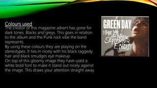
ANALYSIS OF A
MAGAZINE ADVERT
For my first analysis I
wanted to choose a
magazine advert which
Is not a full A4 sheet. As
I am interested in taking
a vertical image. To do
this it would only take
up half of the A4 sheet
and underneath would
be additional
information about the
newly released album/
artist.
Green day is a American Punk rock band. You can see straight away
how this magazine ad relates to their target audience. It has an
almost messy characteristic to it. The image is taken of the lead singer
Billie Joe Armstrong. This will initially grab the audiences attention as
they like the lead singer.
Font used for ‘Green Day’ is all capitalised
and had little scratches taken out of it.
This adds to the grubby vibe they are
aiming for.
Underneath it has the name of one of the
songs from album. This is written in a font
which is almost strained. In relation to the
song, this font works perfectly as it
almost reads heartbroken.
Colours used
The creator of this magazine advert has gone for
dark tones. Blacks and greys. This goes in relation
to the album and the Punk rock vibe the band
represents.
By using these colours they are playing on the
stereotypes. It ties in nicely with his black raggedy
hair and black smudges eye makeup.
On top of this gloomy image they have used a
white bold font to make it stand out nicely against
the image. This draws your attention straight away.

Greenday

  • 1.
  • 2.
    For my firstanalysis I wanted to choose a magazine advert which Is not a full A4 sheet. As I am interested in taking a vertical image. To do this it would only take up half of the A4 sheet and underneath would be additional information about the newly released album/ artist. Green day is a American Punk rock band. You can see straight away how this magazine ad relates to their target audience. It has an almost messy characteristic to it. The image is taken of the lead singer Billie Joe Armstrong. This will initially grab the audiences attention as they like the lead singer. Font used for ‘Green Day’ is all capitalised and had little scratches taken out of it. This adds to the grubby vibe they are aiming for. Underneath it has the name of one of the songs from album. This is written in a font which is almost strained. In relation to the song, this font works perfectly as it almost reads heartbroken.
  • 3.
    Colours used The creatorof this magazine advert has gone for dark tones. Blacks and greys. This goes in relation to the album and the Punk rock vibe the band represents. By using these colours they are playing on the stereotypes. It ties in nicely with his black raggedy hair and black smudges eye makeup. On top of this gloomy image they have used a white bold font to make it stand out nicely against the image. This draws your attention straight away.