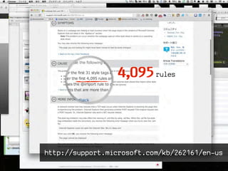
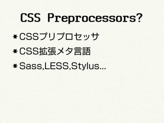
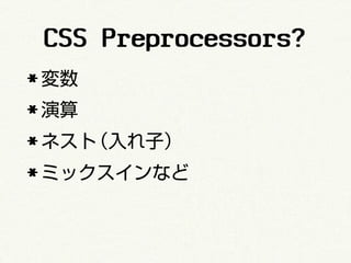
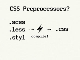
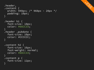
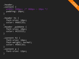
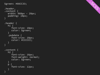
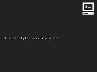
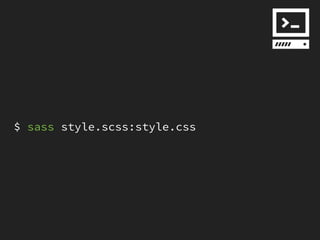
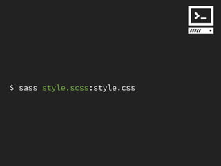
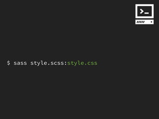
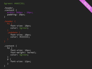
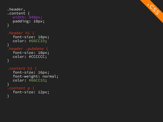
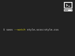
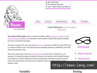
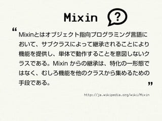
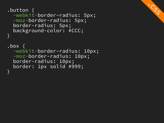
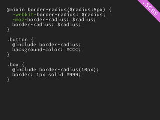
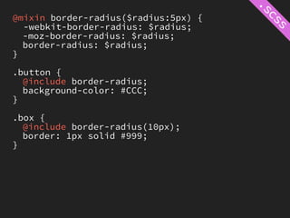
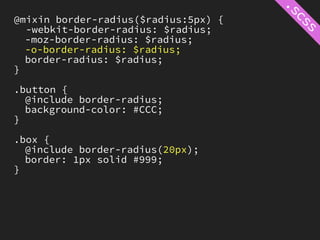
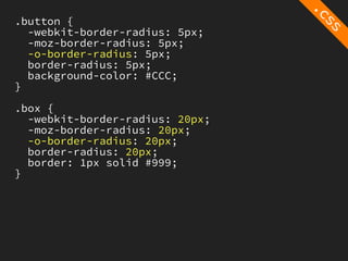
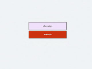
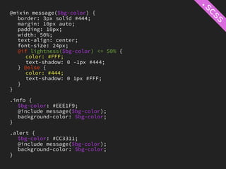
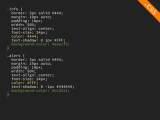
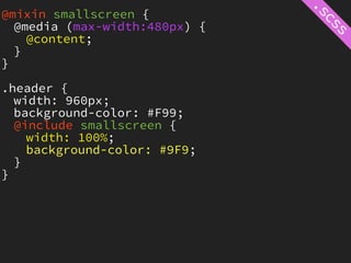
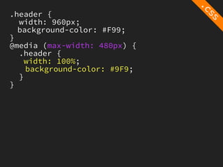
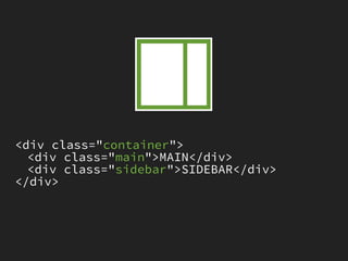
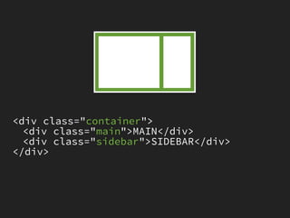
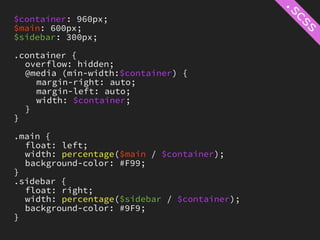
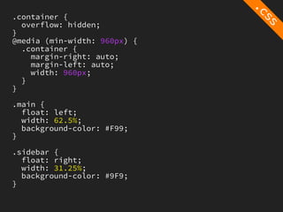
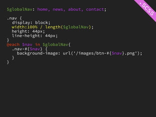
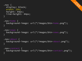
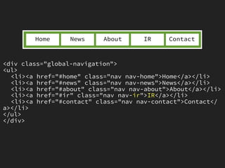
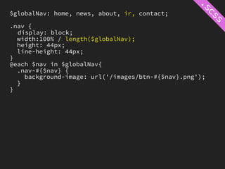
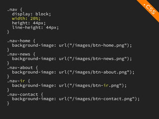
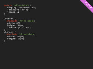
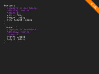
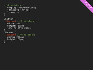
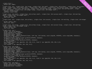
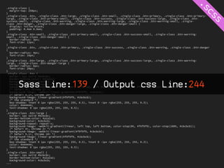
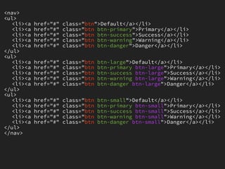
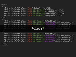
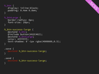
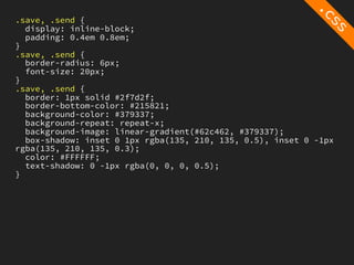
CSS Preprocessors
              The Manual
   Frontrend Vol.3 powered by CyberAgent, Inc.

             Hiroki Tani

                            http://www.flickr.com/photos/theenmoy/6274917102/
Hiroki Tani
Developer @ Cyberagent,Inc
Hiroki Tani   @ hiloki
CSS Preprocessors?
* CSSプリプロセッサ
* CSS拡張メタ言語
* Sass,LESS,Stylus...
CSS Preprocessors?
* 変数
* 演算
* ネスト(入れ子)
* ミックスインなど
CSS Preprocessors?

.scss
.less              .css
.styl   compile!
.header,
.content {
  width: 940px; /* 960px - 20px */
  padding: 10px;
}

.header h1 {
  font-size: 18px;
  color: #66CC33;
}
.header .pubdate {
  font-size: 10px;
  color: #CCCCCC;
}

.content h2 {
  font-size: 16px;
  font-weight: normal;
  color: #66CC33;
}
.content p {
  font-size: 12px;
}
.header,
.content {
  width: 940px; /* 960px - 20px */
  padding: 10px;
}

.header h1 {
  font-size: 18px;
  color: #66CC33;
}
.header .pubdate {
  font-size: 10px;
  color: #CCCCCC;
}

.content h2 {
  font-size: 16px;
  font-weight: normal;
  color: #66CC33;
}
.content p {
  font-size: 12px;
}
.header,
.content {
  width: 940px; /* 960px - 20px */
  padding: 10px;
}

.header h1 {
  font-size: 18px;
  color: #66CC33;
}
.header .pubdate {
  font-size: 10px;
  color: #CCCCCC;
}

.content h2 {
  font-size: 16px;
  font-weight: normal;
  color: #66CC33;
}
.content p {
  font-size: 12px;
}
.header,
.content {
  width: 940px; /* 960px - 20px */
  padding: 10px;
}

.header h1 {
  font-size: 18px;
  color: #66CC33;
}
.header .pubdate {
  font-size: 10px;
  color: #CCCCCC;
}

.content h2 {
  font-size: 16px;
  font-weight: normal;
  color: #66CC33;
}
.content p {
  font-size: 12px;
}
$green: #66CC33;

.header,
.content {
   width: 960px - 20px;
   padding: 10px;
}

.header {
   h1 {
     font-size: 18px;
     color: $green;
   }
   .pubdate {
     font-size: 10px;
     color: #CCCCCC;
   }
}

.content {
   h2 {
     font-size: 16px;
     font-weight: normal;
     color: $green;
   }
   p {
     font-size: 12px;
   }
}
$ sass style.scss:style.css
$green: #66CC33;

.header,
.content {
   width: 960px - 20px;
   padding: 10px;
}

.header {
   h1 {
     font-size: 18px;
     color: $green;
   }
   .pubdate {
     font-size: 10px;
     color: #CCCCCC;
   }
}

.content {
   h2 {
     font-size: 16px;
     font-weight: normal;
     color: $green;
   }
   p {
     font-size: 12px;
   }
}
.header,
.content {
   width: 940px;
   padding: 10px;
}

.header h1 {
   font-size: 18px;
   color: #66CC33;
}
.header .pubdate {
   font-size: 10px;
   color: #CCCCCC;
}

.content h2 {
   font-size: 16px;
   font-weight: normal;
   color: #66CC33;
}
.content p {
   font-size: 12px;
}
$ sass style.scss:style.css
$ sass --watch style.scss:style.css
http://sass-lang.com/
$ gem install sass
$ sass style.scss:style.css
$ gem install sass
$ sass style.scss:style.css
http://lesscss.org/


http://lesscss.org/
$   brew install node
$   brew install npm
$   npm install -g less
$   lessc style.less
$   brew install node
$   brew install npm
$   npm install -g less
$   lessc style.less


                          http://nodejs.org/
http://learnboost.github.com/stylus/
$   brew install node
$   brew install npm
$   npm install -g stylus
$   stylus style.styl
...
http://incident57.com/codekit/
http://livereload.com/
http://mhs.github.com/scout-app/
https://gihyo.jp/dp/ebook/2012/978-4-7741-5123-6
https://gihyo.jp/dp/sp/advent2011/G11C32
http://www.adventar.org/calendars/1
Practice!
Mixin
Mixin
“ Mixinとはオブジェクト指向プログラミング言語に
 おいて、サブクラスによって継承されることにより
 機能を提供し、単体で動作することを意図しないク
 ラスである。Mixin からの継承は、特化の一形態で
 はなく、むしろ機能を他のクラスから集めるための

                                               ”
 手段である。
              http://ja.wikipedia.org/wiki/Mixin
Mixin
ベンダープレフィックスの付与
.button {
  -webkit-border-radius: 5px;
  -moz-border-radius: 5px;
  border-radius: 5px;
  background-color: #CCC;
}

.box {
  -webkit-border-radius: 10px;
  -moz-border-radius: 10px;
  border-radius: 10px;
  border: 1px solid #999;
}
@mixin border-radius($radius:5px) {
  -webkit-border-radius: $radius;
  -moz-border-radius: $radius;
  border-radius: $radius;
}

.button {
  @include border-radius;
  background-color: #CCC;
}

.box {
  @include border-radius(10px);
  border: 1px solid #999;
}
@mixin border-radius($radius:5px) {
  -webkit-border-radius: $radius;
  -moz-border-radius: $radius;
  border-radius: $radius;
}

.button {
  @include border-radius;
  background-color: #CCC;
}

.box {
  @include border-radius(10px);
  border: 1px solid #999;
}
@mixin border-radius($radius:5px) {
  -webkit-border-radius: $radius;
  -moz-border-radius: $radius;
  border-radius: $radius;
}

.button {
  @include border-radius;
  background-color: #CCC;
}

.box {
  @include border-radius(10px);
  border: 1px solid #999;
}
@mixin border-radius($radius:5px) {
  -webkit-border-radius: $radius;
  -moz-border-radius: $radius;
  border-radius: $radius;
}

.button {
  @include border-radius;
  background-color: #CCC;
}

.box {
  @include border-radius(10px);
  border: 1px solid #999;
}
.button {
  -webkit-border-radius: 5px;
  -moz-border-radius: 5px;
  border-radius: 5px;
  background-color: #CCC;
}

.box {
  -webkit-border-radius: 10px;
  -moz-border-radius: 10px;
  border-radius: 10px;
  border: 1px solid #999;
}
@mixin border-radius($radius:5px) {
  -webkit-border-radius: $radius;
  -moz-border-radius: $radius;
  border-radius: $radius;
}

.button {
  @include border-radius;
  background-color: #CCC;
}

.box {
  @include border-radius(10px);
  border: 1px solid #999;
}
@mixin border-radius($radius:5px) {
  -webkit-border-radius: $radius;
  -moz-border-radius: $radius;
  -o-border-radius: $radius;
  border-radius: $radius;
}

.button {
  @include border-radius;
  background-color: #CCC;
}

.box {
  @include border-radius(20px);
  border: 1px solid #999;
}
.button {
  -webkit-border-radius: 5px;
  -moz-border-radius: 5px;
  -o-border-radius: 5px;
  border-radius: 5px;
  background-color: #CCC;
}

.box {
  -webkit-border-radius: 20px;
  -moz-border-radius: 20px;
  -o-border-radius: 20px;
  border-radius: 20px;
  border: 1px solid #999;
}
Mixin
色の明度を判定
@mixin message($bg-color) {
   border: 3px solid #444;
   margin: 10px auto;
   padding: 10px;
   width: 50%;
   text-align: center;
   font-size: 24px;
   @if lightness($bg-color) <= 50% {
     color: #FFF;
     text-shadow: 0 -1px #444;
   } @else {
     color: #444;
     text-shadow: 0 1px #FFF;
   }
}

.info {
   $bg-color: #EEE1F9;
   @include message($bg-color);
   background-color: $bg-color;
}

.alert {
   $bg-color: #CC3311;
   @include message($bg-color);
   background-color: $bg-color;
}
.info {
  border: 3px solid #444;
  margin: 10px auto;
  padding: 10px;
  width: 50%;
  text-align: center;
  font-size: 24px;
  color: #444;
  text-shadow: 0 1px #FFF;
  background-color: #eee1f9;
}

.alert {
  border: 3px solid #444;
  margin: 10px auto;
  padding: 10px;
  width: 50%;
  text-align: center;
  font-size: 24px;
  color: #FFF;
  text-shadow: 0 -1px #444444;
  background-color: #cc3311;
}
Mixin
メディアクエリの設定
@mixin smallscreen {
  @media (max-width:480px) {
    @content;
  }
}

.header {
  width: 960px;
  background-color: #F99;
  @include smallscreen {
    width: 100%;
    background-color: #9F9;
  }
}
.header {
  width: 960px;
  background-color: #F99;
}
@media (max-width: 480px) {
  .header {
    width: 100%;
    background-color: #9F9;
  }
}
Mixin
パーセンテージの計算
<div class="container">
  <div class="main">MAIN</div>
  <div class="sidebar">SIDEBAR</div>
</div>
<div class="container">
  <div class="main">MAIN</div>
  <div class="sidebar">SIDEBAR</div>
</div>
$container: 960px;
$main: 600px;
$sidebar: 300px;

.container {
  overflow: hidden;
  @media (min-width:$container) {
    margin-right: auto;
    margin-left: auto;
    width: $container;
  }
}

.main {
  float: left;
  width: percentage($main / $container);
  background-color: #F99;
}
.sidebar {
  float: right;
  width: percentage($sidebar / $container);
  background-color: #9F9;
}
.container {
  overflow: hidden;
}
@media (min-width: 960px) {
  .container {
    margin-right: auto;
    margin-left: auto;
    width: 960px;
  }
}

.main {
  float: left;
  width: 62.5%;
  background-color: #F99;
}

.sidebar {
  float: right;
  width: 31.25%;
  background-color: #9F9;
}
Mixin
eachを利用したナビゲーション
Home        News        About     Contact


<div class="global-navigation">
<ul>
  <li><a href="#home" class="nav nav-home">Home</a></li>
  <li><a href="#news" class="nav nav-news">News</a></li>
  <li><a href="#about" class="nav nav-about">About</a></li>
  <li><a href="#contact" class="nav nav-contact">Contact</
a></li>
</ul>
</div>
$globalNav: home, news, about, contact;

.nav {
  display: block;
  width:100% / length($globalNav);
  height: 44px;
  line-height: 44px;
}
@each $nav in $globalNav{
  .nav-#{$nav} {
    background-image: url('/images/btn-#{$nav}.png');
  }
}
.nav {
  display: block;
  width: 25%;
  height: 44px;
  line-height: 44px;
}

.nav-home {
  background-image: url("/images/btn-home.png");
}

.nav-news {
  background-image: url("/images/btn-news.png");
}

.nav-about {
  background-image: url("/images/btn-about.png");
}

.nav-contact {
  background-image: url("/images/btn-contact.png");
}
Home      News     About      IR    Contact


<div class="global-navigation">
<ul>
  <li><a href="#home" class="nav nav-home">Home</a></li>
  <li><a href="#news" class="nav nav-news">News</a></li>
  <li><a href="#about" class="nav nav-about">About</a></li>
  <li><a href="#ir" class="nav nav-ir">IR</a></li>
  <li><a href="#contact" class="nav nav-contact">Contact</
a></li>
</ul>
</div>
$globalNav: home, news, about, ir, contact;

.nav {
  display: block;
  width:100% / length($globalNav);
  height: 44px;
  line-height: 44px;
}
@each $nav in $globalNav{
  .nav-#{$nav} {
    background-image: url('/images/btn-#{$nav}.png');
  }
}
.nav {
  display: block;
  width: 20%;
  height: 44px;
  line-height: 44px;
}

.nav-home {
  background-image:   url("/images/btn-home.png");
}
.nav-news {
  background-image:   url("/images/btn-news.png");
}
.nav-about {
  background-image:   url("/images/btn-about.png");
}
.nav-ir {
  background-image:   url("/images/btn-ir.png");
}
.nav-contact {
  background-image:   url("/images/btn-contact.png");
}
http://thoughtbot.com/bourbon/
http://lesshat.com/
Mixin,Extend,
 Placeholder
@mixin inline-block {
   display: inline-block;
   *display: inline;
   *zoom: 1;
}

.button {
  @include inline-block;
   width: 80%;
   height: 30px;
   line-height: 30px;
}
.banner {
  @include inline-block;
   width: 220px;
   height: 60px;
}
button {
  display: inline-block;
  *display: inline;
  *zoom: 1;
  width: 80%;
  height: 30px;
  line-height: 30px;
}

.banner {
  display: inline-block;
  *display: inline;
  *zoom: 1;
  width: 220px;
  height: 60px;
}
.inline-block {
   display: inline-block;
   *display: inline;
   *zoom: 1;
}

.button {
  @extend .inline-block;
   width: 80%;
   height: 30px;
   line-height: 30px;
}
.banner {
  @extend .inline-block;
   width: 220px;
   height: 60px;
}
.inline-block, .button, .banner {
  display: inline-block;
  *display: inline;
  *zoom: 1;
}

.button {
  width: 80%;
  height: 30px;
  line-height: 30px;
}

.banner {
  width: 220px;
  height: 60px;
}
%inline-block {
   display: inline-block;
   *display: inline;
   *zoom: 1;
}

.button {
  @extend %inline-block;
   width: 80%;
   height: 30px;
   line-height: 30px;
}
.banner {
  @extend %inline-block;
   width: 220px;
   height: 60px;
}
.button, .banner {
  display: inline-block;
  *display: inline;
  *zoom: 1;
}

.button {
  width: 80%;
  height: 30px;
  line-height: 30px;
}

.banner {
  width: 220px;
  height: 60px;
}
.inline-block, .button, .banner {
  display: inline-block;
  *display: inline;
  *zoom: 1;
}

.button {
  width: 80%;
  height: 30px;
  line-height: 30px;
}

.banner {
  width: 220px;
  height: 60px;
}
エディタの対応(コード補完)
過剰なネスト
.entry {
   ...
   .entry-header {
       h1 {
           ...
       }
       .pubdate {
           ...
       }
       .tags {
           > li {
               ...
           }
       }
   }
   .entry-body {
       p {
           ...
           small {
               ...
           }
       }
       figure {
           ...
           figcaption {
               ...
           }
           img {
               ...
           }
       }
       blockquote {
           .quote {
               ...
           }
       }
   }
}
.entry   {
  ...
}
.entry   .entry-header h1 {
  ...
}
.entry   .entry-header .pubdate {
  ...
}
.entry   .entry-header .tags > li {
  ...
}
.entry   .entry-body p {
  ...
}
.entry   .entry-body p small {
  ...
}
.entry   .entry-body figure {
  ...
}
.entry   .entry-body figure figcaption {
  ...
}
.entry   .entry-body figure img {
  ...
}
.entry   .entry-body blockquote .quote {
  ...
}
4,095 rules


http://support.microsoft.com/kb/262161/en-us
http://blesscss.com/
プリプロセッサが使えない
複雑なミックスイン
Single Class
      vs
 Multi Class
http://nicolasgallagher.com/about-html-semantics-front-end-architecture/
     http://enja.studiomohawk.com/2012/03/20/about-html-semantics-and-front-end-architecture/
<nav class="clearfix">
   <ul>
     <li><a href="#" class="btn">Default</a></li>
     <li><a href="#" class="btn-primary">Primary</a></li>
     <li><a href="#" class="btn-success">Success</a></li>
     <li><a href="#" class="btn-warning">Warning</a></li>
     <li><a href="#" class="btn-danger">Danger</a></li>
   </ul>
   <ul>
     <li><a href="#" class="btn-large">Default</a></li>
     <li><a href="#" class="btn-primary-large">Primary</a></li>
     <li><a href="#" class="btn-success-large">Success</a></li>
     <li><a href="#" class="btn-warning-large">Warning</a></li>
     <li><a href="#" class="btn-danger-large">Danger</a></li>
   </ul>
   <ul>
     <li><a href="#" class="btn-small">Default</a></li>
     <li><a href="#" class="btn-primary-small">Primary</a></li>
     <li><a href="#" class="btn-success-small">Success</a></li>
     <li><a href="#" class="btn-warning-small">Warning</a></li>
     <li><a href="#" class="btn-danger-small">Danger</a></li>
   </ul>
</nav>
<nav class="clearfix">
   <ul>
     <li><a href="#" class="btn">Default</a></li>
     <li><a href="#" class="btn-primary">Primary</a></li>
     <li><a href="#" class="btn-success">Success</a></li>
     <li><a href="#" class="btn-warning">Warning</a></li>
     <li><a href="#" class="btn-danger">Danger</a></li>
   </ul>
   <ul>
     <li><a href="#" class="btn-large">Default</a></li>
     <li><a href="#" class="btn-primary-large">Primary</a></li>
     <li><a href="#" class="btn-success-large">Success</a></li>
     <li><a href="#" class="btn-warning-large">Warning</a></li>
                         Rules:15
     <li><a href="#" class="btn-danger-large">Danger</a></li>
   </ul>
   <ul>
     <li><a href="#" class="btn-small">Default</a></li>
     <li><a href="#" class="btn-primary-small">Primary</a></li>
     <li><a href="#" class="btn-success-small">Success</a></li>
     <li><a href="#" class="btn-warning-small">Warning</a></li>
     <li><a href="#" class="btn-danger-small">Danger</a></li>
   </ul>
</nav>
%_btn {                     .btn {
   display: inline-block;      @extend %_btn;
   padding: 0.4em 0.8em;       @include button;
}                              @extend %_btnMedium;
                               color: #444444;
%_btnSmall {                   text-shadow: 0 1px rgba(#FFFFFF,0.5);
   border-radius: 3px;      }
   font-size: 12px;
}                           .btn-large {
                               @extend %_btn;
%_btnMedium {                  @include button;
   border-radius: 4px;         @extend %_btnLarge;
   font-size: 16px;            color: #444444;
}                              text-shadow: 0 1px rgba(#FFFFFF,0.5);
                            }
%_btnLarge {
   border-radius: 6px;      .btn-primary {
   font-size: 20px;            @extend %_btn;
}                              @include button(#1199DD);
                               @extend %_btnMedium;
                               color: #FFFFFF;
                               text-shadow: 0 -1px rgba(#000000,0.5);
                            }

                            .btn-primary-large {
                               @extend %_btn;
                               @include button(#1199DD);
                               @extend %_btnLarge;
                               color: #FFFFFF;
                               text-shadow: 0 -1px rgba(#000000,0.5);
                            }

                            ...
%_btn {
     display: inline-block;                   .btn-primary-small {
     padding: 0.4em 0.8em;                         @extend %_btn;
}                                                  @include button(#1199DD);
                                                   @extend %_btnSmall;
%_btnSmall {                                       color: #FFFFFF;
     border-radius: 3px;                           text-shadow: 0 -1px rgba(#000000,0.5);   .btn-danger {
     font-size: 12px;                         }                                                  @extend %_btn;
}                                                                                                @include button(#EE5F5B);
                                              .btn-success {                                     @extend %_btnMedium;
%_btnMedium {                                      @extend %_btn;                                color: #FFFFFF;
     border-radius: 4px;                           @include button(#62C462);                     text-shadow: 0 -1px rgba(#000000,0.5);
     font-size: 16px;                              @extend %_btnMedium;                     }
}                                                  color: #FFFFFF;
                                                   text-shadow: 0 -1px rgba(#000000,0.5);   .btn-danger-large {
%_btnLarge {                                  }                                                  @extend %_btn;
     border-radius: 6px;                                                                         @include button(#EE5F5B);
     font-size: 20px;                         .btn-success-large {                               @extend %_btnLarge;
}                                                  @extend %_btn;                                color: #FFFFFF;
                                                   @include button(#62C462);                     text-shadow: 0 -1px rgba(#000000,0.5);
.btn {                                             @extend %_btnLarge;                      }
     @extend %_btn;                                color: #FFFFFF;
     @include button;                              text-shadow: 0 -1px rgba(#000000,0.5);   .btn-danger-small {
     @extend %_btnMedium;                     }                                                  @extend %_btn;
     color: #444444;                                                                             @include button(#EE5F5B);
     text-shadow: 0 1px rgba(#FFFFFF,0.5);    .btn-success-small {                               @extend %_btnSmall;
}                                                  @extend %_btn;                                color: #FFFFFF;
                                                   @include button(#62C462);                     text-shadow: 0 -1px rgba(#000000,0.5);
.btn-large {                                       @extend %_btnSmall;                      }
     @extend %_btn;                                color: #FFFFFF;
     @include button;                              text-shadow: 0 -1px rgba(#000000,0.5);
     @extend %_btnLarge;                      }
     color: #444444;
     text-shadow: 0 1px rgba(#FFFFFF,0.5);    .btn-warning {
}                                                  @extend %_btn;
                                                   @include button(#FBB450);
.btn-small {                                       @extend %_btnMedium;
     @extend %_btn;                                color: #FFFFFF;
     @include button;                              text-shadow: 0 -1px rgba(#000000,0.5);
     @extend %_btnSmall;                      }
     color: #444444;
     text-shadow: 0 1px rgba(#FFFFFF,0.5);    .btn-warning-large {
}                                                  @extend %_btn;
                                                   @include button(#FBB450);
.btn-primary {                                     @extend %_btnLarge;
     @extend %_btn;                                color: #FFFFFF;
     @include button(#1199DD);                     text-shadow: 0 -1px rgba(#000000,0.5);
     @extend %_btnMedium;                     }
     color: #FFFFFF;
     text-shadow: 0 -1px rgba(#000000,0.5);   .btn-warning-small {
}                                                  @extend %_btn;
                                                   @include button(#FBB450);
.btn-primary-large {                               @extend %_btnSmall;
     @extend %_btn;                                color: #FFFFFF;
     @include button(#1199DD);                     text-shadow: 0 -1px rgba(#000000,0.5);
     @extend %_btnLarge;                      }
     color: #FFFFFF;
     text-shadow: 0 -1px rgba(#000000,0.5);
}
%_btn {
     display: inline-block;                   .btn-primary-small {
     padding: 0.4em 0.8em;                         @extend %_btn;
}                                                  @include button(#1199DD);
                                                   @extend %_btnSmall;
%_btnSmall {                                       color: #FFFFFF;
     border-radius: 3px;                           text-shadow: 0 -1px rgba(#000000,0.5);   .btn-danger {
     font-size: 12px;                         }                                                  @extend %_btn;
}                                                                                                @include button(#EE5F5B);
                                              .btn-success {                                     @extend %_btnMedium;
%_btnMedium {                                      @extend %_btn;                                color: #FFFFFF;
     border-radius: 4px;                           @include button(#62C462);                     text-shadow: 0 -1px rgba(#000000,0.5);
     font-size: 16px;                              @extend %_btnMedium;                     }
}                                                  color: #FFFFFF;
                                                   text-shadow: 0 -1px rgba(#000000,0.5);   .btn-danger-large {
%_btnLarge {                                  }                                                  @extend %_btn;
     border-radius: 6px;                                                                         @include button(#EE5F5B);
     font-size: 20px;                         .btn-success-large {                               @extend %_btnLarge;
}                                                  @extend %_btn;                                color: #FFFFFF;
                                                   @include button(#62C462);                     text-shadow: 0 -1px rgba(#000000,0.5);
.btn {                                             @extend %_btnLarge;                      }
     @extend %_btn;                                color: #FFFFFF;
     @include button;                              text-shadow: 0 -1px rgba(#000000,0.5);   .btn-danger-small {
     @extend %_btnMedium;                     }                                                  @extend %_btn;
     color: #444444;                                                                             @include button(#EE5F5B);
     text-shadow: 0 1px rgba(#FFFFFF,0.5);    .btn-success-small {                               @extend %_btnSmall;
}                                                  @extend %_btn;                                color: #FFFFFF;
                                                   @include button(#62C462);                     text-shadow: 0 -1px rgba(#000000,0.5);
.btn-large {
     @extend %_btn;
     @include button;
     @extend %_btnLarge;
                                              Sass Line:139
                                              }
                                                   @extend %_btnSmall;
                                                   color: #FFFFFF;
                                                   text-shadow: 0 -1px rgba(#000000,0.5);
                                                                                            }


     color: #444444;
     text-shadow: 0 1px rgba(#FFFFFF,0.5);    .btn-warning {
}                                                  @extend %_btn;
                                                   @include button(#FBB450);
.btn-small {                                       @extend %_btnMedium;
     @extend %_btn;                                color: #FFFFFF;
     @include button;                              text-shadow: 0 -1px rgba(#000000,0.5);
     @extend %_btnSmall;                      }
     color: #444444;
     text-shadow: 0 1px rgba(#FFFFFF,0.5);    .btn-warning-large {
}                                                  @extend %_btn;
                                                   @include button(#FBB450);
.btn-primary {                                     @extend %_btnLarge;
     @extend %_btn;                                color: #FFFFFF;
     @include button(#1199DD);                     text-shadow: 0 -1px rgba(#000000,0.5);
     @extend %_btnMedium;                     }
     color: #FFFFFF;
     text-shadow: 0 -1px rgba(#000000,0.5);   .btn-warning-small {
}                                                  @extend %_btn;
                                                   @include button(#FBB450);
.btn-primary-large {                               @extend %_btnSmall;
     @extend %_btn;                                color: #FFFFFF;
     @include button(#1199DD);                     text-shadow: 0 -1px rgba(#000000,0.5);
     @extend %_btnLarge;                      }
     color: #FFFFFF;
     text-shadow: 0 -1px rgba(#000000,0.5);
}
.single-class {
  margin-top: 250px;
}
.single-class .btn, .single-class .btn-large, .single-class .btn-small, .single-class .btn-primary, .single-class .btn-primary-
large, .single-class .btn-primary-small, .single-class .btn-success, .single-class .btn-success-large, .single-class .btn-
success-small, .single-class .btn-warning, .single-class .btn-warning-large, .single-class .btn-warning-small, .single-
class .btn-danger, .single-class .btn-danger-large, .single-class .btn-danger-small {
  display: inline-block;
  padding: 0.4em 0.8em;
}
.single-class .btn-small, .single-class .btn-primary-small, .single-class .btn-success-small, .single-class .btn-warning-
small, .single-class .btn-danger-small {
  border-radius: 3px;
  font-size: 12px;
}
.single-class .btn, .single-class .btn-primary, .single-class .btn-success, .single-class .btn-warning, .single-class .btn-danger
{
  border-radius: 4px;
  font-size: 16px;
}
.single-class .btn-large, .single-class .btn-primary-large, .single-class .btn-success-large, .single-class .btn-warning-
large, .single-class .btn-danger-large {
  border-radius: 6px;
  font-size: 20px;
}
.single-class .btn {
  border: 1px solid #bcbcbc;
  border-bottom-color: #a2a2a2;
  background-color: #cbcbcb;
  background-repeat: repeat-x;
  background-image: -webkit-gradient(linear, left top, left bottom, color-stop(0%, #f9f9f9), color-stop(100%, #cbcbcb));
  /* Safari 4+, Chrome 2+ */
  background-image: -webkit-linear-gradient(#f9f9f9, #cbcbcb);
  /* Safari 5.1+, Chrome 10+ */
  background-image: linear-gradient(#f9f9f9, #cbcbcb);
  /* the standard */
  box-shadow: inset 0 1px rgba(255, 255, 255, 0.5), inset 0 -1px rgba(255, 255, 255, 0.3);
  color: #444444;
  text-shadow: 0 1px rgba(255, 255, 255, 0.5);
}
.single-class .btn-large {
  border: 1px solid #bcbcbc;
  border-bottom-color: #a2a2a2;
  background-color: #cbcbcb;
  background-repeat: repeat-x;
  background-image: -webkit-gradient(linear, left top, left bottom, color-stop(0%, #f9f9f9), color-stop(100%, #cbcbcb));
  /* Safari 4+, Chrome 2+ */
  background-image: -webkit-linear-gradient(#f9f9f9, #cbcbcb);
  /* Safari 5.1+, Chrome 10+ */
  background-image: linear-gradient(#f9f9f9, #cbcbcb);
  /* the standard */
  box-shadow: inset 0 1px rgba(255, 255, 255, 0.5), inset 0 -1px rgba(255, 255, 255, 0.3);
  color: #444444;
  text-shadow: 0 1px rgba(255, 255, 255, 0.5);
}
.single-class .btn-small {
  border: 1px solid #bcbcbc;
  border-bottom-color: #a2a2a2;
  background-color: #cbcbcb;
...
.single-class {
  margin-top: 250px;
}
.single-class .btn, .single-class .btn-large, .single-class .btn-small, .single-class .btn-primary, .single-class .btn-primary-
large, .single-class .btn-primary-small, .single-class .btn-success, .single-class .btn-success-large, .single-class .btn-
success-small, .single-class .btn-warning, .single-class .btn-warning-large, .single-class .btn-warning-small, .single-
class .btn-danger, .single-class .btn-danger-large, .single-class .btn-danger-small {
  display: inline-block;
  padding: 0.4em 0.8em;
}
.single-class .btn-small, .single-class .btn-primary-small, .single-class .btn-success-small, .single-class .btn-warning-
small, .single-class .btn-danger-small {
  border-radius: 3px;
  font-size: 12px;
}
.single-class .btn, .single-class .btn-primary, .single-class .btn-success, .single-class .btn-warning, .single-class .btn-danger
{
  border-radius: 4px;
  font-size: 16px;
}
.single-class .btn-large, .single-class .btn-primary-large, .single-class .btn-success-large, .single-class .btn-warning-
large, .single-class .btn-danger-large {
  border-radius: 6px;
  font-size: 20px;
}
.single-class .btn {
  border: 1px solid #bcbcbc;
  border-bottom-color: #a2a2a2;

        Sass Line:139 / Output css Line:244
  background-color: #cbcbcb;
  background-repeat: repeat-x;
  background-image: -webkit-gradient(linear, left top, left bottom, color-stop(0%, #f9f9f9), color-stop(100%, #cbcbcb));
  /* Safari 4+, Chrome 2+ */
  background-image: -webkit-linear-gradient(#f9f9f9, #cbcbcb);
  /* Safari 5.1+, Chrome 10+ */
  background-image: linear-gradient(#f9f9f9, #cbcbcb);
  /* the standard */
  box-shadow: inset 0 1px rgba(255, 255, 255, 0.5), inset 0 -1px rgba(255, 255, 255, 0.3);
  color: #444444;
  text-shadow: 0 1px rgba(255, 255, 255, 0.5);
}
.single-class .btn-large {
  border: 1px solid #bcbcbc;
  border-bottom-color: #a2a2a2;
  background-color: #cbcbcb;
  background-repeat: repeat-x;
  background-image: -webkit-gradient(linear, left top, left bottom, color-stop(0%, #f9f9f9), color-stop(100%, #cbcbcb));
  /* Safari 4+, Chrome 2+ */
  background-image: -webkit-linear-gradient(#f9f9f9, #cbcbcb);
  /* Safari 5.1+, Chrome 10+ */
  background-image: linear-gradient(#f9f9f9, #cbcbcb);
  /* the standard */
  box-shadow: inset 0 1px rgba(255, 255, 255, 0.5), inset 0 -1px rgba(255, 255, 255, 0.3);
  color: #444444;
  text-shadow: 0 1px rgba(255, 255, 255, 0.5);
}
.single-class .btn-small {
  border: 1px solid #bcbcbc;
  border-bottom-color: #a2a2a2;
  background-color: #cbcbcb;
...
<nav>
<ul>
   <li><a   href="#"   class="btn">Default</a></li>
   <li><a   href="#"   class="btn btn-primary">Primary</a></li>
   <li><a   href="#"   class="btn btn-success">Success</a></li>
   <li><a   href="#"   class="btn btn-warning">Warning</a></li>
   <li><a   href="#"   class="btn btn-danger">Danger</a></li>
</ul>
<ul>
   <li><a   href="#"   class="btn   btn-large">Default</a></li>
   <li><a   href="#"   class="btn   btn-primary btn-large">Primary</a></li>
   <li><a   href="#"   class="btn   btn-success btn-large">Success</a></li>
   <li><a   href="#"   class="btn   btn-warning btn-large">Warning</a></li>
   <li><a   href="#"   class="btn   btn-danger btn-large">Danger</a></li>
</ul>
<ul>
   <li><a   href="#"   class="btn   btn-small">Default</a></li>
   <li><a   href="#"   class="btn   btn-primary btn-small">Primary</a></li>
   <li><a   href="#"   class="btn   btn-success btn-small">Success</a></li>
   <li><a   href="#"   class="btn   btn-warning btn-small">Warning</a></li>
   <li><a   href="#"   class="btn   btn-danger btn-small">Danger</a></li>
</ul>
</nav>
<nav>
<ul>
   <li><a   href="#"   class="btn">Default</a></li>
   <li><a   href="#"   class="btn btn-primary">Primary</a></li>
   <li><a   href="#"   class="btn btn-success">Success</a></li>
   <li><a   href="#"   class="btn btn-warning">Warning</a></li>
   <li><a   href="#"   class="btn btn-danger">Danger</a></li>
</ul>
<ul>
   <li><a   href="#"   class="btn   btn-large">Default</a></li>
   <li><a   href="#"   class="btn   btn-primary btn-large">Primary</a></li>
   <li><a   href="#"   class="btn   btn-success btn-large">Success</a></li>
   <li><a   href="#"   class="btn   btn-warning btn-large">Warning</a></li>
   <li><a
</ul>
            href="#"            Rules:7
                       class="btn   btn-danger btn-large">Danger</a></li>

<ul>
   <li><a   href="#"   class="btn   btn-small">Default</a></li>
   <li><a   href="#"   class="btn   btn-primary btn-small">Primary</a></li>
   <li><a   href="#"   class="btn   btn-success btn-small">Success</a></li>
   <li><a   href="#"   class="btn   btn-warning btn-small">Warning</a></li>
   <li><a   href="#"   class="btn   btn-danger btn-small">Danger</a></li>
</ul>
</nav>
.btn {                                      .btn-large {
   display: inline-block;                      border-radius: 6px;
   padding: 0.4em 0.8em;                       font-size: 20px;
   @include button;                         }
   border-radius: 4px;
   color: #444444;                          .btn-small {
   text-shadow: 0 1px rgba(#FFFFFF,0.5);       border-radius: 3px;
   font-size: 16px;                            font-size: 12px;
}                                           }

.btn-primary {
   @include button(#1199DD);
   color: #FFFFFF;
   text-shadow: 0 -1px rgba(#000000,0.5);
}

.btn-success {
   @include button(#62C462);
   color: #FFFFFF;
   text-shadow: 0 -1px rgba(#000000,0.5);
}

.btn-warning {
   @include button(#FBB450);
   color: #FFFFFF;
   text-shadow: 0 -1px rgba(#000000,0.5);
}

.btn-danger {
   @include button(#EE5F5B);
   color: #FFFFFF;
   text-shadow: 0 -1px rgba(#000000,0.5);
}
.btn {                                      .btn-large {
   display: inline-block;                      border-radius: 6px;
   padding: 0.4em 0.8em;                       font-size: 20px;
   @include button;                         }
   border-radius: 4px;
   color: #444444;                          .btn-small {
   text-shadow: 0 1px rgba(#FFFFFF,0.5);       border-radius: 3px;
   font-size: 16px;                            font-size: 12px;
}                                           }

.btn-primary {
   @include button(#1199DD);
   color: #FFFFFF;
   text-shadow: 0 -1px rgba(#000000,0.5);
}

.btn-success {
   @include button(#62C462);


}
   color: #FFFFFF;
                              Sass Line:43
   text-shadow: 0 -1px rgba(#000000,0.5);


.btn-warning {
   @include button(#FBB450);
   color: #FFFFFF;
   text-shadow: 0 -1px rgba(#000000,0.5);
}

.btn-danger {
   @include button(#EE5F5B);
   color: #FFFFFF;
   text-shadow: 0 -1px rgba(#000000,0.5);
}
.multi-class .btn {
  display: inline-block;
  padding: 0.4em 0.8em;
  border: 1px solid #bcbcbc;
  border-bottom-color: #a2a2a2;
  background-color: #cbcbcb;
  background-repeat: repeat-x;
  background-image: -webkit-gradient(linear, left top, left bottom, color-stop(0%, #f9f9f9),   color-stop(100%, #cbcbcb));
  /* Safari 4+, Chrome 2+ */
  background-image: -webkit-linear-gradient(#f9f9f9, #cbcbcb);
  /* Safari 5.1+, Chrome 10+ */
  background-image: linear-gradient(#f9f9f9, #cbcbcb);
  /* the standard */
  box-shadow: inset 0 1px rgba(255, 255, 255, 0.5), inset 0 -1px rgba(255, 255, 255, 0.3);
  border-radius: 4px;
  color: #444444;
  text-shadow: 0 1px rgba(255, 255, 255, 0.5);
  font-size: 16px;
}
.multi-class .btn-primary {
  border: 1px solid #084a6b;
  border-bottom-color: #052a3c;
  background-color: #0a5e88;
  background-repeat: repeat-x;
  background-image: -webkit-gradient(linear, left top, left bottom, color-stop(0%, #1199dd),   color-stop(100%, #0a5e88));
  /* Safari 4+, Chrome 2+ */
  background-image: -webkit-linear-gradient(#1199dd, #0a5e88);
  /* Safari 5.1+, Chrome 10+ */
  background-image: linear-gradient(#1199dd, #0a5e88);
  /* the standard */
  box-shadow: inset 0 1px rgba(50, 176, 239, 0.5), inset 0 -1px rgba(50, 176, 239, 0.3);
  color: #FFFFFF;
  text-shadow: 0 -1px rgba(0, 0, 0, 0.5);
}
.multi-class .btn-success {
  border: 1px solid #2f7d2f;
  border-bottom-color: #215821;
  background-color: #379337;
  background-repeat: repeat-x;
  background-image: -webkit-gradient(linear, left top, left bottom, color-stop(0%, #62c462),   color-stop(100%, #379337));
  /* Safari 4+, Chrome 2+ */
  background-image: -webkit-linear-gradient(#62c462, #379337);
  /* Safari 5.1+, Chrome 10+ */
  background-image: linear-gradient(#62c462, #379337);
  /* the standard */
  box-shadow: inset 0 1px rgba(135, 210, 135, 0.5), inset 0 -1px rgba(135, 210, 135, 0.3);
  color: #FFFFFF;
  text-shadow: 0 -1px rgba(0, 0, 0, 0.5);
}
.multi-class .btn-warning {
  border: 1px solid #cc7905;
  border-bottom-color: #9a5c04;
  background-color: #ea8b05;
  background-repeat: repeat-x;
  background-image: -webkit-gradient(linear, left top, left bottom, color-stop(0%, #fbb450),   color-stop(100%, #ea8b05));
  /* Safari 4+, Chrome 2+ */
  background-image: -webkit-linear-gradient(#fbb450, #ea8b05);
  /* Safari 5.1+, Chrome 10+ */
  background-image: linear-gradient(#fbb450, #ea8b05);
...
.multi-class .btn {
  display: inline-block;
  padding: 0.4em 0.8em;
  border: 1px solid #bcbcbc;
  border-bottom-color: #a2a2a2;
  background-color: #cbcbcb;
  background-repeat: repeat-x;
  background-image: -webkit-gradient(linear, left top, left bottom, color-stop(0%, #f9f9f9),   color-stop(100%, #cbcbcb));
  /* Safari 4+, Chrome 2+ */
  background-image: -webkit-linear-gradient(#f9f9f9, #cbcbcb);
  /* Safari 5.1+, Chrome 10+ */
  background-image: linear-gradient(#f9f9f9, #cbcbcb);
  /* the standard */
  box-shadow: inset 0 1px rgba(255, 255, 255, 0.5), inset 0 -1px rgba(255, 255, 255, 0.3);
  border-radius: 4px;
  color: #444444;
  text-shadow: 0 1px rgba(255, 255, 255, 0.5);
  font-size: 16px;
}
.multi-class .btn-primary {
  border: 1px solid #084a6b;
  border-bottom-color: #052a3c;
  background-color: #0a5e88;
  background-repeat: repeat-x;
  background-image: -webkit-gradient(linear, left top, left bottom, color-stop(0%, #1199dd),   color-stop(100%, #0a5e88));
  /* Safari 4+, Chrome 2+ */
  background-image: -webkit-linear-gradient(#1199dd, #0a5e88);
  /* Safari 5.1+, Chrome 10+ */

           Sass Line:43 / Output css Line:87
  background-image: linear-gradient(#1199dd, #0a5e88);
  /* the standard */
  box-shadow: inset 0 1px rgba(50, 176, 239, 0.5), inset 0 -1px rgba(50, 176, 239, 0.3);
  color: #FFFFFF;
  text-shadow: 0 -1px rgba(0, 0, 0, 0.5);
}
.multi-class .btn-success {
  border: 1px solid #2f7d2f;
  border-bottom-color: #215821;
  background-color: #379337;
  background-repeat: repeat-x;
  background-image: -webkit-gradient(linear, left top, left bottom, color-stop(0%, #62c462),   color-stop(100%, #379337));
  /* Safari 4+, Chrome 2+ */
  background-image: -webkit-linear-gradient(#62c462, #379337);
  /* Safari 5.1+, Chrome 10+ */
  background-image: linear-gradient(#62c462, #379337);
  /* the standard */
  box-shadow: inset 0 1px rgba(135, 210, 135, 0.5), inset 0 -1px rgba(135, 210, 135, 0.3);
  color: #FFFFFF;
  text-shadow: 0 -1px rgba(0, 0, 0, 0.5);
}
.multi-class .btn-warning {
  border: 1px solid #cc7905;
  border-bottom-color: #9a5c04;
  background-color: #ea8b05;
  background-repeat: repeat-x;
  background-image: -webkit-gradient(linear, left top, left bottom, color-stop(0%, #fbb450),   color-stop(100%, #ea8b05));
  /* Safari 4+, Chrome 2+ */
  background-image: -webkit-linear-gradient(#fbb450, #ea8b05);
  /* Safari 5.1+, Chrome 10+ */
  background-image: linear-gradient(#fbb450, #ea8b05);
...
Semantic
      vs
Non-semantic
Non-semantic?
<button class="btn btn-success btn-large">Save</button>
<button class="btn btn-success btn-large">Send</button>
Semantic!
<button class="save">Save</button>
<button class="send">Send</button>
%_btn {
   display: inline-block;
   padding: 0.4em 0.8em;
}

%_btnLarge {
   border-radius: 6px;
   font-size: 20px;
}

%_btn-success-large {
   @extend %_btn;
   @include button(#62C462);
   @extend %_btnLarge;
   color: #FFFFFF;
   text-shadow: 0 -1px rgba(#000000,0.5);
}

.save {
   @extend %_btn-success-large;
}

.send {
   @extend %_btn-success-large;
}
.save, .send {
  display: inline-block;
  padding: 0.4em 0.8em;
}
.save, .send {
  border-radius: 6px;
  font-size: 20px;
}
.save, .send {
  border: 1px solid #2f7d2f;
  border-bottom-color: #215821;
  background-color: #379337;
  background-repeat: repeat-x;
  background-image: linear-gradient(#62c462, #379337);
  box-shadow: inset 0 1px rgba(135, 210, 135, 0.5), inset 0 -1px
rgba(135, 210, 135, 0.3);
  color: #FFFFFF;
  text-shadow: 0 -1px rgba(0, 0, 0, 0.5);
}
The Class shoul’d have
 “Semantic”? hmmm...
“    If you write poor CSS,
        a pre-processor
    won't make it suck less.
                                                               ”
                                                             Bermon Painter
       https://speakerdeck.com/bermonpainter/css-pre-processors-stylus-less-sass
Thank you!
Frontrend Vol.3 powered by CyberAgent, Inc.

          Hiroki Tani

                         http://www.flickr.com/photos/theenmoy/6274917102/

CSSプリプロセッサの取扱説明書

  • 1.
    CSS Preprocessors The Manual Frontrend Vol.3 powered by CyberAgent, Inc. Hiroki Tani http://www.flickr.com/photos/theenmoy/6274917102/
  • 2.
  • 3.
    Hiroki Tani @ hiloki
  • 5.
    CSS Preprocessors? * CSSプリプロセッサ *CSS拡張メタ言語 * Sass,LESS,Stylus...
  • 6.
    CSS Preprocessors? * 変数 *演算 * ネスト(入れ子) * ミックスインなど
  • 7.
  • 8.
    .header, .content { width: 940px; /* 960px - 20px */ padding: 10px; } .header h1 { font-size: 18px; color: #66CC33; } .header .pubdate { font-size: 10px; color: #CCCCCC; } .content h2 { font-size: 16px; font-weight: normal; color: #66CC33; } .content p { font-size: 12px; }
  • 9.
    .header, .content { width: 940px; /* 960px - 20px */ padding: 10px; } .header h1 { font-size: 18px; color: #66CC33; } .header .pubdate { font-size: 10px; color: #CCCCCC; } .content h2 { font-size: 16px; font-weight: normal; color: #66CC33; } .content p { font-size: 12px; }
  • 10.
    .header, .content { width: 940px; /* 960px - 20px */ padding: 10px; } .header h1 { font-size: 18px; color: #66CC33; } .header .pubdate { font-size: 10px; color: #CCCCCC; } .content h2 { font-size: 16px; font-weight: normal; color: #66CC33; } .content p { font-size: 12px; }
  • 11.
    .header, .content { width: 940px; /* 960px - 20px */ padding: 10px; } .header h1 { font-size: 18px; color: #66CC33; } .header .pubdate { font-size: 10px; color: #CCCCCC; } .content h2 { font-size: 16px; font-weight: normal; color: #66CC33; } .content p { font-size: 12px; }
  • 12.
    $green: #66CC33; .header, .content { width: 960px - 20px; padding: 10px; } .header { h1 { font-size: 18px; color: $green; } .pubdate { font-size: 10px; color: #CCCCCC; } } .content { h2 { font-size: 16px; font-weight: normal; color: $green; } p { font-size: 12px; } }
  • 13.
    $green: #66CC33; .header, .content { width: 960px - 20px; padding: 10px; } .header { h1 { font-size: 18px; color: $green; } .pubdate { font-size: 10px; color: #CCCCCC; } } .content { h2 { font-size: 16px; font-weight: normal; color: $green; } p { font-size: 12px; } }
  • 14.
    $green: #66CC33; .header, .content { width: 960px - 20px; padding: 10px; } .header { h1 { font-size: 18px; color: $green; } .pubdate { font-size: 10px; color: #CCCCCC; } } .content { h2 { font-size: 16px; font-weight: normal; color: $green; } p { font-size: 12px; } }
  • 15.
    $green: #66CC33; .header, .content { width: 960px - 20px; padding: 10px; } .header { h1 { font-size: 18px; color: $green; } .pubdate { font-size: 10px; color: #CCCCCC; } } .content { h2 { font-size: 16px; font-weight: normal; color: $green; } p { font-size: 12px; } }
  • 16.
  • 17.
  • 18.
  • 19.
  • 20.
    $green: #66CC33; .header, .content { width: 960px - 20px; padding: 10px; } .header { h1 { font-size: 18px; color: $green; } .pubdate { font-size: 10px; color: #CCCCCC; } } .content { h2 { font-size: 16px; font-weight: normal; color: $green; } p { font-size: 12px; } }
  • 21.
    .header, .content { width: 940px; padding: 10px; } .header h1 { font-size: 18px; color: #66CC33; } .header .pubdate { font-size: 10px; color: #CCCCCC; } .content h2 { font-size: 16px; font-weight: normal; color: #66CC33; } .content p { font-size: 12px; }
  • 22.
  • 23.
    $ sass --watchstyle.scss:style.css
  • 24.
  • 25.
    $ gem installsass $ sass style.scss:style.css
  • 26.
    $ gem installsass $ sass style.scss:style.css
  • 27.
  • 28.
    $ brew install node $ brew install npm $ npm install -g less $ lessc style.less
  • 29.
    $ brew install node $ brew install npm $ npm install -g less $ lessc style.less http://nodejs.org/
  • 30.
  • 31.
    $ brew install node $ brew install npm $ npm install -g stylus $ stylus style.styl
  • 32.
  • 33.
  • 34.
  • 35.
  • 38.
  • 39.
  • 40.
  • 41.
  • 42.
  • 43.
    Mixin “ Mixinとはオブジェクト指向プログラミング言語に おいて、サブクラスによって継承されることにより 機能を提供し、単体で動作することを意図しないク ラスである。Mixin からの継承は、特化の一形態で はなく、むしろ機能を他のクラスから集めるための ” 手段である。 http://ja.wikipedia.org/wiki/Mixin
  • 44.
  • 45.
    .button { -webkit-border-radius: 5px; -moz-border-radius: 5px; border-radius: 5px; background-color: #CCC; } .box { -webkit-border-radius: 10px; -moz-border-radius: 10px; border-radius: 10px; border: 1px solid #999; }
  • 46.
    @mixin border-radius($radius:5px) { -webkit-border-radius: $radius; -moz-border-radius: $radius; border-radius: $radius; } .button { @include border-radius; background-color: #CCC; } .box { @include border-radius(10px); border: 1px solid #999; }
  • 47.
    @mixin border-radius($radius:5px) { -webkit-border-radius: $radius; -moz-border-radius: $radius; border-radius: $radius; } .button { @include border-radius; background-color: #CCC; } .box { @include border-radius(10px); border: 1px solid #999; }
  • 48.
    @mixin border-radius($radius:5px) { -webkit-border-radius: $radius; -moz-border-radius: $radius; border-radius: $radius; } .button { @include border-radius; background-color: #CCC; } .box { @include border-radius(10px); border: 1px solid #999; }
  • 49.
    @mixin border-radius($radius:5px) { -webkit-border-radius: $radius; -moz-border-radius: $radius; border-radius: $radius; } .button { @include border-radius; background-color: #CCC; } .box { @include border-radius(10px); border: 1px solid #999; }
  • 50.
    .button { -webkit-border-radius: 5px; -moz-border-radius: 5px; border-radius: 5px; background-color: #CCC; } .box { -webkit-border-radius: 10px; -moz-border-radius: 10px; border-radius: 10px; border: 1px solid #999; }
  • 51.
    @mixin border-radius($radius:5px) { -webkit-border-radius: $radius; -moz-border-radius: $radius; border-radius: $radius; } .button { @include border-radius; background-color: #CCC; } .box { @include border-radius(10px); border: 1px solid #999; }
  • 52.
    @mixin border-radius($radius:5px) { -webkit-border-radius: $radius; -moz-border-radius: $radius; -o-border-radius: $radius; border-radius: $radius; } .button { @include border-radius; background-color: #CCC; } .box { @include border-radius(20px); border: 1px solid #999; }
  • 53.
    .button { -webkit-border-radius: 5px; -moz-border-radius: 5px; -o-border-radius: 5px; border-radius: 5px; background-color: #CCC; } .box { -webkit-border-radius: 20px; -moz-border-radius: 20px; -o-border-radius: 20px; border-radius: 20px; border: 1px solid #999; }
  • 54.
  • 56.
    @mixin message($bg-color) { border: 3px solid #444; margin: 10px auto; padding: 10px; width: 50%; text-align: center; font-size: 24px; @if lightness($bg-color) <= 50% { color: #FFF; text-shadow: 0 -1px #444; } @else { color: #444; text-shadow: 0 1px #FFF; } } .info { $bg-color: #EEE1F9; @include message($bg-color); background-color: $bg-color; } .alert { $bg-color: #CC3311; @include message($bg-color); background-color: $bg-color; }
  • 57.
    .info { border: 3px solid #444; margin: 10px auto; padding: 10px; width: 50%; text-align: center; font-size: 24px; color: #444; text-shadow: 0 1px #FFF; background-color: #eee1f9; } .alert { border: 3px solid #444; margin: 10px auto; padding: 10px; width: 50%; text-align: center; font-size: 24px; color: #FFF; text-shadow: 0 -1px #444444; background-color: #cc3311; }
  • 58.
  • 59.
    @mixin smallscreen { @media (max-width:480px) { @content; } } .header { width: 960px; background-color: #F99; @include smallscreen { width: 100%; background-color: #9F9; } }
  • 60.
    .header { width: 960px; background-color: #F99; } @media (max-width: 480px) { .header { width: 100%; background-color: #9F9; } }
  • 61.
  • 62.
    <div class="container"> <div class="main">MAIN</div> <div class="sidebar">SIDEBAR</div> </div>
  • 63.
    <div class="container"> <div class="main">MAIN</div> <div class="sidebar">SIDEBAR</div> </div>
  • 64.
    $container: 960px; $main: 600px; $sidebar:300px; .container { overflow: hidden; @media (min-width:$container) { margin-right: auto; margin-left: auto; width: $container; } } .main { float: left; width: percentage($main / $container); background-color: #F99; } .sidebar { float: right; width: percentage($sidebar / $container); background-color: #9F9; }
  • 65.
    .container { overflow: hidden; } @media (min-width: 960px) { .container { margin-right: auto; margin-left: auto; width: 960px; } } .main { float: left; width: 62.5%; background-color: #F99; } .sidebar { float: right; width: 31.25%; background-color: #9F9; }
  • 66.
  • 67.
    Home News About Contact <div class="global-navigation"> <ul> <li><a href="#home" class="nav nav-home">Home</a></li> <li><a href="#news" class="nav nav-news">News</a></li> <li><a href="#about" class="nav nav-about">About</a></li> <li><a href="#contact" class="nav nav-contact">Contact</ a></li> </ul> </div>
  • 68.
    $globalNav: home, news,about, contact; .nav { display: block; width:100% / length($globalNav); height: 44px; line-height: 44px; } @each $nav in $globalNav{ .nav-#{$nav} { background-image: url('/images/btn-#{$nav}.png'); } }
  • 69.
    .nav { display: block; width: 25%; height: 44px; line-height: 44px; } .nav-home { background-image: url("/images/btn-home.png"); } .nav-news { background-image: url("/images/btn-news.png"); } .nav-about { background-image: url("/images/btn-about.png"); } .nav-contact { background-image: url("/images/btn-contact.png"); }
  • 70.
    Home News About IR Contact <div class="global-navigation"> <ul> <li><a href="#home" class="nav nav-home">Home</a></li> <li><a href="#news" class="nav nav-news">News</a></li> <li><a href="#about" class="nav nav-about">About</a></li> <li><a href="#ir" class="nav nav-ir">IR</a></li> <li><a href="#contact" class="nav nav-contact">Contact</ a></li> </ul> </div>
  • 71.
    $globalNav: home, news,about, ir, contact; .nav { display: block; width:100% / length($globalNav); height: 44px; line-height: 44px; } @each $nav in $globalNav{ .nav-#{$nav} { background-image: url('/images/btn-#{$nav}.png'); } }
  • 72.
    .nav { display: block; width: 20%; height: 44px; line-height: 44px; } .nav-home { background-image: url("/images/btn-home.png"); } .nav-news { background-image: url("/images/btn-news.png"); } .nav-about { background-image: url("/images/btn-about.png"); } .nav-ir { background-image: url("/images/btn-ir.png"); } .nav-contact { background-image: url("/images/btn-contact.png"); }
  • 73.
  • 74.
  • 75.
  • 76.
    @mixin inline-block { display: inline-block; *display: inline; *zoom: 1; } .button { @include inline-block; width: 80%; height: 30px; line-height: 30px; } .banner { @include inline-block; width: 220px; height: 60px; }
  • 77.
    button { display: inline-block; *display: inline; *zoom: 1; width: 80%; height: 30px; line-height: 30px; } .banner { display: inline-block; *display: inline; *zoom: 1; width: 220px; height: 60px; }
  • 78.
    .inline-block { display: inline-block; *display: inline; *zoom: 1; } .button { @extend .inline-block; width: 80%; height: 30px; line-height: 30px; } .banner { @extend .inline-block; width: 220px; height: 60px; }
  • 79.
    .inline-block, .button, .banner{ display: inline-block; *display: inline; *zoom: 1; } .button { width: 80%; height: 30px; line-height: 30px; } .banner { width: 220px; height: 60px; }
  • 80.
    %inline-block { display: inline-block; *display: inline; *zoom: 1; } .button { @extend %inline-block; width: 80%; height: 30px; line-height: 30px; } .banner { @extend %inline-block; width: 220px; height: 60px; }
  • 81.
    .button, .banner { display: inline-block; *display: inline; *zoom: 1; } .button { width: 80%; height: 30px; line-height: 30px; } .banner { width: 220px; height: 60px; }
  • 82.
    .inline-block, .button, .banner{ display: inline-block; *display: inline; *zoom: 1; } .button { width: 80%; height: 30px; line-height: 30px; } .banner { width: 220px; height: 60px; }
  • 84.
  • 85.
  • 86.
    .entry { ... .entry-header { h1 { ... } .pubdate { ... } .tags { > li { ... } } } .entry-body { p { ... small { ... } } figure { ... figcaption { ... } img { ... } } blockquote { .quote { ... } } } }
  • 87.
    .entry { ... } .entry .entry-header h1 { ... } .entry .entry-header .pubdate { ... } .entry .entry-header .tags > li { ... } .entry .entry-body p { ... } .entry .entry-body p small { ... } .entry .entry-body figure { ... } .entry .entry-body figure figcaption { ... } .entry .entry-body figure img { ... } .entry .entry-body blockquote .quote { ... }
  • 88.
  • 89.
  • 90.
  • 91.
  • 92.
    Single Class vs Multi Class
  • 93.
    http://nicolasgallagher.com/about-html-semantics-front-end-architecture/ http://enja.studiomohawk.com/2012/03/20/about-html-semantics-and-front-end-architecture/
  • 94.
    <nav class="clearfix"> <ul> <li><a href="#" class="btn">Default</a></li> <li><a href="#" class="btn-primary">Primary</a></li> <li><a href="#" class="btn-success">Success</a></li> <li><a href="#" class="btn-warning">Warning</a></li> <li><a href="#" class="btn-danger">Danger</a></li> </ul> <ul> <li><a href="#" class="btn-large">Default</a></li> <li><a href="#" class="btn-primary-large">Primary</a></li> <li><a href="#" class="btn-success-large">Success</a></li> <li><a href="#" class="btn-warning-large">Warning</a></li> <li><a href="#" class="btn-danger-large">Danger</a></li> </ul> <ul> <li><a href="#" class="btn-small">Default</a></li> <li><a href="#" class="btn-primary-small">Primary</a></li> <li><a href="#" class="btn-success-small">Success</a></li> <li><a href="#" class="btn-warning-small">Warning</a></li> <li><a href="#" class="btn-danger-small">Danger</a></li> </ul> </nav>
  • 95.
    <nav class="clearfix"> <ul> <li><a href="#" class="btn">Default</a></li> <li><a href="#" class="btn-primary">Primary</a></li> <li><a href="#" class="btn-success">Success</a></li> <li><a href="#" class="btn-warning">Warning</a></li> <li><a href="#" class="btn-danger">Danger</a></li> </ul> <ul> <li><a href="#" class="btn-large">Default</a></li> <li><a href="#" class="btn-primary-large">Primary</a></li> <li><a href="#" class="btn-success-large">Success</a></li> <li><a href="#" class="btn-warning-large">Warning</a></li> Rules:15 <li><a href="#" class="btn-danger-large">Danger</a></li> </ul> <ul> <li><a href="#" class="btn-small">Default</a></li> <li><a href="#" class="btn-primary-small">Primary</a></li> <li><a href="#" class="btn-success-small">Success</a></li> <li><a href="#" class="btn-warning-small">Warning</a></li> <li><a href="#" class="btn-danger-small">Danger</a></li> </ul> </nav>
  • 96.
    %_btn { .btn { display: inline-block; @extend %_btn; padding: 0.4em 0.8em; @include button; } @extend %_btnMedium; color: #444444; %_btnSmall { text-shadow: 0 1px rgba(#FFFFFF,0.5); border-radius: 3px; } font-size: 12px; } .btn-large { @extend %_btn; %_btnMedium { @include button; border-radius: 4px; @extend %_btnLarge; font-size: 16px; color: #444444; } text-shadow: 0 1px rgba(#FFFFFF,0.5); } %_btnLarge { border-radius: 6px; .btn-primary { font-size: 20px; @extend %_btn; } @include button(#1199DD); @extend %_btnMedium; color: #FFFFFF; text-shadow: 0 -1px rgba(#000000,0.5); } .btn-primary-large { @extend %_btn; @include button(#1199DD); @extend %_btnLarge; color: #FFFFFF; text-shadow: 0 -1px rgba(#000000,0.5); } ...
  • 97.
    %_btn { display: inline-block; .btn-primary-small { padding: 0.4em 0.8em; @extend %_btn; } @include button(#1199DD); @extend %_btnSmall; %_btnSmall { color: #FFFFFF; border-radius: 3px; text-shadow: 0 -1px rgba(#000000,0.5); .btn-danger { font-size: 12px; } @extend %_btn; } @include button(#EE5F5B); .btn-success { @extend %_btnMedium; %_btnMedium { @extend %_btn; color: #FFFFFF; border-radius: 4px; @include button(#62C462); text-shadow: 0 -1px rgba(#000000,0.5); font-size: 16px; @extend %_btnMedium; } } color: #FFFFFF; text-shadow: 0 -1px rgba(#000000,0.5); .btn-danger-large { %_btnLarge { } @extend %_btn; border-radius: 6px; @include button(#EE5F5B); font-size: 20px; .btn-success-large { @extend %_btnLarge; } @extend %_btn; color: #FFFFFF; @include button(#62C462); text-shadow: 0 -1px rgba(#000000,0.5); .btn { @extend %_btnLarge; } @extend %_btn; color: #FFFFFF; @include button; text-shadow: 0 -1px rgba(#000000,0.5); .btn-danger-small { @extend %_btnMedium; } @extend %_btn; color: #444444; @include button(#EE5F5B); text-shadow: 0 1px rgba(#FFFFFF,0.5); .btn-success-small { @extend %_btnSmall; } @extend %_btn; color: #FFFFFF; @include button(#62C462); text-shadow: 0 -1px rgba(#000000,0.5); .btn-large { @extend %_btnSmall; } @extend %_btn; color: #FFFFFF; @include button; text-shadow: 0 -1px rgba(#000000,0.5); @extend %_btnLarge; } color: #444444; text-shadow: 0 1px rgba(#FFFFFF,0.5); .btn-warning { } @extend %_btn; @include button(#FBB450); .btn-small { @extend %_btnMedium; @extend %_btn; color: #FFFFFF; @include button; text-shadow: 0 -1px rgba(#000000,0.5); @extend %_btnSmall; } color: #444444; text-shadow: 0 1px rgba(#FFFFFF,0.5); .btn-warning-large { } @extend %_btn; @include button(#FBB450); .btn-primary { @extend %_btnLarge; @extend %_btn; color: #FFFFFF; @include button(#1199DD); text-shadow: 0 -1px rgba(#000000,0.5); @extend %_btnMedium; } color: #FFFFFF; text-shadow: 0 -1px rgba(#000000,0.5); .btn-warning-small { } @extend %_btn; @include button(#FBB450); .btn-primary-large { @extend %_btnSmall; @extend %_btn; color: #FFFFFF; @include button(#1199DD); text-shadow: 0 -1px rgba(#000000,0.5); @extend %_btnLarge; } color: #FFFFFF; text-shadow: 0 -1px rgba(#000000,0.5); }
  • 98.
    %_btn { display: inline-block; .btn-primary-small { padding: 0.4em 0.8em; @extend %_btn; } @include button(#1199DD); @extend %_btnSmall; %_btnSmall { color: #FFFFFF; border-radius: 3px; text-shadow: 0 -1px rgba(#000000,0.5); .btn-danger { font-size: 12px; } @extend %_btn; } @include button(#EE5F5B); .btn-success { @extend %_btnMedium; %_btnMedium { @extend %_btn; color: #FFFFFF; border-radius: 4px; @include button(#62C462); text-shadow: 0 -1px rgba(#000000,0.5); font-size: 16px; @extend %_btnMedium; } } color: #FFFFFF; text-shadow: 0 -1px rgba(#000000,0.5); .btn-danger-large { %_btnLarge { } @extend %_btn; border-radius: 6px; @include button(#EE5F5B); font-size: 20px; .btn-success-large { @extend %_btnLarge; } @extend %_btn; color: #FFFFFF; @include button(#62C462); text-shadow: 0 -1px rgba(#000000,0.5); .btn { @extend %_btnLarge; } @extend %_btn; color: #FFFFFF; @include button; text-shadow: 0 -1px rgba(#000000,0.5); .btn-danger-small { @extend %_btnMedium; } @extend %_btn; color: #444444; @include button(#EE5F5B); text-shadow: 0 1px rgba(#FFFFFF,0.5); .btn-success-small { @extend %_btnSmall; } @extend %_btn; color: #FFFFFF; @include button(#62C462); text-shadow: 0 -1px rgba(#000000,0.5); .btn-large { @extend %_btn; @include button; @extend %_btnLarge; Sass Line:139 } @extend %_btnSmall; color: #FFFFFF; text-shadow: 0 -1px rgba(#000000,0.5); } color: #444444; text-shadow: 0 1px rgba(#FFFFFF,0.5); .btn-warning { } @extend %_btn; @include button(#FBB450); .btn-small { @extend %_btnMedium; @extend %_btn; color: #FFFFFF; @include button; text-shadow: 0 -1px rgba(#000000,0.5); @extend %_btnSmall; } color: #444444; text-shadow: 0 1px rgba(#FFFFFF,0.5); .btn-warning-large { } @extend %_btn; @include button(#FBB450); .btn-primary { @extend %_btnLarge; @extend %_btn; color: #FFFFFF; @include button(#1199DD); text-shadow: 0 -1px rgba(#000000,0.5); @extend %_btnMedium; } color: #FFFFFF; text-shadow: 0 -1px rgba(#000000,0.5); .btn-warning-small { } @extend %_btn; @include button(#FBB450); .btn-primary-large { @extend %_btnSmall; @extend %_btn; color: #FFFFFF; @include button(#1199DD); text-shadow: 0 -1px rgba(#000000,0.5); @extend %_btnLarge; } color: #FFFFFF; text-shadow: 0 -1px rgba(#000000,0.5); }
  • 99.
    .single-class { margin-top: 250px; } .single-class .btn, .single-class .btn-large, .single-class .btn-small, .single-class .btn-primary, .single-class .btn-primary- large, .single-class .btn-primary-small, .single-class .btn-success, .single-class .btn-success-large, .single-class .btn- success-small, .single-class .btn-warning, .single-class .btn-warning-large, .single-class .btn-warning-small, .single- class .btn-danger, .single-class .btn-danger-large, .single-class .btn-danger-small { display: inline-block; padding: 0.4em 0.8em; } .single-class .btn-small, .single-class .btn-primary-small, .single-class .btn-success-small, .single-class .btn-warning- small, .single-class .btn-danger-small { border-radius: 3px; font-size: 12px; } .single-class .btn, .single-class .btn-primary, .single-class .btn-success, .single-class .btn-warning, .single-class .btn-danger { border-radius: 4px; font-size: 16px; } .single-class .btn-large, .single-class .btn-primary-large, .single-class .btn-success-large, .single-class .btn-warning- large, .single-class .btn-danger-large { border-radius: 6px; font-size: 20px; } .single-class .btn { border: 1px solid #bcbcbc; border-bottom-color: #a2a2a2; background-color: #cbcbcb; background-repeat: repeat-x; background-image: -webkit-gradient(linear, left top, left bottom, color-stop(0%, #f9f9f9), color-stop(100%, #cbcbcb)); /* Safari 4+, Chrome 2+ */ background-image: -webkit-linear-gradient(#f9f9f9, #cbcbcb); /* Safari 5.1+, Chrome 10+ */ background-image: linear-gradient(#f9f9f9, #cbcbcb); /* the standard */ box-shadow: inset 0 1px rgba(255, 255, 255, 0.5), inset 0 -1px rgba(255, 255, 255, 0.3); color: #444444; text-shadow: 0 1px rgba(255, 255, 255, 0.5); } .single-class .btn-large { border: 1px solid #bcbcbc; border-bottom-color: #a2a2a2; background-color: #cbcbcb; background-repeat: repeat-x; background-image: -webkit-gradient(linear, left top, left bottom, color-stop(0%, #f9f9f9), color-stop(100%, #cbcbcb)); /* Safari 4+, Chrome 2+ */ background-image: -webkit-linear-gradient(#f9f9f9, #cbcbcb); /* Safari 5.1+, Chrome 10+ */ background-image: linear-gradient(#f9f9f9, #cbcbcb); /* the standard */ box-shadow: inset 0 1px rgba(255, 255, 255, 0.5), inset 0 -1px rgba(255, 255, 255, 0.3); color: #444444; text-shadow: 0 1px rgba(255, 255, 255, 0.5); } .single-class .btn-small { border: 1px solid #bcbcbc; border-bottom-color: #a2a2a2; background-color: #cbcbcb; ...
  • 100.
    .single-class { margin-top: 250px; } .single-class .btn, .single-class .btn-large, .single-class .btn-small, .single-class .btn-primary, .single-class .btn-primary- large, .single-class .btn-primary-small, .single-class .btn-success, .single-class .btn-success-large, .single-class .btn- success-small, .single-class .btn-warning, .single-class .btn-warning-large, .single-class .btn-warning-small, .single- class .btn-danger, .single-class .btn-danger-large, .single-class .btn-danger-small { display: inline-block; padding: 0.4em 0.8em; } .single-class .btn-small, .single-class .btn-primary-small, .single-class .btn-success-small, .single-class .btn-warning- small, .single-class .btn-danger-small { border-radius: 3px; font-size: 12px; } .single-class .btn, .single-class .btn-primary, .single-class .btn-success, .single-class .btn-warning, .single-class .btn-danger { border-radius: 4px; font-size: 16px; } .single-class .btn-large, .single-class .btn-primary-large, .single-class .btn-success-large, .single-class .btn-warning- large, .single-class .btn-danger-large { border-radius: 6px; font-size: 20px; } .single-class .btn { border: 1px solid #bcbcbc; border-bottom-color: #a2a2a2; Sass Line:139 / Output css Line:244 background-color: #cbcbcb; background-repeat: repeat-x; background-image: -webkit-gradient(linear, left top, left bottom, color-stop(0%, #f9f9f9), color-stop(100%, #cbcbcb)); /* Safari 4+, Chrome 2+ */ background-image: -webkit-linear-gradient(#f9f9f9, #cbcbcb); /* Safari 5.1+, Chrome 10+ */ background-image: linear-gradient(#f9f9f9, #cbcbcb); /* the standard */ box-shadow: inset 0 1px rgba(255, 255, 255, 0.5), inset 0 -1px rgba(255, 255, 255, 0.3); color: #444444; text-shadow: 0 1px rgba(255, 255, 255, 0.5); } .single-class .btn-large { border: 1px solid #bcbcbc; border-bottom-color: #a2a2a2; background-color: #cbcbcb; background-repeat: repeat-x; background-image: -webkit-gradient(linear, left top, left bottom, color-stop(0%, #f9f9f9), color-stop(100%, #cbcbcb)); /* Safari 4+, Chrome 2+ */ background-image: -webkit-linear-gradient(#f9f9f9, #cbcbcb); /* Safari 5.1+, Chrome 10+ */ background-image: linear-gradient(#f9f9f9, #cbcbcb); /* the standard */ box-shadow: inset 0 1px rgba(255, 255, 255, 0.5), inset 0 -1px rgba(255, 255, 255, 0.3); color: #444444; text-shadow: 0 1px rgba(255, 255, 255, 0.5); } .single-class .btn-small { border: 1px solid #bcbcbc; border-bottom-color: #a2a2a2; background-color: #cbcbcb; ...
  • 101.
    <nav> <ul> <li><a href="#" class="btn">Default</a></li> <li><a href="#" class="btn btn-primary">Primary</a></li> <li><a href="#" class="btn btn-success">Success</a></li> <li><a href="#" class="btn btn-warning">Warning</a></li> <li><a href="#" class="btn btn-danger">Danger</a></li> </ul> <ul> <li><a href="#" class="btn btn-large">Default</a></li> <li><a href="#" class="btn btn-primary btn-large">Primary</a></li> <li><a href="#" class="btn btn-success btn-large">Success</a></li> <li><a href="#" class="btn btn-warning btn-large">Warning</a></li> <li><a href="#" class="btn btn-danger btn-large">Danger</a></li> </ul> <ul> <li><a href="#" class="btn btn-small">Default</a></li> <li><a href="#" class="btn btn-primary btn-small">Primary</a></li> <li><a href="#" class="btn btn-success btn-small">Success</a></li> <li><a href="#" class="btn btn-warning btn-small">Warning</a></li> <li><a href="#" class="btn btn-danger btn-small">Danger</a></li> </ul> </nav>
  • 102.
    <nav> <ul> <li><a href="#" class="btn">Default</a></li> <li><a href="#" class="btn btn-primary">Primary</a></li> <li><a href="#" class="btn btn-success">Success</a></li> <li><a href="#" class="btn btn-warning">Warning</a></li> <li><a href="#" class="btn btn-danger">Danger</a></li> </ul> <ul> <li><a href="#" class="btn btn-large">Default</a></li> <li><a href="#" class="btn btn-primary btn-large">Primary</a></li> <li><a href="#" class="btn btn-success btn-large">Success</a></li> <li><a href="#" class="btn btn-warning btn-large">Warning</a></li> <li><a </ul> href="#" Rules:7 class="btn btn-danger btn-large">Danger</a></li> <ul> <li><a href="#" class="btn btn-small">Default</a></li> <li><a href="#" class="btn btn-primary btn-small">Primary</a></li> <li><a href="#" class="btn btn-success btn-small">Success</a></li> <li><a href="#" class="btn btn-warning btn-small">Warning</a></li> <li><a href="#" class="btn btn-danger btn-small">Danger</a></li> </ul> </nav>
  • 103.
    .btn { .btn-large { display: inline-block; border-radius: 6px; padding: 0.4em 0.8em; font-size: 20px; @include button; } border-radius: 4px; color: #444444; .btn-small { text-shadow: 0 1px rgba(#FFFFFF,0.5); border-radius: 3px; font-size: 16px; font-size: 12px; } } .btn-primary { @include button(#1199DD); color: #FFFFFF; text-shadow: 0 -1px rgba(#000000,0.5); } .btn-success { @include button(#62C462); color: #FFFFFF; text-shadow: 0 -1px rgba(#000000,0.5); } .btn-warning { @include button(#FBB450); color: #FFFFFF; text-shadow: 0 -1px rgba(#000000,0.5); } .btn-danger { @include button(#EE5F5B); color: #FFFFFF; text-shadow: 0 -1px rgba(#000000,0.5); }
  • 104.
    .btn { .btn-large { display: inline-block; border-radius: 6px; padding: 0.4em 0.8em; font-size: 20px; @include button; } border-radius: 4px; color: #444444; .btn-small { text-shadow: 0 1px rgba(#FFFFFF,0.5); border-radius: 3px; font-size: 16px; font-size: 12px; } } .btn-primary { @include button(#1199DD); color: #FFFFFF; text-shadow: 0 -1px rgba(#000000,0.5); } .btn-success { @include button(#62C462); } color: #FFFFFF; Sass Line:43 text-shadow: 0 -1px rgba(#000000,0.5); .btn-warning { @include button(#FBB450); color: #FFFFFF; text-shadow: 0 -1px rgba(#000000,0.5); } .btn-danger { @include button(#EE5F5B); color: #FFFFFF; text-shadow: 0 -1px rgba(#000000,0.5); }
  • 105.
    .multi-class .btn { display: inline-block; padding: 0.4em 0.8em; border: 1px solid #bcbcbc; border-bottom-color: #a2a2a2; background-color: #cbcbcb; background-repeat: repeat-x; background-image: -webkit-gradient(linear, left top, left bottom, color-stop(0%, #f9f9f9), color-stop(100%, #cbcbcb)); /* Safari 4+, Chrome 2+ */ background-image: -webkit-linear-gradient(#f9f9f9, #cbcbcb); /* Safari 5.1+, Chrome 10+ */ background-image: linear-gradient(#f9f9f9, #cbcbcb); /* the standard */ box-shadow: inset 0 1px rgba(255, 255, 255, 0.5), inset 0 -1px rgba(255, 255, 255, 0.3); border-radius: 4px; color: #444444; text-shadow: 0 1px rgba(255, 255, 255, 0.5); font-size: 16px; } .multi-class .btn-primary { border: 1px solid #084a6b; border-bottom-color: #052a3c; background-color: #0a5e88; background-repeat: repeat-x; background-image: -webkit-gradient(linear, left top, left bottom, color-stop(0%, #1199dd), color-stop(100%, #0a5e88)); /* Safari 4+, Chrome 2+ */ background-image: -webkit-linear-gradient(#1199dd, #0a5e88); /* Safari 5.1+, Chrome 10+ */ background-image: linear-gradient(#1199dd, #0a5e88); /* the standard */ box-shadow: inset 0 1px rgba(50, 176, 239, 0.5), inset 0 -1px rgba(50, 176, 239, 0.3); color: #FFFFFF; text-shadow: 0 -1px rgba(0, 0, 0, 0.5); } .multi-class .btn-success { border: 1px solid #2f7d2f; border-bottom-color: #215821; background-color: #379337; background-repeat: repeat-x; background-image: -webkit-gradient(linear, left top, left bottom, color-stop(0%, #62c462), color-stop(100%, #379337)); /* Safari 4+, Chrome 2+ */ background-image: -webkit-linear-gradient(#62c462, #379337); /* Safari 5.1+, Chrome 10+ */ background-image: linear-gradient(#62c462, #379337); /* the standard */ box-shadow: inset 0 1px rgba(135, 210, 135, 0.5), inset 0 -1px rgba(135, 210, 135, 0.3); color: #FFFFFF; text-shadow: 0 -1px rgba(0, 0, 0, 0.5); } .multi-class .btn-warning { border: 1px solid #cc7905; border-bottom-color: #9a5c04; background-color: #ea8b05; background-repeat: repeat-x; background-image: -webkit-gradient(linear, left top, left bottom, color-stop(0%, #fbb450), color-stop(100%, #ea8b05)); /* Safari 4+, Chrome 2+ */ background-image: -webkit-linear-gradient(#fbb450, #ea8b05); /* Safari 5.1+, Chrome 10+ */ background-image: linear-gradient(#fbb450, #ea8b05); ...
  • 106.
    .multi-class .btn { display: inline-block; padding: 0.4em 0.8em; border: 1px solid #bcbcbc; border-bottom-color: #a2a2a2; background-color: #cbcbcb; background-repeat: repeat-x; background-image: -webkit-gradient(linear, left top, left bottom, color-stop(0%, #f9f9f9), color-stop(100%, #cbcbcb)); /* Safari 4+, Chrome 2+ */ background-image: -webkit-linear-gradient(#f9f9f9, #cbcbcb); /* Safari 5.1+, Chrome 10+ */ background-image: linear-gradient(#f9f9f9, #cbcbcb); /* the standard */ box-shadow: inset 0 1px rgba(255, 255, 255, 0.5), inset 0 -1px rgba(255, 255, 255, 0.3); border-radius: 4px; color: #444444; text-shadow: 0 1px rgba(255, 255, 255, 0.5); font-size: 16px; } .multi-class .btn-primary { border: 1px solid #084a6b; border-bottom-color: #052a3c; background-color: #0a5e88; background-repeat: repeat-x; background-image: -webkit-gradient(linear, left top, left bottom, color-stop(0%, #1199dd), color-stop(100%, #0a5e88)); /* Safari 4+, Chrome 2+ */ background-image: -webkit-linear-gradient(#1199dd, #0a5e88); /* Safari 5.1+, Chrome 10+ */ Sass Line:43 / Output css Line:87 background-image: linear-gradient(#1199dd, #0a5e88); /* the standard */ box-shadow: inset 0 1px rgba(50, 176, 239, 0.5), inset 0 -1px rgba(50, 176, 239, 0.3); color: #FFFFFF; text-shadow: 0 -1px rgba(0, 0, 0, 0.5); } .multi-class .btn-success { border: 1px solid #2f7d2f; border-bottom-color: #215821; background-color: #379337; background-repeat: repeat-x; background-image: -webkit-gradient(linear, left top, left bottom, color-stop(0%, #62c462), color-stop(100%, #379337)); /* Safari 4+, Chrome 2+ */ background-image: -webkit-linear-gradient(#62c462, #379337); /* Safari 5.1+, Chrome 10+ */ background-image: linear-gradient(#62c462, #379337); /* the standard */ box-shadow: inset 0 1px rgba(135, 210, 135, 0.5), inset 0 -1px rgba(135, 210, 135, 0.3); color: #FFFFFF; text-shadow: 0 -1px rgba(0, 0, 0, 0.5); } .multi-class .btn-warning { border: 1px solid #cc7905; border-bottom-color: #9a5c04; background-color: #ea8b05; background-repeat: repeat-x; background-image: -webkit-gradient(linear, left top, left bottom, color-stop(0%, #fbb450), color-stop(100%, #ea8b05)); /* Safari 4+, Chrome 2+ */ background-image: -webkit-linear-gradient(#fbb450, #ea8b05); /* Safari 5.1+, Chrome 10+ */ background-image: linear-gradient(#fbb450, #ea8b05); ...
  • 107.
    Semantic vs Non-semantic
  • 108.
    Non-semantic? <button class="btn btn-successbtn-large">Save</button> <button class="btn btn-success btn-large">Send</button>
  • 109.
  • 110.
    %_btn { display: inline-block; padding: 0.4em 0.8em; } %_btnLarge { border-radius: 6px; font-size: 20px; } %_btn-success-large { @extend %_btn; @include button(#62C462); @extend %_btnLarge; color: #FFFFFF; text-shadow: 0 -1px rgba(#000000,0.5); } .save { @extend %_btn-success-large; } .send { @extend %_btn-success-large; }
  • 111.
    .save, .send { display: inline-block; padding: 0.4em 0.8em; } .save, .send { border-radius: 6px; font-size: 20px; } .save, .send { border: 1px solid #2f7d2f; border-bottom-color: #215821; background-color: #379337; background-repeat: repeat-x; background-image: linear-gradient(#62c462, #379337); box-shadow: inset 0 1px rgba(135, 210, 135, 0.5), inset 0 -1px rgba(135, 210, 135, 0.3); color: #FFFFFF; text-shadow: 0 -1px rgba(0, 0, 0, 0.5); }
  • 112.
    The Class shoul’dhave “Semantic”? hmmm...
  • 113.
    If you write poor CSS, a pre-processor won't make it suck less. ” Bermon Painter https://speakerdeck.com/bermonpainter/css-pre-processors-stylus-less-sass
  • 114.
    Thank you! Frontrend Vol.3powered by CyberAgent, Inc. Hiroki Tani http://www.flickr.com/photos/theenmoy/6274917102/