Download as PDF, PPTX
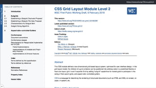


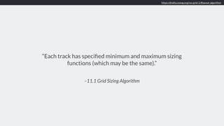
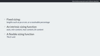
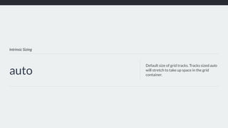
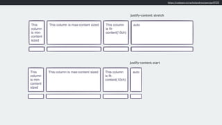
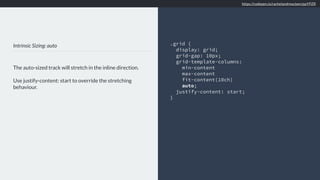
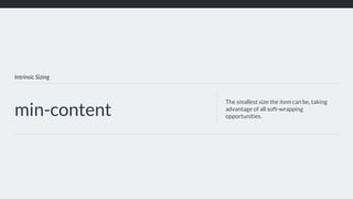
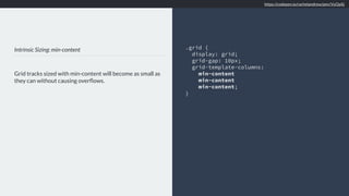
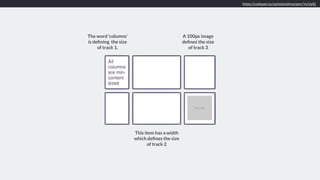
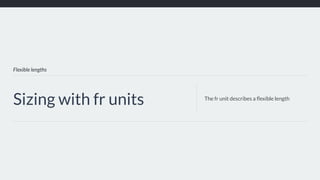
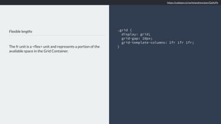

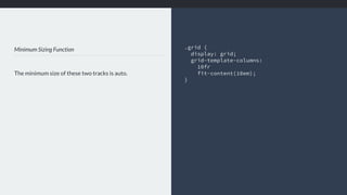

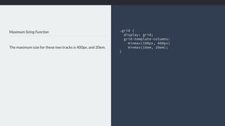
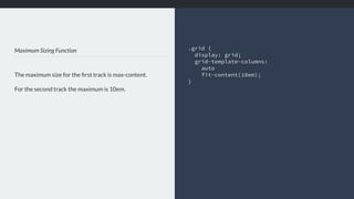
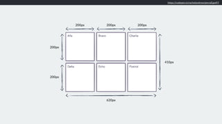
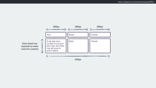
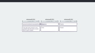
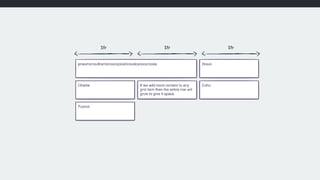
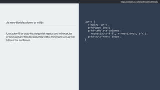
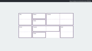

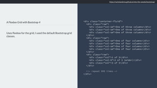
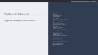
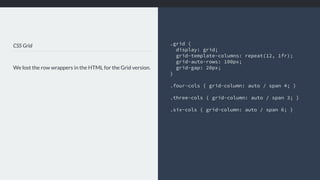
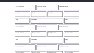
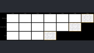
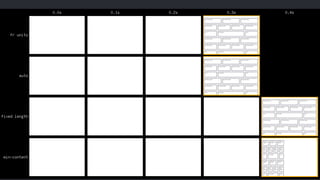
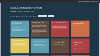
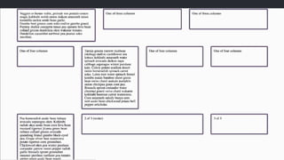
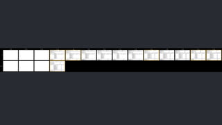


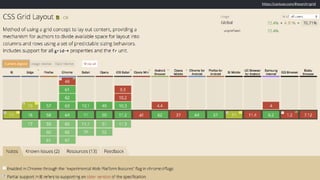
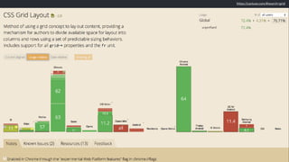
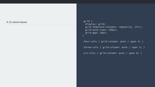

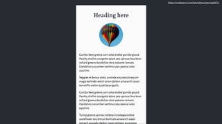
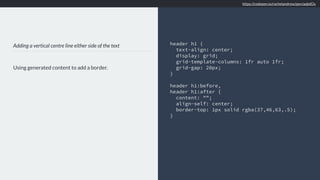
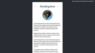
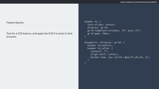
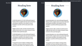
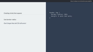
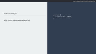
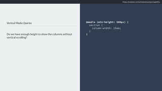
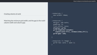


The document provides a summary of Rachel Andrew's presentation on CSS layout at Smashing Conf London. It includes links to various CSS specifications and code examples demonstrating different CSS layout techniques like grid sizing, intrinsic sizing, flexible lengths with fr units, minimum and maximum sizing, and responsive design patterns using media queries and feature queries.


![Getting Started with Apache Spark: Big Data Made Simple [Free Meetup]](https://cdn.slidesharecdn.com/ss_thumbnails/apachesparkgettingstarted-260203175547-8361bcc3-thumbnail.jpg?width=640&height=640&fit=bounds)


