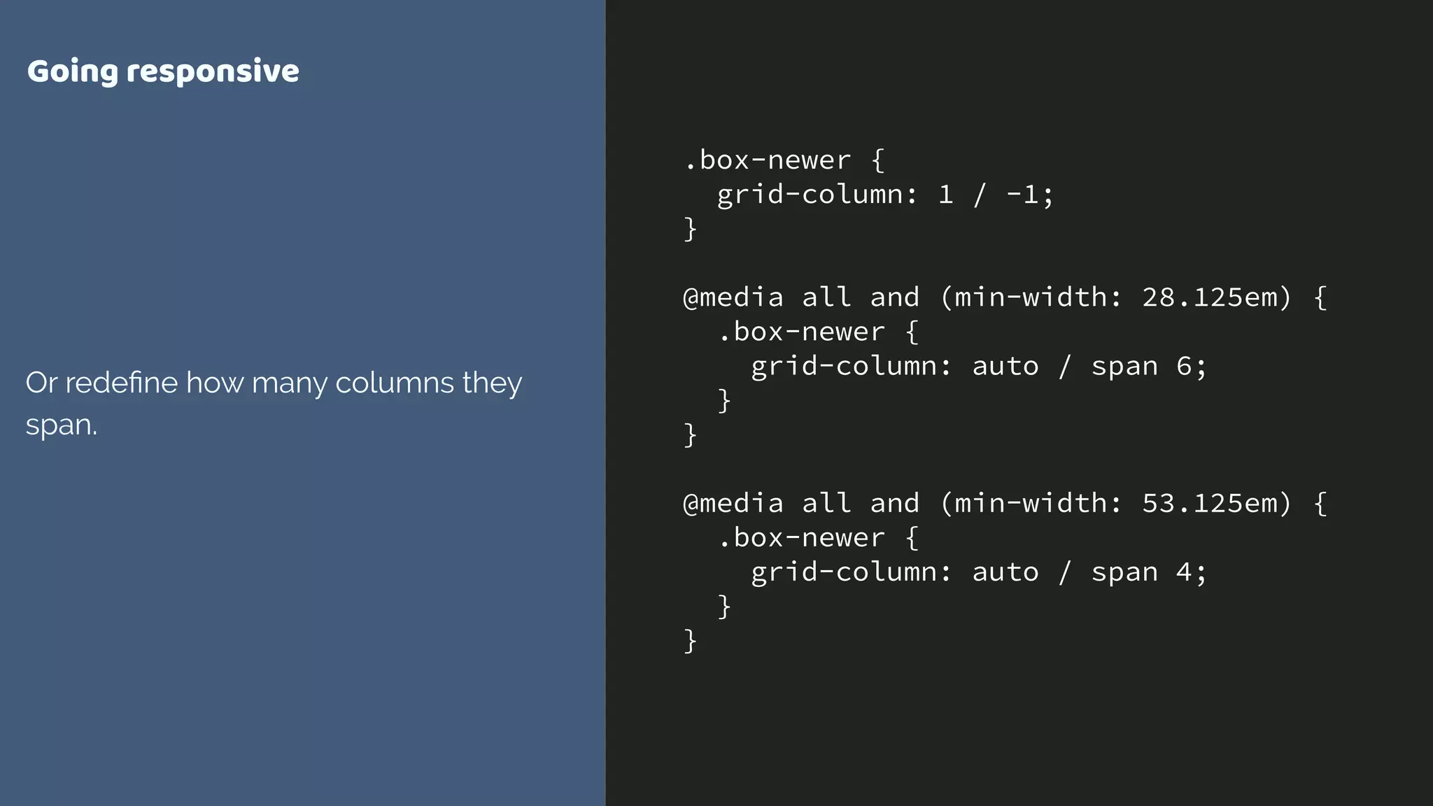
Download as PDF, PPTX


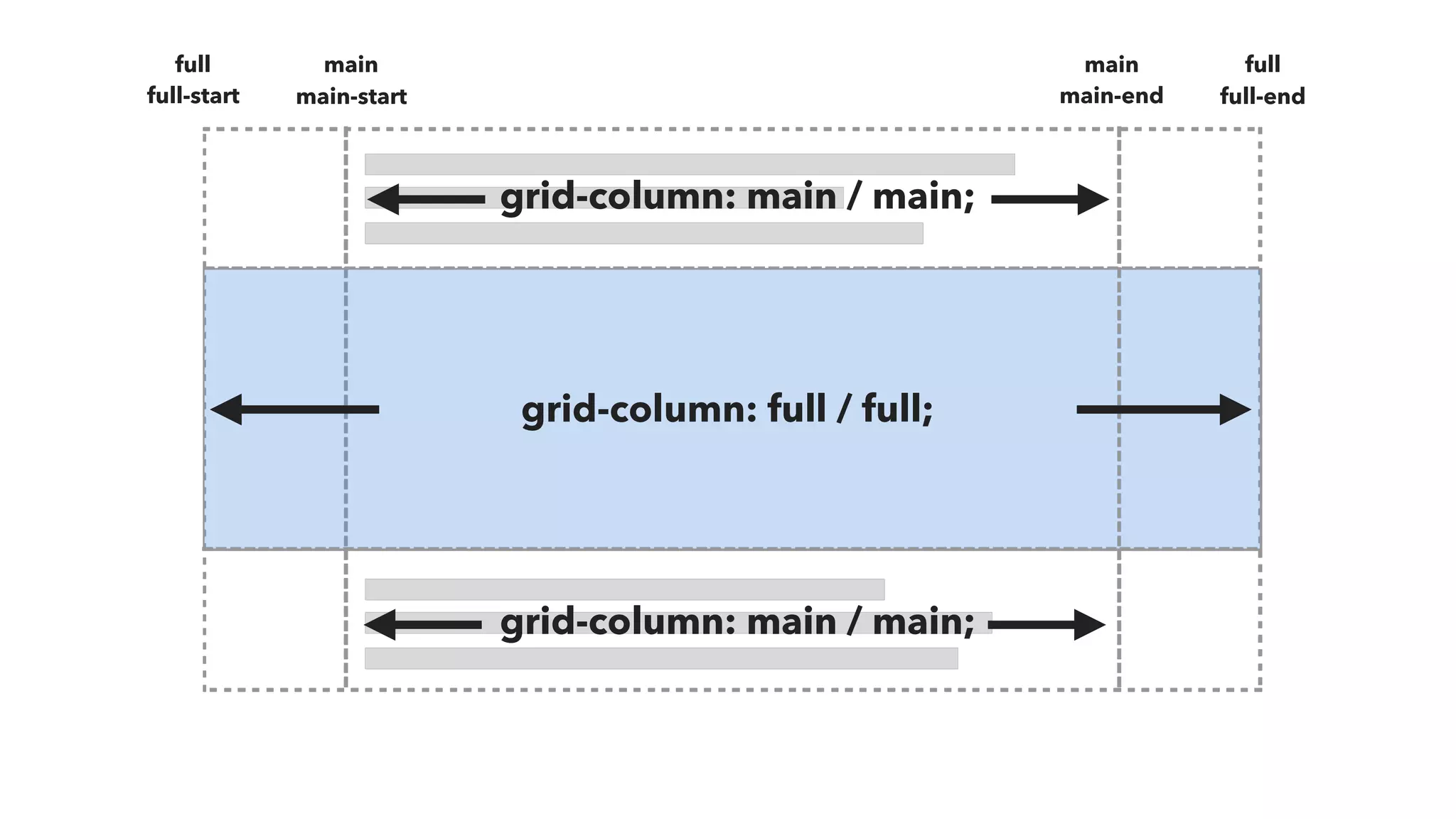
![.Prose {
display: grid;
grid-template-columns:
[full-start] minmax(1em, 1fr)
[main-start] minmax(0, 40em) [main-end]
minmax(1em, 1fr) [full-end];
}
.Prose > * {
grid-column: main;
}
.Prose-splash {
grid-column: full;
}
Just do this!
Magic occurs.](https://image.slidesharecdn.com/evergreen-websites-170621153955/75/Evergreen-websites-for-Evergreen-browsers-30-2048.jpg)


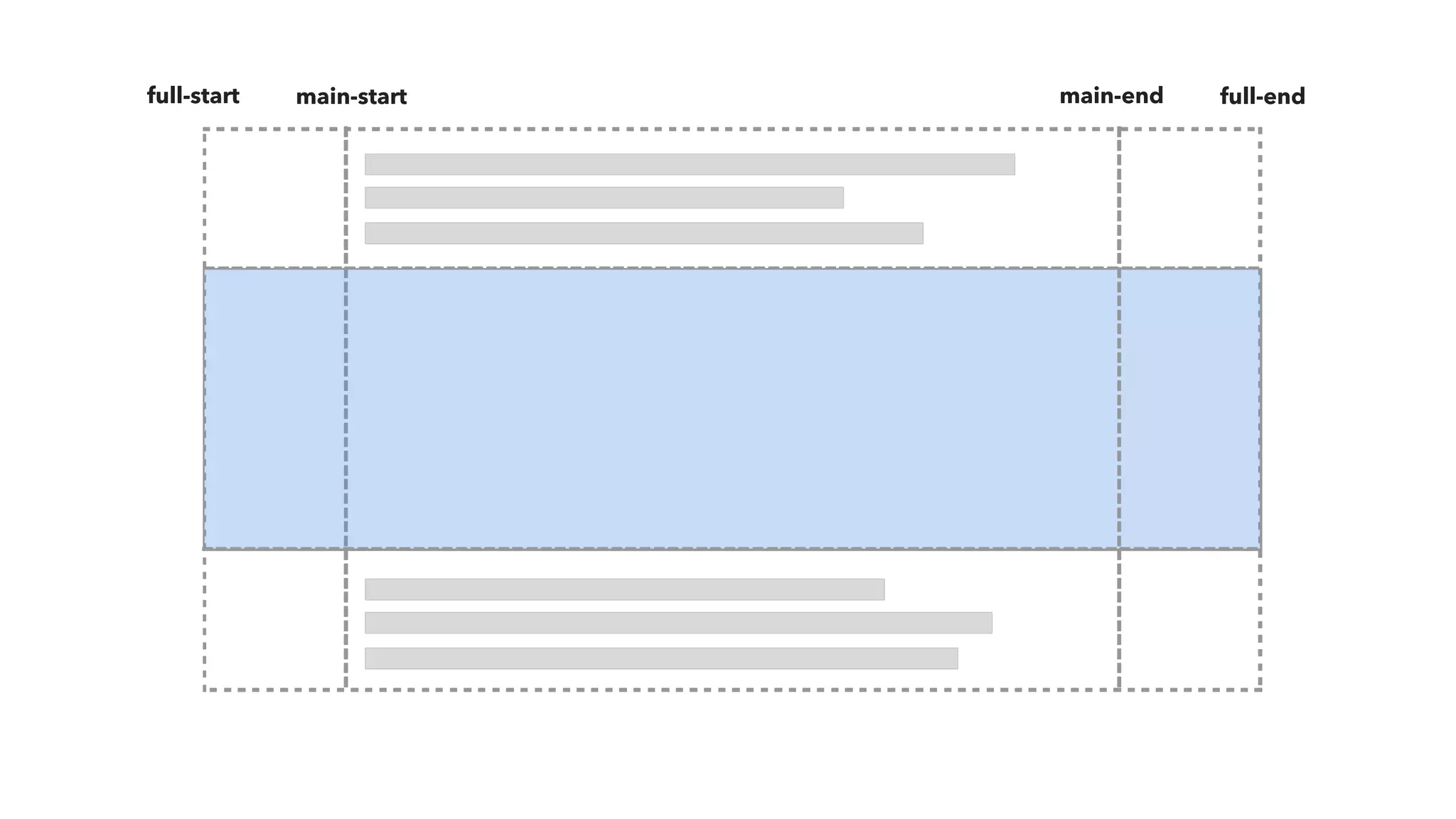
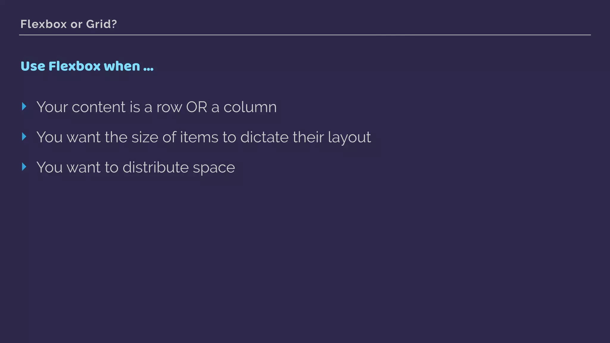
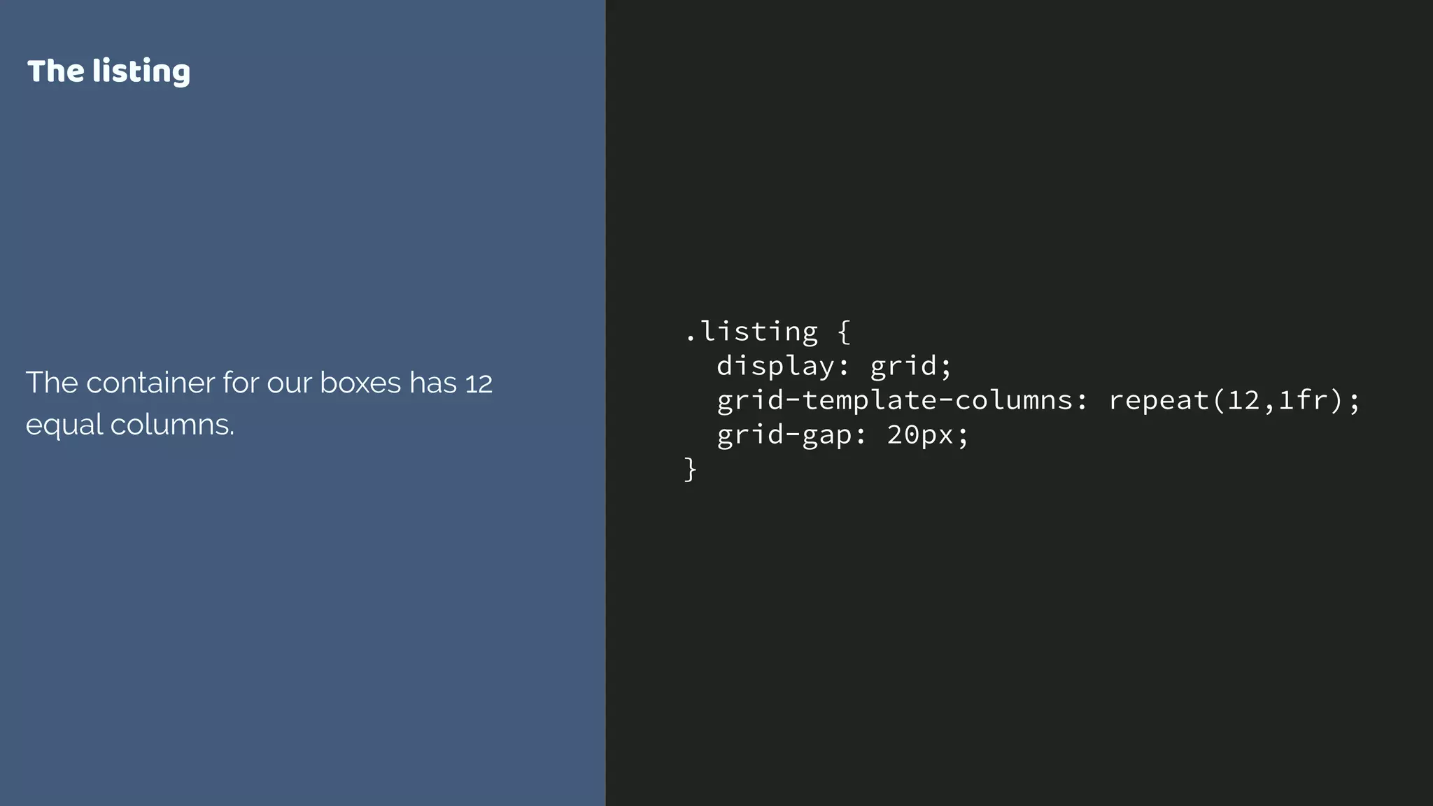
![.grid {
display: grid;
grid-gap: 20px;
grid-template-columns:
[full-start] minmax(1em, 1fr)
[main-start] minmax(0, 40em) [main-end]
minmax(1em, 1fr) [full-end];
}
.grid > * {
grid-column: main-start ;
}
.grid > .full {
grid-column: full-start / full-end;
}
Naming lines on the grid
We can now position the items using
their line names.](https://image.slidesharecdn.com/evergreen-websites-170621153955/75/Evergreen-websites-for-Evergreen-browsers-35-2048.jpg)


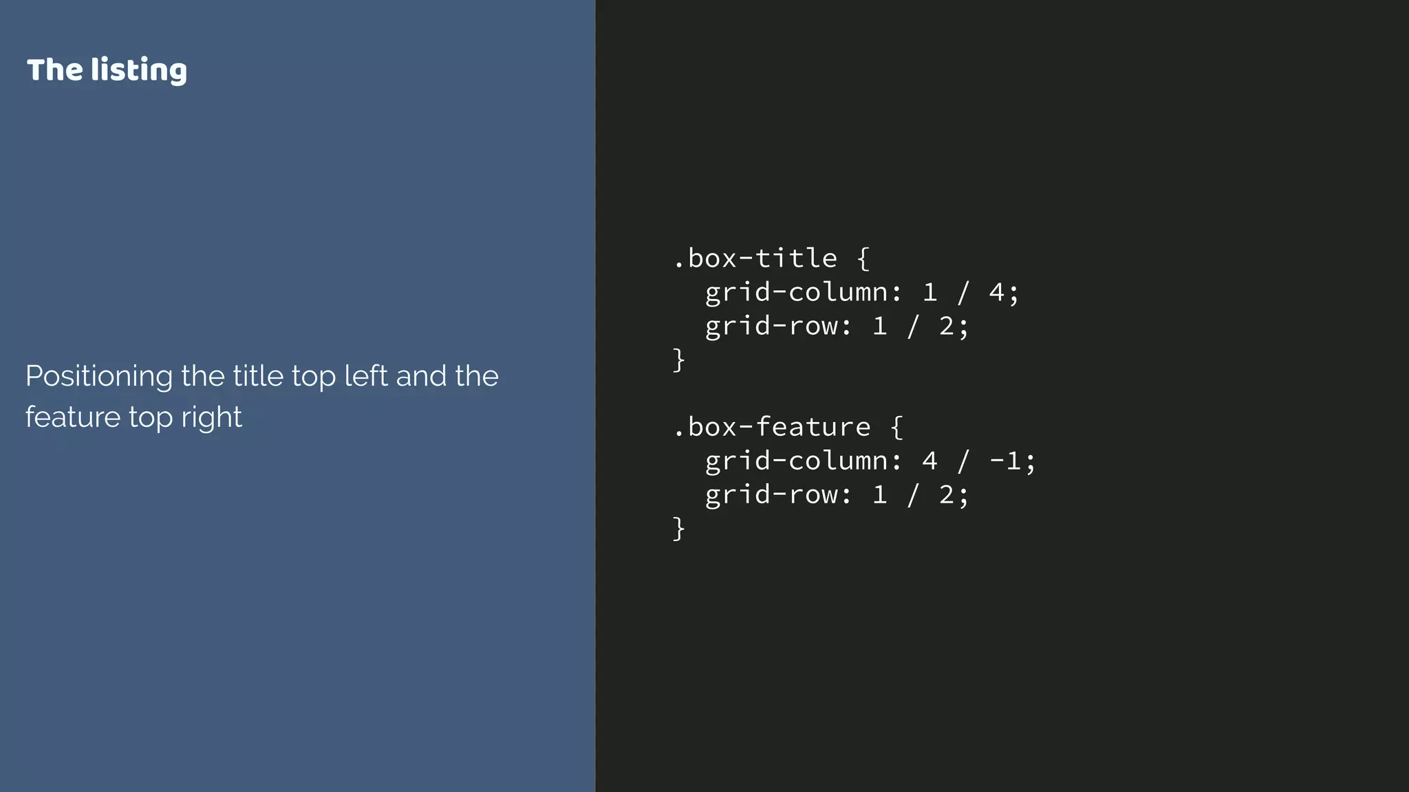
![.grid {
display: grid;
grid-gap: 20px;
grid-template-columns:
[full-start] minmax(1em, 1fr)
[main-start] minmax(0, 40em) [main-end]
minmax(1em, 1fr) [full-end];
}
.grid > * {
grid-column: main;
}
.grid > .full {
grid-column: full;
}
‘main’and‘full’
These line names don’t exist
anywhere in our grid definition.](https://image.slidesharecdn.com/evergreen-websites-170621153955/75/Evergreen-websites-for-Evergreen-browsers-39-2048.jpg)


![.grid {
display: grid;
grid-gap: 20px;
grid-template-columns:
100px [main-start]
100px 100px 100px [main-end]
100px 100px;
grid-template-rows:
100px [main-start]
100px 100px [main-end] 100px;
}
.item {
grid-area: main;
}
Implicit named areas
Created by having named lines using
an ident with *-start and *-end.
https://codepen.io/rachelandrew/pen/
eWoKmd/](https://image.slidesharecdn.com/evergreen-websites-170621153955/75/Evergreen-websites-for-Evergreen-browsers-42-2048.jpg)
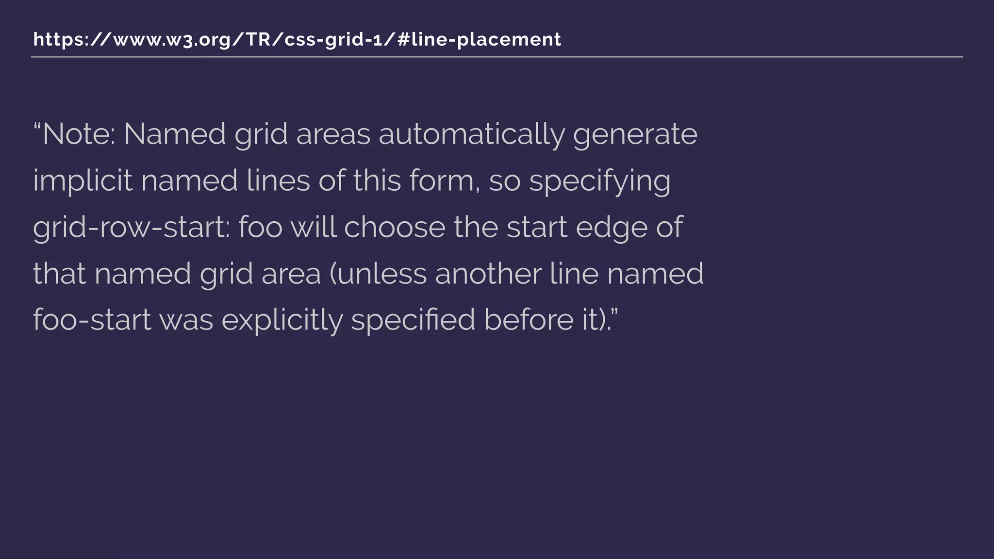
![https://www.w3.org/TR/css-grid-1/#placement-shorthands
“[when using grid-row and grid-column
shorthands] … When the second value is omitted,
if the first value is a <custom-ident>, the grid-row-
end/grid-column-end longhand is also set to
that <custom-ident>; otherwise, it is set to auto.”](https://image.slidesharecdn.com/evergreen-websites-170621153955/75/Evergreen-websites-for-Evergreen-browsers-44-2048.jpg)


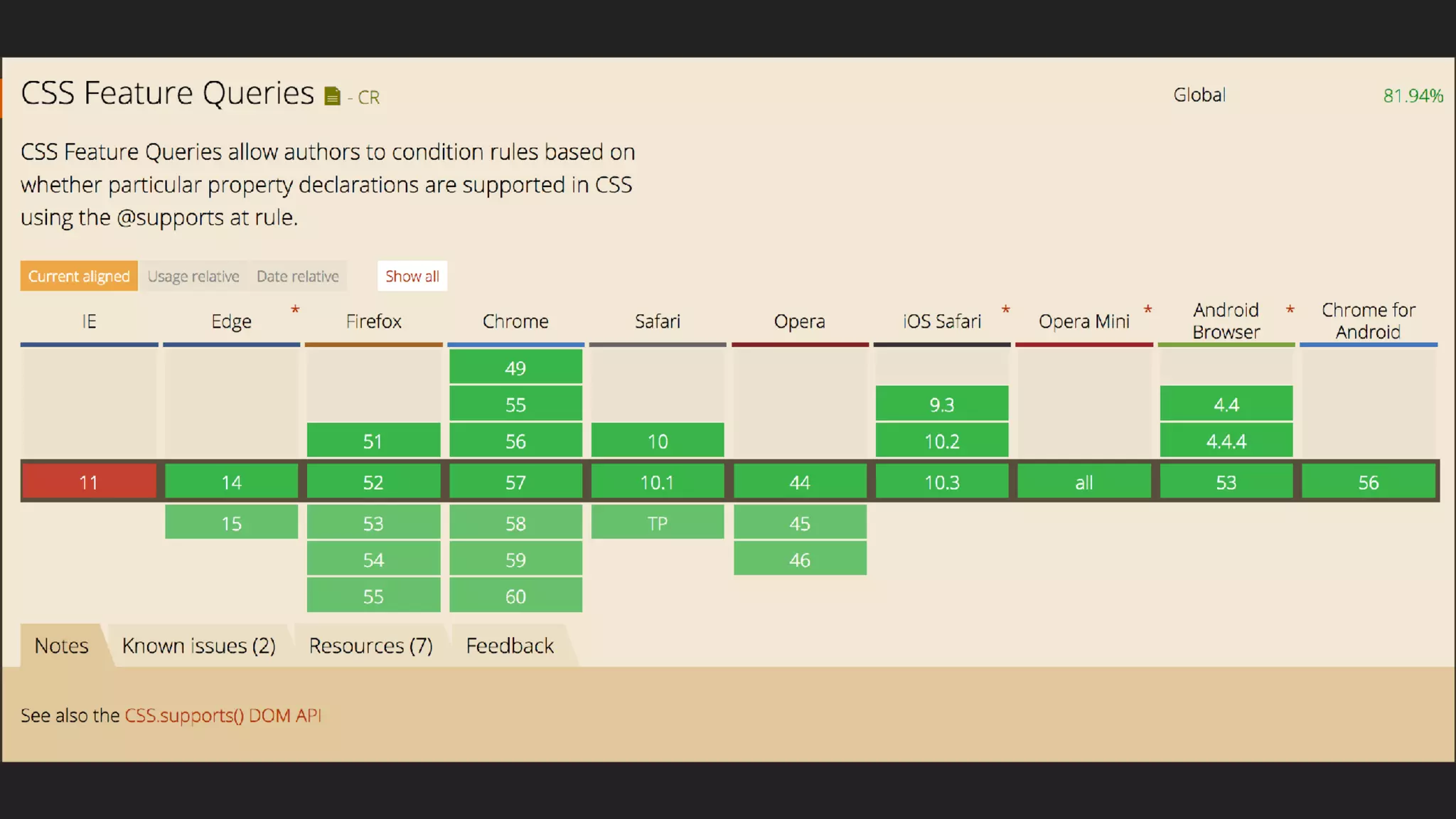


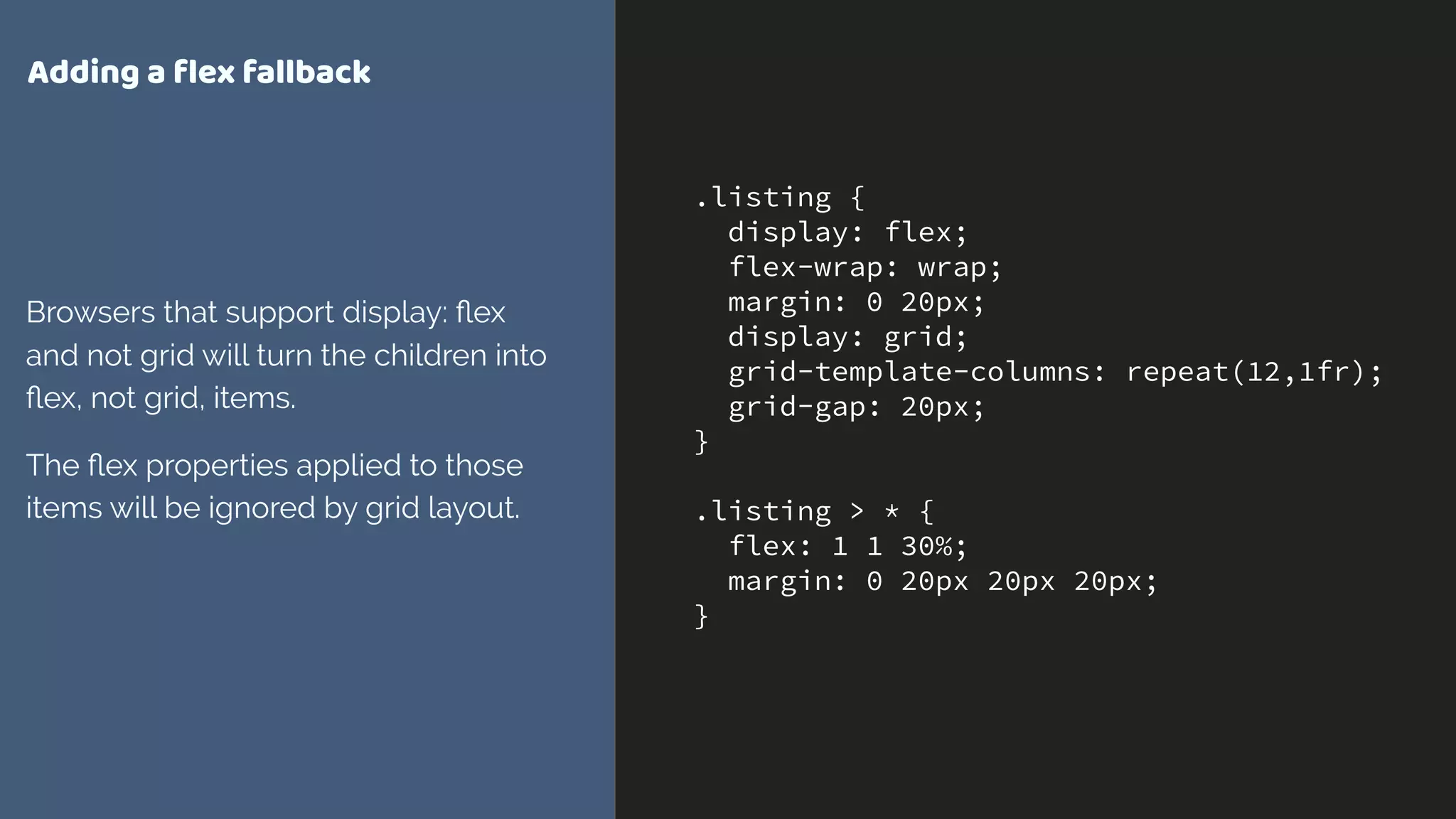


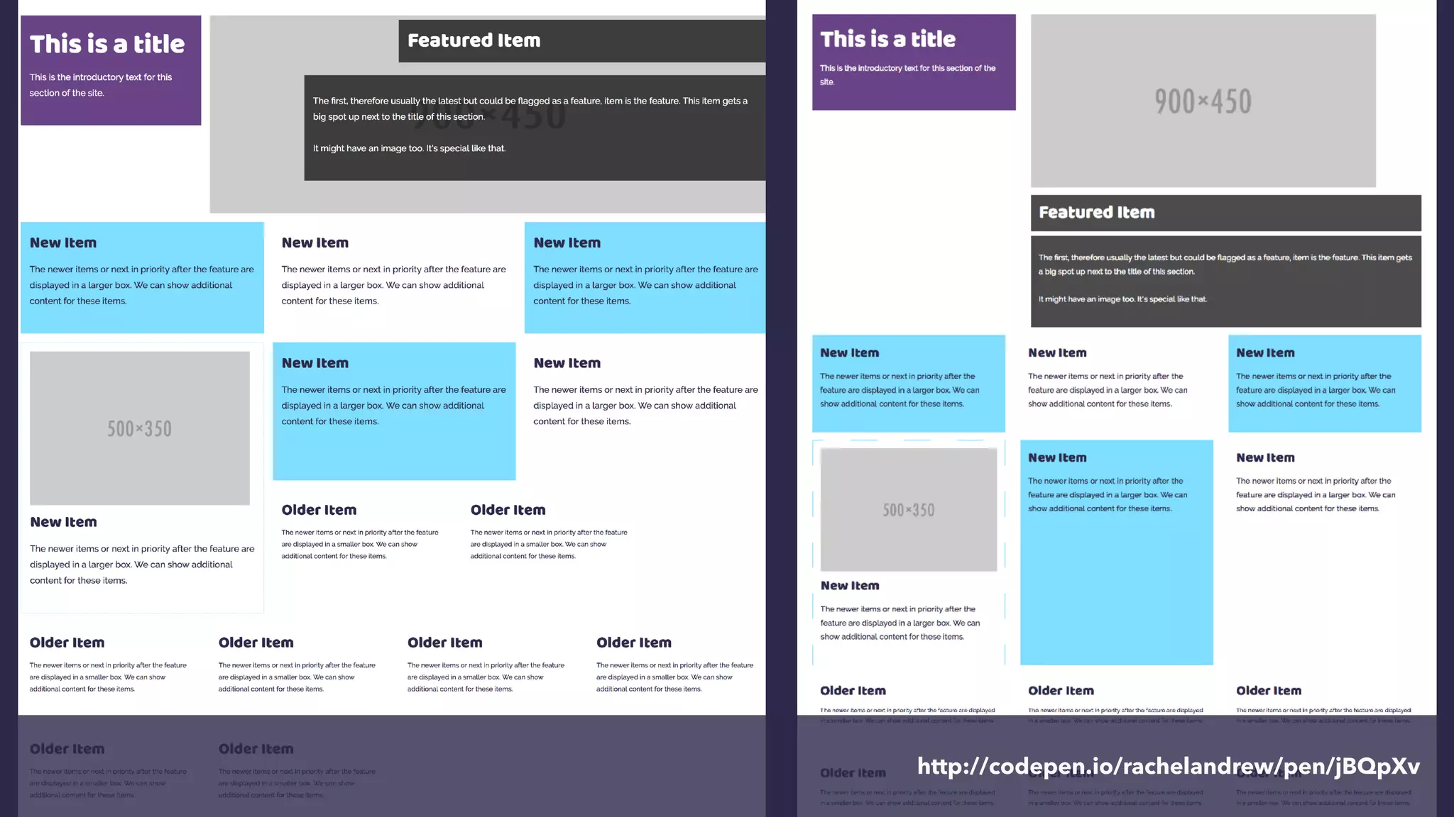


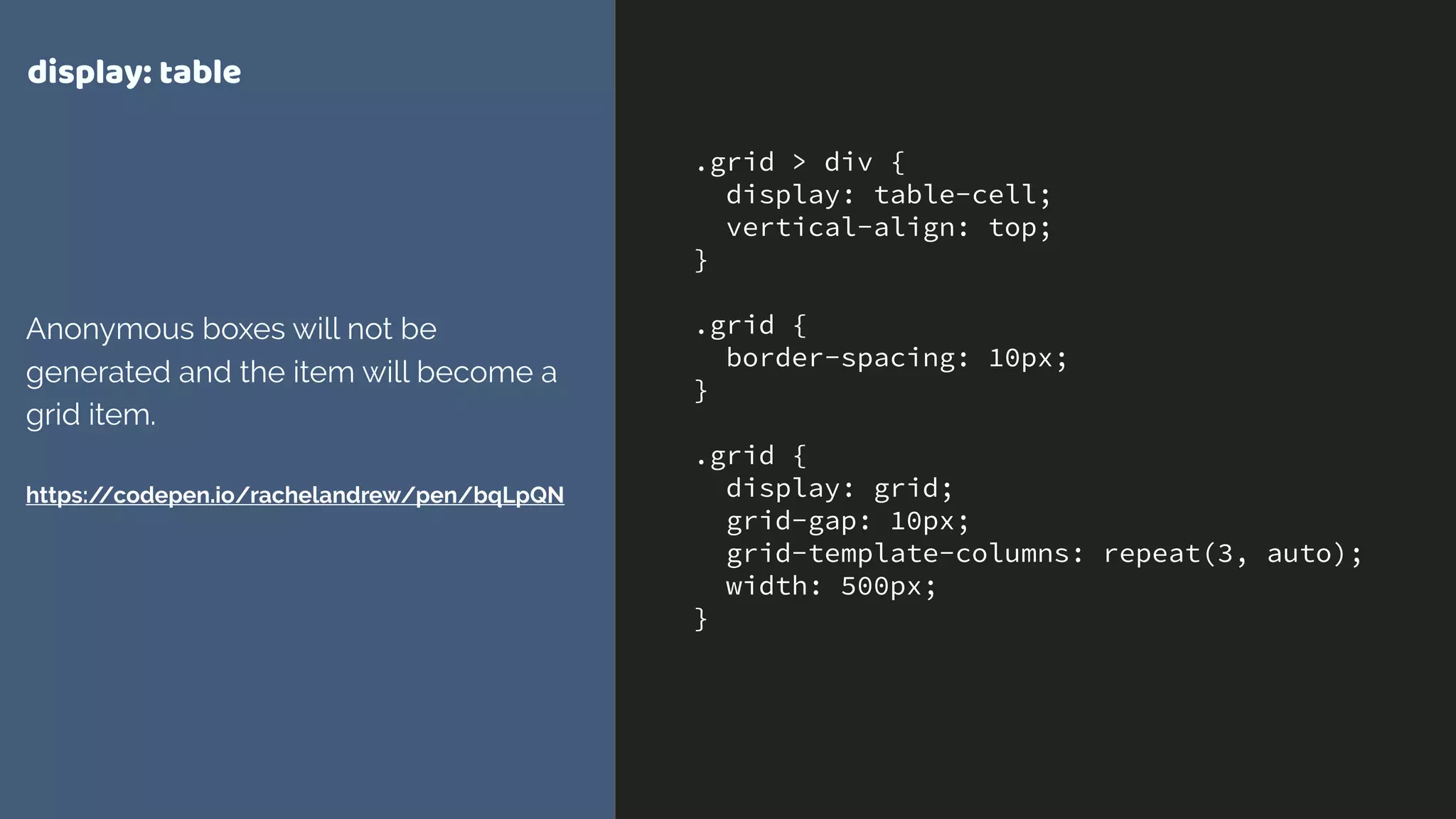


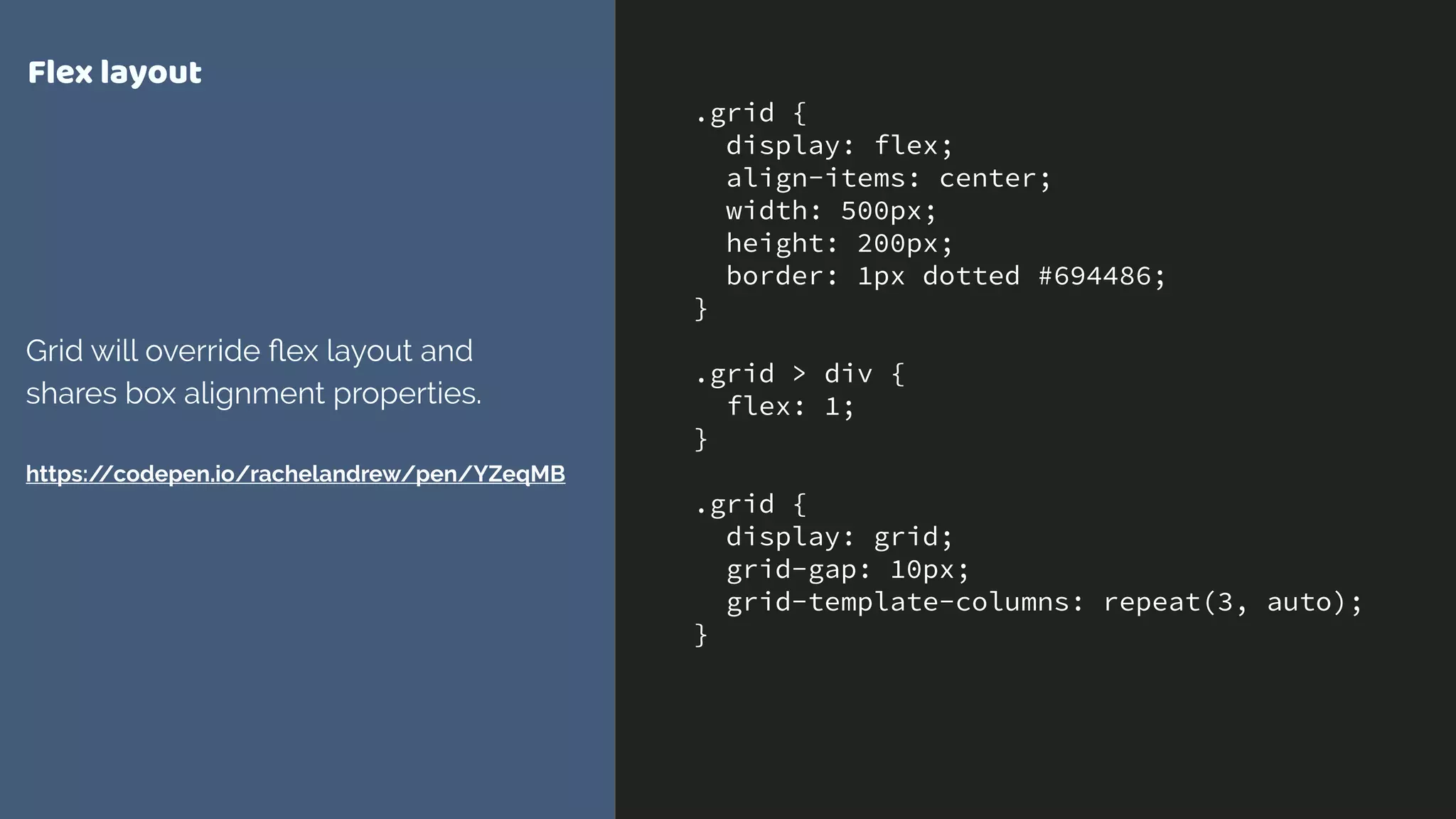


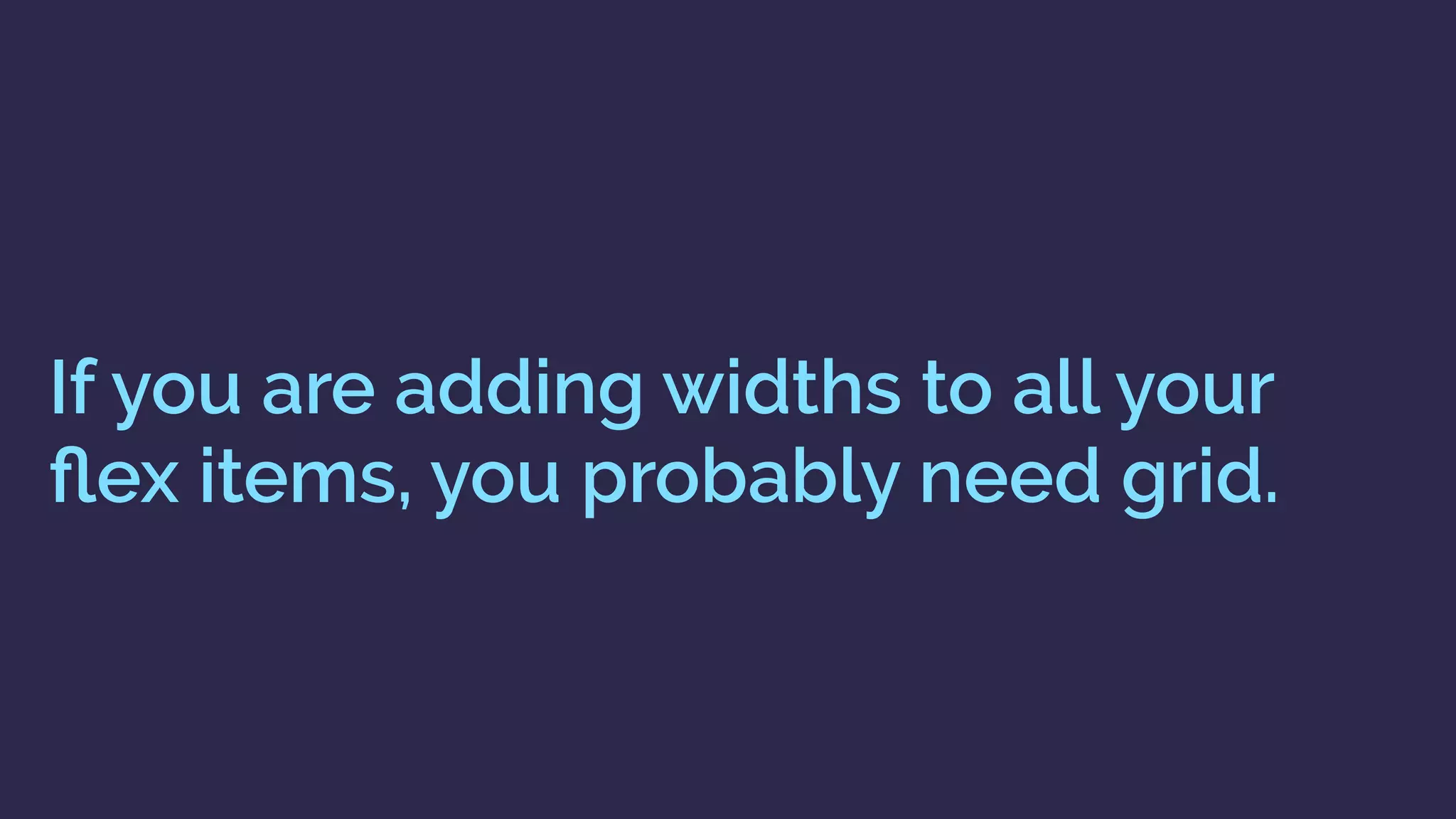
Grid is for two-dimensional layout, while flexbox is for one-dimensional layout. Grid allows control of layout from the parent container by defining column and row tracks on the container, rather than adding properties to child items. This allows child items to be positioned and overlap in the grid space without adding widths or heights to them directly. Feature queries can be used to provide an enhanced grid-based layout for supporting browsers while avoiding conflicts with non-supporting browsers.


![Coded Agents – with UiPath SDK + LangGraph [Virtual Hands-on Workshop]](https://cdn.slidesharecdn.com/ss_thumbnails/codedagentsdeck-251215155422-5497c599-thumbnail.jpg?width=640&height=640&fit=bounds)


