Download as PDF, PPTX


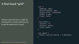
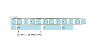

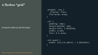
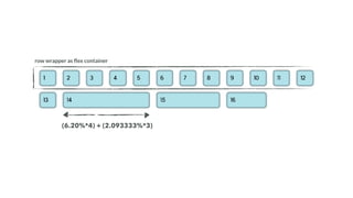
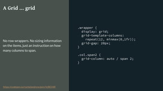
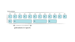

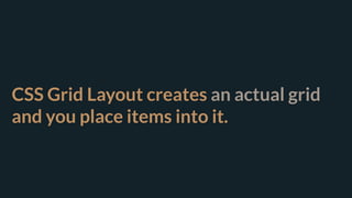
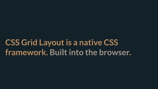
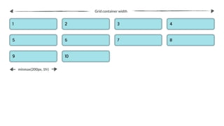
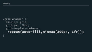
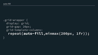
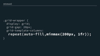

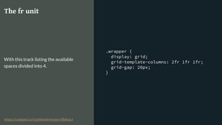
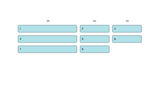
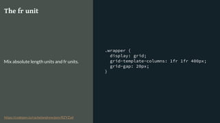
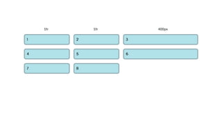
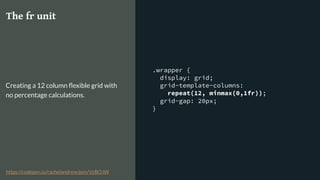
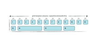
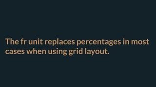
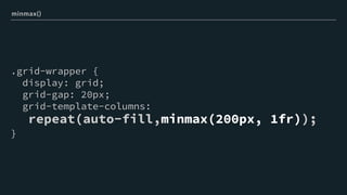

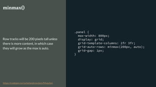
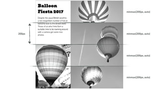


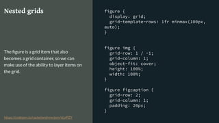


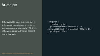

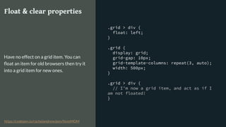
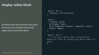
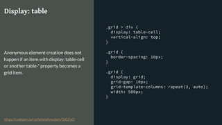
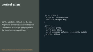
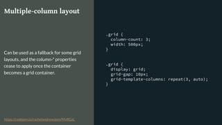
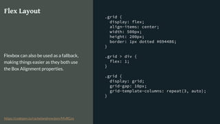

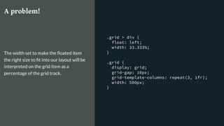
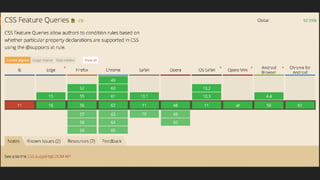


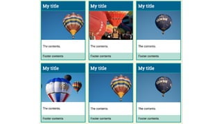
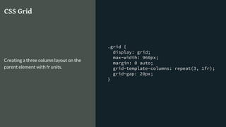
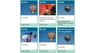
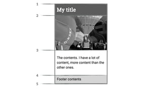
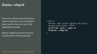
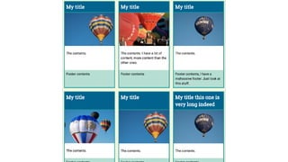


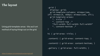

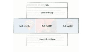


This document summarizes Rachel Andrew's presentation on solving layout problems with CSS Grid and friends. It discusses how CSS Grid creates an actual grid structure, unlike float-based or flexbox grids which only mimic a grid. Key features of CSS Grid like grid-template-columns, repeat, minmax, and fr units for column sizing are explained. The document also covers using features like float or flexbox as fallbacks for older browsers, and potential future additions to grid like subgrids and masonry layouts.